Minecraft is a computer game developed on May 10, 2009, by Markus Persson and released by Mojang AB. It is characterized by a three-dimensional world, which consists of cubes. It has simple gameplay but allows you to create complex logic circuits.
Minecraft هي لعبة كمبيوتر تم تطويرها في 10 مايو 2009 بواسطة Markus Persson وتم إصدارها بواسطة Mojang AB. يتميز بعالم ثلاثي الأبعاد ، يتكون من مكعبات. تتميز بطريقة لعب بسيطة ولكنها تسمح لك بإنشاء دوائر منطقية معقدة.
MEANING AND HISTORY
What is Minecraft?
Minecraft is a popular development from Mojang Studios, an indie game with non-linear gameplay. Its first version appeared in 2009; later, it was updated and adapted for different platforms.
Minecraft هو تطوير مشهور من Mojang Studios ، وهي لعبة مستقلة ذات أسلوب لعب غير خطي. ظهرت نسخته الأولى في عام 2009 ؛ لاحقًا ، تم تحديثه وتكييفه مع منصات مختلفة.
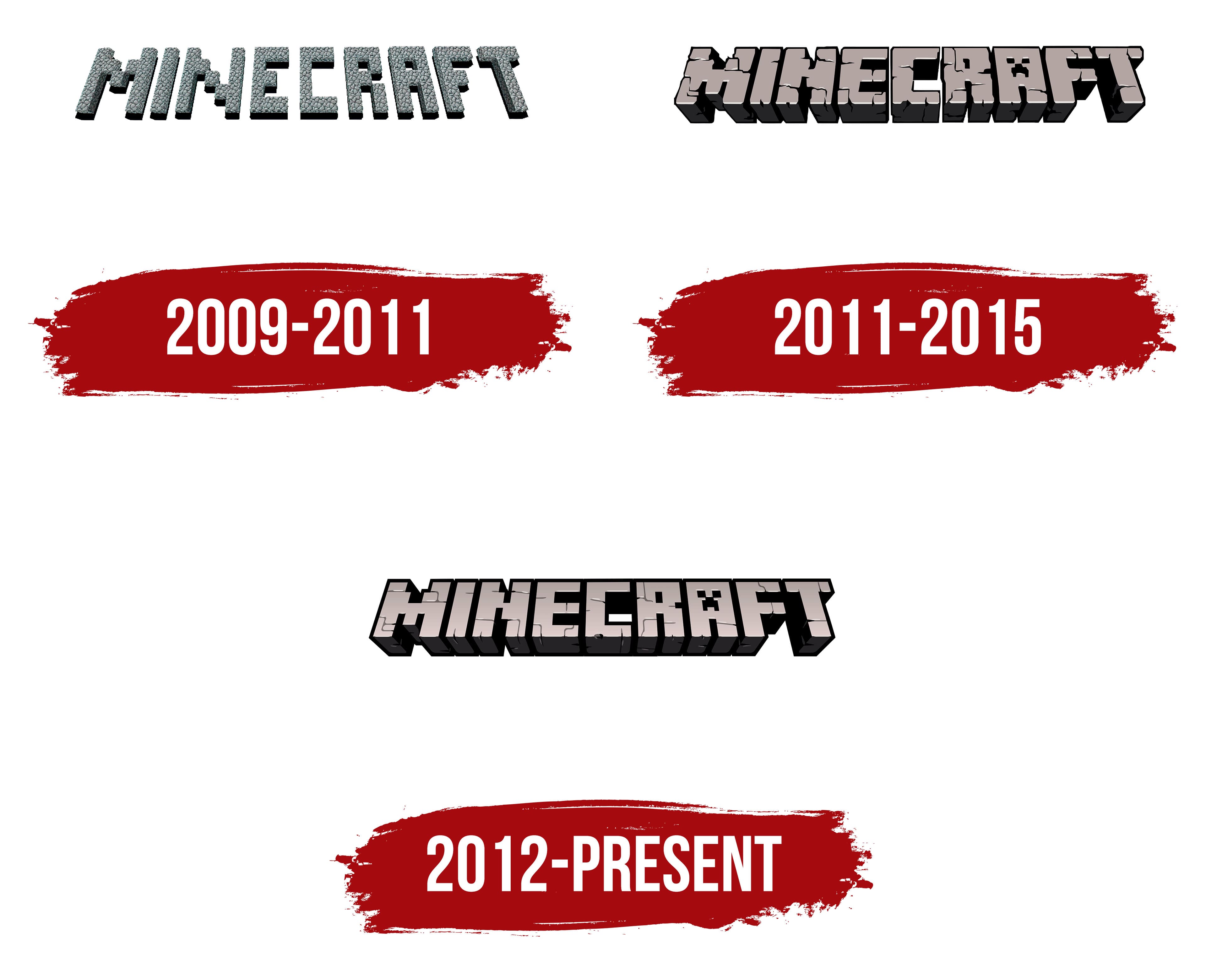
From May 10 to May 15, 2009, the video game was called the Cave Game, which was reflected in its logo. Then the authors renamed their “brainchild” and, at the same time, decided to change the brand name to a more appropriate one.
من 10 مايو إلى 15 مايو 2009 ، كانت لعبة الفيديو تسمى لعبة الكهف ، والتي انعكست في شعارها. ثم أعاد المؤلفون تسمية "بنات أفكارهم" وقرروا في نفس الوقت تغيير اسم العلامة التجارية إلى اسم أكثر ملاءمة.
Hayden Scott-Baron, nicknamed Dock, proposed the first version. A professional illustrator at the time worked as a game designer with Markus Persson. But his version was immediately rejected: the owner of Mojang AB did not like the four-color Minecraft sign with rounded galloping letters. Therefore, Dock left the team, and Markus himself came up with a prototype of the modern logo.
اقترح هايدن سكوت بارون ، الملقب بـ Dock ، النسخة الأولى. عمل رسام محترف في ذلك الوقت كمصمم ألعاب مع ماركوس بيرسون. لكن رُفضت نسخته على الفور: لم يعجب مالك Mojang AB بعلامة Minecraft ذات الألوان الأربعة بأحرف مستديرة متقاربة. لذلك ، ترك Dock الفريق ، وتوصل ماركوس نفسه إلى نموذج أولي للشعار الحديث.
On May 15, 2009, a logo with distinctive graphics appeared. The word “Minecraft” is lined with gray paving stones, which are used in the game world as a building material. The letters consist of separate square segments and have an uneven texture. The inscription is located at a slight angle in the horizontal plane. Because of the black shadows, it seems that it hangs in space.
في 15 مايو 2009 ظهر شعار برسومات مميزة. كلمة "Minecraft" مبطنة بأحجار الرصف الرمادية ، والتي تُستخدم في عالم اللعبة كمواد بناء. تتكون الحروف من مقاطع مربعة منفصلة ولها نسيج غير متساوٍ. يقع النقش بزاوية طفيفة في المستوى الأفقي. بسبب الظلال السوداء ، يبدو أنها معلقة في الفضاء.
When launching the game on MineCon, Mojang AB created a second brand name. It was introduced in beta 1.4. This option is not much different from the previous one. Designers removed the shadows but left a black color on the inner edges. Also, they enhanced the three-dimensional effect, making the letters shorter and thicker.
عند إطلاق اللعبة على MineCon ، أنشأ Mojang AB اسمًا تجاريًا ثانيًا. تم تقديمه في بيتا 1.4. لا يختلف هذا الخيار كثيرًا عن الخيار السابق. أزال المصممون الظلال لكنهم تركوا اللون الأسود على الحواف الداخلية. كما أنها عززت التأثير ثلاثي الأبعاد ، مما جعل الحروف أقصر وأكثر سمكًا.
Another change affected the texture. Now the word is not lined with square paving stones but is carved from several cobblestones, which are covered with cracks on all sides. Also noteworthy is the stylization of the letter “A.” Inside it is the face of the most famous Minecraft monster – Creeper. Marcus Persson created this creature by chance when he tried to construct a pig.
تغيير آخر أثر على النسيج. الآن الكلمة ليست مبطنة بأحجار رصف مربعة ولكنها منحوتة من عدة أحجار مرصوفة بالحصى مغطاة بالشقوق من جميع الجوانب. وتجدر الإشارة أيضًا إلى أسلوب الحرف "أ". يوجد بداخلها وجه أشهر وحش Minecraft - Creeper. ابتكر ماركوس بيرسون هذا المخلوق بالصدفة عندما حاول تكوين خنزير.
Also, the current emblem had several additional versions. They were developed specifically for the Java Edition and Bedrock Edition. All options differed in minor details.
أيضًا ، كان للشعار الحالي عدة إصدارات إضافية. تم تطويرها خصيصًا لإصدار Java Edition و Bedrock Edition. اختلفت جميع الخيارات في التفاصيل الصغيرة.
[sc_fs_faq html=”true” headline=”p” img=”” question=”What was the first logo of Minecraft?” img_alt=”” css_class=””] The first Minecraft logo had the same structure as the modern one. It contained a fallen inscription, which consisted of separate blocks. But unlike the current version, the game’s name was laid out with gray paving stones. The letter A had a standard design, without stylization to resemble the creature’s face. [/sc_fs_faq]
[sc_fs_faq html = "true" headline = "p" img = "" question = "ما هو أول شعار لماين كرافت؟" img_alt = ”” css_class = ””] كان لشعار Minecraft الأول نفس هيكل الشعار الحديث. احتوت على نقش ساقط ، يتكون من كتل منفصلة. ولكن على عكس الإصدار الحالي ، تم وضع اسم اللعبة بأحجار رصف رمادية. كان للحرف A تصميم قياسي ، بدون أسلوب يشبه وجه المخلوق. [/ sc_fs_faq]
In 2012, designers modernized the art style and made the logo more “pixelated.” To do this, they leveled the edges, circled all parts of the word with bold black contours, and blurred the cracks. Nothing else has changed: the colors, shapes, and proportions have remained the same. The famous Creeper, as before, is immortalized in the letter “A.”
في عام 2012 ، حدَّث المصممون أسلوب الفن وجعلوا الشعار أكثر "بكسلًا". للقيام بذلك ، قاموا بتسوية الحواف ، ووضع دائرة حول جميع أجزاء الكلمة بخطوط سوداء جريئة ، وطمسوا التشققات. لم يتغير شيء آخر: ظلت الألوان والأشكال والنسب كما هي. الزاحف الشهير ، كما كان من قبل ، تم تخليده في الحرف "أ".
Initially, this logo was used only for the Xbox 360 Edition as a side version of the original graphic sign. It became the main one only in 2015. This happened after Microsoft bought Mojang AB along with Minecraft.
FONT AND COLOR OF THE EMBLEM

Why did Minecraft change its logo?
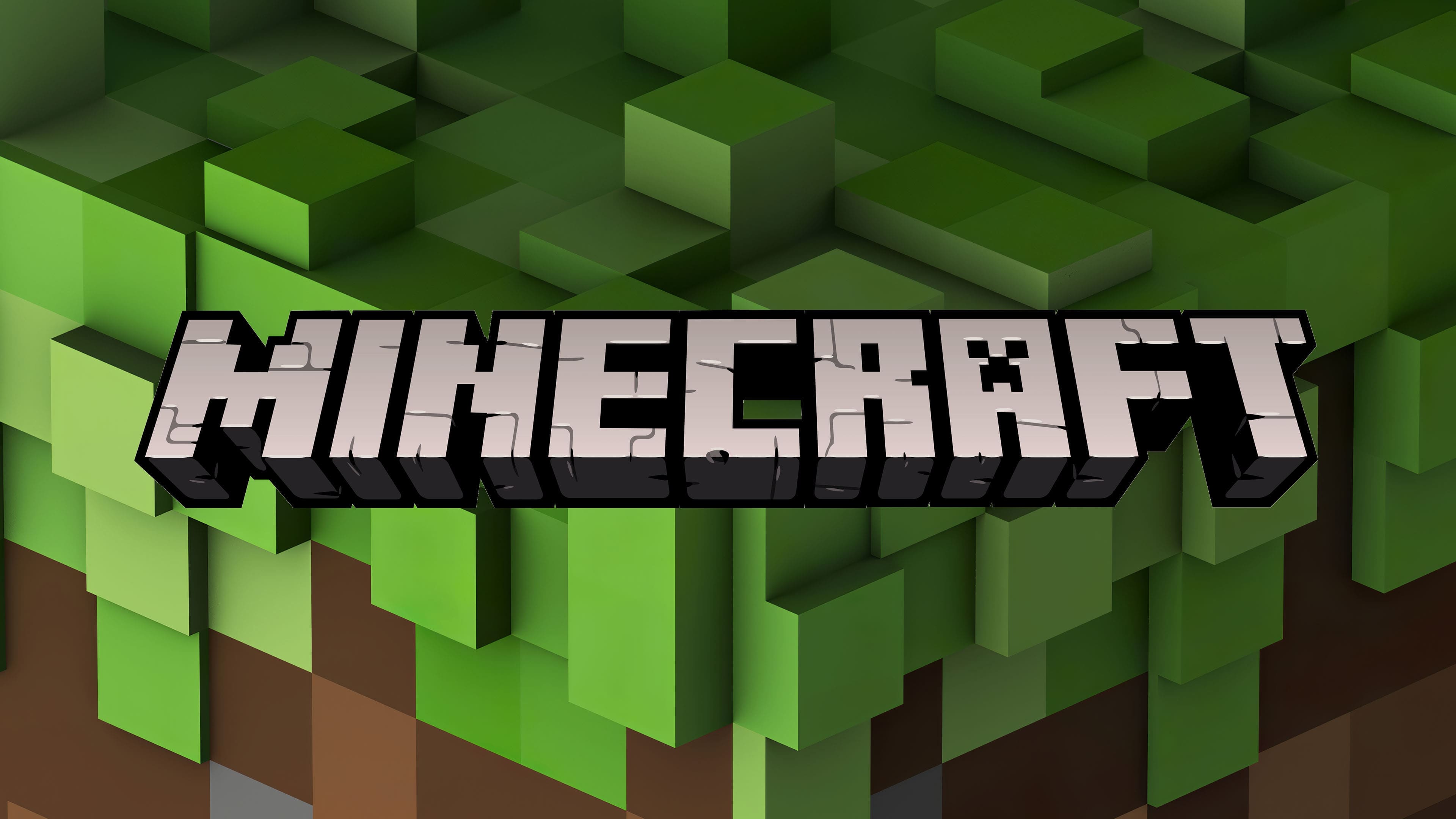
The logo in use today was created for the Xbox 360 Edition. It became the main graphic icon for Minecraft when Microsoft acquired the rights to this video game series and its developer Mojang AB. That is, the design update marked the transition to another owner.
تم إنشاء الشعار المستخدم اليوم لإصدار Xbox 360. أصبح رمز الرسم الرئيسي لماين كرافت عندما حصلت Microsoft على حقوق سلسلة ألعاب الفيديو هذه ومطورها Mojang AB. أي أن تحديث التصميم وضع علامة على الانتقال إلى مالك آخر.
The recognizable Minecraft emblem appears in the game and promotional materials. This is a stylized inscription, consisting of numerous block-cubes used as building materials in the fictional universe. Three-dimensional letters “lie” on the plane at a slight angle. Their surface is covered with uneven cracks, making it seem that they are carved out of stone.
يظهر شعار Minecraft المميز في اللعبة والمواد الترويجية. هذا نقش منمنمة ، يتكون من العديد من المكعبات الكبيرة المستخدمة كمواد بناء في الكون الخيالي. الحروف ثلاثية الأبعاد "تكمن" على المستوى بزاوية طفيفة. سطحها مغطى بشقوق غير مستوية ، مما يجعلها تبدو وكأنها منحوتة من الحجر.

The Minecraft logo makers designed the design from scratch. Standard fonts did not guide them: the word looks more like a picture than an inscription. The letters’ characteristic features are great height (in 3D space), right angles, and no serifs.
صمم صانعو شعار Minecraft التصميم من البداية. لم ترشدهم الخطوط القياسية: تبدو الكلمة أشبه بالصورة أكثر من كونها نقشًا. السمات المميزة للحروف هي ارتفاع كبير (في مساحة ثلاثية الأبعاد) ، وزوايا قائمة ، وعدم وجود رقيق.
To simulate the cobblestone texture, the artists used several shades of gray for the main surface and black for shadows, cracks, and outlines. This combination matches the color of the building blocks in the game.
لمحاكاة النسيج المرصوف بالحصى ، استخدم الفنانون عدة درجات من الرمادي للسطح الرئيسي والأسود للظلال والشقوق والخطوط العريضة. تتطابق هذه المجموعة مع لون اللبنات الأساسية في اللعبة.
Comments
Post a Comment