Xfinity is one of the brands owned by Comcast. The main specialization of the platform is to provide customers with offerings and services related to television and the Internet. The Xfinity name began to be used after a global rebranding in 2010. Until then, the current name was Comcast. Globally speaking, it is one of the largest television providers in the world. In turn, Comcast Corporation is an American telecommunications conglomerate.
Xfinity هي إحدى العلامات التجارية المملوكة لشركة Comcast. التخصص الرئيسي للمنصة هو تزويد العملاء بالعروض والخدمات المتعلقة بالتلفزيون والإنترنت. بدأ استخدام اسم Xfinity بعد تغيير العلامة التجارية العالمية في عام 2010. حتى ذلك الحين ، كان الاسم الحالي هو Comcast. على الصعيد العالمي ، فهي واحدة من أكبر مزودي التلفزيون في العالم. بدورها ، شركة Comcast Corporation هي شركة اتصالات أمريكية عملاقة.
MEANING AND HISTORY
What is Xfinity?
First and foremost, millions of users worldwide can have television services and access to the global Internet.
أولاً وقبل كل شيء ، يمكن لملايين المستخدمين في جميع أنحاء العالم الحصول على خدمات التلفزيون والوصول إلى الإنترنت العالمي.
Comcast Cable Communications has been in the communications market since 1981. It is a cult company when it comes to the US market. Thanks to its services, the residents began getting access to the Internet in 1990. The company is not fixated exclusively on the broadcasting of national channels. Its main emphasis is on broadcasting sports channels, and it is the exclusive broadcaster of the Olympic Games.
تعمل Comcast Cable Communications في سوق الاتصالات منذ عام 1981. وهي شركة مرموقة عندما يتعلق الأمر بسوق الولايات المتحدة. بفضل خدماتها ، بدأ السكان في الوصول إلى الإنترنت في عام 1990. ولا تركز الشركة حصريًا على بث القنوات الوطنية. ينصب تركيزها الأساسي على قنوات البث الرياضية ، وهي المذيع الحصري للألعاب الأولمبية.
Considering the market trends that have been taking place in the new millennium, in 2010, the company decided to use the Xfinity trademark for its Internet and Television-related services.
بالنظر إلى اتجاهات السوق التي حدثت في الألفية الجديدة ، في عام 2010 ، قررت الشركة استخدام علامة Xfinity التجارية لخدماتها المتعلقة بالإنترنت والتلفزيون.
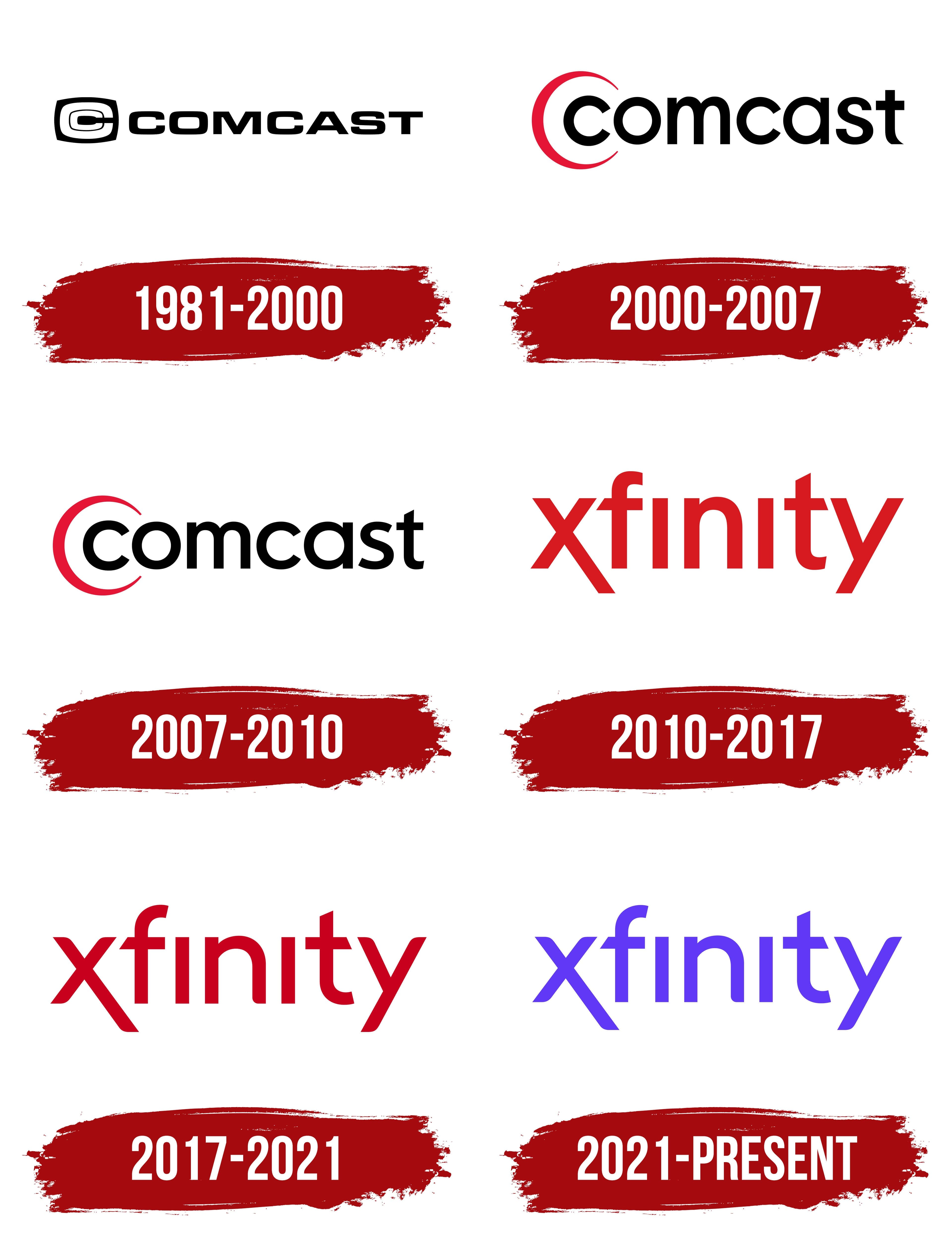
Altogether, since 1981 the company has changed its logo four times. Still, considering the scale of distribution of Xfinity services, the brand’s visual recognition was at a high level at all stages. The first three logos were issued under the Comcast brand name, and later Xfinity was used.
إجمالاً ، منذ عام 1981 ، قامت الشركة بتغيير شعارها أربع مرات. ومع ذلك ، وبالنظر إلى حجم توزيع خدمات Xfinity ، كان التعرف المرئي للعلامة التجارية على مستوى عالٍ في جميع المراحل. تم إصدار الشعارات الثلاثة الأولى تحت الاسم التجاري Comcast ، وبعد ذلك تم استخدام Xfinity.
1981 – 2000
A black and white color scheme was chosen for the emblem. A black square with rounded corners showed two C’s, one inside the other. Despite the simplicity of the logo, at the time, it looked modern and appealed to the target audience.
تم اختيار مخطط ألوان أبيض وأسود للشعار. يظهر مربع أسود بزوايا دائرية اثنين من حرف C ، أحدهما داخل الآخر. على الرغم من بساطة الشعار ، إلا أنه في ذلك الوقت بدا حديثًا وجذابًا للجمهور المستهدف.
2000 – 2010
The first major redesign took place in 2000 for a word inscription, used lower case letters in a classic bold font without serifs. The color also remained black, but the rounded corners in the letters gave the logo a modern twist. The emblem was removed. Instead, an arched line was created, repeating the first “C” but in red.
تمت أول عملية إعادة تصميم رئيسية في عام 2000 لنقش كلمة ، واستخدمت الأحرف الصغيرة بخط عريض كلاسيكي بدون الرقيق. ظل اللون أيضًا أسودًا ، لكن الزوايا الدائرية في الأحرف أعطت الشعار لمسة عصرية. تمت إزالة الشعار. بدلاً من ذلك ، تم إنشاء خط مقنطر ، مكررًا الحرف الأول "C" ولكن باللون الأحمر.
Minimal changes were made to this version in 2007. And they were concerned only with the style of spelling of the last letter in the name “Comcast.”
تم إجراء تغييرات طفيفة على هذا الإصدار في عام 2007. وكانوا معنيين فقط بأسلوب تهجئة الحرف الأخير في اسم "Comcast".
2010 – 2017
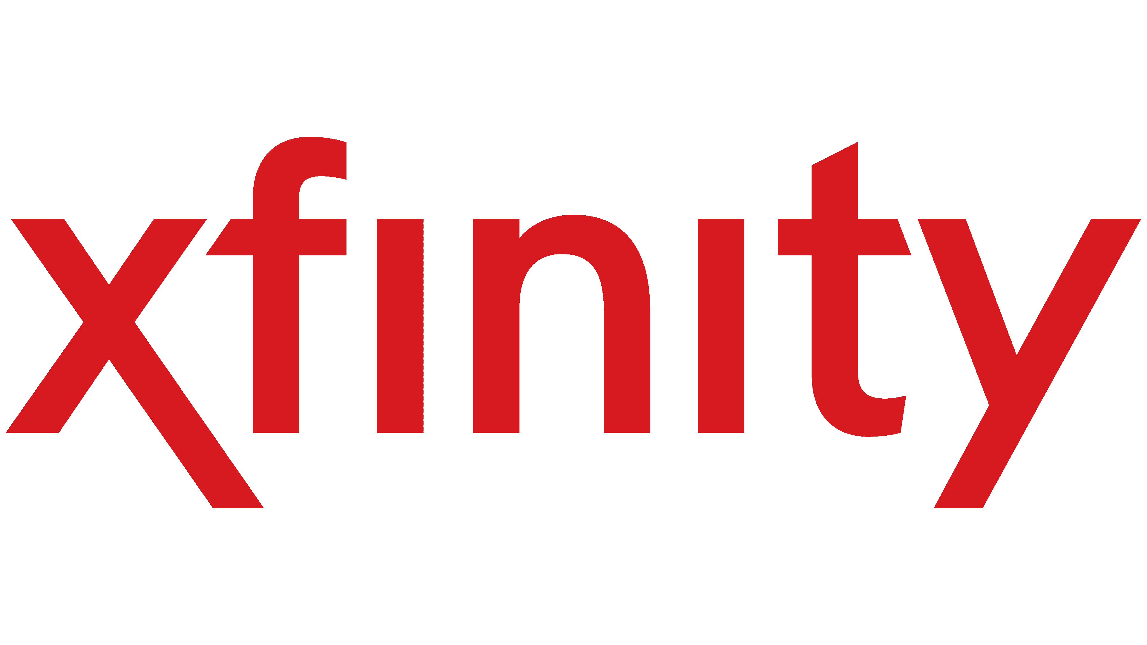
The 2017 redesign brought only minimal changes to the style of the lettering. The lines in the letters became thinner. In addition, the outlines became more pronounced and vibrant. The main emphasis in this variation of the logo was on color. The dark red color allowed the company’s name to stand out from the competition, indicating its ambition and constant development.
جلبت إعادة التصميم لعام 2017 تغييرات طفيفة فقط في أسلوب الكتابة. أصبحت الخطوط في الحروف أرق. بالإضافة إلى ذلك ، أصبحت الخطوط العريضة أكثر وضوحًا وحيوية. كان التركيز الرئيسي في هذا الاختلاف في الشعار على اللون. سمح اللون الأحمر الغامق لاسم الشركة بالتميز عن المنافسة مما يدل على طموحها وتطورها المستمر.
2021 – today
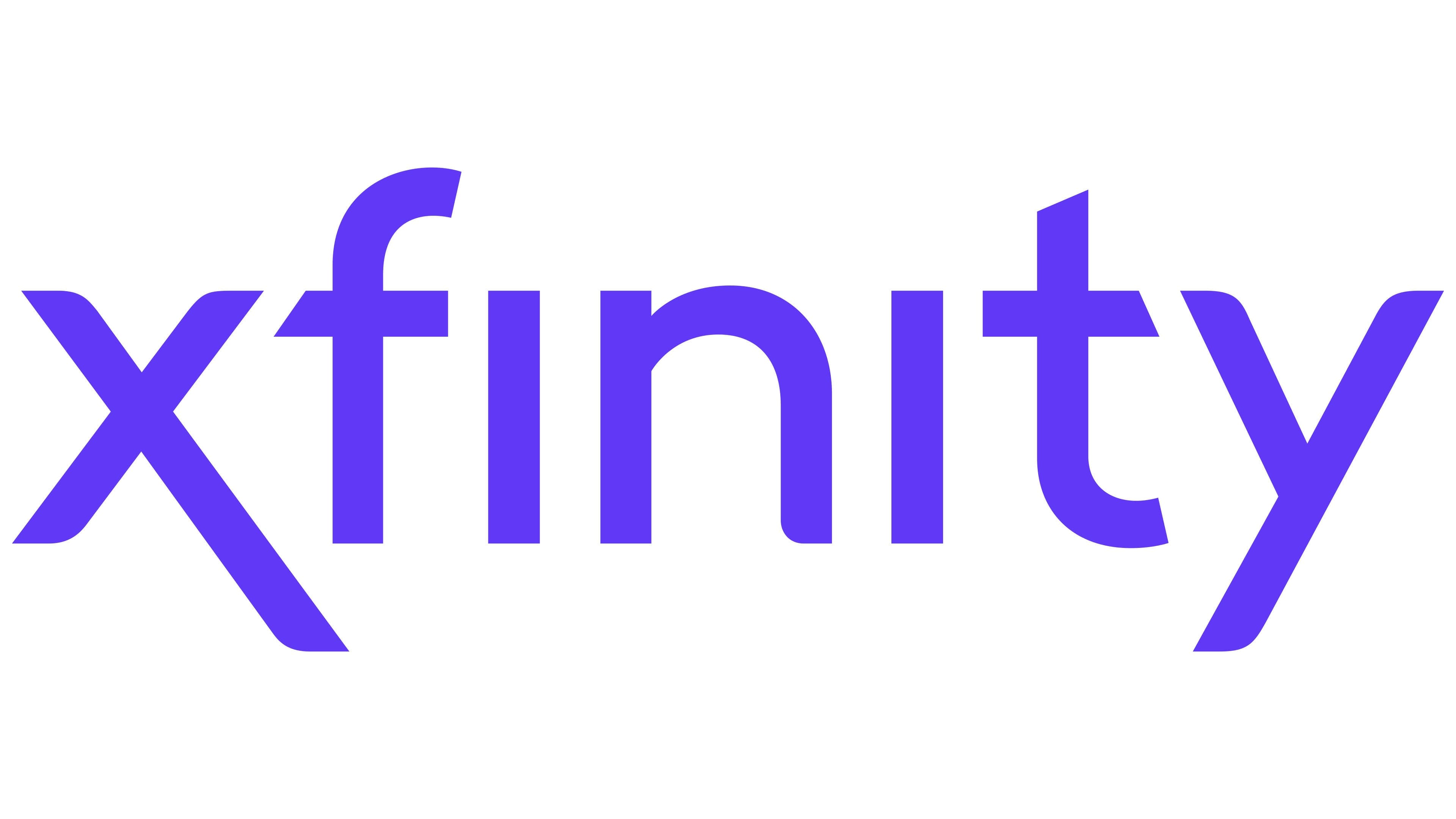
The last logo update to date took place in 2021. The only change was in the color palette. As a result, the color red was changed to bright purple. It communicates the company’s focus, its mission, and the services it offers to its customers.
تم آخر تحديث للشعار حتى الآن في عام 2021. وكان التغيير الوحيد في لوحة الألوان. نتيجة لذلك ، تم تغيير اللون الأحمر إلى اللون الأرجواني الفاتح. ينقل تركيز الشركة ورسالتها والخدمات التي تقدمها لعملائها.
FONT AND COLORS OF THE EMBLEM

The lettering in the Xfinity logo is done in a stylish and modern sans serif font. It is closest to Merrant Regular and Neue Radial Book. If we talk about the differences, it is the absence of dots over the “i” and the elongated stripes in the first and last letters. Thus, the logo font is unique and special for this company.
تتم كتابة شعار Xfinity بخط sans serif الأنيق والحديث. إنه الأقرب إلى كتاب Merrant Regular و Neue Radial Book. إذا تحدثنا عن الاختلافات ، فهذا يعني عدم وجود نقاط فوق حرف "i" والخطوط الممدودة في الحرفين الأول والأخير. وبالتالي ، فإن خط الشعار فريد ومميز لهذه الشركة.
If previously the main color was red, then today, a bright purple color is used, which gives the logo a technological feel. Many people associate purple with creativity and wisdom. It looks more confident when it comes to Xfinity’s field of work.
إذا كان اللون الأساسي هو الأحمر في السابق ، فسيتم استخدام اللون الأرجواني الساطع اليوم ، مما يمنح الشعار إحساسًا تقنيًا. كثير من الناس يربطون اللون الأرجواني بالإبداع والحكمة. يبدو أكثر ثقة عندما يتعلق الأمر بمجال عمل Xfinity.
Comments
Post a Comment