McDonald’s is a well-known corporation and a chain of fast-food restaurants of the same name. It operates under the franchising system. It appeared in the 1940th year. Company created by brothers Maurice McDonald and Richard McDonald. Her career started in the city of San Bernardino, California.
ماكدونالدز هي شركة معروفة وسلسلة مطاعم للوجبات السريعة تحمل الاسم نفسه. تعمل بموجب نظام الامتياز. ظهرت في العام 1940. شركة أنشأها الأخوان موريس ماكدونالد وريتشارد ماكدونالد. بدأت حياتها المهنية في مدينة سان برناردينو بكاليفورنيا.
The beginning of a great empire called McDonald’s dates back to the middle of the 20th century. The restaurant opened in 1940 and was opened by the McDonald’s brothers. His menu only had 20 dishes, including hamburgers, french fries, and Coca-Cola.
يعود تاريخ بداية إمبراطورية عظيمة تسمى ماكدونالدز إلى منتصف القرن العشرين. افتتح المطعم في عام 1940 وافتتحه الأخوان ماكدونالدز. تحتوي قائمة طعامه على 20 طبقًا فقط ، بما في ذلك الهامبرغر والبطاطا المقلية وكوكاكولا.
Realizing that there is a great demand, they decide to create and implement their system of quick customer service. They created a kitchen project where people can work quickly to serve customers more efficiently. Thanks to this, they were able to reduce customer service time to be able to work faster and get more dishes sold and much cheaper. For example, burgers began to cost 0.15 euros, which was half the price of a competitor. As the business began to grow, the brothers opened the first Mcdonald’s restaurant with yellow arches, which are the restaurant’s logo today. They were arches that crossed the restaurant, but they were not together, as now in the restaurant logo. After some attempts to create a franchise, a third party, Ray Kroc, who managed to expand the network around the world, was added to this story.
وإدراكًا منهم أن هناك طلبًا كبيرًا ، قرروا إنشاء وتنفيذ نظامهم لخدمة العملاء السريعة. لقد أنشأوا مشروع مطبخ حيث يمكن للناس العمل بسرعة لخدمة العملاء بشكل أكثر كفاءة. بفضل هذا ، تمكنوا من تقليل وقت خدمة العملاء ليكونوا قادرين على العمل بشكل أسرع والحصول على المزيد من الأطباق المباعة وبأسعار أرخص بكثير. على سبيل المثال ، بدأ سعر البرغر يكلف 0.15 يورو ، وهو نصف سعر أحد المنافسين. عندما بدأ العمل في النمو ، افتتح الأخوان أول مطعم ماكدونالدز بأقواس صفراء ، وهو شعار المطعم اليوم. كانتا أقواس تعبران المطعم لكنهما لم تكنا معًا كما هو الحال الآن في شعار المطعم. بعد بعض المحاولات لإنشاء امتياز ، تمت إضافة طرف ثالث تمكن من توسيع الشبكة حول العالم إلى هذه القصة.
When the company was expanded, it was decided to use marketing strategies, then they first used the famous clown Ronald MacDonald, who later became another symbol of the company. In the 1970s, the idea came up to realize the Automatic feature, which turned out to be a complete success, and Happy Meal was launched a few years later. The idea of happy boxes was a great success, as children around the world were eagerly waiting to receive the toy with their favorite food. At the end of the 20th century, the McCafé idea was embodied, which offered breakfast, and even a kosher restaurant was opened in Israel. The McDonalds chain opens in Moscow, and this is a fact that cannot be ignored.
عندما تم توسيع الشركة ، تقرر استخدام استراتيجيات التسويق ، ثم استخدموا لأول مرة المهرج الشهير رونالد ماكدونالد ، الذي أصبح فيما بعد رمزًا آخر للشركة. في سبعينيات القرن الماضي ، جاءت الفكرة لتحقيق الميزة التلقائية ، والتي تحولت إلى نجاح كامل ، وتم إطلاقها بعد بضع سنوات. حققت فكرة الصناديق السعيدة نجاحًا كبيرًا ، حيث كان الأطفال حول العالم ينتظرون بفارغ الصبر الحصول على اللعبة مع طعامهم المفضل. في نهاية القرن العشرين ، تم تجسيد فكرة مكافي ، حيث تم تقديم وجبة الإفطار ، وتم افتتاح مطعم كوشير في إسرائيل. تفتح سلسلة مطاعم ماكدونالدز في موسكو ، وهذه حقيقة لا يمكن تجاهلها.
In 2000, the slogan “I love him” was invented, which became a very strong benchmark for the brand. With this slogan, McDonald’s does not so much approve of its food but represents the joyful spirit that is felt in every franchise in the world. We must also bear in mind that this is not a simple name, but that it covers an entire era – from a long and well-studied history to development as an empire.
في عام 2000 ، تم اختراع شعار "أنا أحبه" ، والذي أصبح معيارًا قويًا جدًا للعلامة التجارية. مع هذا الشعار ، لا توافق ماكدونالدز كثيرًا على طعامها ولكنها تمثل الروح البهيجة التي يشعر بها كل امتياز في العالم. يجب أن نضع في اعتبارنا أيضًا أن هذا ليس اسمًا بسيطًا ، ولكنه يغطي حقبة بأكملها - من تاريخ طويل ومدروس جيدًا إلى التطور كإمبراطورية.
Although the official year of the foundation of the company is considered to be 1955, its roots go back 15 years. The beginning of a great empire ruled by hamburgers, french fries, and Coca-Cola dates back to the mid-20th century. The restaurant opened in 1940 near one of the gas stations. In its assortment, there were only three positions. Thus began the era of the minimal menu, trusting self-service and affordable food.
على الرغم من أن السنة الرسمية لتأسيس الشركة تعتبر 1955 ، إلا أن جذورها تعود إلى 15 عامًا. يعود تاريخ بداية إمبراطورية عظيمة يحكمها الهامبرغر والبطاطا المقلية والكوكاكولا إلى منتصف القرن العشرين. افتتح المطعم عام 1940 بالقرب من إحدى محطات الوقود. في تشكيلتها ، كان هناك ثلاثة وظائف فقط. وهكذا بدأ عصر الحد الأدنى من القائمة ، والثقة في الخدمة الذاتية والطعام بأسعار معقولة.
Over time, the project turned into a franchise – trading in a business idea. This was facilitated by Ray Croc, who first bought a franchise (in 1954), and then fully acquired the rights to a food service facility (in 1961). That is why the start of McDonald’s is considered in April 1955.
بمرور الوقت ، تحول المشروع إلى امتياز - تداول في فكرة عمل. تم تسهيل ذلك من خلال ، الذي اشترى أولاً حق امتياز (في عام 1954) ، ثم حصل بالكامل على حقوق منشأة خدمات الطعام (في عام 1961). هذا هو السبب في اعتبار بدء مطاعم ماكدونالدز في أبريل 1955.
With the advent of the new owner, the system became more active and entered a phase of rapid development, since Croc knew a lot about marketing. It was from his submission that the company logo was transformed, which subsequently became recognized throughout the world. Moreover, the owner did not abandon the original image – on the contrary, he applied it to his advantage. But before becoming a recognizable emblem, she went through several transformations.
مع ظهور المالك الجديد ، أصبح النظام أكثر نشاطًا ودخل مرحلة من التطور السريع ، حيث عرف الكثير عن التسويق منذ ذلك الحين. من خلال تقديمه ، تم تغيير شعار الشركة ، والذي أصبح معروفًا لاحقًا في جميع أنحاء العالم. علاوة على ذلك ، لم يتخلى المالك عن الصورة الأصلية - بل على العكس من ذلك ، طبقها لصالحه. ولكن قبل أن تصبح شعارًا مميزًا ، مرت بالعديد من التحولات.
Today it is impossible to single out one specific emblem which the company adheres to. All logos have the right to exist and are used in a particular situation on products by McDonald’s.
اليوم من المستحيل تمييز شعار محدد تلتزم به الشركة. جميع الشعارات لها الحق في الوجود وتستخدم في حالة معينة على منتجات ماكدونالدز.
The debut trademark looks classic: a rectangle with several inscriptions made in different fonts. At the top of the signboard is the word “McDonald’s,” in the middle – “Famous,” at the bottom – “Barbecue.” The palette is monochrome and unattractive.
تبدو العلامة التجارية الأولى كلاسيكية: مستطيل به العديد من النقوش المصنوعة بخطوط مختلفة. أعلى اللافتة توجد كلمة "ماكدونالدز" وفي المنتصف - "مشهور" وفي الأسفل - "شواء". اللوحة أحادية اللون وغير جذابة.
At that time, the diner was going through hard times and needed a change. The owners decided to redesign the logo and changed the principle of contrast. If earlier, it was black letters on a white background, now it is the other way around. Also, the phrase “Buyer by the bag” and the image of a chef in a white cap placed in a circle was added.
في ذلك الوقت ، كان المطعم يمر بأوقات عصيبة ويحتاج إلى تغيير. قرر المالكون إعادة تصميم الشعار وتغيير مبدأ التباين. إذا كانت في السابق عبارة عن أحرف سوداء على خلفية بيضاء ، فالأمر الآن العكس. كما تمت إضافة عبارة "المشتري بالحقيبة" وصورة رئيس الطهاة بغطاء أبيض موضوع في دائرة.
On the eve of the appearance of Ray Croc’s fast food restaurant in the career, the logo went through another major transformation. The word “McDonald’s” appeared on it, written in bright red. The font is jagged, slanted. The image of the cook in a circle remained on the logo, and the inscription “From coast to coast” was added to it.
عشية ظهور مطعم الوجبات السريعة في المهنة ، مر الشعار بتحول كبير آخر. ظهرت عليها كلمة "ماكدونالدز" باللون الأحمر الفاتح. الخط مسنن ، مائل. بقيت صورة الطباخ في دائرة على الشعار ، وأضيف إليها النقش "من الساحل إلى الساحل".
This is a legendary time: it was then that the Golden Arches became the hallmark of the restaurant food chain. They flaunted at a restaurant located in the city of Phoenix, Arizona. The central legs are crossed (they go one after another), and they are crossed by an inclined line of the same color.
هذا وقت أسطوري: في ذلك الوقت أصبحت الأقواس الذهبية السمة المميزة لسلسلة مطاعم المطاعم. كانوا يتفاخرون في مطعم يقع في مدينة فينيكس ، أريزونا. تتقاطع الأرجل المركزية (تتقاطع واحدة تلو الأخرى) ، ويتقاطعها خط مائل من نفس اللون.
During this period, the lower inscription (the name “McDonald’s”) was moved higher and changed the color from red to black. Also, they changed the location of the central element by connecting the legs of the arches so that the object visually resembled the letter “M.”
خلال هذه الفترة ، تم نقل النقش السفلي (اسم "ماكدونالدز") إلى أعلى وتغيير اللون من الأحمر إلى الأسود. أيضًا ، قاموا بتغيير موقع العنصر المركزي من خلال ربط أرجل الأقواس بحيث يشبه الكائن بصريًا الحرف.
In 1983, the developers introduced a red background into the logo and made the letters white.
في عام 1983 ، أدخل المطورون خلفية حمراء في الشعار وجعلوا الحروف بيضاء.
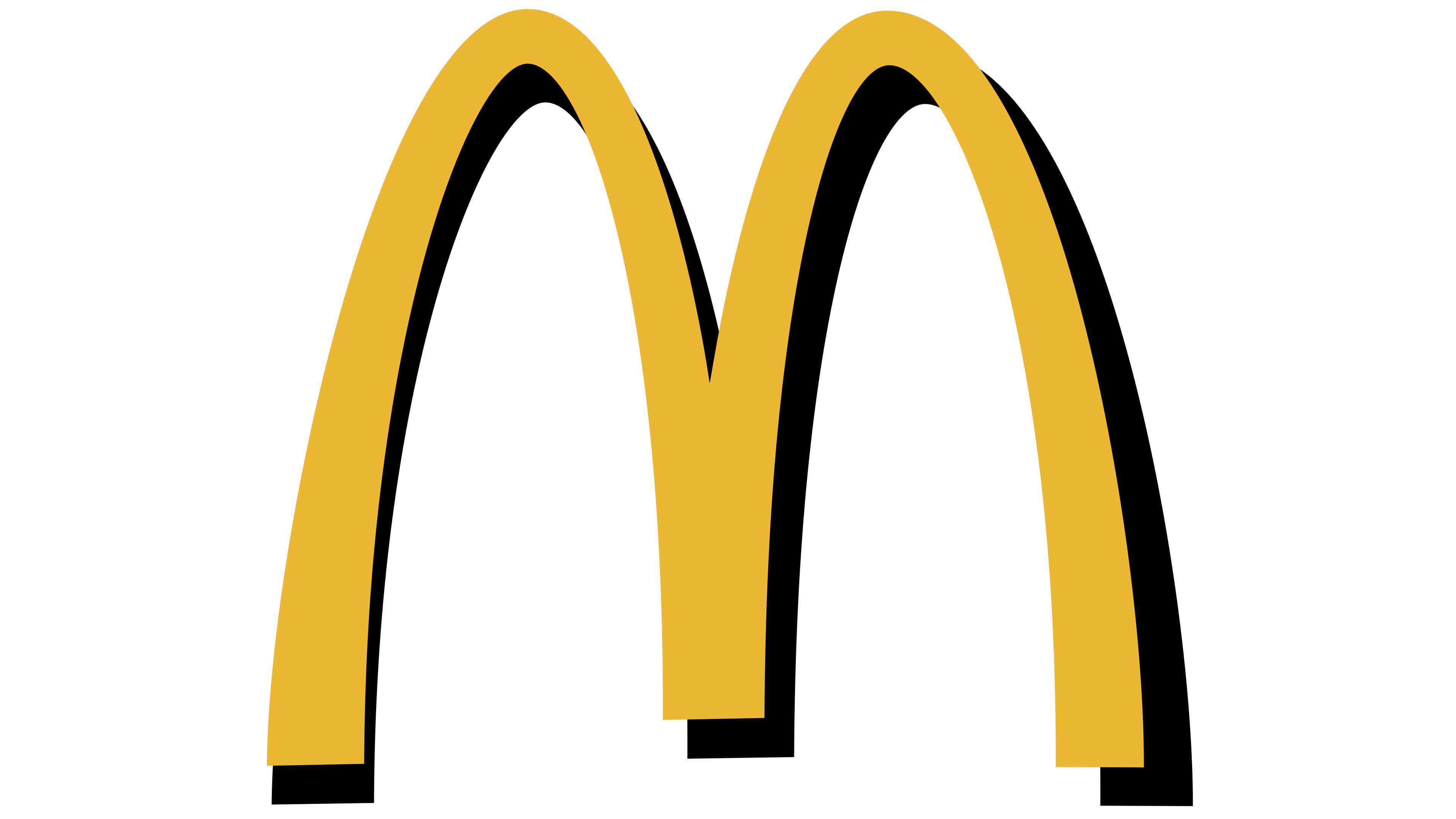
Ten years later, a chain of restaurants got an emblem that resembles the modern one as much as possible – without inscriptions and other signs. On it, there are only double Golden Arches yellow and black. Because of this, the arch seems to stand out above the surface where it was applied. This alteration is associated with the general recognition of the brand name.
بعد عشر سنوات ، حصلت سلسلة مطاعم على شعار يشبه الشعار الحديث قدر الإمكان - بدون نقوش وعلامات أخرى. يوجد عليها أقواس ذهبية مزدوجة فقط صفراء وسوداء. لهذا السبب ، يبدو أن القوس يبرز فوق السطح حيث تم تطبيقه. يرتبط هذا التغيير بالاعتراف العام باسم العلامة التجارية.
Two versions belong to that period, from which the black outline on the right was removed, which added volume to the arches. On one version, the logo is located on a red square background, on the other – on white.
تنتمي نسختان إلى تلك الفترة ، حيث تمت إزالة المخطط الأسود على اليمين ، مما أضاف حجمًا إلى الأقواس. في أحد الإصدارات ، يوجد الشعار على خلفية مربعة حمراء ، وعلى الأخرى - على خلفية بيضاء.
Since that time, Golden Arches have been used in a minimalistic design and a golden-bright palette.
منذ ذلك الوقت ، تم استخدامها في تصميم بسيط ولوحة ذهبية مشرقة.
Added another version of the logo used on the product. A golden arch is applied over a square with a red background. In 2020, due to the spread of the COVID-19 virus, the company introduced a logo where the arches are divided among themselves. By this, the company decided to show its attitude to this situation. It urged buyers of its products to maintain a distance between people to avoid infection with the virus.
تمت إضافة نسخة أخرى من الشعار المستخدم على المنتج. يوضع قوس ذهبي فوق مربع بخلفية حمراء. في عام 2020 ، وبسبب انتشار فيروس 19 ، قدمت الشركة شعارًا تقسم فيه الأقواس فيما بينها. بهذا قررت الشركة إظهار موقفها من هذا الموقف. وحث مشتري منتجاتها على الحفاظ على مسافة بين الناس لتجنب الإصابة بالفيروس.

Golden arches symbolize the wealth they were able to obtain as part of the company. Golden Arches are also a symbol of protection and security.
الأقواس الذهبية ترمز إلى الثروة التي تمكنوا من الحصول عليها كجزء من الشركة. تعتبر الأقواس الذهبية أيضًا رمزًا للحماية والأمن.

Almost from the very beginning, the letter “M” was present on the restaurant’s logo. At first, it was doubled as a reminder of the two founding brothers by the name of McDonald’s. At the end of the 60s of the last century, the icon was corrected, giving it a distinct form of arches connected in the form of an “M” with a thickening at the end.
منذ البداية تقريبًا ، كانت الرسالة موجودة على شعار المطعم. في البداية ، تمت مضاعفته كتذكير للأخوين المؤسسين باسم ماكدونالدز. في نهاية الستينيات من القرن الماضي ، تم تصحيح الأيقونة ، مما منحها شكلاً مميزًا من الأقواس المتصلة على شكل مع سماكة في النهاية.
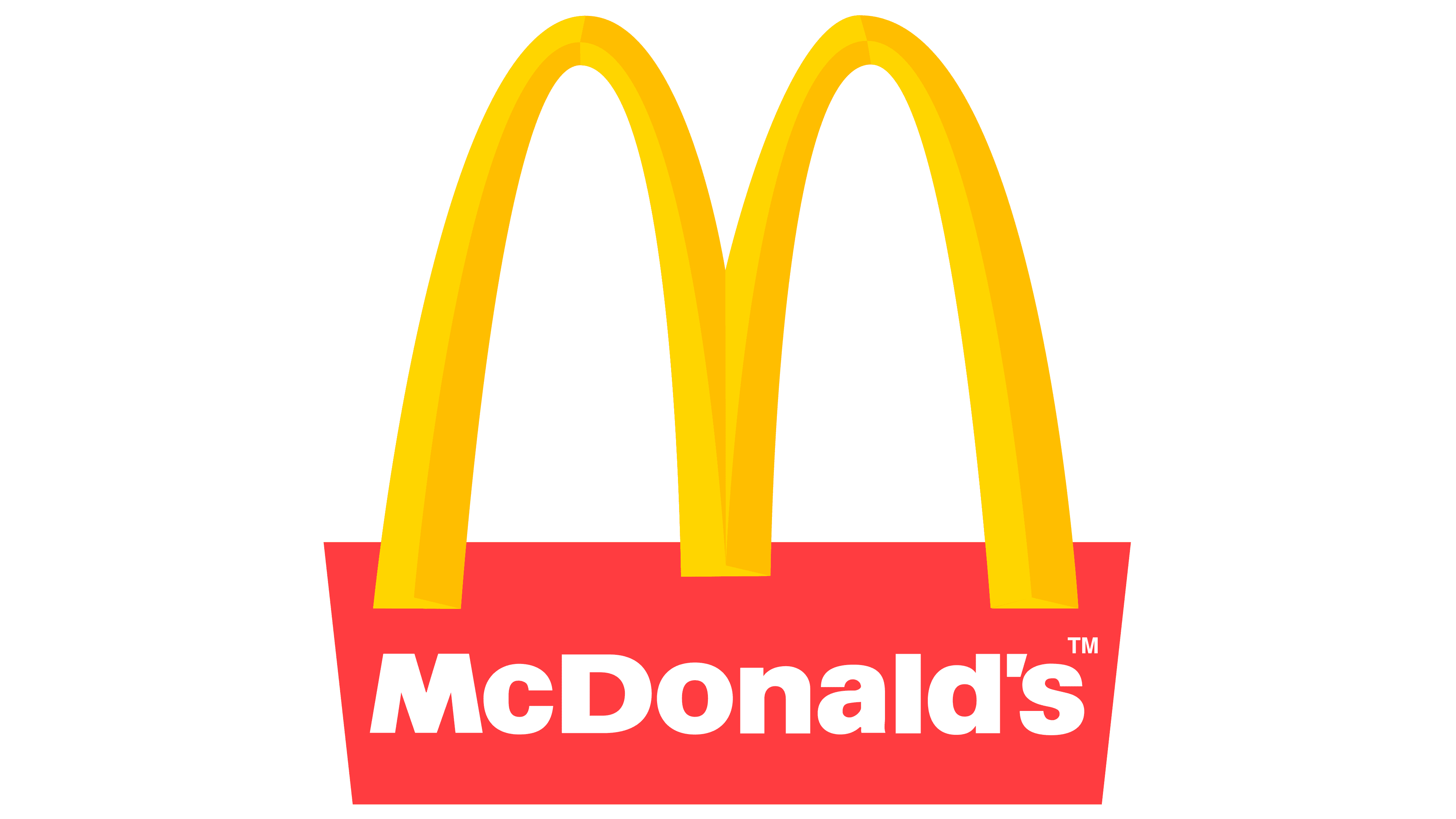
The color scheme of the brand consists of a combination of yellow, red, and green. Red, according to the founders, attracts attention and arouses appetite. Yellow represents joy, high spirits, good spirits, and friendliness. Green (it appeared in 2007) symbolizes a commitment to sustainable development and stability.
يتكون نظام ألوان العلامة التجارية من مزيج من الأصفر والأحمر والأخضر. الأحمر ، حسب المؤسسين ، يجذب الانتباه ويثير الشهية. يمثل اللون الأصفر الفرح والأرواح العالية والأرواح الطيبة والود. الأخضر (ظهر عام 2007) يرمز إلى الالتزام بالتنمية المستدامة والاستقرار.
Why are McDonald’s colors red and yellow? Red attracts attention and causes hunger. On the other hand, the yellow color causes a feeling of joy and friendship. Without a doubt, red and yellow create a high contrast to arouse in people the need to eat at McDonald’s, as they are the colors that make the consumer eat there unconsciously.
لماذا لون ماكدونالدز باللونين الأحمر والأصفر؟ يجذب اللون الأحمر الانتباه ويسبب الجوع. من ناحية أخرى ، يتسبب اللون الأصفر في الشعور بالبهجة والصداقة. لا شك أن اللونين الأحمر والأصفر يخلقان تباينًا كبيرًا لإثارة حاجة الناس لتناول الطعام في مطعم ماكدونالدز ، حيث إنهما الألوان التي تجعل المستهلك يأكل هناك دون وعي.
The dark green color, which appeared in 2007, symbolizes a commitment to sustainable development. Also, it should be noted that in Europe, logos are mostly green. However, the background color of the logo changes periodically.
اللون الأخضر الغامق الذي ظهر عام 2007 يرمز إلى الالتزام بالتنمية المستدامة. وتجدر الإشارة أيضًا إلى أن الشعارات في أوروبا غالبًا ما تكون خضراء. ومع ذلك ، يتغير لون خلفية الشعار بشكل دوري.
Thus, the small, fast food restaurant could become an empire and was able to expand around the world until it became a large company. The logo is one of the most recognizable in the world, it is not confused with any others, and an entire era is hidden behind its golden arches. It is no secret that the letter “M” was, is, and will delight both children and adults.
Comments
Post a Comment