Mercedes Benz is a world-famous brand and manufacturer of premium passenger cars and buses, trucks, and other vehicles. The company located in the city of Stuttgart (Germany) and appeared in 1926th year, founded by Karl Benz, Gottlieb Daimler, and Wilhelm Maybach. The brand is part of the Daimler AG concern.
مرسيدس بنز هي علامة تجارية مشهورة عالميًا ومصنع لسيارات الركاب الفاخرة والحافلات والشاحنات وغيرها من المركبات. يقع مقر الشركة في مدينة شتوتغارت (ألمانيا) وظهرت في عام 1926 ، أسسها كارل بنز وجوتليب ديملر وويلهلم مايباخ. تعد العلامة التجارية جزءًا من اهتمام شركة Daimler AG.
MEANING AND HISTORY
What is Mercedes Benz?
Mercedes-Benz AG is an automobile company from the German city of Stuttgart. It had several predecessors, which started in 1926, united under a common name. The word “Benz” is a tribute to the inventor of the first internal combustion engine, Carl Friedrich Benz. Mercedes cars are produced in Germany and other countries on five continents.
Mercedes-Benz AG هي شركة سيارات من مدينة شتوتغارت الألمانية. كان لها عدة أسلاف ، بدأوا في عام 1926 ، متحدين تحت اسم مشترك. كلمة "بنز" هي تكريم لمخترع محرك الاحتراق الداخلي الأول ، كارل فريدريش بنز. يتم إنتاج سيارات المرسيدس في ألمانيا ودول أخرى في القارات الخمس.
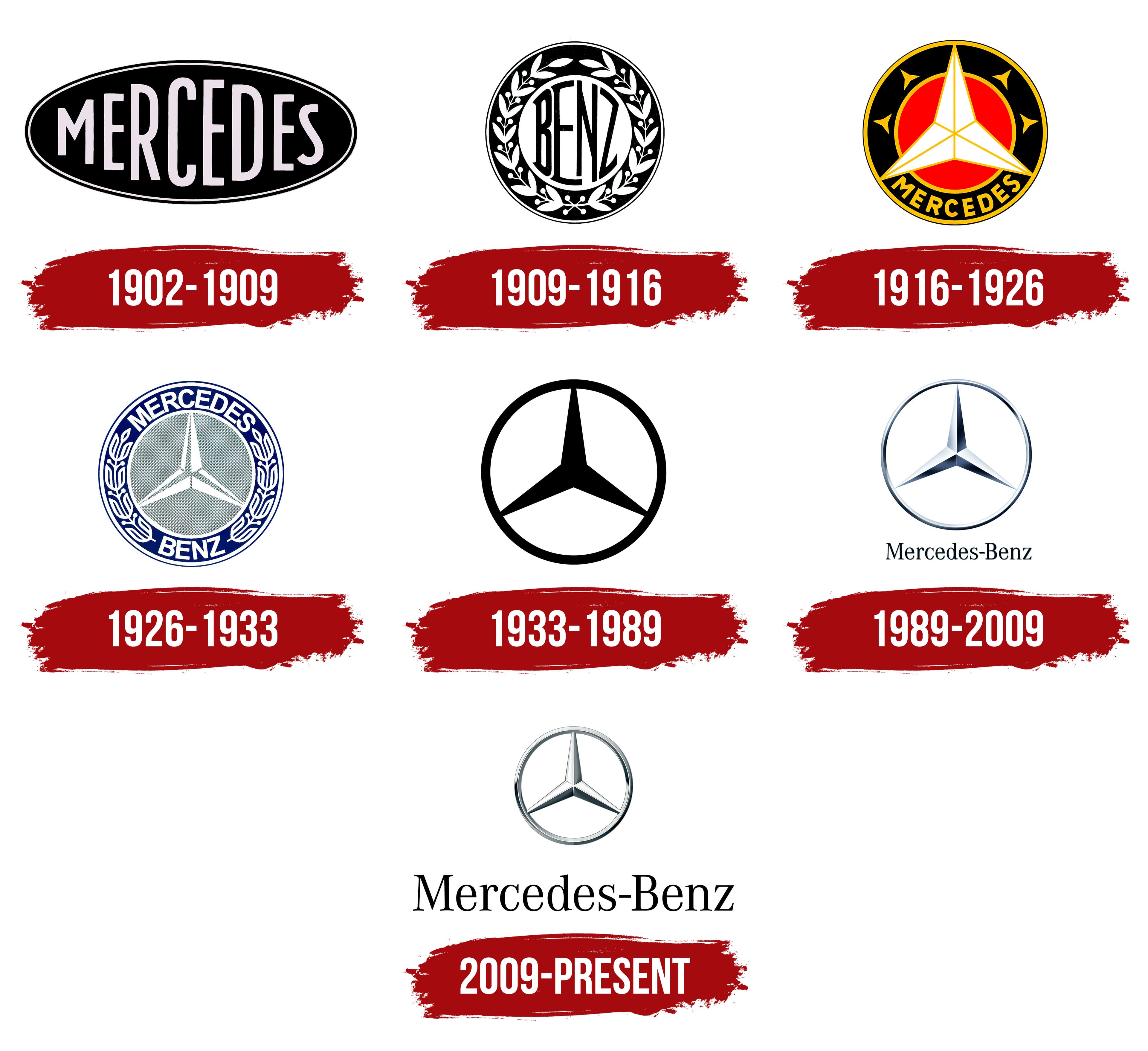
The three-pointed star, the current logo of the brand, has been known for over a century. It was first used by Gottlieb Daimler and patented in 1901. The fact is that the future auto giant arose thanks to the merger of two large competing companies – Benz & Cie (led by Karl Benz) and Daimler-Motoren-Gesellschaft (led by Gottlieb Daimler). And the brand name is formed from the leading cars of these companies – Benz Patent-Motorwagen (1886 of the year of manufacture) and Mercedes (1900 of the year of production).
النجمة ثلاثية النقاط ، الشعار الحالي للعلامة التجارية ، معروفة منذ أكثر من قرن. تم استخدامه لأول مرة من قبل Gottlieb Daimler وحصل على براءة اختراع في عام 1901. والحقيقة هي أن عملاق صناعة السيارات في المستقبل نشأ بفضل اندماج شركتين متنافستين كبيرتين - Benz & Cie (بقيادة كارل بنز) و Daimler-Motoren-Gesellschaft (بقيادة جوتليب) دايملر). ويتكون اسم العلامة التجارية من السيارات الرائدة لهذه الشركات - Benz Patent-Motorwagen (1886 سنة الصنع) ومرسيدس (1900 سنة الإنتاج).
At first, the brand name was used by Daimler as a personal label: it indicated the location of his house. It was a marker symbol, not associated either with a particular vehicle or even with a car brand.
في البداية ، تم استخدام اسم العلامة التجارية من قبل دايملر كعلامة شخصية: فهي تشير إلى موقع منزله. لقد كان رمز علامة ، غير مرتبط بمركبة معينة أو حتى بعلامة تجارية للسيارة.
Before merging the two companies into a single concern, the Daimler-Motoren-Gesellschaft had the word “Mercedes” in the horizontally elongated oval on the emblem. And in 1909, competitors had a star as the central element. In 1916, she was placed in a double circle – red inner and dark gray outer. The task of the backgrounds was to link the logo to the field of activity of the transport manufacturer. However, over time, they disappeared, since the area of work of the company is already familiar to everyone.
قبل دمج الشركتين في شركة واحدة ، كان لدى Daimler-Motoren-Gesellschaft كلمة "مرسيدس" في الشكل البيضاوي الممدود أفقيًا على الشعار. وفي عام 1909 ، كان للمنافسين نجمة كعنصر مركزي. في عام 1916 ، تم وضعها في دائرة مزدوجة - حمراء داخلية ورمادية داكنة خارجية. كانت مهمة الخلفيات ربط الشعار بمجال نشاط الشركة المصنعة للنقل. ومع ذلك ، مع مرور الوقت ، اختفوا ، لأن مجال عمل الشركة مألوف بالفعل للجميع.
What does the Mercedes-Benz logo represent?
A silver three-pointed star, encircled in a ring of the same color, represents Daimler engines’ incredible power and reliability.
تمثل النجمة الفضية ثلاثية الرؤوس ، والمحاطة بحلقة من نفس اللون ، قوة وموثوقية محركات دايملر المذهلة.
Gradually, the logo evolved from a complex shape to a simple one, until it was completely minimized, turning into a three-pointed silver star in a circle. By the period of the unification of automotive companies, it already had an actual appearance; therefore, it has become a distinctive symbol of the new structure.
تدريجيًا ، تطور الشعار من شكل معقد إلى شكل بسيط ، حتى تم تصغيره تمامًا ، وتحول إلى نجمة فضية ثلاثية الرؤوس في دائرة. بحلول فترة توحيد شركات السيارات ، كان لها بالفعل مظهر فعلي ؛ لذلك ، أصبح رمزًا مميزًا للهيكل الجديد.
Initially, the logo of the automotive giant was extremely simple. It was attended only by the word “Mercedes,” placed inside a horizontal oval with a double edging. The letters were uneven in height: on the edges were small, and in the middle – large. The background was black, the font gray.
في البداية ، كان شعار عملاق السيارات بسيطًا للغاية. وقد حضرها فقط كلمة "مرسيدس" الموضوعة داخل شكل بيضاوي أفقي بحافة مزدوجة. كانت الأحرف غير متساوية الارتفاع: كانت الأطراف صغيرة وفي الوسط - كبيرة. كانت الخلفية سوداء ، والخط رمادي.
At the dawn of its formation, the future concern chose a round emblem, in the center of which on the white substrate was an elongated inscription “Benz.” A light laurel wreath surrounded her on a dark background.
في فجر تشكيلها ، اختار الاهتمام المستقبلي شعارًا دائريًا ، كان في وسطه نقشًا ممدودًا "بنز" على الركيزة البيضاء. أحاطت بها إكليل من الغار الفاتح على خلفية مظلمة.
After the merger of the two founding companies, management combined the logos. On the updated version, there is a classic rondelle and the word “Mercedes.” The name is at the bottom of the double circle. The middle is a three-pointed star, separated by long thin lines of the same color as the inscription below. Its smaller copies are mirrored to the right and left of the central beam.
بعد اندماج الشركتين المؤسستين ، جمعت الإدارة الشعارات. في الإصدار المحدّث ، هناك رونديل كلاسيكي وكلمة "مرسيدس". الاسم موجود أسفل الدائرة المزدوجة. الوسط عبارة عن نجمة ثلاثية الرؤوس ، مفصولة بخطوط رفيعة طويلة من نفس لون النقش أدناه. تنعكس نسخه الأصغر على يمين ويسار الحزمة المركزية.
In this version, the company management decided to present the joint past of a well-known automobile manufacturer. That is why the emblem contains the names of both companies – “Mercedes” (above) and “Benz” (below). The rest of the space on a wide fringing strip is occupied by a wreath of laurel branches – a sign of leadership and great honor. A central place is given to a smaller diameter circle with a three-pointed star, each ray of which is white on one side and gray on the other, which forms a three-dimensional effect.
في هذا الإصدار ، قررت إدارة الشركة تقديم الماضي المشترك لشركة معروفة لصناعة السيارات. هذا هو السبب في أن الشعار يحتوي على أسماء كلتا الشركتين - "مرسيدس" (أعلاه) و "بنز" (أدناه). يشغل إكليل من فروع الغار باقي المساحة على شريط هامش عريض - علامة على القيادة والشرف العظيم. يتم إعطاء مكان مركزي لدائرة ذات قطر أصغر مع نجمة ثلاثية الرؤوس ، كل شعاع منها أبيض من جانب ورمادي من ناحية أخرى ، مما يشكل تأثيرًا ثلاثي الأبعاد.
The next period was recognized as the most minimal in the history of the German concern’s logo. It consists only of a white circle and a black star.
تم التعرف على الفترة التالية باعتبارها الحد الأدنى في تاريخ شعار الشركة الألمانية. يتكون فقط من دائرة بيضاء ونجمة سوداء.
In 1989, an emblem appeared with the familiar design currently in use. This is a metalized star with three rays, taken in a circle. Under it is a combined inscription of the founding companies: “Mercedes-Benz.”
في عام 1989 ، ظهر شعار بالتصميم المألوف المستخدم حاليًا. هذا نجم معدني بثلاثة أشعة ، مأخوذ في دائرة. تحته نقش مشترك للشركات المؤسسة: "مرسيدس بنز".
In this option, designers have changed the scale ratio of the main elements. They increased the proportions of the name of the concern and reduced the graphic icon, enhancing the effect of steel gleam.
في هذا الخيار ، قام المصممون بتغيير نسبة مقياس العناصر الرئيسية. لقد زادوا نسب اسم الاهتمام وقللوا من أيقونة الرسم ، مما عزز تأثير بريق الفولاذ.
FONT AND COLOR OF THE EMBLEM

The image marking the Gottlieb Daimler home has a different meaning. If at first, it was a protective sign, then later it received an extended interpretation. The triple (the number of rays indicates it) has always been considered sacred – the number of perfection.
الصورة التي تميز منزل جوتليب دايملر لها معنى مختلف. إذا كانت في البداية علامة واقية ، فقد تلقت لاحقًا تفسيرًا موسعًا. لطالما اعتبر الثلاثي (عدد الأشعة يشير إليه) مقدسًا - عدد الكمال.
By this, Daimler emphasized that his company’s products subordinate three elements at once: water, air, and earth. After all, the concern produced engines for sea and river transport, motors for the aviation industry, and power units for ground vehicles. He created them, worked out, improved, and tested them, customizing them to the time requirements. No wonder one of the first models was a racing car, on which engines are usually tested.
بهذا ، أكد دايملر أن منتجات شركته تخضع لثلاثة عناصر في آنٍ واحد: الماء والهواء والأرض. بعد كل شيء ، أنتج الاهتمام محركات للنقل البحري والنهري ، ومحركات لصناعة الطيران ، ووحدات طاقة للمركبات الأرضية. قام بإنشائها وعملها وتحسينها واختبارها ، وتخصيصها وفقًا لمتطلبات الوقت. لا عجب في أن أحد الطرازات الأولى كان سيارة سباق يتم اختبار المحركات عليها عادةً.
After connecting the industrial sites, the Mercedes brand mark was not approved for a good reason: approximately the same symbolism (name in an elongated ellipse) was already assigned to the Italian auto giant Maserati. And he is his closest competitor in the world market, so the founders used a three-ray star.
بعد ربط المواقع الصناعية ، لم تتم الموافقة على علامة مرسيدس التجارية لسبب وجيه: تم تخصيص نفس الرمز تقريبًا (الاسم في شكل بيضاوي ممدود) لشركة السيارات الإيطالية العملاقة مازيراتي. وهو أقرب منافس له في السوق العالمية ، لذلك استخدم المؤسسون نجمة ثلاثية الأشعة.
At first, they tried to explain it as a steering wheel, later (after the war) – as a lifebuoy. However, such interpretations did not take root, because Daimler breathed into it a completely different meaning. That is what remains. And the name Mercedes was chosen with the light hand of Emil Jellinek, the French consul, and distributor of Gottlieb. He convinced the employer that the name sounds cool and is already known in racing circles.
في البداية ، حاولوا تفسيرها على أنها عجلة قيادة ، فيما بعد (بعد الحرب) - على أنها عوامة نجاة. ومع ذلك ، فإن مثل هذه التفسيرات لم تتجذر ، لأن دايملر تنفست فيها معنى مختلفًا تمامًا. هذا ما تبقى. وتم اختيار اسم مرسيدس بيد خفيفة من إميل جيلينيك ، القنصل الفرنسي ، وموزع جوتليب. أقنع صاحب العمل أن الاسم يبدو رائعًا ومعروف بالفعل في دوائر السباق.
Before approving the three-pointed sign, they experimented with it: the designers tried to remove the circle, make the sign four-pointed, and change the color. But after several attempts, they decided to leave everything as it is. There were several reasons: a three-beam star is unique and recognizable, and without a circle, it is perceived to be unpresentable. The four-pointed option has not found practical application.
قبل الموافقة على العلامة ثلاثية الرؤوس ، جربوها: حاول المصممون إزالة الدائرة ، وجعل العلامة رباعية الرؤوس ، وتغيير اللون. لكن بعد عدة محاولات ، قرروا ترك كل شيء كما هو. كانت هناك عدة أسباب: نجم ثلاثي الحزمة فريد ومعروف ، وبدون دائرة ، يُنظر إليه على أنه غير قابل للتمثيل. لم يجد الخيار الرباعي تطبيقًا عمليًا.

Why did Mercedes choose their logo?
The three-pointed star has been part of the Mercedes logo since 1916. Adolf and Paul Daimler came up with this design. They were inspired by a postcard their father Gottlieb Daimler sent in 1872. The man marked his birthplace with the star and wished it to shine over the flourishing factory.
كانت النجمة ثلاثية الرؤوس جزءًا من شعار مرسيدس منذ عام 1916. ابتكر أدولف وبول دايملر هذا التصميم. استلهموا من بطاقة بريدية أرسلها والدهم جوتليب دايملر في عام 1872. الرجل وضع علامة النجمة على مسقط رأسه وتمنى لها أن تتألق فوق المصنع المزدهر.
What does the Mercedes-Benz emblem represent?
The Mercedes-Benz emblem reflects the ambitions of the company. The rays of the three-pointed star symbolize the dominance of this car manufacturer in the air, on land, and in water. And also, it is a tribute to historical traditions because this element of the logo has been used since 1916.
يعكس شعار مرسيدس-بنز طموحات الشركة. ترمز أشعة النجمة ثلاثية الرؤوس إلى هيمنة الشركة المصنعة للسيارة في الهواء وعلى الأرض وفي الماء. وأيضًا ، إنه تقدير للتقاليد التاريخية لأن هذا العنصر من الشعار مستخدم منذ عام 1916.
What Mercedes has the glowing emblem?
The LED illuminated emblem can fit the 2006+ CLS-Class, 2012+ M-Class, 2013+ GL-Class, and 2014 E-Class models. It’s about a big star in a ring on the grille.
يمكن أن يتناسب شعار LED المضيء مع طرازات 2006 + CLS-Class و 2012 + M-Class و 2013 + GL-Class و 2014 E-Class. الأمر يتعلق بنجم كبير في حلقة على الشبك.
What does the Mercedes symbol represent?
The symbol of Mercedes in the form of a three-pointed star represents the dominance of this company throughout the world. In particular, it embodies the automaker’s commitment to having its engines dominate on land, in the air, and on the water.
يمثل رمز مرسيدس على شكل نجمة ثلاثية النجمة هيمنة هذه الشركة في جميع أنحاء العالم. على وجه الخصوص ، فهو يجسد التزام شركة صناعة السيارات بأن تهيمن محركاتها على الأرض وفي الهواء وعلى الماء.
The font never performed the dominant function in the logo, so the brand name is written in a classic typeface. All letters are the same in thickness and easy to read. But the color was given great attention. In the early years, the emblem was gold, white, red, blue, and even crowned with a yellow laurel wreath. In 1916, when the star became the central element, it was painted silver.
لم يؤد الخط أبدًا الوظيفة المهيمنة في الشعار ، لذلك تمت كتابة اسم العلامة التجارية بخط كلاسيكي. جميع الحروف متشابهة في السُمك وسهلة القراءة. لكن اللون حظي باهتمام كبير. في السنوات الأولى ، كان الشعار ذهبيًا ، وأبيض ، وأحمرًا ، وأزرقًا ، وحتى مُتوجًا بإكليل من الغار الأصفر. في عام 1916 ، عندما أصبح النجم العنصر المركزي ، تم طلاؤه بالفضة.
Comments
Post a Comment