MEANING AND HISTORY
What is Acom?
American corporation engaged in various activities in the fields of architecture, design, landscape, management, planning, commissioning and decommissioning, consulting, etc. Its clients are enterprises in 150 countries, and its revenue reaches 20 billion dollars.
شركة أمريكية تعمل في أنشطة مختلفة في مجالات الهندسة المعمارية والتصميم والمناظر الطبيعية والإدارة والتخطيط والتكليف وإيقاف التشغيل والاستشارات وما إلى ذلك. عملائها هم شركات في 150 دولة ، وتصل عائداتها إلى 20 مليار دولار.
Aecom’s origins date back to a 1910 drilling station that grew into the Ashland Oil & Refining Company. In 1966, the company, in addition to oil production, added the construction business, asphalting roads, then oil refining and engineering services. Therefore, in 1985, it changed its name to Ashland Technology Corporation. In 1990, the oil refining business was spun off into a separate company, and all developments related to technology, construction, and engineering were united under the common name AECOM.
تعود أصول شركة Aecom إلى عام 1910 في محطة حفر نمت لتصبح شركة Ashland Oil & Refining Company. في عام 1966 ، أضافت الشركة ، بالإضافة إلى إنتاج النفط ، أعمال البناء ، وسفلتة الطرق ، ثم تكرير النفط والخدمات الهندسية. لذلك ، في عام 1985 ، غيرت اسمها إلى Ashland Technology Corporation. في عام 1990 ، تم تقسيم أعمال تكرير النفط إلى شركة منفصلة ، وتم توحيد جميع التطورات المتعلقة بالتكنولوجيا والبناء والهندسة تحت الاسم الشائع AECOM.
The company logo has always been the company’s name with stylized letters. It has changed twice to reflect the development of the corporation.
لطالما كان شعار الشركة هو اسم الشركة بأحرف منمقة. لقد تغير مرتين ليعكس تطور الشركة.
In 1990, AECOM spun off from a parent company with a rich history. And her first logo pointed to this process. It was a vertical gray line followed by the newly acquired name in blue capital letters.
في عام 1990 ، انبثقت "إيكوم" عن شركة أم ذات تاريخ ثري. وأشار شعارها الأول إلى هذه العملية. كان خطًا رماديًا رأسيًا متبوعًا بالاسم المكتسب حديثًا بأحرف كبيرة زرقاء.
The dividing line indicated a new start for the company, its separation from the parent company, and movement in a new direction. The wall seemed to put a barrier between the past and the future and gave a starting point. The gray color indicated something taken for granted, arising from the past. He hinted at the gray asphalt of the roads, the moment at which the roads diverge from the old corporation.
يشير الخط الفاصل إلى بداية جديدة للشركة ، وانفصالها عن الشركة الأم ، والحركة في اتجاه جديد. بدا أن الجدار وضع حاجزًا بين الماضي والمستقبل وأعطى نقطة انطلاق. يشير اللون الرمادي إلى شيء مفروغ منه ، نشأ من الماضي. ألمح إلى الأسفلت الرمادي للطرق ، وهي اللحظة التي تنحرف فيها الطرق عن الشركة القديمة.
For the new company, the trait symbolizes the wall, related to architecture and construction.
بالنسبة للشركة الجديدة ، ترمز السمة إلى الجدار المتعلق بالهندسة المعمارية والبناء.
The name AECOM on the logo was an attempt to cover all the areas of activity that the company planned to deal with. And it represented, in fact, an abbreviation:
- A – architectural business (Architecture),
- E – engineering (Engineering),
- C – design, construction (Construction),
- O – operation, production activities (Operations),
- M – management, management (Management).
The company could design, build and launch production of any complexity. Active acquisition of small companies in the service sector (8 firms, several individual engineers, and architects in 10 years) strengthened the position of AECOM.
يمكن للشركة تصميم وبناء وإطلاق إنتاج من أي تعقيد. الاستحواذ النشط على الشركات الصغيرة في قطاع الخدمات (8 شركات ، العديد من المهندسين الأفراد ، والمهندسين المعماريين في 10 سنوات) عزز مكانة إيكوم.
The blue color symbolizes the sky, the tops of constructed buildings, the movement towards dreams, and the implementation of plans. The new company planned to rise to the heights, and it succeeded.
يرمز اللون الأزرق إلى السماء وقمم الأبنية المشيدة والحركة نحو الأحلام وتنفيذ المخططات. خططت الشركة الجديدة للارتقاء إلى المرتفعات ونجحت.
In 2007, AECOM went public and began selling shares, resulting in a nearly $500 million capital inflow. Which, together with profits, were used to purchase five large firms in the field of consulting, engineering and construction. Representing an international corporation, the giant changed the logo to a more solid one corresponding to the current situation.
في عام 2007 ، تم طرح أسهم شركة AECOM للاكتتاب العام وبدأت في بيع الأسهم ، مما أدى إلى تدفق رأس مال يقارب 500 مليون دولار. والتي تم استخدامها مع الأرباح لشراء خمس شركات كبيرة في مجال الاستشارات والهندسة والبناء. ممثلاً لشركة دولية ، قام العملاق بتغيير الشعار إلى شعار أكثر صلابة يتوافق مع الوضع الحالي.
The new version was still an abbreviated name but in larger, massive black letters. The image of the wall was removed; the company had already moved far away from its parent company.
كان الإصدار الجديد لا يزال اسمًا مختصرًا ولكن بأحرف سوداء كبيرة الحجم. أزيلت صورة الحائط. كانت الشركة قد انتقلت بالفعل بعيدًا عن الشركة الأم.
The name was distinguished by a stylized letter E, placed without a vertical line in the form of three stripes of different lengths. The middle horizontal line is in blue-green as a gradient. Three traits indicated three main areas of activity: consulting, engineering, and construction. They were a symbol of floors, starting platforms, on which the company climbed up, taking more and more serious positions.
تم تمييز الاسم بحرف منمنمة E ، تم وضعه بدون خط عمودي على شكل ثلاثة خطوط بأطوال مختلفة. الخط الأفقي الأوسط باللون الأزرق والأخضر كتدرج. أشارت ثلاث سمات إلى ثلاثة مجالات رئيسية للنشاط: الاستشارات ، والهندسة ، والبناء. لقد كانوا رمزًا للأرضيات ، ومنصات انطلاق ، صعدت عليها الشركة ، وأخذت مواقف أكثر جدية.
The combination of blue and green symbolizes growth in the field of exact sciences, planning, and management, a logical approach. The company’s strength is constantly fueled by growth and the infusion of new resources.
يرمز الجمع بين اللونين الأزرق والأخضر إلى النمو في مجال العلوم الدقيقة والتخطيط والإدارة ، وهو نهج منطقي. تتغذى قوة الشركة باستمرار من خلال النمو وضخ موارد جديدة.
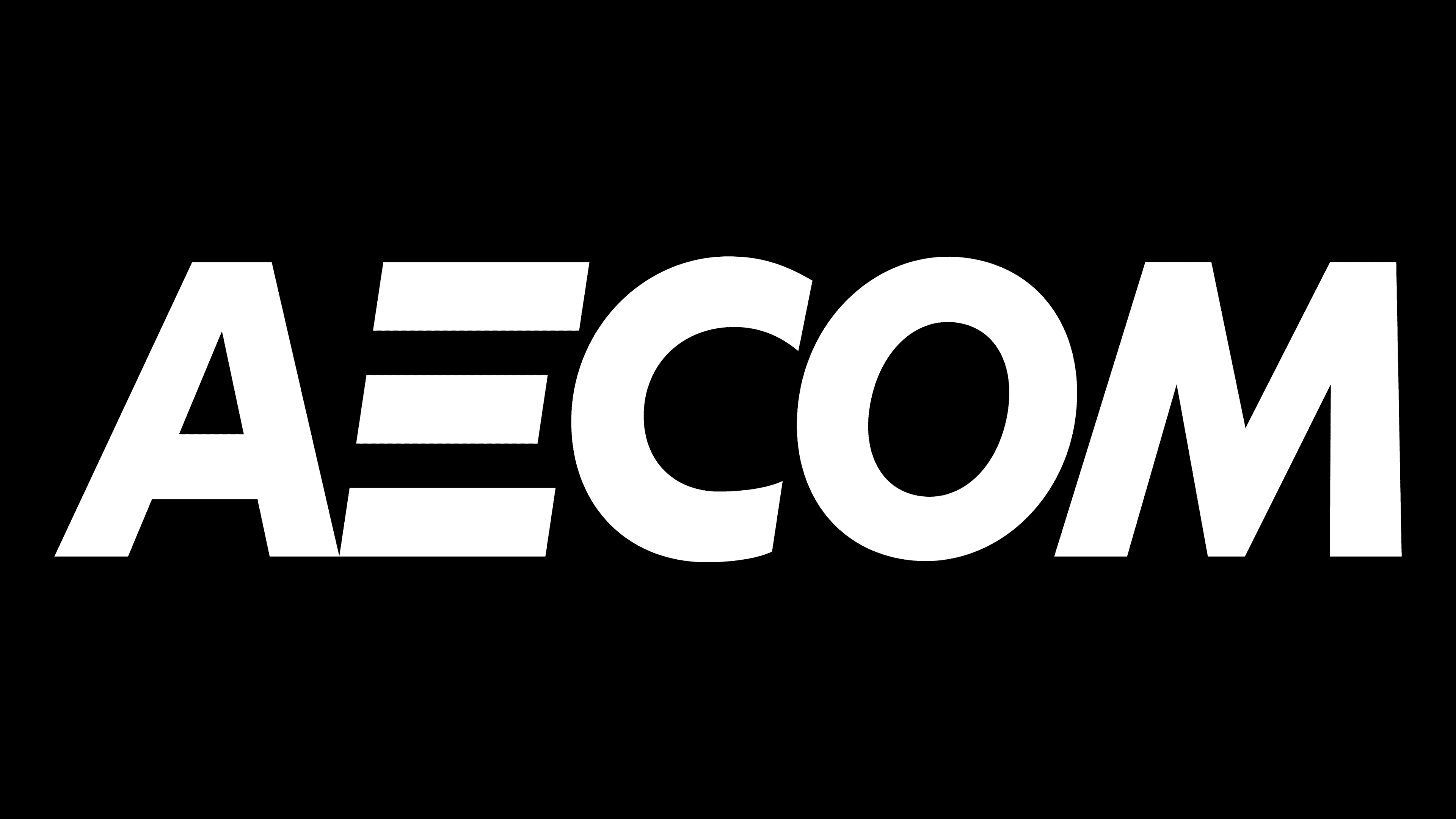
The acquisition of URS Corporation makes AECOM the largest engineering company globally. To emphasize its power and globality, the corporation changed its logo, removing a colored fragment from it. Now the visual sign is a black monolith, demonstrating the solidity and achievement of the desired pinnacle. The stylization of E has been preserved as a reminder of the steps that were overcome on the way to the top. The stripes are also a reflection of the individual components of the business.
جعل الاستحواذ على شركة URS Corporation من شركة AECOM أكبر شركة هندسية على مستوى العالم. للتأكيد على قوتها وعالميتها ، قامت الشركة بتغيير شعارها ، وإزالة جزء ملون منه. الآن العلامة المرئية عبارة عن كتلة متراصة سوداء ، مما يدل على صلابة وتحقيق القمة المرغوبة. تم الحفاظ على أسلوب E كتذكير بالخطوات التي تم التغلب عليها في الطريق إلى القمة. تمثل الخطوط أيضًا انعكاسًا للمكونات الفردية للعمل.
FONT AND COLORS OF THE EMBLEM

The main color of the emblem is black. Demonstrates large size, world fame, and power. The corporation has practically no competitors left.
اللون الرئيسي للشعار أسود. يوضح الحجم الكبير والشهرة العالمية والقوة. الشركة ليس لديها عمليا أي منافسين.

The font corresponds to Twentieth Century Pro Extra Bold Italic, but with a modified E. Capital letters and their massiveness emphasize the power of the company. A slight tilt to the right indicates movement into the future.
يتوافق الخط مع Twentieth Century Pro Extra Bold Italic ، ولكن بحرف E. Capital المعدل وضخامة حجمها يؤكدان على قوة الشركة. يشير الميل الطفيف إلى اليمين إلى التحرك نحو المستقبل.
Comments
Post a Comment