
Today, not only scientists are concerned about ways to obtain alternative electricity, the American company Attentive Energy, which was recently launched to develop and implement offshore wind farms, devotes its activities to these problems. Its main goal is to provide the US with more affordable and affordable energy that will lead to energy independence. Today, the brand provides offshore opportunities in the power industry, which today, and even more so tomorrow, will become available to all human communities. With deep experience in the sector, and a forward-thinking commitment to always and everywhere putting people first, the company, through the power of the offshore wind, strengthens these communities, enabling the creation of a new industry and an inclusive economy of environmentally friendly, clean and affordable energy. This vision had to be expressed through the elements of the external identity, the formation of which was entrusted to the professional design company North Street.
اليوم ، لا يهتم العلماء فقط بطرق الحصول على الكهرباء البديلة ، فالشركة الأمريكية ، التي تم إطلاقها مؤخرًا لتطوير وتنفيذ مزارع الرياح البحرية ، تكرس أنشطتها لهذه المشاكل. هدفها الرئيسي هو تزويد الولايات المتحدة بمزيد من الطاقة ميسورة التكلفة وبأسعار معقولة والتي ستؤدي إلى الاستقلال في مجال الطاقة. اليوم ، توفر العلامة التجارية فرصًا خارجية في صناعة الطاقة ، والتي ستصبح اليوم ، وحتى أكثر من ذلك غدًا ، متاحة لجميع المجتمعات البشرية. من خلال الخبرة العميقة في القطاع ، والالتزام بالتفكير المستقبلي بوضع الناس دائمًا وفي كل مكان في المقام الأول ، تعمل الشركة ، من خلال قوة الرياح البحرية ، على تقوية هذه المجتمعات ، وتمكين إنشاء صناعة جديدة واقتصاد شامل صديق للبيئة وطاقة نظيفة وبأسعار معقولة. كان لابد من التعبير عن هذه الرؤية من خلال عناصر الهوية الخارجية ، التي عُهد بتشكيلها إلى شركة التصميم المحترفة.
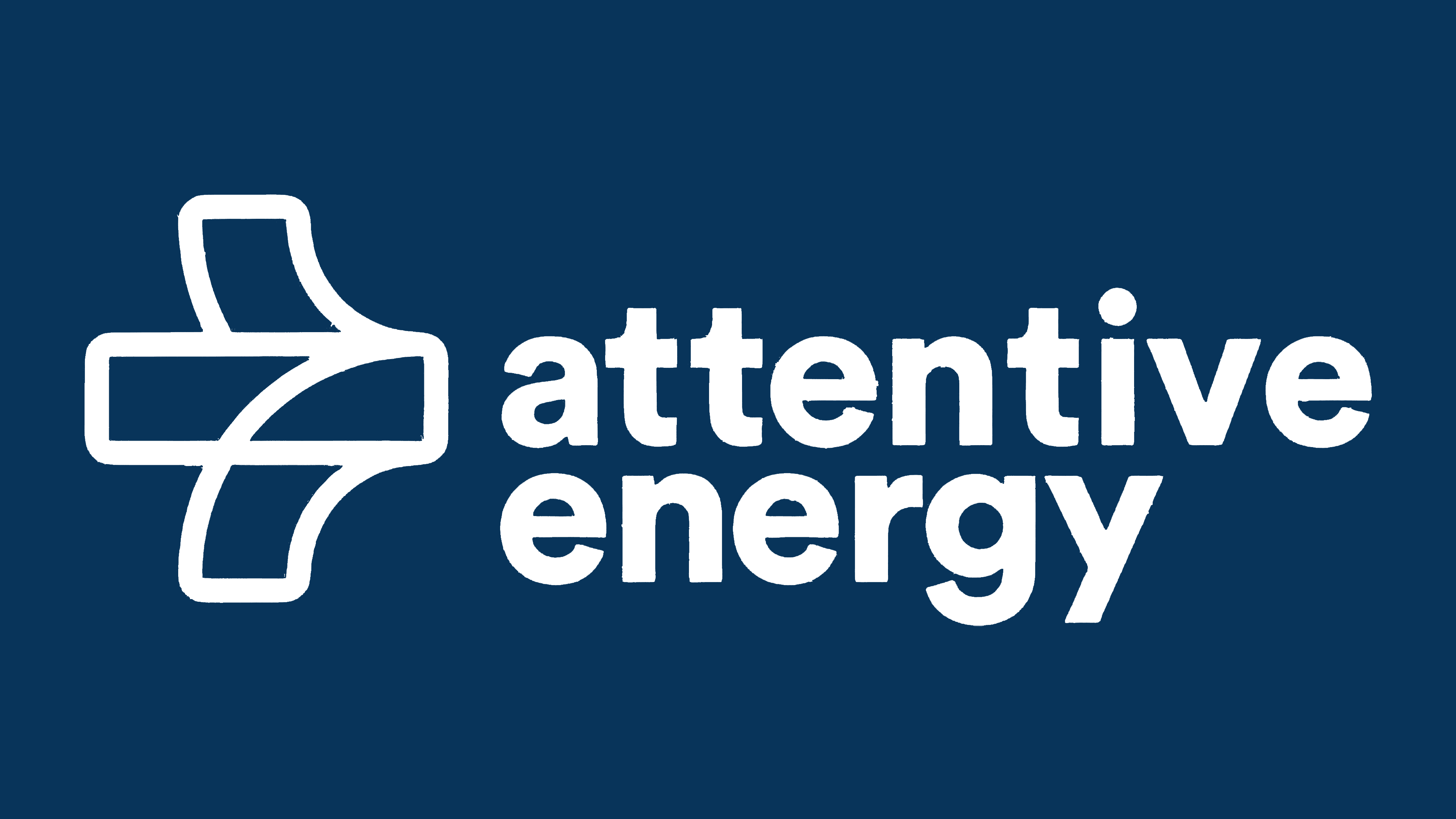
The beginning was laid by developing the original name – Attentive Energy. It immediately points to the unique focus of the enterprise, with safety issues, strong public relations, and concern for the environment. The whole developed visual identity is aimed at strengthening and supporting these efforts, ensuring the successful involvement of the public, government, and corporate audience in implementing their ambitious plans. The construction of the logo is distinguished by an innovative look at the ways of visual reflection of information. Inspired by a forward-thinking and community-driven spirit of initiative, it reflects the inner energy behind it from the beginning. This is achieved through visually distinct but overlapping shapes representing convergence and cooperation, the progressiveness of movements, and the power of the airflow used, called the wind.
تم وضع البداية من خلال تطوير الاسم الأصلي - الطاقة اليقظة. يشير على الفور إلى التركيز الفريد للمؤسسة ، مع قضايا السلامة والعلاقات العامة القوية والاهتمام بالبيئة. تهدف الهوية المرئية المطورة بالكامل إلى تعزيز ودعم هذه الجهود ، وضمان المشاركة الناجحة للجمهور والحكومة وجمهور الشركات في تنفيذ خططهم الطموحة. يتميز بناء الشعار بإلقاء نظرة مبتكرة على طرق الانعكاس البصري للمعلومات. مستوحاة من التفكير المستقبلي وروح المبادرة المجتمعية ، فهي تعكس الطاقة الداخلية الكامنة وراءها منذ البداية. يتم تحقيق ذلك من خلال أشكال مميزة بصريًا ولكنها متداخلة تمثل التقارب والتعاون ، وتدرج الحركات ، وقوة تدفق الهواء المستخدم ، والتي تسمى الريح.
The color palette used in the display is clear and contrasting. The main colors – black and pale green – were used for the symbolic module, which is the brand’s full name. The first word is made in contrasting black, the second in soft green, symbolizing the purity and naturalness of the natural ecology. The text is in a round, uniform sans-serif font that is easy to read, both in typographic and digital versions. Its readability and visibility facilitate memorability and brand recognition.
لوحة الألوان المستخدمة في الشاشة واضحة ومتناقضة. تم استخدام الألوان الرئيسية - الأسود والأخضر الباهت - للوحدة الرمزية ، وهو الاسم الكامل للعلامة التجارية. الكلمة الأولى مصنوعة في تباين الأسود ، والثانية باللون الأخضر الناعم ، ترمز إلى نقاء وطبيعة البيئة الطبيعية. النص مكتوب بخط دائري وموحد يسهل قراءته ، سواء في النسخ المطبعية أو الرقمية. تسهل قراءتها ووضوحها التذكر والتعرف على العلامة التجارية.
An important element of the logo is the sign, which is a symbolic image of airflow or a mechanical element of a winding structure rotating under its influence. Its execution resonates with the purity and transparency of the airflow and the conditional vision of the resulting energy wave. The ability to see some correspondence to the mathematical plus sign gives an idea of the positive effect of the brand’s activities for the benefit of humanity.
عنصر مهم في الشعار هو العلامة ، وهي صورة رمزية لتدفق الهواء أو عنصر ميكانيكي لهيكل متعرج يدور تحت تأثيره. تنفيذه يتناسب مع نقاء وشفافية تدفق الهواء والرؤية الشرطية لموجة الطاقة الناتجة. تعطي القدرة على رؤية بعض التطابقات مع علامة الجمع الرياضية فكرة عن التأثير الإيجابي لأنشطة العلامة التجارية لصالح البشرية.

Comments
Post a Comment