Skyscanner is a global service originally used only as a metasearch engine to collect information about airline tickets and compare prices for different flights. Over time, additional functions appeared in it: now the site allows you to book tickets, rent cars, arrange travel insurance, buy hotel rooms – in general, do everything that is required to organize a comfortable trip.
Skyscanner هي خدمة عالمية تُستخدم في الأصل فقط كمحرك بحث metasearch لجمع معلومات حول تذاكر الطيران ومقارنة أسعار الرحلات المختلفة. بمرور الوقت ، ظهرت وظائف إضافية فيه: يتيح لك الموقع الآن حجز التذاكر واستئجار السيارات وترتيب التأمين على السفر وشراء غرف الفنادق - بشكل عام ، افعل كل ما هو مطلوب لتنظيم رحلة مريحة.
MEANING AND HISTORY
What is Skyscanner?
Skyscanner started as an online flight search tool until it evolved into a true full-service travel agency. Its headquarters is based in the capital of Scotland – in the city of Edinburgh. At the same time, the brand is owned by the Chinese company Trip.com Group Limited, which bought it in 2016.
بدأت Skyscanner كأداة بحث عن الرحلات عبر الإنترنت حتى تطورت إلى وكالة سفر كاملة الخدمات. يقع مقرها الرئيسي في عاصمة اسكتلندا - في مدينة إدنبرة. في الوقت نفسه ، العلامة التجارية مملوكة لشركة Trip.com Group Limited الصينية ، التي اشترتها في عام 2016.
Skyscanner entered the tourism market in 2003. Three IT people founded it: Bonamy Grimes, Barry Smith, and Gareth Williams. It all started with the fact that one of them was going to fly on vacation but could not find cheap plane tickets. This inspired computer experts to start an unusual startup. Together they developed a website that combined search results from various online travel agencies to compare prices on selected flights.
دخلت Skyscanner سوق السياحة في عام 2003. أسسها ثلاثة من العاملين في مجال تكنولوجيا المعلومات: بونامي غرايمز ، وباري سميث ، وغاريث ويليامز. بدأ كل شيء بحقيقة أن أحدهم كان سيسافر في إجازة لكنه لم يتمكن من العثور على تذاكر طيران رخيصة. ألهم خبراء الكمبيوتر هذا لبدء تشغيل غير عادي. قاموا معًا بتطوير موقع ويب يجمع نتائج البحث من مختلف وكالات السفر عبر الإنترنت لمقارنة الأسعار على الرحلات الجوية المحددة.
Now it is used by tens of millions of people, and modern features of the service allow you to book tickets directly. Travelers freely pay for them and, at the same time, order additional services, including car rental and travel insurance.
يتم استخدامه الآن من قبل عشرات الملايين من الأشخاص ، وتتيح لك الميزات الحديثة للخدمة حجز التذاكر مباشرة. يدفع المسافرون ثمنها بحرية وفي نفس الوقت يطلبون خدمات إضافية ، بما في ذلك تأجير السيارات والتأمين على السفر.
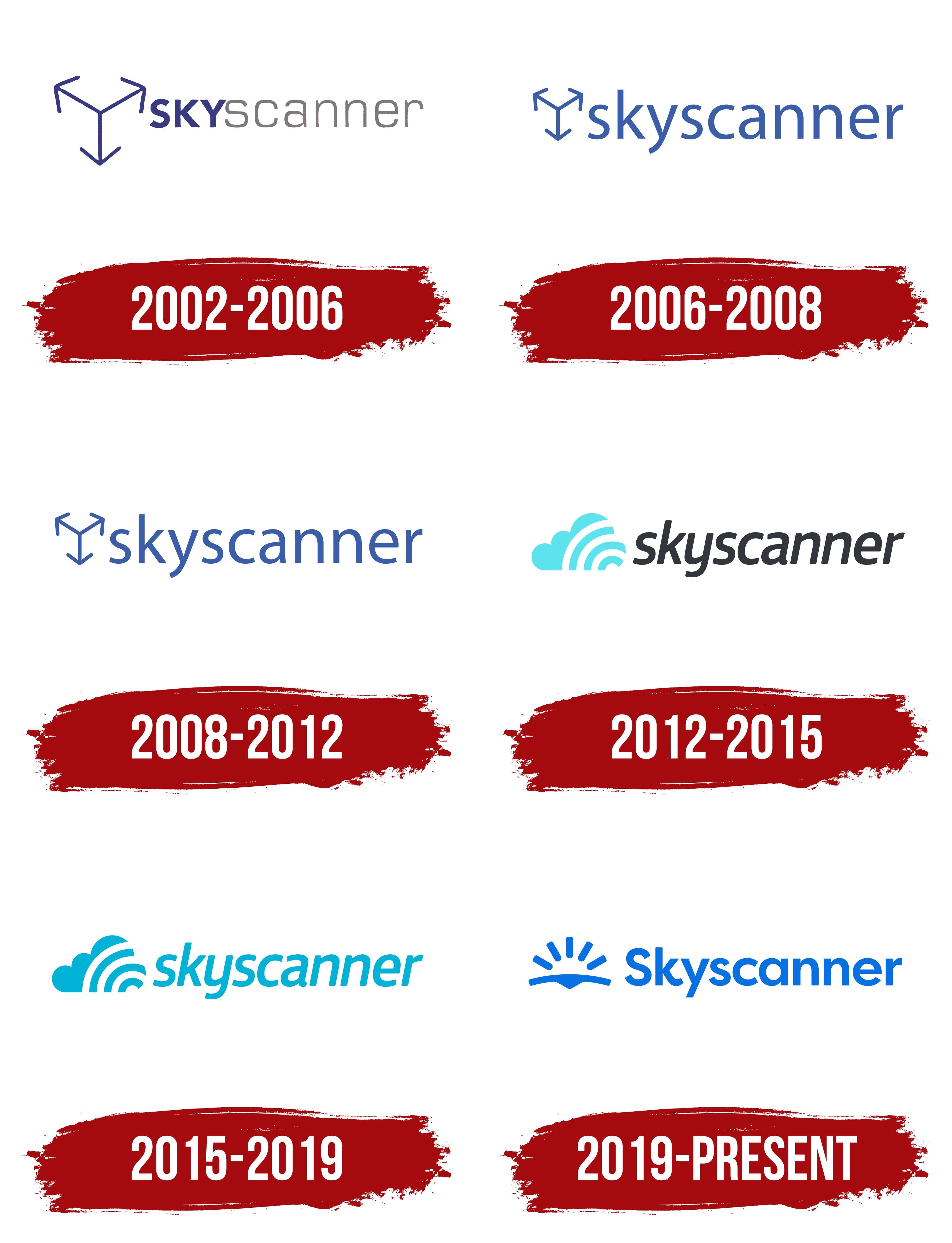
Such a sharp leap in the development of Skyscanner is reflected in the emblem of this company. If the old symbol hinted only at air travel, then the modern version presents a universal sign associated with tourism. The brand image was last updated in 2019. The designers tried to keep the traditional structure of the logo: a combination of an icon and a company name.
تنعكس هذه القفزة الحادة في تطوير Skyscanner في شعار هذه الشركة. إذا تم التلميح إلى الرمز القديم في السفر الجوي فقط ، فإن النسخة الحديثة تقدم علامة عالمية مرتبطة بالسياحة. تم تحديث صورة العلامة التجارية آخر مرة في عام 2019. حاول المصممون الحفاظ على الهيكل التقليدي للشعار: مزيج من رمز واسم شركة.
Even though the Skyscanner organization was officially registered in 2003, the site of the same name appeared a year earlier. Its emblem consisted of three differently directed arrows. They looked like three pyramid ribs (top view) because one of them looked to the upper left corner, the second – down, and the third – to the upper right corner. The center was the starting point from where travel began. Three arrows symbolize a large selection of flights that allow you to travel to any part of the world. On the other hand, the junction of the lines can be interpreted as a Skyscanner user. The arrows, in turn, can indicate the global scope of the search for air tickets using the online service.
على الرغم من تسجيل منظمة Skyscanner رسميًا في عام 2003 ، إلا أن الموقع الذي يحمل الاسم نفسه ظهر قبل عام. يتألف شعارها من ثلاثة أسهم مختلفة التوجيه. بدوا وكأنهم ثلاثة أضلاع هرمية (منظر علوي) لأن أحدهم نظر إلى الزاوية اليسرى العليا ، والثاني - لأسفل ، والثالث - إلى الزاوية اليمنى العليا. كان المركز نقطة البداية من حيث بدأ السفر. ثلاثة أسهم ترمز إلى مجموعة كبيرة من الرحلات الجوية التي تسمح لك بالسفر إلى أي جزء من العالم. من ناحية أخرى ، يمكن تفسير تقاطع الخطوط على أنه مستخدم Skyscanner. يمكن أن تشير الأسهم بدورها إلى النطاق العالمي للبحث عن تذاكر الطيران باستخدام الخدمة عبر الإنترنت.
On the right was the brand name, written in two different fonts. The first three letters (“SKY”) were uppercase. Their headset was reminiscent of SoftMaker’s Quebec Serial Heavy, S-Core’s Core Sans B 55 Bold, or Paulo Pedott’s Doris PP bold. The end of the word was converted to lowercase but differed from the first part only in glyphs because the designers equalized all the letters in size. His typeface was roughly similar to Transmute Light by Typodermic Fonts Inc. The three-arrow symbol and “SKY” were dark blue, while the “scanner” was gray.
على اليمين كان اسم العلامة التجارية مكتوبًا بخطين مختلفين. الأحرف الثلاثة الأولى ("SKY") كانت كبيرة. كانت سماعة الرأس الخاصة بهم تذكرنا بـ SoftMaker's Quebec Serial Heavy ، أو Core Sans B 55 Bold من S-Core ، أو Doris PP bold من Paulo Pedott. تم تحويل نهاية الكلمة إلى أحرف صغيرة ولكنها اختلفت عن الجزء الأول فقط في الحروف الرسومية لأن المصممين قاموا بتعادل جميع الأحرف في الحجم. كان محرفه مشابهًا تقريبًا لـ Transmute Light بواسطة Typodermic Fonts Inc. وكان الرمز ثلاثي الأسهم و "SKY" باللون الأزرق الداكن ، بينما كان "الماسح الضوئي" باللون الرمادي.
In 2006, the logo creators reduced the graphic symbol and moved it slightly higher. At the same time, they repainted all the elements in a new shade of blue and lowercase “SKY” to make the inscription look harmonious. The new typeface looked like a cross between Ligurino SemiCondensed Book by Typodermic Fonts Inc. and Oslo Bold by Wilton Foundry.
في عام 2006 ، قام منشئو الشعار بتقليل رمز الرسم ونقله إلى أعلى قليلاً. في الوقت نفسه ، أعادوا طلاء جميع العناصر بظلال جديدة من اللون الأزرق والأحرف الصغيرة "SKY" لجعل النقش يبدو متناغمًا. بدا الخط الجديد وكأنه تقاطع بين كتاب Ligurino SemiCondensed من قبل Typodermic Fonts Inc. و Oslo Bold لـ Wilton Foundry.
In 2008, the investment company Scottish Equity Partners allocated a large sum of money to develop Skyscanner. Meanwhile, the online service has changed its logo. The designers made the lines of the arrows a little thicker and slightly corrected the inscription. In particular, they slightly increased the intra-letter gaps of “e” and “a,” straightened the lower part of the stem of “y,” and expanded “c.” Adobe has a similar headset. It’s called Myriad Hebrew Regular.
في عام 2008 ، خصصت شركة الاستثمار Scottish Equity Partners مبلغًا كبيرًا من المال لتطوير Skyscanner. وفي الوقت نفسه ، غيرت الخدمة عبر الإنترنت شعارها. جعل المصممون خطوط الأسهم أسمك قليلاً وقاموا بتصحيح النقش قليلاً. على وجه الخصوص ، قاموا بإحداث زيادة طفيفة في الفجوات داخل الحروف لـ "e" و "a" ، وتقويم الجزء السفلي من جذع "y" ، وتوسيع "c". لدى Adobe سماعة رأس مماثلة. إنه يسمى Myriad Hebrew Regular.
With the advent of 2012, Skyscanner has a new office in Beijing and an equally new logo that differs from the previous version. The obsolete symbol of three arrows has been replaced with a schematic representation of a cloud – a symbol of air travel. It was light blue but not solid: the left side of the emblem was streaked with white rounded lines, reminiscent of fragments of concentric rings: only three white stripes with a small circle in the middle. This element was similar to a radar signal for detecting airborne objects.
مع ظهور عام 2012 ، أصبح لدى Skyscanner مكتب جديد في بكين وشعار جديد بنفس القدر يختلف عن الإصدار السابق. تم استبدال الرمز القديم لثلاثة أسهم بتمثيل تخطيطي للسحابة - رمز السفر الجوي. كانت زرقاء فاتحة ولكنها ليست صلبة: كان الجانب الأيسر للشعار مخططاً بخطوط بيضاء مدورة ، تذكرنا بأجزاء من حلقات متحدة المركز: ثلاثة خطوط بيضاء فقط بها دائرة صغيرة في المنتصف. كان هذا العنصر مشابهًا لإشارة الرادار للكشف عن الأجسام المحمولة جواً.
The brand name was in bold gray italics. Its closest counterpart is Hand Foundry’s Bronkoh Bold Italic, although the lowercase “a” looks like the corresponding letter from Durotype’s Aspira XNar Demi Italic.
كان اسم العلامة التجارية بخط مائل رمادي غامق. أقرب نظيره هو Bronkoh Bold Italic من Hand Foundry ، على الرغم من أن الحرف الصغير "a" يشبه الحرف المقابل من Aspira XNar Demi Italic من Durotype.
The next logo changes took place in 2015. But they were not global: the company only updated the color, repainting the cloud and the inscription in one common light blue color (#00b3d7). The hue matched in all parts, even though the left side visually seemed darker.
حدثت التغييرات التالية في الشعار في عام 2015. لكنها لم تكن عالمية: قامت الشركة فقط بتحديث اللون ، وإعادة طلاء السحابة والنقش بلون أزرق فاتح مشترك واحد (# 00b3d7). تطابق التدرج في جميع الأجزاء ، على الرغم من أن الجانب الأيسر بدا أغمق بصريًا.
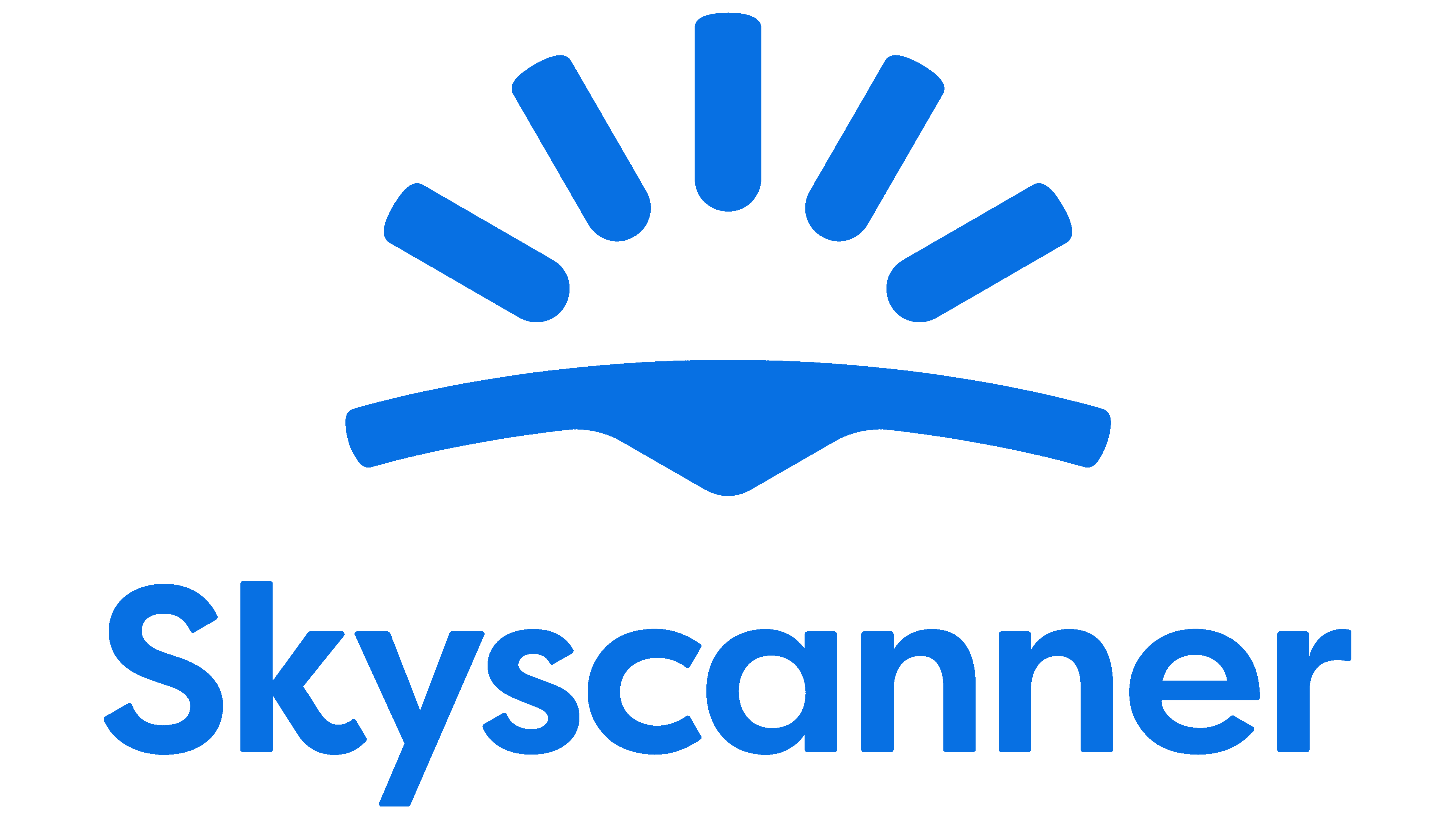
The turning point in the history of visual identity Skyscanner came in 2019. As the service expanded from being just a flight comparison metasearch engine to a travel company, it needed a universal sign. The cloud did not meet this criterion because it was associated with gloomy weather and did not inspire travel. The designers removed the variable cloudiness icon and replaced it with the opposite symbol – a radiant sun.
جاءت نقطة التحول في تاريخ الهوية المرئية Skyscanner في عام 2019. ومع توسع الخدمة من كونها مجرد محرك بحث لمقارنة الرحلات الجوية إلى شركة سفر ، فقد احتاجت إلى علامة عالمية. لم تستوف السحابة هذا المعيار لأنها كانت مرتبطة بطقس قاتم ولم تلهم السفر. قام المصممون بإزالة أيقونة السحب المتغيرة واستبدالها بالرمز المعاكس - الشمس المشرقة.
London-based studio Koto and more than 50 Skyscanner in-house designers worked on the brand’s new image. Together, they came up with a revolutionary concept, embodying four elements: discoveries, ideas, stability, and optimism. The icon reflects these aspects, which consists of a curved strip with a triangle at the bottom and five short lines resembling the sun’s rays. The image is adapted for mobile devices because statistics showed that 60% of smartphone Skyscanner customers access the site.
عمل استوديو Koto ومقره لندن وأكثر من 50 مصممًا داخليًا من Skyscanner على الصورة الجديدة للعلامة التجارية. توصلوا معًا إلى مفهوم ثوري يجسد أربعة عناصر: الاكتشافات والأفكار والاستقرار والتفاؤل. تعكس الأيقونة هذه الجوانب ، والتي تتكون من شريط منحني به مثلث في الأسفل وخمسة خطوط قصيرة تشبه أشعة الشمس. تم تكييف الصورة للأجهزة المحمولة لأن الإحصائيات أظهرت أن 60٪ من عملاء Skyscanner للهواتف الذكية يصلون إلى الموقع.
The brand name, as before, is located on the right side. Colophon created a new sans-serif typeface for it, Skyscanner Relative. The first “S” is capitalized, and the lower diagonal “k” is unusually curled up. The color of the logo is dark blue.
يقع اسم العلامة التجارية ، كما كان من قبل ، على الجانب الأيمن. أنشأ Colophon محرفًا جديدًا لـ sans-serif ، Skyscanner Relative. تتم كتابة الحرف الأول "S" ، والقطري السفلي "k" يتم تجعيده بشكل غير عادي. لون الشعار أزرق غامق.
FONT AND COLORS OF THE EMBLEM

The Skyscanner graphic sign is shaped like the bottom of a swimsuit, so the associations with leisure and travel are obvious. Of course, the designers did not put such a meaning into the emblem. The large curved band represents the Earth and the horizon in particular. A small triangle pointing downwards symbolizes an arrow that points to a destination. And five dashes, built in the form of an arch, represent the sunrise.
تتشكل علامة Skyscanner الرسومية على شكل الجزء السفلي من ملابس السباحة ، لذا فإن الارتباط بالترفيه والسفر واضح. بالطبع ، لم يضع المصممون هذا المعنى في الشعار. يمثل الشريط المنحني الكبير الأرض والأفق على وجه الخصوص. يرمز المثلث الصغير المتجه لأسفل إلى سهم يشير إلى وجهة. وخمس شرطات ، مبنية على شكل قوس ، تمثل شروق الشمس.

The Skyscanner Relative corporate font was specially developed for the company logo. The author of this grotesque is Colophon. Proportional, symmetrical letters look harmoniously in combination with the rounded lines of the emblem. The color scheme is based on a rich shade of sky blue (#0770e3). It reflects the first part of the brand name (“Sky”) and establishes a connection with the old Skyscanner graphic signs.
تم تطوير خط شركة Skyscanner Relative خصيصًا لشعار الشركة. مؤلف هذا الغريب هو كولوفون. تبدو الأحرف المتناسبة والمتناسقة متناغمة مع الخطوط الدائرية للشعار. يعتمد نظام الألوان على الظل الغني باللون الأزرق السماوي (# 0770e3). إنه يعكس الجزء الأول من اسم العلامة التجارية ("Sky") ويؤسس اتصالاً بعلامات Skyscanner الرسومية القديمة.
Comments
Post a Comment