AirJapan – “novelty” in the field of passenger transportation from ANA HOLDINGS - "حداثة" في مجال نقل الركاب
Continuing to develop passenger transportation services, the Japanese company ANA HOLDINGS, together with Air Japan Co., Ltd, has formed a new brand, the visualization of which has already been presented to customers. It was created to provide services for the transportation of customers on international routes of medium length; such a decision was made to improve the comfortable service for passengers, which will be achieved through a new concept. The launch of the project is scheduled for the fiscal year 2023. The main difference between the new company will be a wide range of offers and services based on Japanese culture in the comfortable space created by the new aircraft cabins. At the same time, the prices will be especially affordable. This brand is the result of the transformation of the ANA Group’s business model, creating the conditions for sustainable growth and the ability to quickly respond to the huge variety of needs of its customers. The company’s name, logo, and design have already been developed and are ready for presentation.
استمرارًا في تطوير خدمات نقل الركاب ، قامت الشركة اليابانية ANA HOLDINGS ، جنبًا إلى جنب مع Air Japan Co.، Ltd ، بتشكيل علامة تجارية جديدة ، تم تقديم تصورها للعملاء بالفعل. تم إنشاؤه لتقديم خدمات نقل العملاء على الطرق الدولية ذات الطول المتوسط ؛ تم اتخاذ هذا القرار لتحسين الخدمة المريحة للركاب ، والتي سيتم تحقيقها من خلال مفهوم جديد. من المقرر إطلاق المشروع في السنة المالية 2023. سيكون الاختلاف الرئيسي بين الشركة الجديدة هو مجموعة واسعة من العروض والخدمات القائمة على الثقافة اليابانية في المساحة المريحة التي أنشأتها كبائن الطائرات الجديدة. في الوقت نفسه ، ستكون الأسعار معقولة بشكل خاص. هذه العلامة التجارية هي نتيجة التحول في نموذج أعمال مجموعة ANA ، مما خلق الظروف للنمو المستدام والقدرة على الاستجابة بسرعة لمجموعة كبيرة ومتنوعة من احتياجات عملائها. تم بالفعل تطوير اسم الشركة وشعارها وتصميمها وهي جاهزة للعرض.
The developed concept and brand philosophy were reflected in a short but very capacious slogan – Fly Thoughtful. It accurately and clearly expresses the care, thoughtfulness, and delicacy of the company’s approach to its responsibilities and customers. The friendliness and demonstration of care distinguish all visualizations for all ready to use its services. By creating completely new types of air travel based on Japanese ideas and the pursuit of high quality, the founders demonstrated revolutionary methods and innovative approaches in the organization of a new enterprise.
انعكس المفهوم المطور وفلسفة العلامة التجارية في شعار قصير ولكنه رحيب للغاية - Fly Thoughtful. إنه يعبر بدقة ووضوح عن العناية والتفكير والحساسية في نهج الشركة تجاه مسؤولياتها وعملائها. إن الود وإظهار الرعاية يميزان جميع التصورات للجميع على استعداد لاستخدام خدماتها. من خلال إنشاء أنواع جديدة تمامًا من السفر الجوي بناءً على الأفكار اليابانية والسعي لتحقيق الجودة العالية ، أظهر المؤسسون طرقًا ثورية وأساليب مبتكرة في تنظيم مؤسسة جديدة.
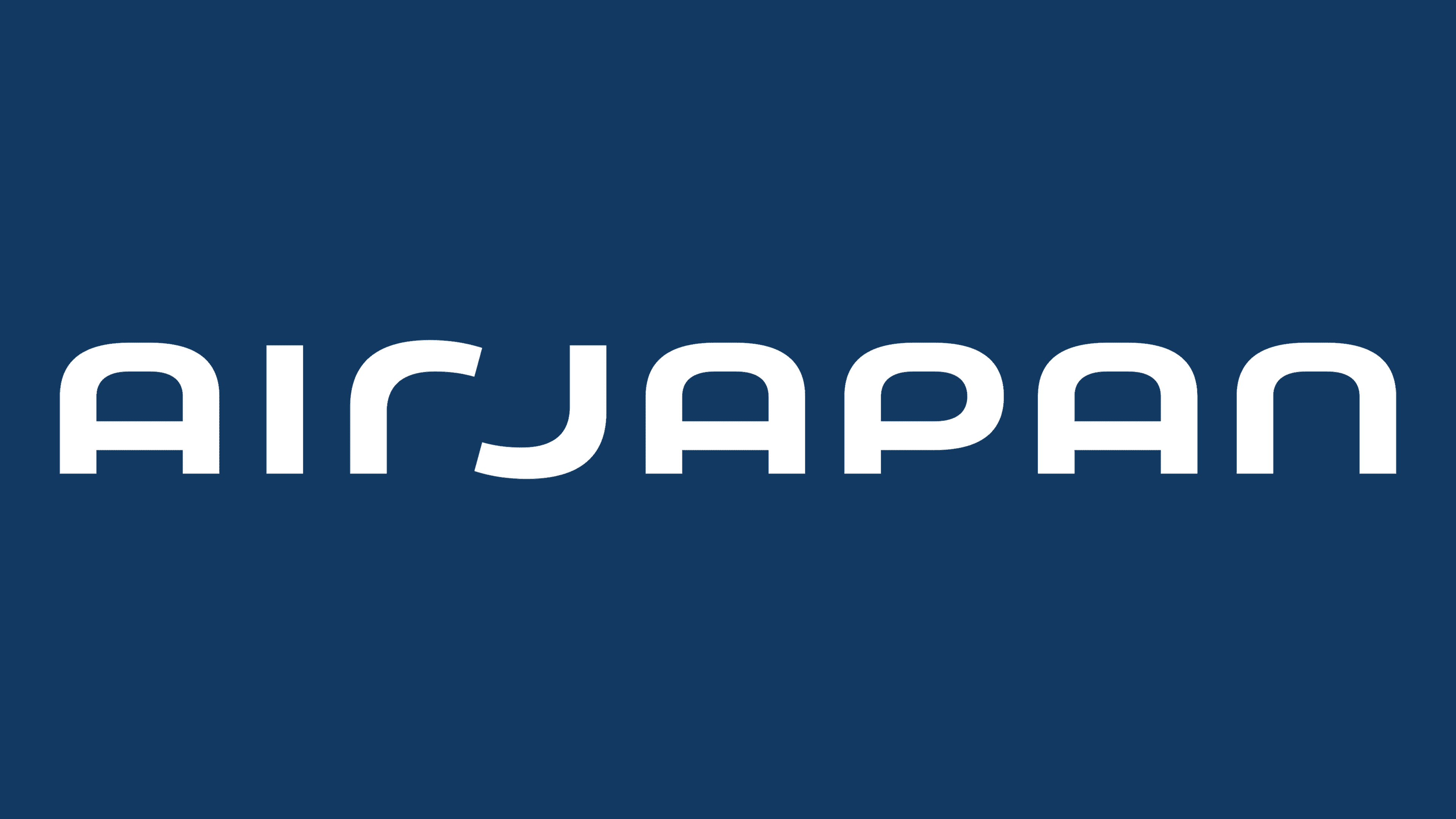
When developing the brand name – Air Japan, the company sought to convey to people worldwide the main idea that it is Japanese. At the same time, it was especially important to remind customers that everything she does is based on Japanese quality. This text symbol was inspired by the image of a kind and thoughtful hand-to-hand interaction, symbolized by the two letters “r” and “J” in their inversely symmetrical graphic design. The successful graphical execution of these symbols made it possible to form a unique and memorable trademark for Air Japan, making it convenient for placement on any surfaces, digital platforms, and typographic media.
عند تطوير اسم العلامة التجارية - Air Japan ، سعت الشركة إلى نقل الفكرة الرئيسية للناس في جميع أنحاء العالم بأنها يابانية. في الوقت نفسه ، كان من المهم بشكل خاص تذكير العملاء بأن كل ما تفعله يعتمد على الجودة اليابانية. تم استلهام رمز النص هذا من صورة تفاعل لطيف ومدروس باليد ، يرمز إليه بالحرفين "r" و "J" في تصميمهما الجرافيكي المتماثل عكسياً. أتاح التنفيذ الرسومي الناجح لهذه الرموز إمكانية تكوين علامة تجارية فريدة لا تُنسى لشركة Air Japan ، مما يجعلها ملائمة لوضعها على أي أسطح ومنصات رقمية ووسائط طباعة.

The color palette was chosen in such a way as to combine the traditional Japanese colors – “Ai” and “Akebono.” The first, indigo, symbolizes the craftsmanship and meticulous technique in traditional Japanese art, a complex dyeing process requiring the performer’s trust and thoughtfulness. The second, the color of the rising sun, has become a reflection of spring in Japan and the epitome of comfortable warmth, to the brand’s commitment to providing comfort and care.
تم اختيار لوحة الألوان بطريقة تجمع بين الألوان اليابانية التقليدية - "Ai" و "Akebono". الأول ، النيلي ، يرمز إلى الحرفية والتقنية الدقيقة في الفن الياباني التقليدي ، وهي عملية صباغة معقدة تتطلب ثقة وفناني الأداء. أما اللون الثاني ، وهو لون الشمس المشرقة ، فقد أصبح انعكاسًا لفصل الربيع في اليابان وخلاصة الدفء المريح ، لالتزام العلامة التجارية بتوفير الراحة والرعاية.
Comments
Post a Comment