The well-known Italian brand Colnago, founded by Ernesto Colnago in 1954, presented its new identity to cycling enthusiasts and professionals. Until 2020, the company was a family business near Milano in Cambiago, Italy. This year, UAE investment company Chimera Investments LLC became the owner of a controlling stake in the brand. At the beginning of his business history, the company’s founder became a student of Gloria Bicycles at the age of 13, later becoming interested in road racing. After an injury, he subcontracted from Gloria, opening the shop in 1954. Simultaneously with the production of frames, Ernesto remains a sought-after mechanic, repairing the Nivea Giro d’Italia equipment managed by Faliero Masi, moving in 1963 to the position of chief mechanic in the Belgian Molteni. The brand earned its primary fame with a high-quality steel frame that met the requirements of professional racing. Then the company began to pay attention to special creativity, applying innovations in design, and experimenting with materials. Today it is one of the most creative manufacturers of modern carbon fiber race bikes. The brand has reflected its legendary history, represented by the world-famous symbol “Ace,” in a new rethought identity. With her help, it was possible to raise the visualization to the legendary historical level.
قدمت العلامة التجارية الإيطالية الشهيرة Colnago ، التي أسسها إرنستو كولناغو في عام 1954 ، هويتها الجديدة لعشاق ركوب الدراجات والمهنيين. حتى عام 2020 ، كانت الشركة عبارة عن شركة عائلية بالقرب من ميلانو في كامبياغو بإيطاليا. هذا العام ، أصبحت شركة الاستثمار الإماراتية Chimera Investments LLC هي المالكة لحصة مسيطرة في العلامة التجارية. في بداية تاريخ أعماله ، أصبح مؤسس الشركة طالبًا في Gloria Bicycles في سن 13 عامًا ، وأصبح مهتمًا فيما بعد بسباق الطرق. بعد الإصابة ، تعاقد من الباطن مع جلوريا ، وافتتح المتجر في عام 1954. وبالتزامن مع إنتاج الإطارات ، ظل إرنستو ميكانيكيًا مطلوبًا ، حيث قام بإصلاح معدات Nivea Giro d'Italia التي يديرها Faliero Masi ، وانتقل في عام 1963 إلى منصب كبير ميكانيكيي شركة Molteni البلجيكي. اكتسبت العلامة التجارية شهرتها الأولى من خلال إطار فولاذي عالي الجودة يلبي متطلبات السباقات الاحترافية. ثم بدأت الشركة في الاهتمام بالإبداع الخاص ، وتطبيق الابتكارات في التصميم ، وتجربة المواد. تعد اليوم واحدة من أكثر الشركات المصنعة إبداعًا لدراجات سباق ألياف الكربون الحديثة. تعكس العلامة التجارية تاريخها الأسطوري ، الذي يمثله الرمز المشهور عالميًا "آيس" ، في هوية جديدة أعيد التفكير فيها. بمساعدتها ، كان من الممكن رفع التصور إلى المستوى التاريخي الأسطوري.
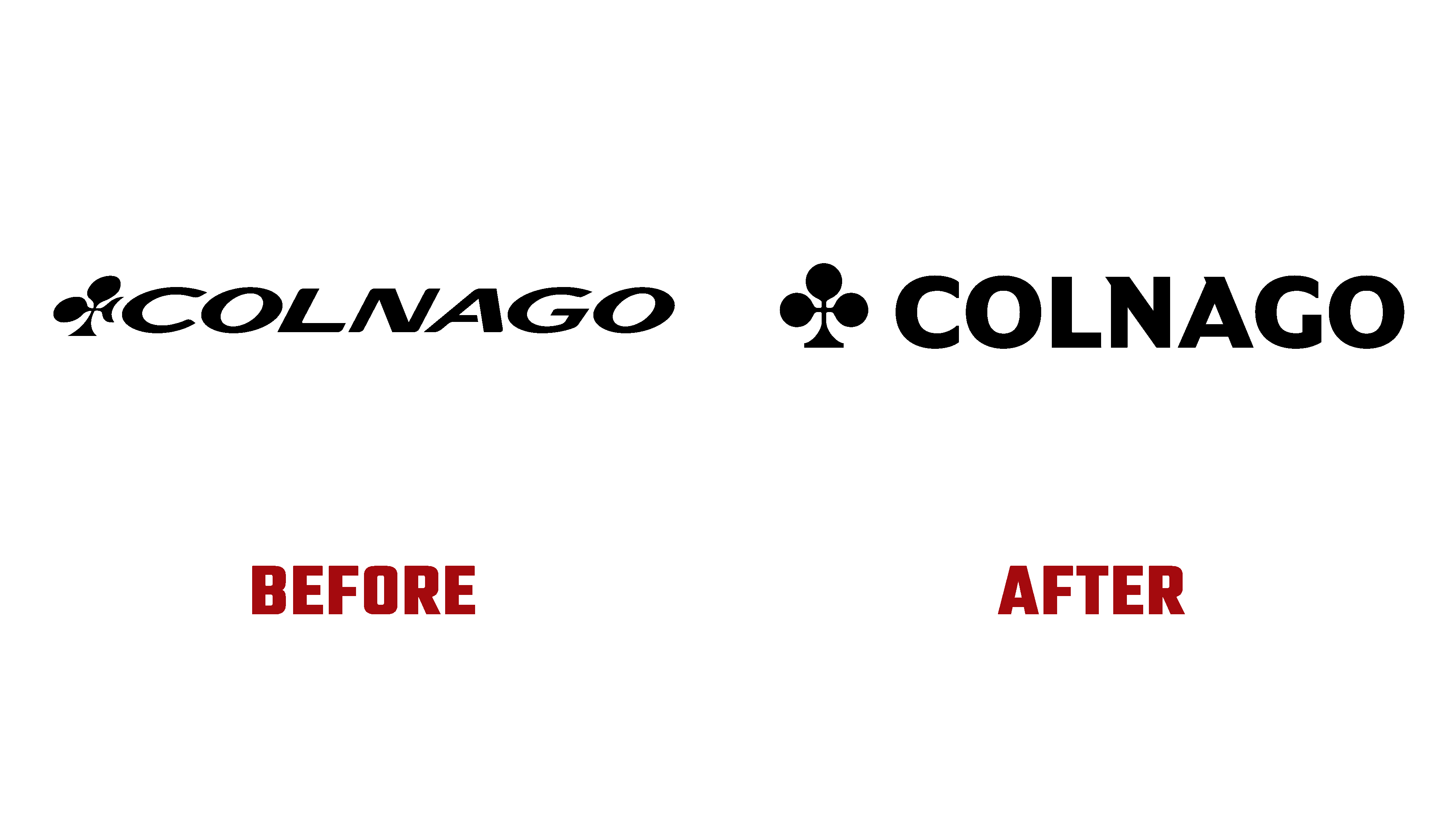
The new identity was built to reflect the company’s core values while redirecting strategy into the future. Inspired by the storied heritage, designers have turned the Ace symbol into a solid, elegant sign. The new visual language conveys the brand’s excellence very accurately, with two unique types of fonts – Bodoni and Sans, a sound system, and an exclusive color shade, all demonstrating that the ace of cycling is returning to its leading position.
تم بناء الهوية الجديدة لتعكس القيم الأساسية للشركة مع إعادة توجيه الإستراتيجية نحو المستقبل. مستوحى من التراث التاريخي ، قام المصممون بتحويل رمز Ace إلى علامة متينة وأنيقة. تنقل اللغة المرئية الجديدة تميز العلامة التجارية بدقة شديدة ، مع نوعين فريدين من الخطوط - Bodoni and Sans ، ونظام صوت ، وظلال ألوان حصرية ، كل ذلك يدل على عودة آس ركوب الدراجات إلى مكانتها الرائدة.

Each identity element was carefully thought out and worked out to achieve high image quality. The logo began to correspond in its visual symbolism to each of the bike’s important parts. His design was born in the cradle of Italian art, full of passion and aspirations. The underlying origins, which were a strength of the company, were improved by infusing the symbol with hints of Italian culture, which provided a new serif typeface inspired by the archetype of Italian typography, Bodoni. Second, Sans was closely related to the Aldo Novarese typefaces, one of the icons of the Italian typographic language.
تم التفكير بعناية في كل عنصر هوية وتم تصميمه لتحقيق جودة صورة عالية. بدأ الشعار يتوافق في رمزيه المرئي مع كل جزء من أجزاء الدراجة المهمة. وُلد تصميمه في مهد الفن الإيطالي المليء بالعاطفة والتطلعات. تم تحسين الأصول الأساسية ، التي كانت قوة الشركة ، من خلال غرس تلميحات من الثقافة الإيطالية في الرمز ، والتي قدمت خطًا جديدًا من طراز Serif مستوحى من النموذج الأصلي للطباعة الإيطالية ، Bodoni. ثانيًا ، كانت Sans مرتبطة ارتباطًا وثيقًا بخطوط Aldo Novarese ، وهي إحدى أيقونات اللغة المطبعية الإيطالية.
Comments
Post a Comment