In its modern update, new solutions for managing B2B marketing events are presented by the American company Bizzabo, a leader in this field. Founded by Boaz Katz, Alon Alroy, and Eran Ben-Shushan, it has offices in New York, Tel-Aviv, Kyiv, London, and Montreal. Leveraging immersive in-person, virtual, and hybrid experiences, the Bizzabo Event Experience OS is a data-rich, open platform that empowers executives to manage events, engage audiences, build communities, and achieve better business results. This ensures the absolute preservation of confidentiality and security for all participants. The application’s success is confirmed by a large number of the world’s leading brands that entrust their tasks to Bizzabo. Its community includes corporate organizations, financial institutions, creative agencies, and large-scale technology companies, including those from the Fortune 100 list. Developing and improving, following modern trends, the platform has undergone a dramatic change in its identity, recently introducing it to its users.
في تحديثها الحديث ، قدمت شركة Bizzabo الأمريكية الرائدة في هذا المجال حلولًا جديدة لإدارة أحداث التسويق بين الشركات. أسسها بواز كاتس وألون ألروي وعيران بن شوشان ، ولها مكاتب في نيويورك وتل أبيب وكييف ولندن ومونتريال. من خلال الاستفادة من التجارب الشخصية والافتراضية والهجينة ، فإن نظام Bizzabo Event Experience OS عبارة عن نظام أساسي مفتوح غني بالبيانات يمكّن المديرين التنفيذيين من إدارة الأحداث وإشراك الجماهير وبناء المجتمعات وتحقيق نتائج أعمال أفضل. هذا يضمن الحفاظ المطلق على السرية والأمان لجميع المشاركين. تم تأكيد نجاح التطبيق من خلال عدد كبير من العلامات التجارية الرائدة في العالم التي أوكلت مهامها إلى Bizzabo. يشمل مجتمعها منظمات الشركات والمؤسسات المالية والوكالات الإبداعية وشركات التكنولوجيا واسعة النطاق ، بما في ذلك الشركات المدرجة في قائمة Fortune 100. تطوير وتحسين النظام الأساسي ، وفقًا للاتجاهات الحديثة ، شهد تغييرًا جذريًا في هويته ، حيث قدمه مؤخرًا لمستخدميه.
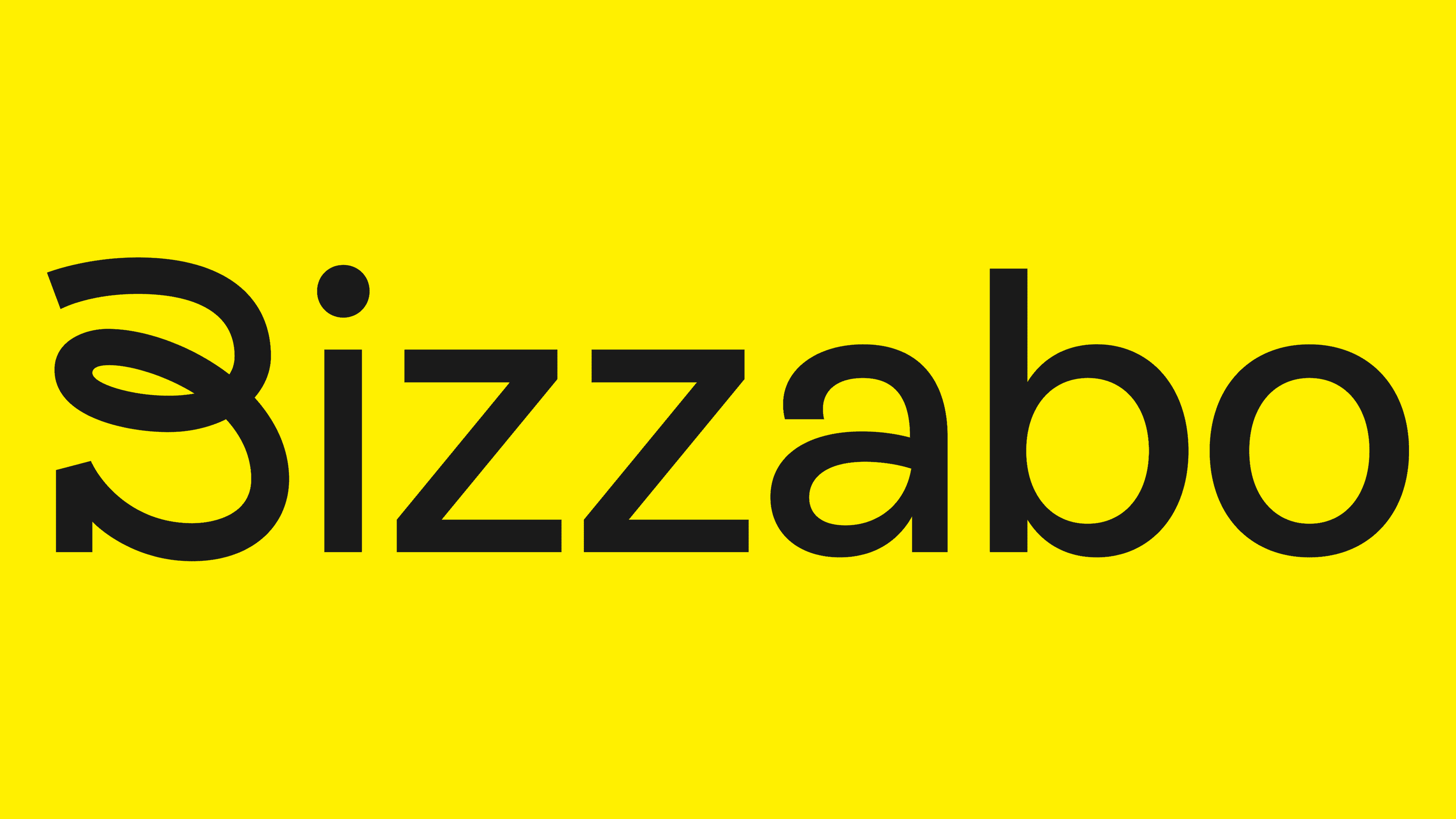
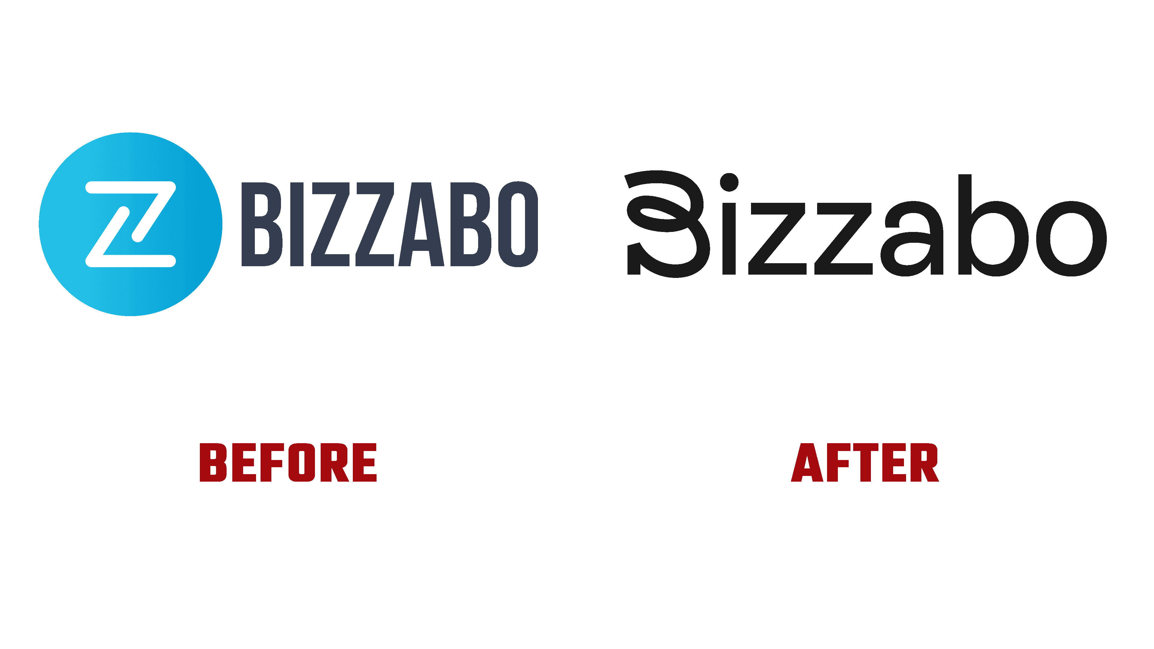
A dynamic logo was designed using eye-catching scribble lettering technology that blends harmoniously with the sans-serif Rebond Grotesque. It was whimsical and reflected the brand’s friendly and upbeat nature, versatility, and hybrid aspects. To improve the visual impact on the user, a new color palette has been added that is bright and cheerful, which is a dramatic departure from the traditional clichés of tech blues. This atmosphere is supported by human photographs and whimsical illustrations that capture the true spirit of the platform’s hybrid events. The Rebond Grotesque typeface was effectively paired with a serif variant, Galaxy Copernicus. The latter was used for headlines. Their combination emphasized the humanity of the brand, reinforcing its hybrid concept.
تم تصميم الشعار الديناميكي باستخدام تقنية حروف خربشة ملفتة للنظر تمتزج بانسجام مع sans-serif Rebond Grotesque. لقد كان غريب الأطوار وعكس طبيعة العلامة التجارية الودودة والمتفائلة ، وتعدد الاستخدامات ، والجوانب المختلطة. لتحسين التأثير البصري على المستخدم ، تمت إضافة لوحة ألوان جديدة مشرقة ومبهجة ، وهو ما يعد خروجًا دراماتيكيًا عن الكليشيهات التقليدية لموسيقى البلوز التقنية. يتم دعم هذا الجو من خلال الصور البشرية والرسوم التوضيحية الغريبة التي تلتقط الروح الحقيقية للأحداث المختلطة للمنصة. تم إقران محرف Rebond Grotesque بشكل فعال مع متغير Serif ، Galaxy Copernicus. تم استخدام هذا الأخير لعناوين الأخبار. أكد مزيجهم على إنسانية العلامة التجارية ، مما عزز مفهومها الهجين.

The new logo has served to create interest and appeal, where the font’s funky loops can be interpreted as twists and turns awaiting a real event in terms of connecting with people. Achieving such visual popularity became possible due to the abandonment of the desire to make the logo especially informational, without trying to put in it understandable and accessible information about what the brand is professionally engaged in. Visually, the created wordmark looks quite nice. The quirkiness of the font and its execution were a major signal of the company’s optimistic nature, supporting the application’s simplicity and efficiency, aided by the pleasing combination of the font family.
يعمل الشعار الجديد على خلق الاهتمام والجاذبية ، حيث يمكن تفسير الحلقات غير التقليدية للخط على أنها تقلبات وانعطافات في انتظار حدث حقيقي من حيث التواصل مع الأشخاص. أصبح تحقيق هذه الشعبية المرئية ممكنًا بسبب التخلي عن الرغبة في جعل الشعار إعلاميًا بشكل خاص ، دون محاولة إدخال معلومات مفهومة ويمكن الوصول إليها حول ما تنخرط فيه العلامة التجارية بشكل احترافي. بصريًا ، تبدو العلامة النصية التي تم إنشاؤها لطيفة جدًا. كان غرابة الخط وتنفيذه إشارة رئيسية لطبيعة الشركة المتفائلة ، ودعم بساطة التطبيق وكفاءته ، مدعومًا بمزيج ممتع من عائلة الخطوط.
Comments
Post a Comment