Fundamental rebranding of Henry Ford Health System - تغيير العلامة التجارية الأساسي لنظام هنري فورد الصحي
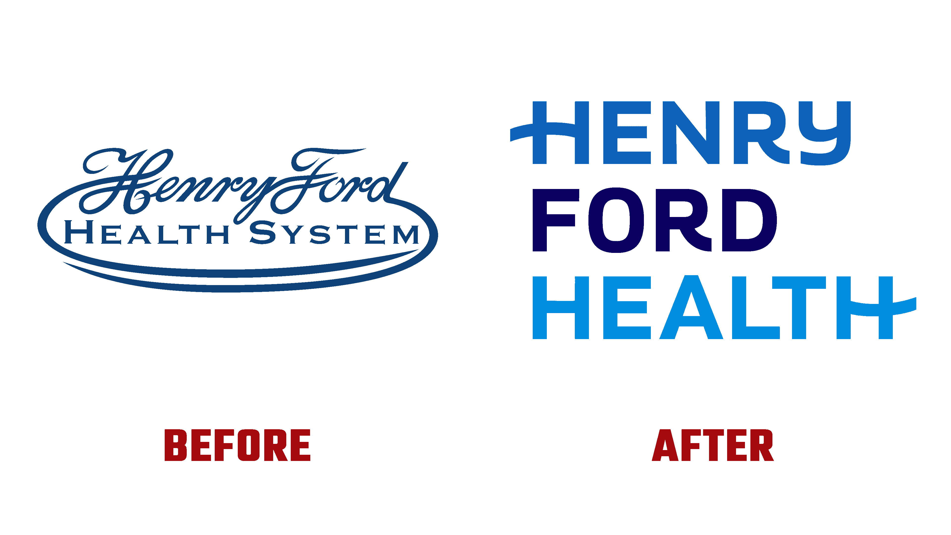
In 1915, Henry Ford decided to justify a new health care system – Henry Ford Health System, which received his name. Based in Metro Detroit, it opened a corporate office located at One Ford Place, Midtown Detroit, Michigan. Over the 107 years of its existence, the non-profit organization has gained trust and location not only in its region. Today, it provides emergency, specialized, primary, and preventive care backed by cutting-edge research and specialized state-of-the-art staff education. Keeping up with the times and forming the Health Alliance Plan, the organization’s board of trustees decided to rebrand, which led to simplifying the imaging system and a name change.
في عام 1915 ، قرر هنري فورد تبرير نظام رعاية صحية جديد - نظام هنري فورد الصحي ، الذي حصل على اسمه. مقرها في مترو ديترويت ، فتحت مكتبًا للشركة يقع في One Ford Place ، Midtown Detroit ، Michigan. على مدار 107 عامًا من وجودها ، اكتسبت المنظمة غير الربحية الثقة والموقع ليس فقط في منطقتها. اليوم ، يوفر رعاية طارئة ومتخصصة وأولية ووقائية مدعومة بأحدث الأبحاث وتعليم الموظفين المتخصصين على أحدث طراز. مواكبة للعصر وتشكيل خطة تحالف الصحة ، قرر مجلس أمناء المنظمة تغيير العلامة التجارية ، مما أدى إلى تبسيط نظام التصوير وتغيير الاسم.
In an effort to dynamically develop and reduce the information overload of its identity, the brand abandoned the word System in the name. Thus, emphasis was placed on an important moment for the organization – the word Health, which is fundamental to the company’s strategy. The new identity demonstrates the brand’s deep commitment to its partnership with every patient and community. It also points to making the most of your abilities and your entire workforce along the difficult path to Health.
في محاولة لتطوير وتقليل الحمل الزائد للمعلومات بشكل ديناميكي ، تخلت العلامة التجارية عن كلمة System في الاسم. وبالتالي ، تم التركيز على لحظة مهمة للمؤسسة - كلمة الصحة ، والتي تعتبر أساسية لاستراتيجية الشركة. توضح الهوية الجديدة التزام العلامة التجارية العميق بشراكتها مع كل مريض ومجتمع. يشير أيضًا إلى تحقيق أقصى استفادة من قدراتك وقوة العمل بأكملها على طول الطريق الصعب إلى الصحة.

The logo’s construction and the entire design’s construction provide a visual unification of all the company’s offerings – from primary and preventive care to comprehensive services provided, including at home, pharmacies, and retail. The main emphasis is placed on the academic mission to promote research and educate the next generation of highly qualified specialists. The new visualization has become an effective platform for dynamic storytelling, the opportunity to share your personal stories, hopes, and resilience with partners and community members. At the same time, the typography and color palette were focused on connecting individual stories to reinforce the mission and promises of triumph and inspiration. Here are the thrilling stories of a pregnant COVID patient undergoing a double lung transplant to a nurse practitioner housing her patient.
يوفر إنشاء الشعار وتصميم التصميم بالكامل توحيدًا مرئيًا لجميع عروض الشركة - بدءًا من الرعاية الأولية والوقائية وحتى الخدمات الشاملة المقدمة ، بما في ذلك في المنزل والصيدليات وتجارة التجزئة. ينصب التركيز الرئيسي على المهمة الأكاديمية لتعزيز البحث وتثقيف الجيل القادم من المتخصصين المؤهلين تأهيلا عاليا. أصبح التصور الجديد منصة فعالة لسرد القصص الديناميكي ، وفرصة لمشاركة قصصك الشخصية ، وآمالك ، ومرونتك مع الشركاء وأعضاء المجتمع. في الوقت نفسه ، ركزت الطباعة ولوحة الألوان على ربط القصص الفردية لتعزيز المهمة ووعود الانتصار والإلهام. إليكم القصص المثيرة لمريضة حامل بفيروس كورونا تخضع لعملية زرع رئة مزدوجة لممرضة ممارس تؤوي مريضتها.
Shades of blue were chosen as the main corporate colors – saturated dark and light, in which two words of the wordmark are executed, separated by a black contrasting execution of the founder’s surname. Thus, the emphasis on the figure of the founder was ensured, and the brand’s founded philosophy was formed – the pursuit of endless health care, constantly improving its capabilities. The new signature pays homage to the organization’s powerful heritage, providing a bold new look.
تم اختيار ظلال من اللون الأزرق كألوان رئيسية للشركة - داكنة مشبعة وفاتحة ، حيث يتم تنفيذ كلمتين من العلامة النصية ، مفصولة بتنفيذ أسود متباين لاسم المؤسس. وبالتالي ، تم التأكيد على شخصية المؤسس ، وتم تشكيل فلسفة العلامة التجارية - السعي وراء رعاية صحية لا نهاية لها ، وتحسين قدراتها باستمرار. يكرم التوقيع الجديد التراث القوي للمؤسسة ، ويوفر مظهرًا جديدًا جريئًا.
Comments
Post a Comment