Burger King is the name of an American company that owns a chain of fast-food restaurants. It was founded in Jacksonville, Florida, in 1953. After 1954, Insta-Burger King ran into financial difficulties. Two local businesses that used the brand in a franchise (a private or legal entity that uses the trademark with the franchisor’s consent), David Edgerton and James McLamore, acquired the company and renamed it, Burger King. Soon it was bought by two local franchisees – but then they resold the company. Now the Brazilian corporation 3G Capital owns a controlling stake, and the institution itself is located in Miami, Florida.
برجر كينج هو اسم شركة أمريكية تمتلك سلسلة مطاعم للوجبات السريعة. تأسست في جاكسونفيل ، فلوريدا ، في عام 1953. بعد عام 1954 ، واجهت Insta-Burger King صعوبات مالية. استحوذت شركتان محليتان استخدمتا العلامة التجارية في الامتياز (كيان خاص أو قانوني يستخدم العلامة التجارية بموافقة صاحب الامتياز) ، وهما David Edgerton و James McLamore ، على الشركة وأعادا تسميتها ، Burger King. سرعان ما تم شراؤها من قبل اثنين من أصحاب الامتياز المحليين - ولكنهم أعادوا بيع الشركة بعد ذلك. الآن تمتلك شركة 3G Capital البرازيلية حصة مسيطرة ، وتقع المؤسسة نفسها في ميامي ، فلوريدا.
MEANING AND HISTORY
What is Burger King?
Burger King is the corporation that runs the eponymous fast-food restaurant brand. At the same time, she herself belongs to Burger King Holdings and Restaurant Brands International Inc. Its predecessor was Insta-Burger King, founded in 1953 and named after the Insta-Broiler oven, where the patties were originally fried. It was renamed in 1959 after restructuring.
برجر كنج هي الشركة التي تدير العلامة التجارية لمطاعم الوجبات السريعة. في الوقت نفسه ، تنتمي هي نفسها إلى شركة Burger King Holdings ومطعم Brands International Inc. ، كانت سابقتها Insta-Burger King ، التي تأسست عام 1953 وسميت على اسم فرن Insta-Broiler ، حيث كانت الفطائر تُقلى في الأصل. تم تغيير اسمها في عام 1959 بعد إعادة الهيكلة.
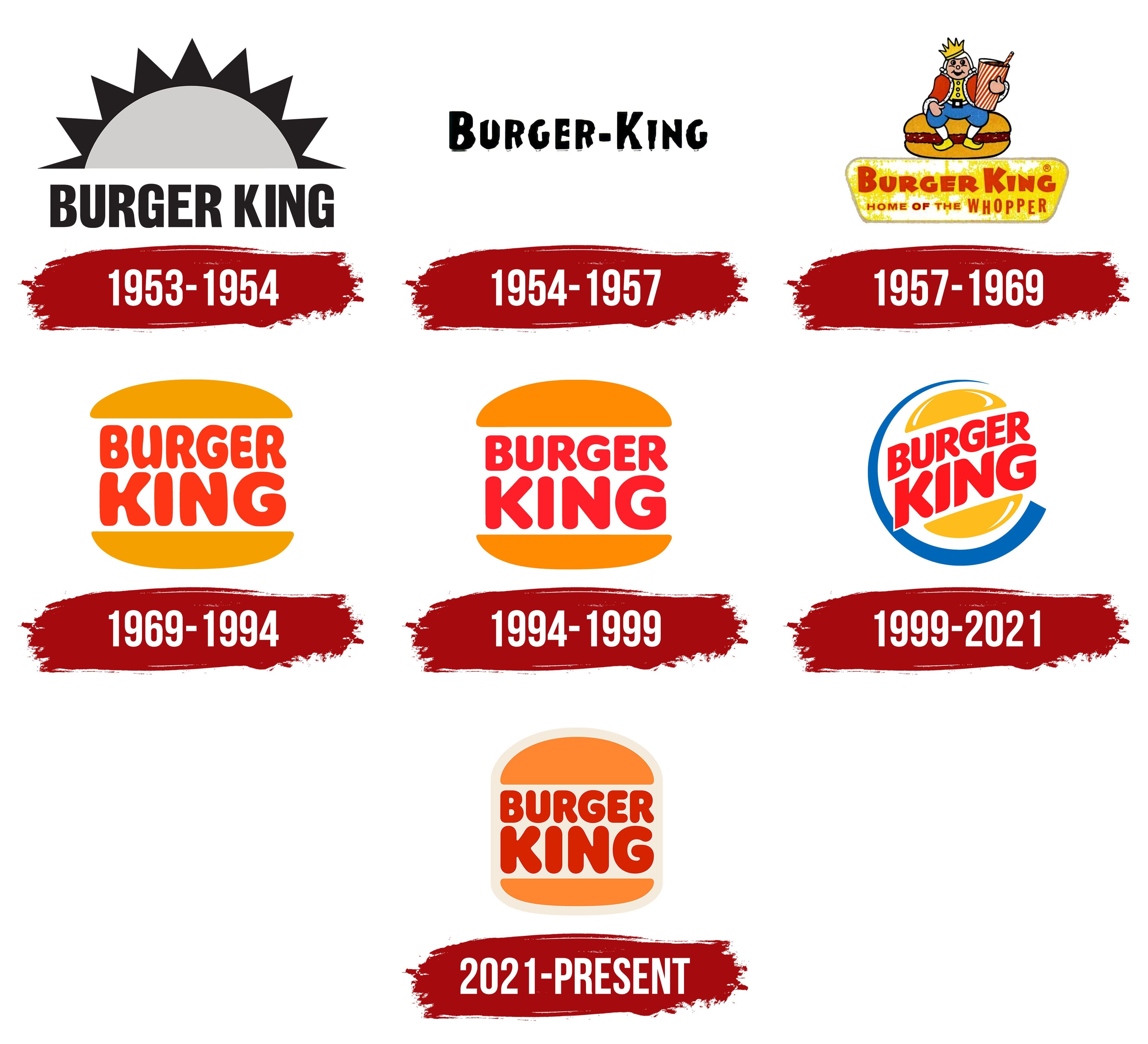
The original company was called Insta Burger King. Its emblem had an icon resembling the sun. But a year later, the founders began to experience financial difficulties and sold the company to David Edgerton and James McLamore, who renamed it, Burger King. Over the next 50 years, she changed owners four times, reflected in the corporate design.
كانت الشركة الأصلية تسمى Insta Burger King. كان لشعارها أيقونة تشبه الشمس. ولكن بعد مرور عام ، بدأ المؤسسون يواجهون صعوبات مالية وباعوا الشركة إلى ديفيد إدجيرتون وجيمس مكلامور ، اللذين أعادا تسميتها ، برجر كنج. على مدار الخمسين عامًا التالية ، قامت بتغيير المالكين أربع مرات ، وهو ما انعكس في تصميم الشركة.
The company is the second most recognized brand in the world among fast-food restaurants, of course, after the famous McDonald’s Golden Arch. In many ways, this became possible due to a very bright and memorable logo.
تعد الشركة ثاني أكثر العلامات التجارية شهرة في العالم بين مطاعم الوجبات السريعة ، بالطبع ، بعد ماكدونالدز جولدن آرك الشهير. من نواح كثيرة ، أصبح هذا ممكنًا بسبب شعار لامع للغاية ولا يُنسى.
Initially, the company logo had only one textual embodiment (even before David Edgerton and James McLamore acquired the company’s shares). The image of the king of hamburgers flaunted on restaurant signs and was actively promoted in the media.
في البداية ، كان لشعار الشركة تجسيدًا نصيًا واحدًا فقط (حتى قبل أن يستحوذ David Edgerton و James McLamore على أسهم الشركة). ظهرت صورة ملك الهامبرغر على لافتات المطاعم وتم الترويج لها بنشاط في وسائل الإعلام.
In the decades that followed, logos were quite complex in terms of the number of elements and details. Their integral part was the king himself (the same Burger King), who was sitting on a hamburger with a glass of drink and a pipe in his hand.
في العقود التي تلت ذلك ، كانت الشعارات معقدة للغاية من حيث عدد العناصر والتفاصيل. كان الجزء الأساسي منهم هو الملك نفسه (نفس برجر كنج) ، الذي كان جالسًا على الهامبرغر مع كوب من الشراب وأنبوب في يده.
What does the Burger King logo represent?
The Burger King logo bears the restaurant chain’s name, and the designers have made it so that the inscription is associated with a cutlet. To do this, they dyed it brown and placed it between the two halves of a cut burger bun.
يحمل شعار Burger King اسم سلسلة المطاعم ، وقد صنعه المصممون بحيث يرتبط النقش بقطعة صغيرة. للقيام بذلك ، قاموا بصبغته باللون البني ووضعوه بين نصفي كعكة البرجر المقطعة.
1953 – 1954
The debut logo looked like a rising or setting sun. It was a half-disk with short triangular beams. The color scheme is gray-black.
بدا الشعار الأول وكأنه شروق الشمس أو غروبها. كان عبارة عن نصف قرص مع عوارض مثلثة قصيرة. نظام الألوان رمادي - أسود.
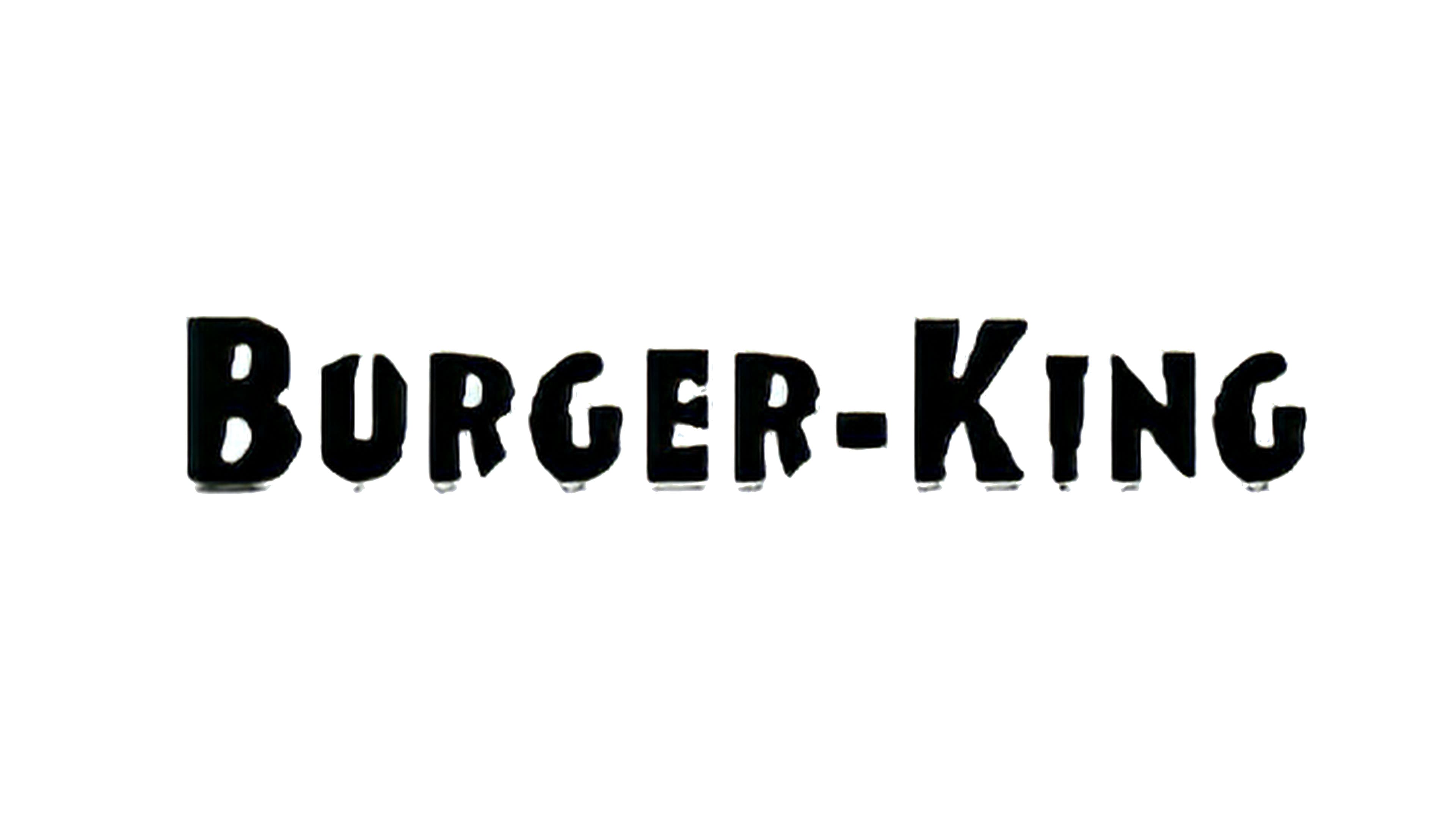
1954 – 1957
The merit of the franchisors was that they cut off an extra word from the name. Therefore, the emblem of that period looks minimalistic, practical, and restrained. There is nothing superfluous on it – only the name made in black letters on a white background. The font is individual, with a shortened stem at the “R” and pointed ends at the “U.”
كانت ميزة مانحي الامتياز أنهم قطعوا كلمة إضافية من الاسم. لذلك ، يبدو شعار تلك الفترة في أضيق الحدود وعمليًا وضبطًا. لا يوجد شيء لا لزوم له - فقط الاسم مكتوب بأحرف سوداء على خلفية بيضاء. الخط فردي ، مع جذع مختصر عند "R" ونهايات مدببة عند "U."
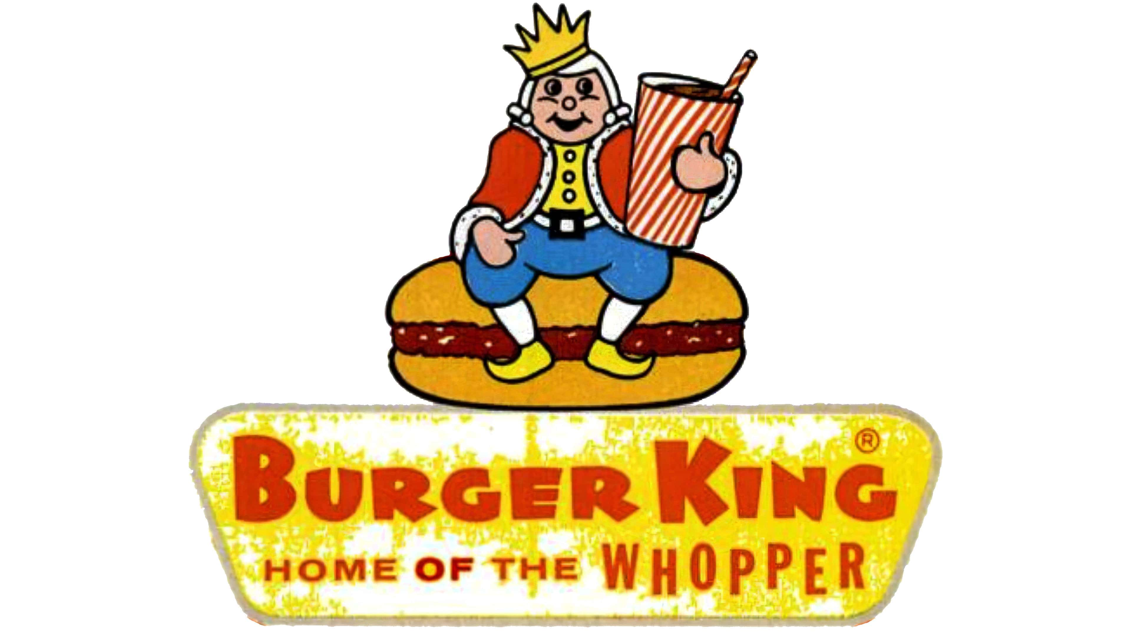
1957 – 1969
The following owners of the establishment redesigned the logo to emphasize the phrase “Burger King.” They used an image of a king sitting on a large burger with a drink in a plastic glass. Below on a yellow background is written the company’s name and the phrase “Home of the Whopper.” That is, it was an advertising badge, not a trademark designation. The logo was very colorful. In addition to yellow, it contained red (two types), blue, white, and black (for contours). In parallel, the previous version of the logo appeared: it was included in the inscription.
أعاد مالكو المؤسسة التالية تصميم الشعار للتأكيد على عبارة "برجر كنج". استخدموا صورة لملك جالس على برجر كبير مع مشروب في كوب بلاستيكي. يوجد أدناه على خلفية صفراء اسم الشركة وعبارة "منزل الهائل". أي أنها كانت شارة إعلانية ، وليست علامة تجارية. كان الشعار ملونًا جدًا. بالإضافة إلى اللون الأصفر ، احتوت على الأحمر (نوعان) ، والأزرق ، والأبيض ، والأسود (لخطوط الكنتور). في موازاة ذلك ، ظهرت النسخة السابقة من الشعار: تم تضمينها في النقش.
1969 – 1994
In 1969, the company switched to an updated logo. It shows a bun cut in two, and the name of a restaurant chain is placed between the halves in two tiers. This option lasted a short time and was revived in 2019 for Super Bowl LIII (took place in February) and the third season of the Netflix series Stranger Things (May).
في عام 1969 ، تحولت الشركة إلى شعار محدث. يُظهر قطعة كعكة مقطوعة إلى قسمين ، ويوضع اسم سلسلة مطاعم بين النصفين في مستويين. استمر هذا الخيار لفترة قصيرة وتم إحياؤه في عام 2019 لـ Super Bowl LIII (حدث في فبراير) والموسم الثالث من سلسلة Netflix Stranger Things (مايو).
The color scheme is borrowed from the previous version, but the form, composition, and style have received dramatic changes. The bold red lettering takes center stage in a rounded sans serif font with smooth lines. The designers stretched the “King” part to create the best balance between long and short words.
تم استعارة نظام الألوان من الإصدار السابق ، لكن الشكل والتكوين والأسلوب قد تغيرات جذرية. تأخذ الحروف الحمراء الجريئة مركز الصدارة في خط دائري sans serif مع خطوط ناعمة. قام المصممون بمد جزء "King" لتحقيق أفضل توازن بين الكلمات الطويلة والقصيرة.
1994 – 1999
This emblem is an improved version of the previous one. It was introduced in April 1994 with less cartoonish text. The Burger King lettering style is austere, with straight letters and a fluffy top of an improvised bun.
هذا الشعار هو نسخة محسنة من سابقتها. تم تقديمه في أبريل 1994 بنص أقل كرتونية. أسلوب حروف برجر كينج صارم ، بأحرف مستقيمة وقمة رقيق من كعكة مرتجلة.
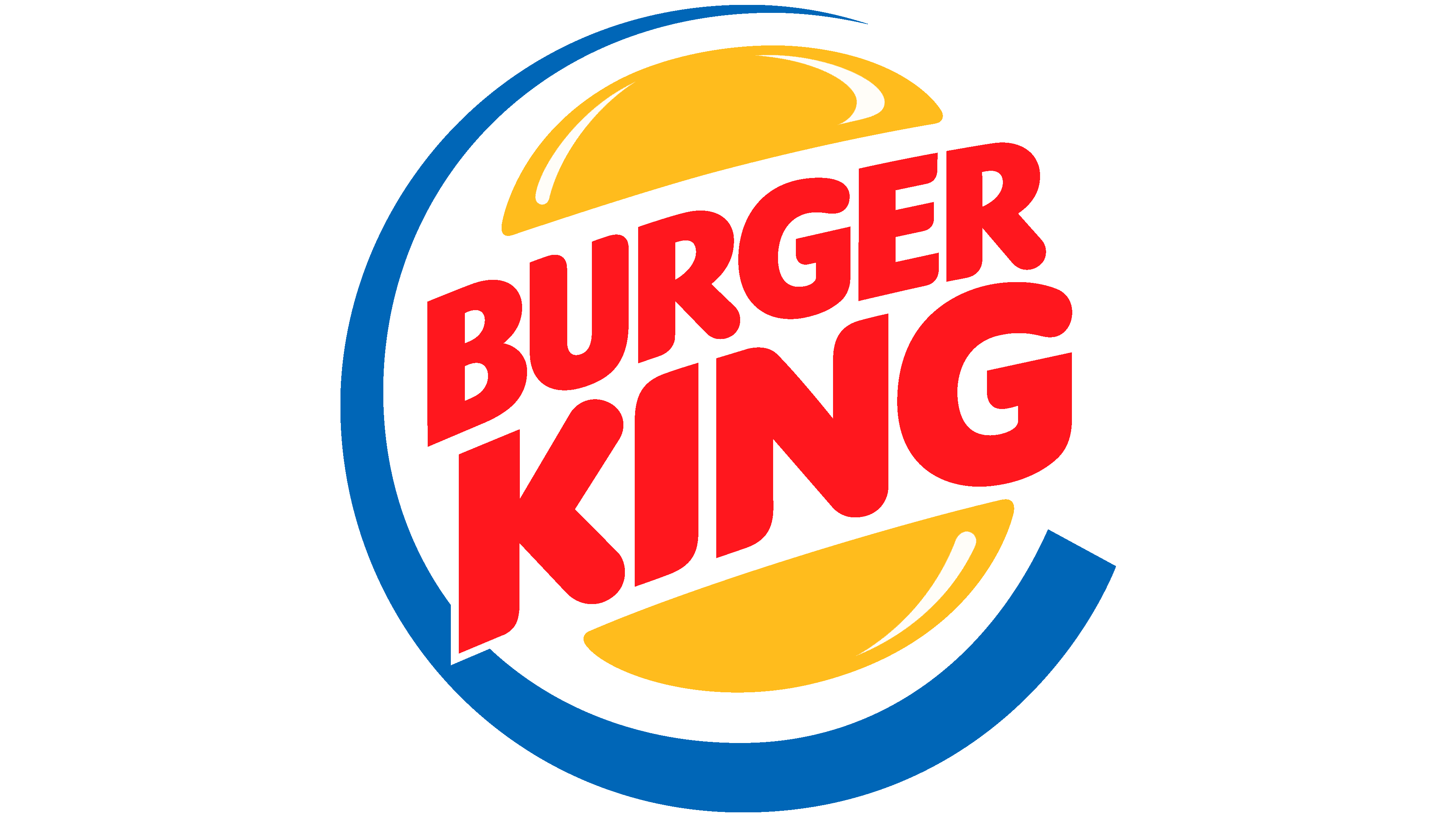
1999 – 2021
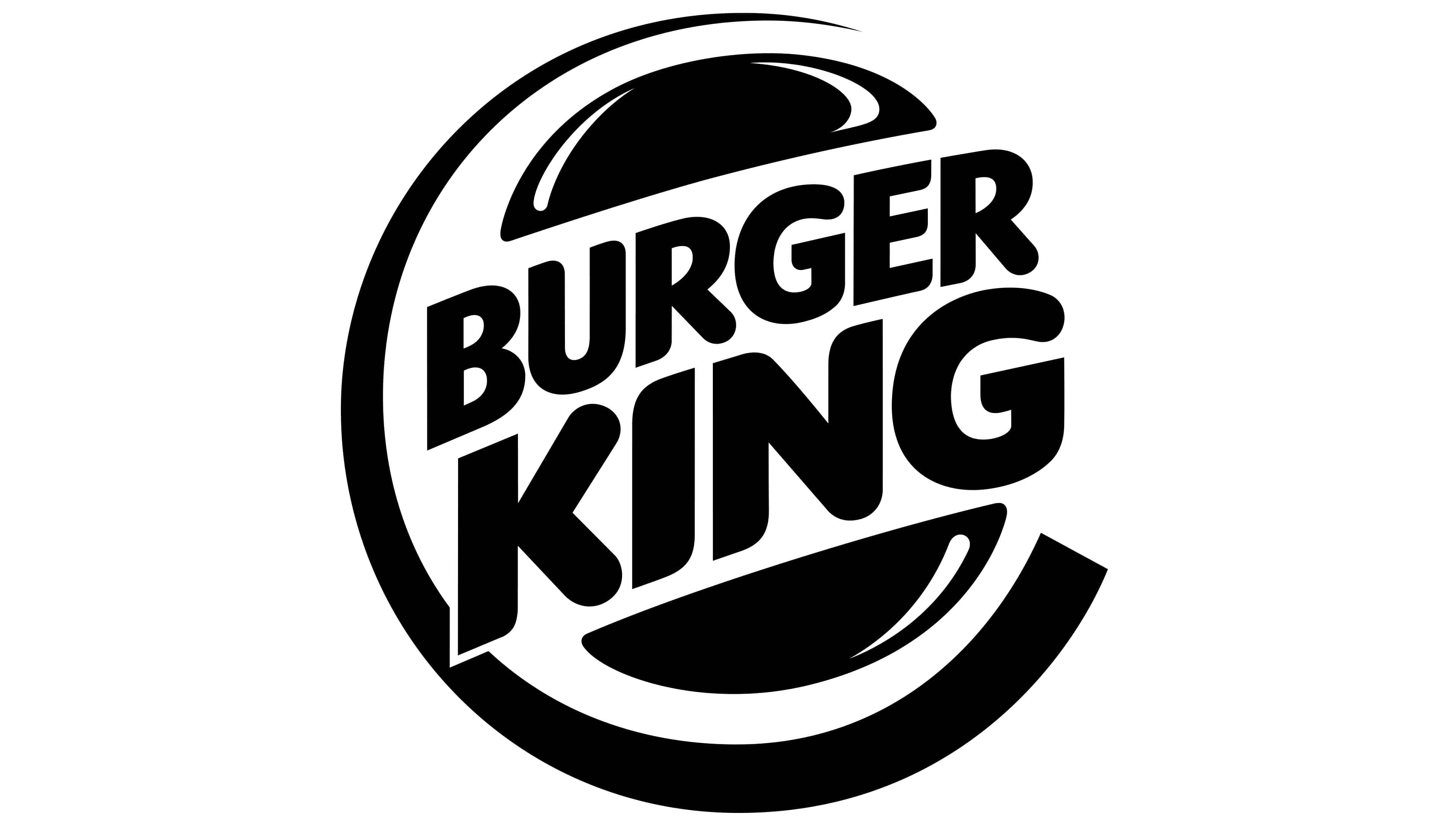
On the eve of the new century, Burger King redesigned its logo again. It was developed by the professional studio Sterling Brands. Outwardly, it resembles the original 1969 version and the 1994 version. The only difference is the blue C-shaped crescent that complements the logo. The company name is still found inside the burger between the two halves of the loaf. But it’s zoomed in, diagonally positioned, and written in a modern sans-serif typeface.
عشية القرن الجديد ، أعاد برجر كنج تصميم شعاره مرة أخرى. تم تطويره من قبل الاستوديو المحترف ستيرلنج براندز. ظاهريًا ، يشبه الإصدار الأصلي لعام 1969 وإصدار 1994. الاختلاف الوحيد هو الهلال الأزرق على شكل حرف C الذي يكمل الشعار. لا يزال اسم الشركة موجودًا داخل البرغر بين نصفي الرغيف. ولكن تم تكبيره ووضعه قطريًا وكتابته بخط sans-serif الحديث.
The color of the logo is extremely important for catering. From the very beginning, the designers aimed to stimulate potential buyers’ appetite by using very mouth-watering images and colors. The colors of the modern logo match the ultra-modern fast-food culture. The owners perfectly understood this and tried to fill the logo with paints as close as possible to the natural color of bread, meat, vegetables. As a result, they chose juicy yellow, orange, red, and recently supplemented them with blue.
لون الشعار مهم للغاية لتقديم الطعام. منذ البداية ، كان المصممون يهدفون إلى تحفيز شهية المشترين المحتملين باستخدام صور وألوان يسيل لها اللعاب. تتوافق ألوان الشعار الحديث مع ثقافة الوجبات السريعة الحديثة للغاية. لقد فهم المالكون ذلك تمامًا وحاولوا ملء الشعار بدهانات أقرب ما يمكن إلى اللون الطبيعي للخبز واللحوم والخضروات. نتيجة لذلك ، اختاروا اللون الأصفر والبرتقالي والأحمر العصير ، واستكملوها مؤخرًا باللون الأزرق.
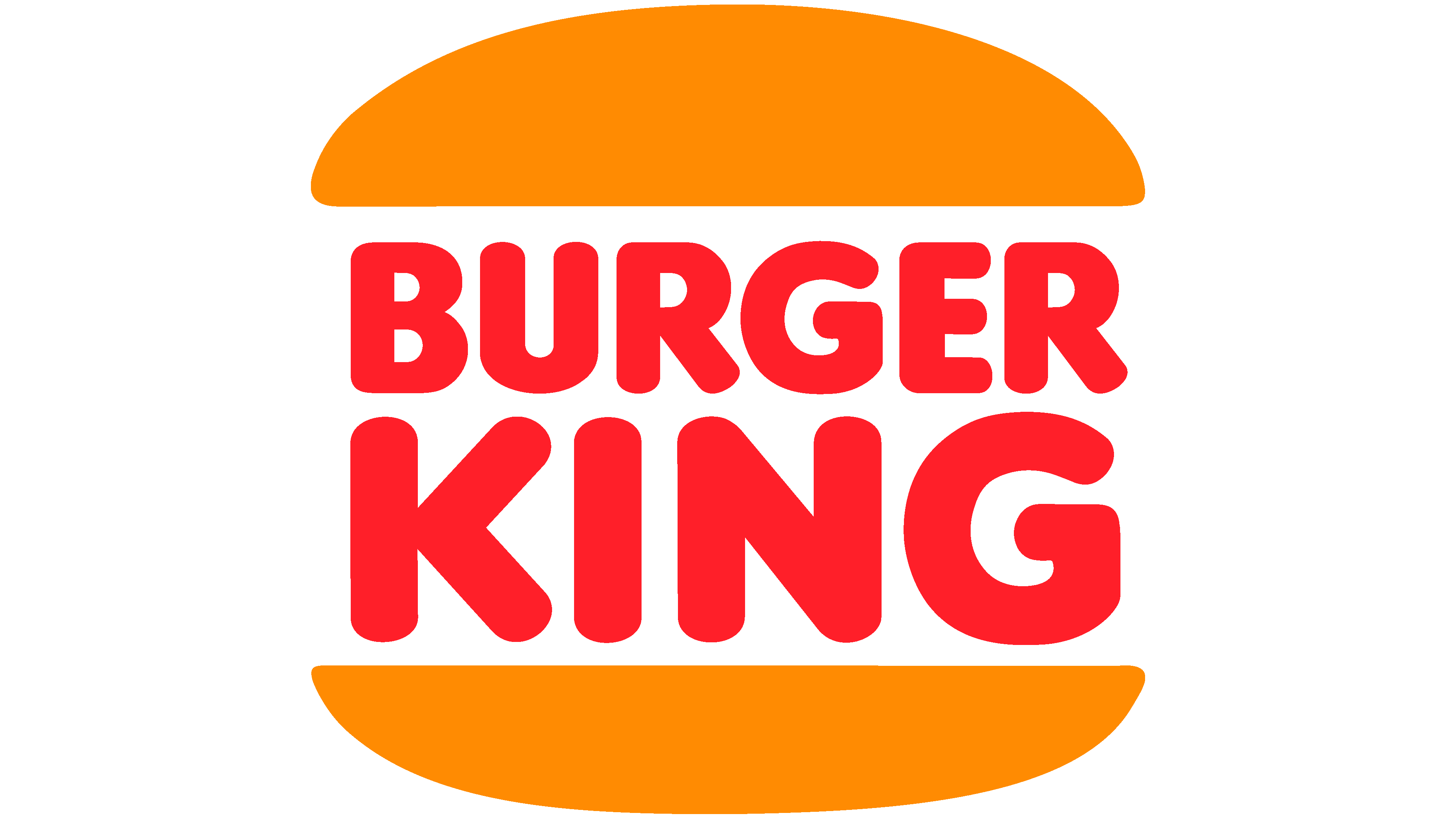
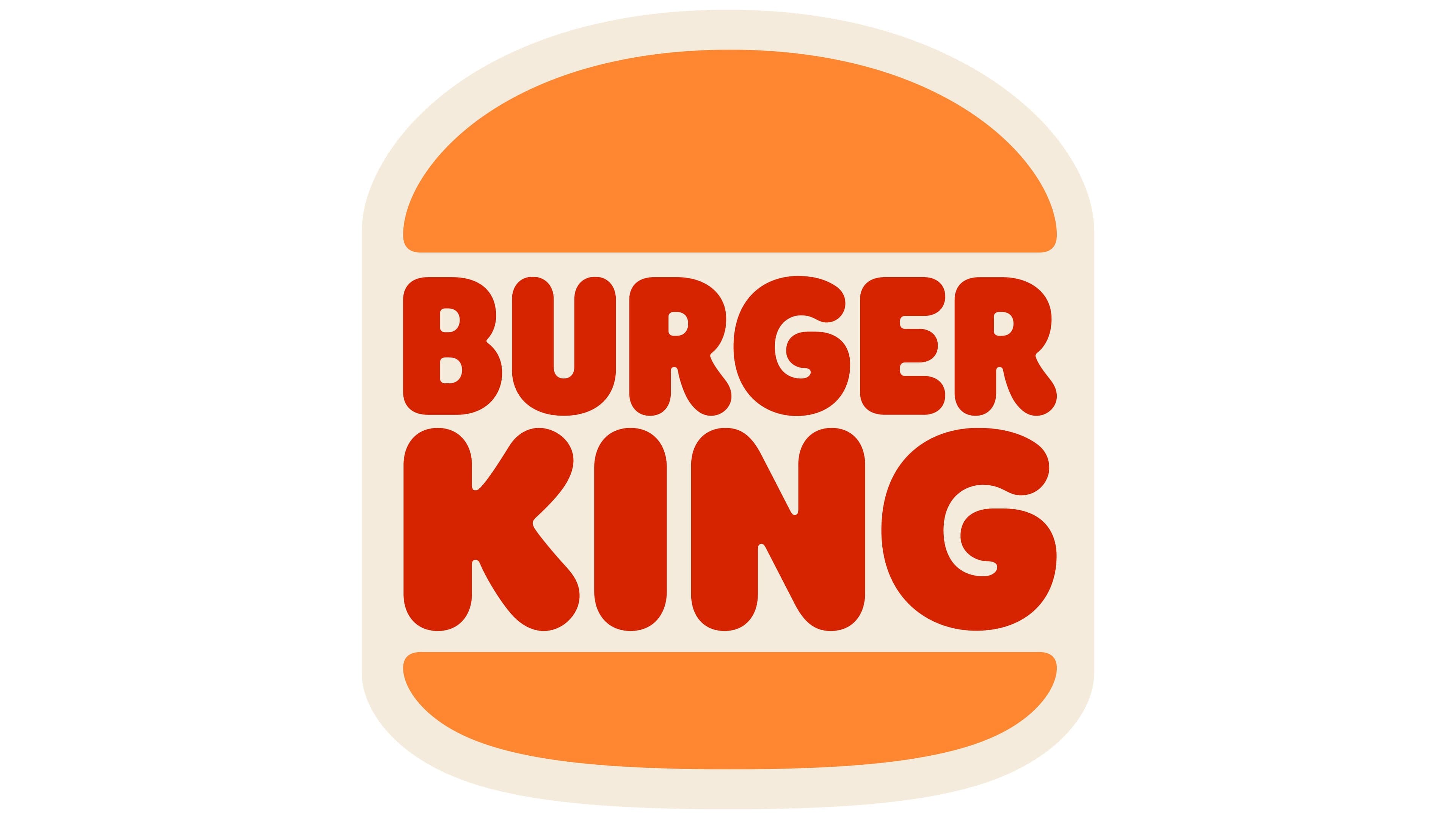
2021 – today
The current logo is a harmonious stylization of the two previous versions. From the 1969-1994 emblem, the designers borrowed rounded letters, and from the 1994-1999 version, the shape of a bun. The element that unites them is a light lilac background, on which is an impromptu yellow-orange burger with red lettering inside.
الشعار الحالي هو أسلوب متناغم للإصدارين السابقين. من شعار 1969-1994 ، استعار المصممون أحرفًا مستديرة ، ومن نسخة 1994-1999 ، شكل كعكة. العنصر الذي يوحدهم هو خلفية أرجوانية فاتحة ، وعليها برغر برتقالي أصفر مرتجل مع كتابة حمراء بالداخل.
FONT AND COLOR OF THE EMBLEM

Why did Burger King change its logo?
The Burger King logo was redesigned in 2021 because the owners wanted the new design to echo the classic 1969 concept, so it is a symbol of the beginning of a new era and a tribute to the past. The logo designers made it more “appetizing” by using the natural color of baked goods for the bun and the shade of a well-done cutlet for the text.
أعيد تصميم شعار برجر كينج في عام 2021 لأن المالكين أرادوا أن يعكس التصميم الجديد المفهوم الكلاسيكي لعام 1969 ، لذلك فهو رمز لبداية حقبة جديدة وإشادة بالماضي. جعله مصممو الشعار أكثر "فاتح للشهية" باستخدام اللون الطبيعي للمخبوزات للكعكة وظلال الكستليت الجيد للنص.
Thanks to constant renewal, brand identity is now recognizable all over the world. It visually stylized the name of the restaurant chain – Burger King. That is, the most successful variants have a large mouth-watering “burger king.”
بفضل التجديد المستمر ، أصبحت هوية العلامة التجارية معروفة الآن في جميع أنحاء العالم. إنه منمق بصريًا اسم سلسلة المطاعم - برجر كنج. وهذا يعني أن المتغيرات الأكثر نجاحًا لها "برجر كينج" الذي يسيل له اللعاب.

The Burger King logo has used different fonts at different times. They were smooth, bubbly, convex, streamlined, or, on the contrary, strict. One of the older versions resembles the TILT typeface, the modern ones – VAG Rounded ExtraBold.
استخدم شعار Burger King خطوطًا مختلفة في أوقات مختلفة. كانت سلسة ، شمبانيا ، محدبة ، مبسطة ، أو على العكس من ذلك صارمة. يشبه أحد الإصدارات القديمة محرف TILT ، والإصدارات الحديثة - VAG Rounded ExtraBold.
The corporate palette consists of colors that are as close as possible to the theme of food. They awaken the appetite, which is very important for the marketing promotion of a fast-food restaurant. Therefore, the management chose yellow-orange (the natural color of the crust of buns) and red, which actively whet the appetite.
تتكون لوحة الشركة من ألوان قريبة قدر الإمكان من موضوع الطعام. إنهم يوقظون الشهية ، وهو أمر مهم جدًا للترويج التسويقي لمطعم للوجبات السريعة. لذلك ، اختارت الإدارة اللون الأصفر البرتقالي (اللون الطبيعي لقشرة الكعك) والأحمر ، مما يؤدي إلى تنشيط الشهية.
Comments
Post a Comment