Family Dollar National Discount Stores cater to low-income families trying to save on everything from groceries to clothing and home furnishings. Therefore, most of the shelves are filled with American brands worth from $1 to $10. Another budget retailer, Dollar Tree, owns the retail chain. He moved the Family Dollar headquarters to Virginia and created new department store formats to find a better business model.
The Family Dollar retail chain was born thanks to the efforts of Leon Levine, who was inspired by the concept of “everything for the dollar” stores. In 1959, he opened the first outlet and named it after the target audience in honor of financially disadvantaged families. He made the right choice of demographic group: it was not long before sales revenue allowed him to create several more department stores. At the same time, the price threshold was raised because Leon understood that it was not profitable to offer everything for 1-2 dollars.
ولدت سلسلة متاجر فاميلي دولار بفضل جهود ليون ليفين ، الذي استوحى فكرة متاجر "كل شيء مقابل الدولار". في عام 1959 ، افتتح أول منفذ وأطلق عليه اسم الجمهور المستهدف تكريما للعائلات المحرومة ماليا. لقد قام بالاختيار الصحيح للمجموعة الديموغرافية: لم يمض وقت طويل قبل أن تسمح له عائدات المبيعات بإنشاء العديد من المتاجر الكبرى. في الوقت نفسه ، تم رفع الحد الأدنى للسعر لأن ليون أدرك أنه ليس من المربح عرض كل شيء مقابل 1-2 دولار.
The network expanded at an accelerated pace: by 1989, it included 1.5 thousand stores. And by 2011, there were more than 7 thousand of them. In 2015, the most significant event in the history of Family Dollar happened: the budget retailer was bought by rival company Dollar Tree. But there was no final merger: both brands operate independently because their business concepts are completely different. They have different supply chains, price ranges, and customer groups. Still, the new owner decided to rebrand some Family Dollar outlets, turning them into Dollar Tree. The integration was not complete, as the remaining locations continue to use the old name and logo, which has not changed since 2005.
توسعت الشبكة بوتيرة متسارعة: بحلول عام 1989 ، ضمت 1.5 ألف متجر. وبحلول عام 2011 ، كان هناك أكثر من 7 آلاف منهم. في عام 2015 ، حدث أهم حدث في التاريخ: تم شراء بائع التجزئة ذي الميزانية المحدودة من قبل شركة منافسة دولار تري. لكن لم يكن هناك اندماج نهائي: تعمل كلتا العلامتين التجاريتين بشكل مستقل لأن مفاهيم أعمالهما مختلفة تمامًا. لديهم سلاسل توريد مختلفة ونطاقات أسعار ومجموعات عملاء مختلفة. ومع ذلك ، قرر المالك الجديد تغيير العلامة التجارية لبعض منافذ فاميلي دولار ، وتحويلها إلى دولار تري. لم يكتمل التكامل ، حيث استمرت المواقع المتبقية في استخدام الاسم والشعار القديم ، والذي لم يتغير منذ 2005.
The retail chain has retained its identity to remain recognizable to regular customers. It can be said that throughout the company’s history, its graphic sign has hardly changed because it always contained an inscription made in bold capital letters without serifs. But in fact, there were changes and noticeable ones: after each redesign, the style became more understandable and closer to the original business concept.
In 1959, young entrepreneur Leon Levine opened his first self-service store and named it Family Dollar. By 1965, the number of outlets had been increased to three. Before becoming a retail giant, the company used a white-printed “FAMILY DOLLAR STORES” logo. It was intended primarily for signage, where the first two words were at the top and the third at the bottom, centered. Both parts were located in separate black rectangles with a white outline. For the text, the designers chose a simple geometric sans-serif typeface.
في عام 1959 ، افتتح رجل الأعمال الشاب ليون ليفين أول متجر للخدمة الذاتية وأطلق عليه اسم. بحلول عام 1965 ، تم زيادة عدد المنافذ إلى ثلاثة. قبل أن تصبح شركة عملاقة للبيع بالتجزئة ، استخدمت الشركة شعارًا مطبوعًا باللون الأبيض. كانت مخصصة في المقام الأول للافتات ، حيث كانت أول كلمتين في الأعلى والثالثة في الأسفل ، في المنتصف. تم وضع كلا الجزأين في مستطيلات سوداء منفصلة مع مخطط أبيض. بالنسبة للنص ، اختار المصممون محرفًا هندسيًا بسيطًا بلا سيريف.
In 1974, the chain opened its 200th-anniversary store and a new distribution center. At the same time, her sales began to fall, so she hired a team of marketers who had to change the strategy. Specialists suggested raising the maximum price threshold; as a result, the inscription of about “three dollars” was removed from the logo. Its redesign has become part of global changes.
The creators of the wordmark retained only the name of the company. The phrase “FAMILY DOLLAR” remained white, which is the only thing that connected the new design with the previous one. The font was no longer cartoony, but it still looked non-standard. The developers used bold grotesque with disproportionate glyphs. Inside “A,” “D,” and “R” were slits extending down parallel to the main stroke. At the same time, almost all the letters, as before, crawled on top of each other. A dark crimson outline replaced the black background. At the bottom, it looked like a solid horizontal line, so the inscription seemed stable and monolithic.
احتفظ منشئو العلامة النصية باسم الشركة فقط. بقيت العبارة بيضاء ، وهو الشيء الوحيد الذي ربط التصميم الجديد بالتصميم السابق. لم يعد الخط كارتوني ، لكنه لا يزال يبدو غير قياسي. استخدم المطورون بشع جريء مع صور رمزية غير متناسبة. كانت الشقوق تمتد إلى الأسفل بالتوازي مع السكتة الدماغية الرئيسية. في الوقت نفسه ، تزحف جميع الحروف تقريبًا ، كما كان من قبل ، فوق بعضها البعض. حل مخطط قرمزي غامق محل الخلفية السوداء. في الجزء السفلي ، بدا وكأنه خط أفقي صلب ، لذلك بدا النقش مستقرًا ومتجانسة.
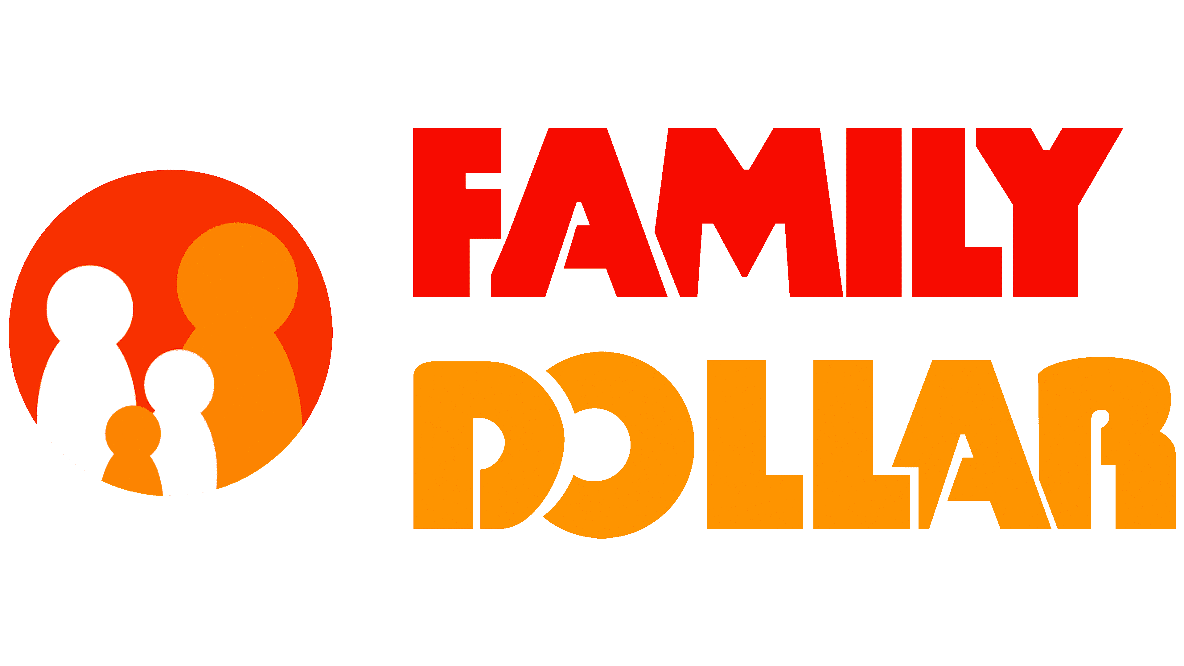
In 2003, the company was inherited by Howard R. Levine. A couple of years later, the logo was changed under his leadership. The designers divided the brand name into two parts, placing a red circle between them with four figurines of white and orange men. The word “FAMILY” became red, and “DOLLAR” was recolored orange. The inscription “my family, my family dollar” appeared on the right side with a dot at the end. Everything after the comma is in bold. The slogan is reduced to such an extent that it fits perfectly under the word “DOLLAR” – from “D” to “R” inclusive. The general background is white; there are no contours around the letters.
في عام 2003 ، ورث الشركة هوارد آر ليفين. بعد عامين ، تم تغيير الشعار تحت قيادته. قسّم المصممون اسم العلامة التجارية إلى قسمين ، ووضعوا بينهما دائرة حمراء بها أربعة تماثيل لرجال أبيض وبرتقالي. أصبحت الكلمة حمراء ، وأعيد تلوينها باللون البرتقالي. ظهر النقش "عائلتي ، دولار عائلتي" على الجانب الأيمن مع نقطة في النهاية. كل شيء بعد الفاصلة بخط عريض. تم تقليص الشعار إلى درجة تناسبه تمامًا تحت كلمة "شامل". الخلفية العامة بيضاء. لا توجد ملامح حول الحروف.
At the same time, an alternate logo was used several times on the TV program Save to Win. Its base is a red rectangle. Inside is the same red word “FAMILY” with a white outline, and below it is an orange “DOLLAR” with a dot in the center of the “O.”
في الوقت نفسه ، تم استخدام شعار بديل عدة مرات في البرنامج التلفزيوني. قاعدته مستطيل أحمر. بالداخل توجد نفس الكلمة الحمراء ذات مخطط أبيض وأسفلها برتقالية مع نقطة في وسط الحرف

The chain of discount stores, known for its lucrative discounts, targets low-income families. And this is reflected not only in its name but also in the logo. Indeed, in addition to the inscriptions, it contains around icon which depicts a family of four: judging by the size, two adults and two children. This element was added to inspire confidence in the core demographic. The concept did not change even after the Family Dollar Company became the property of Dollar Tree.
سلسلة متاجر التخفيضات ، المعروفة بخصوماتها المربحة ، تستهدف الأسر ذات الدخل المنخفض. وهذا لا ينعكس فقط في اسمها ولكن أيضًا في الشعار. في الواقع ، بالإضافة إلى النقوش ، فإنه يحتوي على أيقونة تصور عائلة مكونة من أربعة أفراد: بالحجم ، شخصان بالغان وطفلان. تمت إضافة هذا العنصر لبث الثقة في جوهر التركيبة السكانية. لم يتغير المفهوم حتى بعد أن أصبح الملكية
Judging by the unusual shape of the letters, the designers used a modified Tabasco Bold font from SoftMaker for the brand name. This is a retro sans serif inspired by the John Schaedler typeface of the same name. It is characterized by a lack of proportionality and a pronounced asymmetry of some letters. The slogan is written in a standard sans-serif font: one half has a normal style, and the other half is bold.
انطلاقًا من الشكل غير المعتاد للأحرف ، استخدم المصممون خطًا معدلًا من اسم العلامة التجارية. هذا ريترو مستوحى من الخط الذي يحمل نفس الاسم. يتميز بنقص التناسب وعدم تناسق واضح في بعض الحروف. الشعار مكتوب بخط قياسي: نصف نمط عادي ، والنصف الآخر بخط عريض.

To draw attention to the brand name, its creators combined two bright colors: red (#ef4136) and orange (#f89d33). They are visually balanced because they are complemented by white, which is used not only for the background but also for the icon.
لجذب الانتباه إلى اسم العلامة التجارية ، قام منشئوها بدمج لونين ساطعين: الأحمر والبرتقالي. إنها متوازنة بصريًا لأنها مكملة باللون الأبيض ، والتي لا تستخدم فقط للخلفية ولكن أيضًا للأيقونة.
Comments
Post a Comment