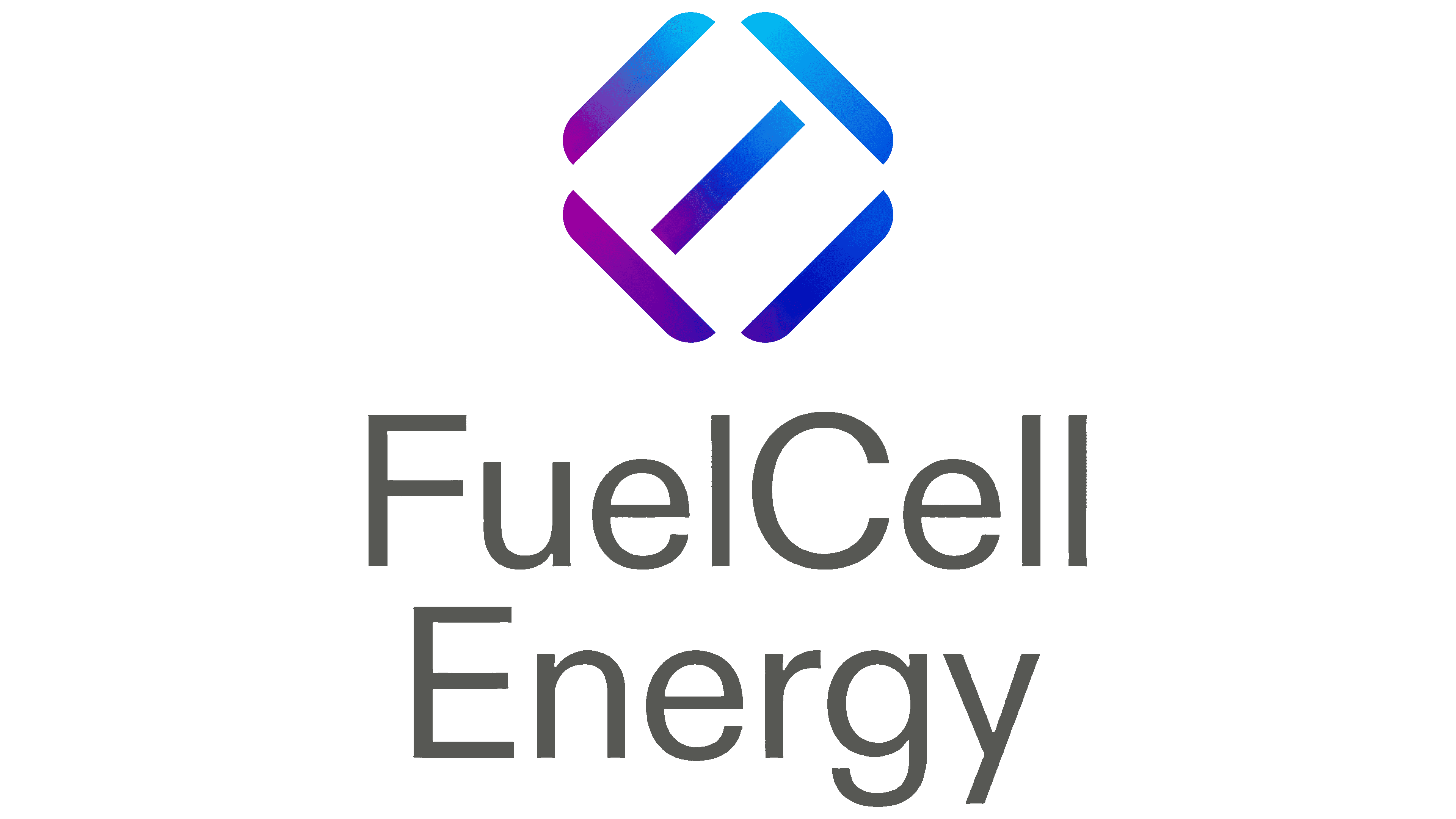
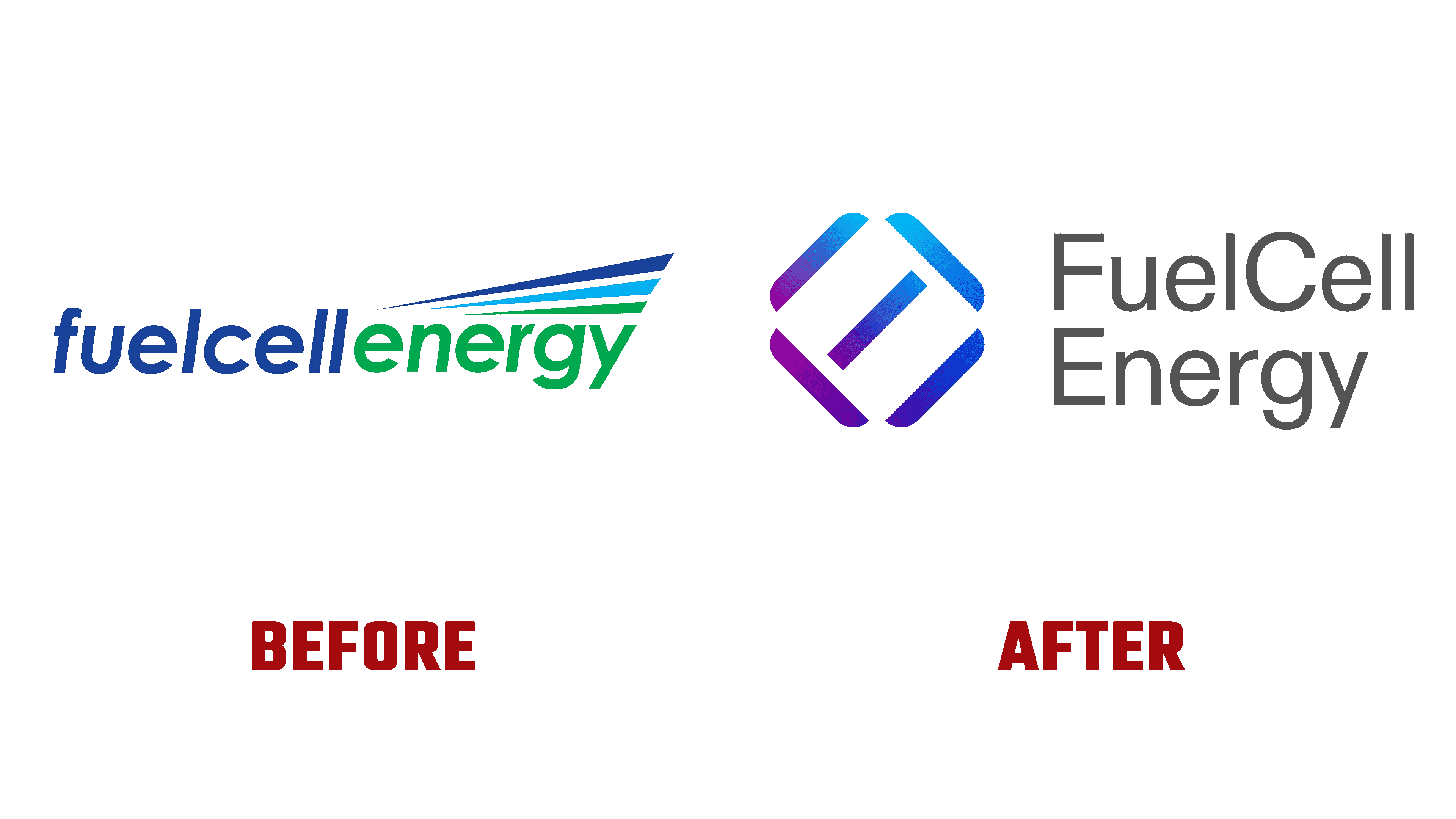
One of the largest fuel cell manufacturers in the US, headquartered in Danbury, Connecticut, public company FuelCell Energy has changed its visual identity. Founded in 1969, today, it designs, manufactures, operates, and services molten carbonate power plants. This technology is an alternative to traditional combustion-based power generation, becoming an effective complement to intermittent power sources such as solar and wind. Over the years of its existence, the brand has become one of the largest producers and suppliers in the US of clean energy, supplied to more than 50 countries worldwide. The brand operates the world’s largest Gyeonggi Green Energy fuel cell park in South Korea and the largest park in North America. The brand covers commercial and industrial enterprises, municipalities, and educational institutions, constantly expanding its customer base with its services. The ongoing changes in the development of the brand, one of the main objectives of which was the pursuit of zero carbon emissions, are reflected in the recently introduced new corporate identity.
واحدة من أكبر الشركات المصنعة لخلايا الوقود في الولايات المتحدة ، ومقرها في دانبري ، كونيتيكت ، غيّرت شركة FuelCell Energy العامة هويتها المرئية. تأسست في عام 1969 ، واليوم ، تقوم بتصميم وتصنيع وتشغيل وخدمة محطات توليد الطاقة من الكربونات المنصهرة. هذه التكنولوجيا هي بديل لتوليد الطاقة التقليدية القائمة على الاحتراق ، لتصبح مكملاً فعالاً لمصادر الطاقة المتقطعة مثل الطاقة الشمسية وطاقة الرياح. على مدار سنوات وجودها ، أصبحت العلامة التجارية واحدة من أكبر منتجي وموردي الطاقة النظيفة في الولايات المتحدة ، حيث يتم توفيرها إلى أكثر من 50 دولة حول العالم. تدير العلامة التجارية أكبر مجمع لخلية الوقود في Gyeonggi Green Energy في كوريا الجنوبية وأكبر منتزه في أمريكا الشمالية. تغطي العلامة التجارية المؤسسات التجارية والصناعية والبلديات والمؤسسات التعليمية ، وتعمل باستمرار على توسيع قاعدة عملائها بخدماتها. تنعكس التغييرات المستمرة في تطوير العلامة التجارية ، والتي كان أحد أهدافها الرئيسية السعي وراء انبعاثات كربونية صفرية ، في هوية الشركة الجديدة التي تم تقديمها مؤخرًا.
The desire to lead humanity into a carbon-neutral future has become the main goal of the brand’s development. The new visualization was formed to signal to customers, communities, and employees about the company’s absolute commitment to providing a safe, reliable, and practical approach to achieving the set goal. The new brand reflects the energy platform’s purpose, functions, and features. The created design, built on three reference points, determines the path which the company follows. Initially, the use of color gradients was introduced as evidence of the passage of the path to the goal. The minimization of visual elements and reflection systems symbolized the reduction in the area of the design system, which confirms the seamless implementation of clean energy. The color scheme was chosen in such a way as to reduce the visual toxicity of the impact on the viewer, which led to the abandonment of the previously adopted corporate green color.
أصبحت الرغبة في قيادة البشرية إلى مستقبل خالٍ من الكربون الهدف الرئيسي لتطوير العلامة التجارية. تم تشكيل التصور الجديد للإشارة إلى العملاء والمجتمعات والموظفين حول التزام الشركة المطلق بتوفير نهج آمن وموثوق وعملي لتحقيق الهدف المحدد. تعكس العلامة التجارية الجديدة الغرض من منصة الطاقة ووظائفها وميزاتها. يحدد التصميم الذي تم إنشاؤه ، المبني على ثلاث نقاط مرجعية ، المسار الذي تتبعه الشركة. في البداية ، تم تقديم استخدام التدرجات اللونية كدليل على مرور المسار إلى الهدف. يرمز تقليل العناصر المرئية وأنظمة الانعكاس إلى الحد من مساحة نظام التصميم ، مما يؤكد التنفيذ السلس للطاقة النظيفة. تم اختيار نظام الألوان بطريقة تقلل السمية البصرية للتأثير على العارض ، مما أدى إلى التخلي عن اللون الأخضر للشركة الذي تم اعتماده مسبقًا.

The whole identity was inspired by the large and positive history of the company, which offers universal fuel cells running on biogas and natural gas, as well as their mixtures with hydrogen. The design was based on the effect of molecular bonds that break down to create a different chemical reaction.
الهوية الكاملة مستوحاة من التاريخ الكبير والإيجابي للشركة ، التي تقدم خلايا وقود عالمية تعمل بالغاز الحيوي والغاز الطبيعي ، بالإضافة إلى خلطاتها مع الهيدروجين. اعتمد التصميم على تأثير الروابط الجزيئية التي تتفكك لخلق تفاعل كيميائي مختلف.
The unique typography in the form of letterforms, including FCEL, has become a spectacular stock sticker. Its development has provided an accent element in the growth strategy, demonstrating a redoubling of efforts to achieve the set goals.
أصبحت الطباعة الفريدة في شكل أشكال الحروف ، بما في ذلك FCEL ، ملصقًا رائعًا للمخزون. لقد وفر تطورها عنصرًا بارزًا في استراتيجية النمو ، مما يدل على مضاعفة الجهود لتحقيق الأهداف المحددة.
Comments
Post a Comment