Today, probably, no person in the civilized world would not know who Harry Potter is. The name of this fictional character rattled on the lips in 1997, when the first book of the English writer Joan Rowling about an unusual school of magic, its teachers and students, went out of print. Now the image of a boy with glasses and with a magic wand in his hand, as well as an unusual spelling of his name is as recognizable as, for example, the logo of McDonald’s or Adidas.
اليوم ، على الأرجح ، لن يعرف أي شخص في العالم المتحضر من هو هاري بوتر. هز اسم هذه الشخصية الخيالية على الشفاه في عام 1997 ، عندما نفد طبع أول كتاب للكاتب الإنجليزي جوان رولينغ عن مدرسة غير عادية للسحر ، ومعلميها وطلابها. الآن ، يمكن التعرف على صورة صبي يرتدي نظارات وبيده عصا سحرية ، بالإضافة إلى تهجئة غير عادية لاسمه مثل شعار ماكدونالدز أو أديداس على سبيل المثال.
MEANING AND HISTORY
The first Harry Potter book was published on July 26, 1997. As Rowling herself later admitted, she offered the manuscript to many publishers for several years but was refused everywhere. The story of magic and strange heroes seemed uninteresting to the reader.
نُشر أول كتاب لهاري بوتر في 26 يوليو 1997. وكما اعترفت رولينج نفسها لاحقًا ، فقد عرضت المخطوطة على العديد من الناشرين لعدة سنوات ولكن تم رفضها في كل مكان. بدت قصة السحر والأبطال الغريبين غير ممتعة للقارئ.
But after the release of the first part, the book immediately became a bestseller. To date, seven books have been released, and 10 Potteriana films have been shot (8 for books plus spin-offs and a sequel to it). Books and movies have been translated into 80 languages, nearly 700 million copies have been sold – this is the most widely read literary work in history. The number of movie views cannot even be calculated exactly – in movie theaters, the box office is almost $ 2 billion.
ولكن بعد إصدار الجزء الأول ، أصبح الكتاب على الفور من أكثر الكتب مبيعًا. حتى الآن ، تم إصدار سبعة كتب ، وتم تصوير 10 أفلام من طراز Potteriana (8 للكتب بالإضافة إلى العناصر الفرعية وتكملة لها). تمت ترجمة الكتب والأفلام إلى 80 لغة ، وتم بيع ما يقرب من 700 مليون نسخة - وهذا هو العمل الأدبي الأكثر قراءة على نطاق واسع في التاريخ. لا يمكن حتى حساب عدد مشاهدات الفيلم بالضبط - في دور السينما ، تبلغ شباك التذاكر ما يقرب من 2 مليار دولار.
The Harry Potter trademark was patented in 1997 for book design.
تم تسجيل براءة اختراع علامة هاري بوتر التجارية في عام 1997 لتصميم الكتب.
1997 – today
In the first English edition, the name was made in a rather minimalistic presentation – the name of the hero, written in the Gothic font Cochin Bold with a small stepwise arrangement of letters.
في الطبعة الإنجليزية الأولى ، تم تقديم الاسم في عرض تقديمي بسيط إلى حد ما - اسم البطل ، مكتوب بالخط القوطي Cochin Bold مع ترتيب صغير متدرج للأحرف.
After the first success in Europe, the book was republished in the USA – then a special spelling of the letter P appeared – zigzag lightning was added to it below, symbolizing the magic power emanating from the magic wand. Another association is the scar on Harry Potter’s forehead, which he received at the age of 1 from the hands of the dark magician Volan de Mort. The color of the letters on the logo is black.
بعد النجاح الأول في أوروبا ، أعيد نشر الكتاب في الولايات المتحدة - ثم ظهر تهجئة خاصة للحرف P - تمت إضافة البرق المتعرج إليه أدناه ، مما يرمز إلى القوة السحرية المنبثقة من العصا السحرية. ارتباط آخر هو الندبة الموجودة على جبين هاري بوتر ، والتي تلقاها في سن 1 من يدي الساحر الأسود فولان دي مورت. لون الحروف على الشعار أسود.
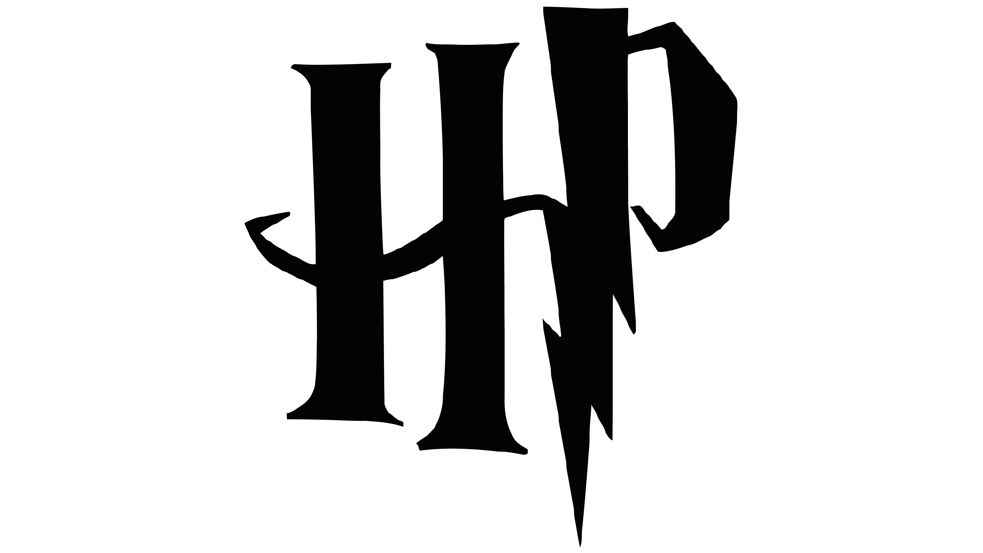
A short emblem was created at the same time. Consisting of recognizable letters H and P, surrounded by a discontinuous oval and a flying ball with wings. All done in gold color.
تم إنشاء شعار قصير في نفس الوقت. يتألف من حرفين مميزين H و P ، ويحيط بهما شكل بيضاوي متقطع وكرة طائرة بأجنحة. كل ذلك باللون الذهبي.
2001 – 2002
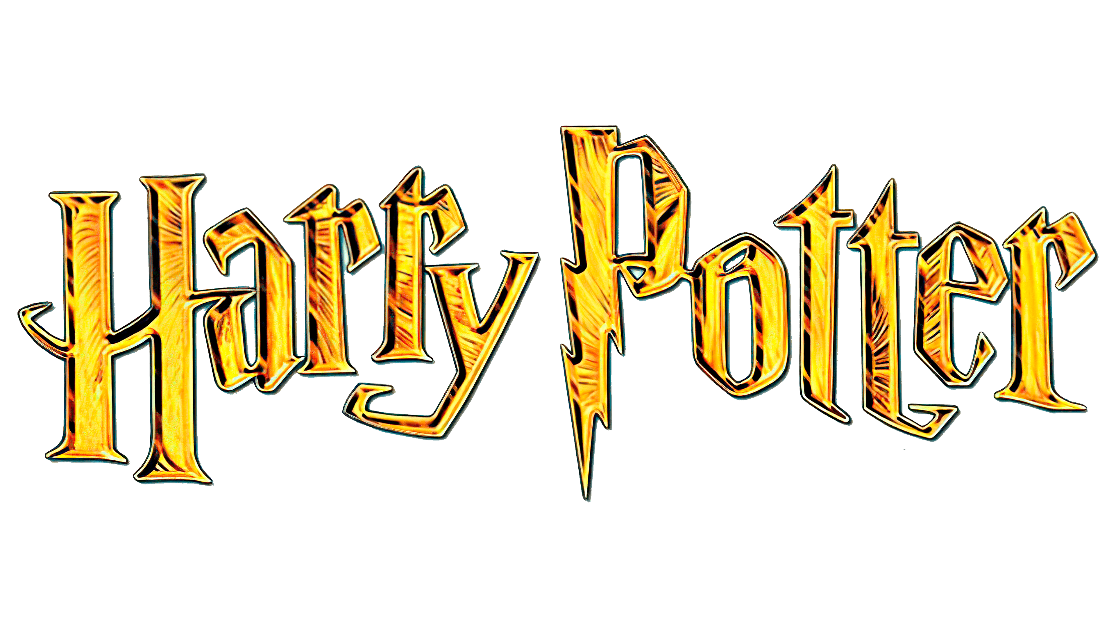
In 2001, with the release of the first film, the logo changed color to gold with shadows that create the impression of volume. The effect of crushed foil is also used.
في عام 2001 ، مع إصدار الفيلم الأول ، تغير لون الشعار إلى اللون الذهبي مع ظلال تخلق انطباعًا بالحجم. يتم استخدام تأثير الرقائق المكسرة أيضًا.
2004 – 2011
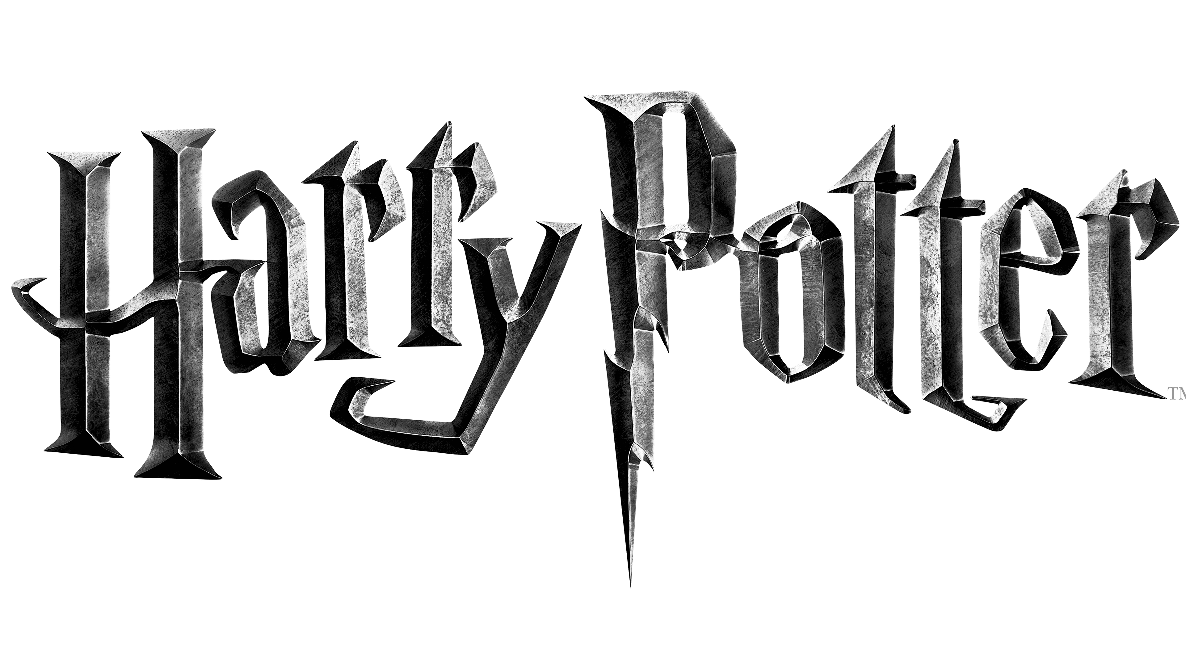
The logo again changed color – to gray-silver with a black shade placed randomly. This gave the words a special mystery, eerie, and emphasized the gloomy atmosphere of what is happening in the 3rd part of the film. This decision was made by its director Alfonso Cuaron. The symbol TM was added to the bottom right – a sign that the trademark is officially registered and protected. Subsequently, the entire filmography of Potteriana was performed with this logo.
تم تغيير لون الشعار مرة أخرى - إلى الرمادي الفضي مع وضع الظل الأسود بشكل عشوائي. أعطى هذا الكلمات لغزا خاصا ، وغريبا ، وأكد على الجو القاتم لما يحدث في الجزء الثالث من الفيلم. اتخذ هذا القرار من قبل مديرها ألفونسو كوارون. تمت إضافة رمز TM إلى أسفل اليمين - إشارة إلى أن العلامة التجارية مسجلة رسميًا ومحمية. بعد ذلك ، تم تنفيذ فيلم Potteriana بأكمله بهذا الشعار.
FONT AND COLOR OF THE EMBLEM

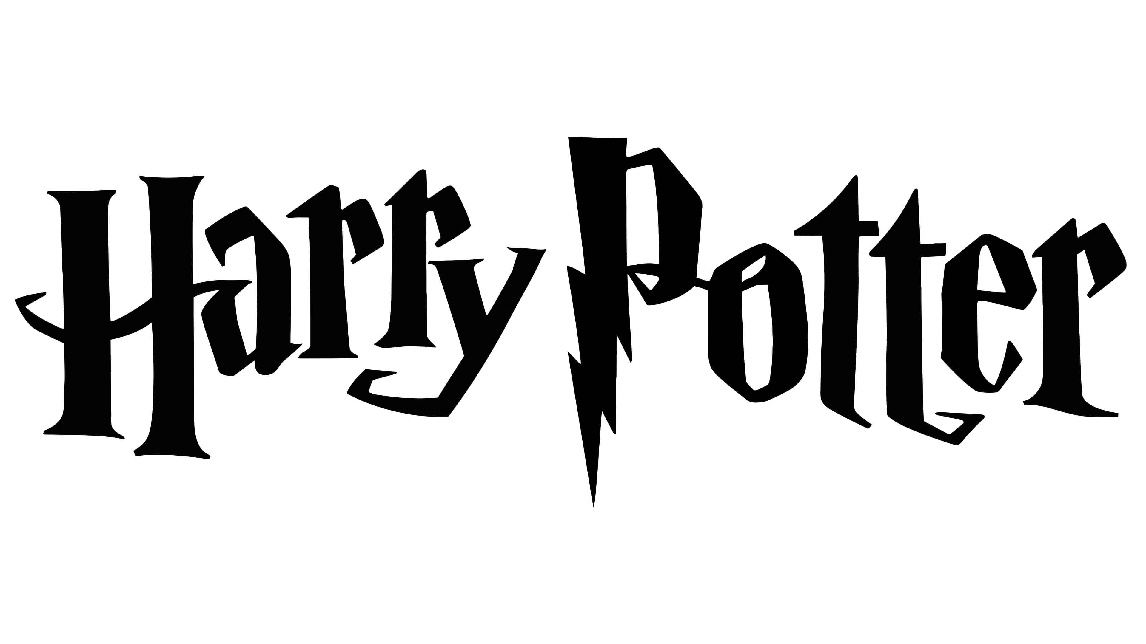
Since 2011, the letters have again changed the color and a little proportion of them. Topical today are white letters on a black background, and black on white, yellow, gold, and silver spelling can also be used. As the label owners said, the color scheme is not a unique part of the logo. The font of Cochin Bold was slightly changed – the letters became a little wider; the sharp corners were softened – since that time, it received the individual name, Harry Potter.
منذ عام 2011 ، تغيرت الحروف مرة أخرى اللون ونسبة قليلة منها. الموضوع اليوم عبارة عن أحرف بيضاء على خلفية سوداء ، ويمكن أيضًا استخدام تهجئة باللون الأسود في الأبيض والأصفر والذهبي والفضي. كما قال أصحاب الملصقات ، فإن نظام الألوان ليس جزءًا فريدًا من الشعار. تم تغيير خط Cochin Bold قليلاً - أصبحت الحروف أوسع قليلاً ؛ تم تخفيف الزوايا الحادة - منذ ذلك الوقت ، حصلت على الاسم الفردي ، هاري بوتر.
The Harry Potter logo will forever remain in history in its unique spelling, and the author of the books promises another five parts.
سيبقى شعار هاري بوتر في التاريخ إلى الأبد في تهجئته الفريدة ، ويعد مؤلف الكتب بخمسة أجزاء أخرى.

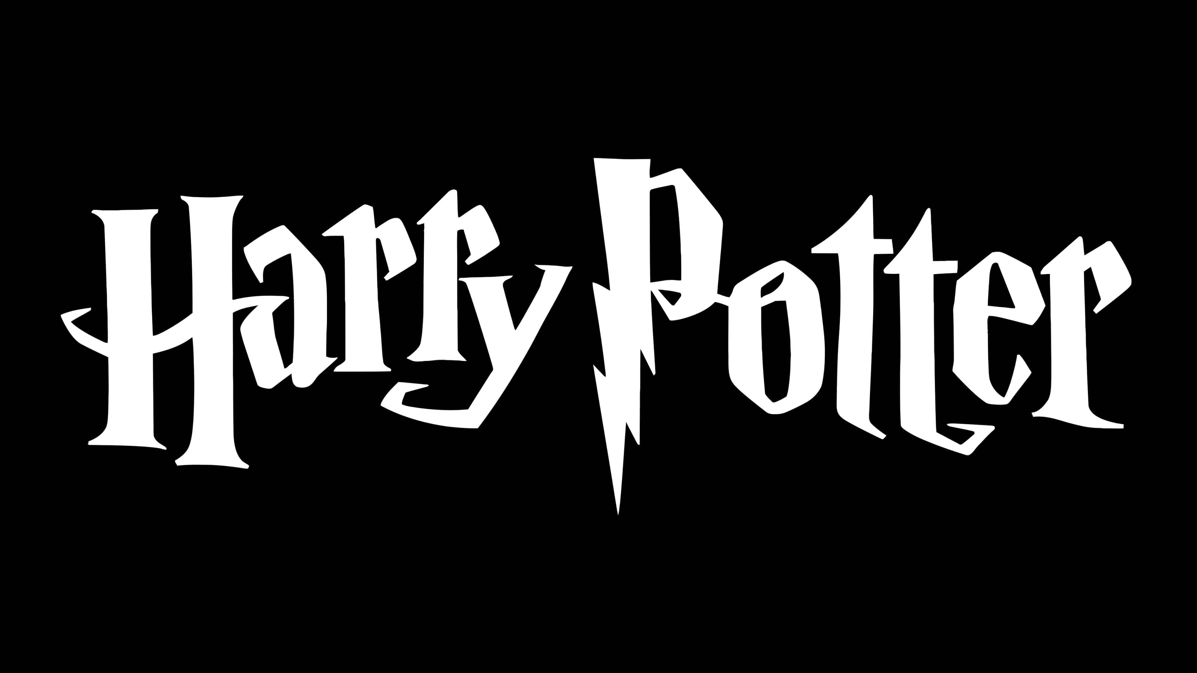
The Harry Potter lettering looks recognizable. The designers used long, curved serifs, broken strokes, and bouncing letters to convey the magical world’s mood. The personalized font features a triangular top “t,” a capital “P” with a zigzag zipper, and an asymmetrical “H” with vertical lines reminiscent of columns of different heights.
تبدو حروف هاري بوتر معروفة. استخدم المصممون الخطوط الرفيعة الطويلة والمنحنية والسكتات الدماغية المكسورة والحروف المرتدة للتعبير عن مزاج العالم السحري. يتميز الخط المخصص بحرف مثلث علوي "t" ، وحرف "P" كبير مع سحاب متعرج ، و "H" غير متماثل مع خطوط عمودية تذكرنا بأعمدة ذات ارتفاعات مختلفة.
A simple black and white logo are used, although earlier, there were brighter versions: the inscription was stylized first in gold and then in silver. The designers tried to convey the shine and texture of precious materials using a gradient. But the metal imitation did not take root, and the developers returned to the black and white version.
تم استخدام شعار بسيط بالأبيض والأسود ، على الرغم من وجود نسخ أكثر إشراقًا في وقت سابق: تم منمق النقش أولاً بالذهب ثم باللون الفضي. حاول المصممون نقل لمعان وملمس المواد الثمينة باستخدام التدرج اللوني. لكن التقليد المعدني لم يتجذر ، وعاد المطورون إلى النسخة بالأبيض والأسود.
Comments
Post a Comment