Unified Email Marketing Client Platform – Klaviyo of BOSTON, MA, founded in 2012, has changed its look. To offer the best-personalized experience, an infinitely scalable customer infrastructure, expert guidance, and full ownership of data and relationships, the brand is constantly improving and developing, spanning a wide range of businesses from small family stores to international super brands. As it expanded and increased its success, the company experienced tremendous growth, doubling its headcount and raising its funding levels. Designed as a great add-on for Klaviyo e-commerce platforms, it can also be used as a standalone tool. Its application provides everything you need to create powerful email companies, providing a reliable way to connect with all your existing audiences on a deeper level through meaningful email flows and messages. To facilitate the use and implementation of the operation, the developers have introduced many useful functions into the program, attractive templates, and the ability to automate marketing. All this required to be reflected in the external identity of the brand, which today represents a completely new visual design.
النظام الأساسي الموحد لعملاء التسويق عبر البريد الإلكتروني - غيّر Klaviyo من بوسطن ، ماساتشوستس ، الذي تأسس في عام 2012 ، شكله. لتقديم أفضل تجربة مخصصة ، وبنية تحتية للعملاء قابلة للتطوير بشكل لا نهائي ، وإرشادات الخبراء ، والملكية الكاملة للبيانات والعلاقات ، فإن العلامة التجارية تتحسن وتتطور باستمرار ، وتشمل مجموعة واسعة من الشركات من المتاجر العائلية الصغيرة إلى العلامات التجارية الكبرى الدولية. مع توسعها وزيادة نجاحها ، شهدت الشركة نموًا هائلاً ، حيث ضاعفت عدد موظفيها ورفعت مستويات تمويلها. تم تصميمه كإضافة رائعة لمنصات التجارة الإلكترونية Klaviyo ، ويمكن استخدامه أيضًا كأداة قائمة بذاتها. يوفر تطبيقه كل ما تحتاجه لإنشاء شركات بريد إلكتروني قوية ، مما يوفر طريقة موثوقة للاتصال بجميع جماهيرك الحالية على مستوى أعمق من خلال تدفقات البريد الإلكتروني والرسائل ذات المغزى. لتسهيل استخدام العملية وتنفيذها ، أدخل المطورون العديد من الوظائف المفيدة في البرنامج ، والقوالب الجذابة ، والقدرة على أتمتة التسويق. كل هذا يجب أن ينعكس في الهوية الخارجية للعلامة التجارية ، والتي تمثل اليوم تصميمًا مرئيًا جديدًا تمامًا.
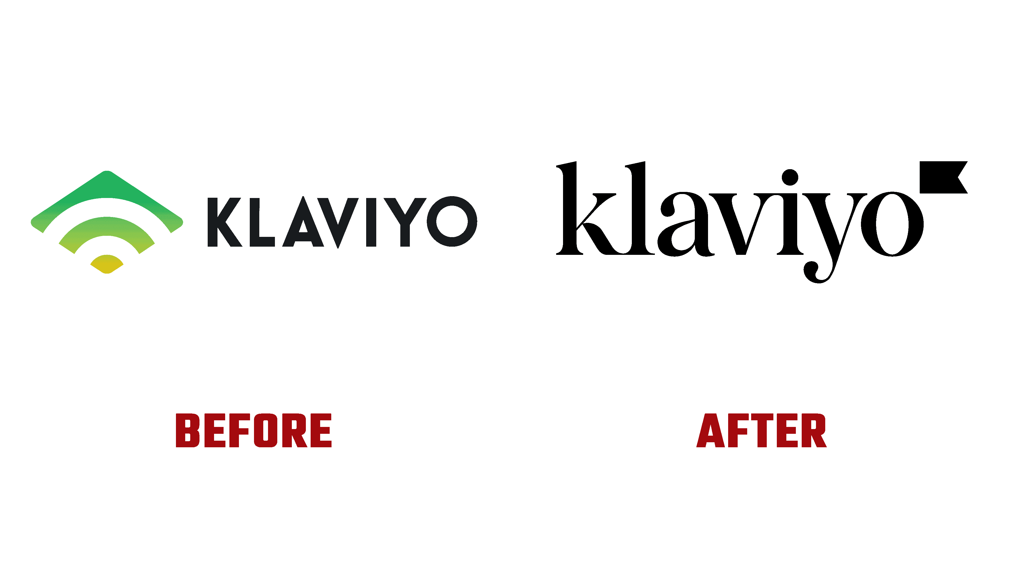
The change of identity included introducing new work on the logo, iconography, and images. The wordmark was changed, represented by an original and more attractive font. In combination with all the changes, the color palette began to reflect the mission and values of the platform more accurately. The updated identity was based on the important idea that, at any scale, meaningful connections matter more than ever, putting the inviolability of ownership at the forefront.
شمل تغيير الهوية إدخال عمل جديد على الشعار والأيقونات والصور. تم تغيير العلامة النصية ، ممثلة بخط أصلي وأكثر جاذبية. بالاقتران مع جميع التغييرات ، بدأت لوحة الألوان تعكس مهمة النظام الأساسي وقيمه بدقة أكبر. استندت الهوية المحدثة إلى فكرة مهمة مفادها أن الاتصالات الهادفة ، على أي نطاق ، مهمة أكثر من أي وقت مضى ، مما يضع حرمة الملكية في المقدمة.

The brand name is the image of the flag, designed to reflect several qualities and principles that underlie the use of the platform – data ownership, communities, leadership, and speed of development. An important role in the transfer of basic information is also played by the color palette, where mostly neutral tones are used but with accent splashes of bright color elements. The imagery used in the renderings is warm and documentary, demonstrating the confidence and strength of both Klaviyo and his clients.
اسم العلامة التجارية هو صورة العلم ، وهو مصمم ليعكس العديد من الصفات والمبادئ التي تكمن وراء استخدام النظام الأساسي - ملكية البيانات والمجتمعات والقيادة وسرعة التطوير. تلعب لوحة الألوان أيضًا دورًا مهمًا في نقل المعلومات الأساسية ، حيث يتم استخدام نغمات محايدة في الغالب ولكن مع بقع تمييز لعناصر الألوان الزاهية. الصور المستخدمة في العروض دافئة ووثائقية ، مما يدل على ثقة وقوة كل من Klaviyo وعملائه.
The visual identity has become a spectacular reflection of the maturity and evolution of the company and its characteristics in a sea of technical similarities. It helped stand out with a modern take on a classic organic serif typeface that will last for years to come.
أصبحت الهوية المرئية انعكاسًا مذهلاً لنضج وتطور الشركة وخصائصها في بحر من أوجه التشابه التقنية. لقد ساعد في التميز بأسلوب حديث على محرف سيريف عضوي كلاسيكي سيستمر لسنوات قادمة.
Comments
Post a Comment