MEANING AND HISTORY
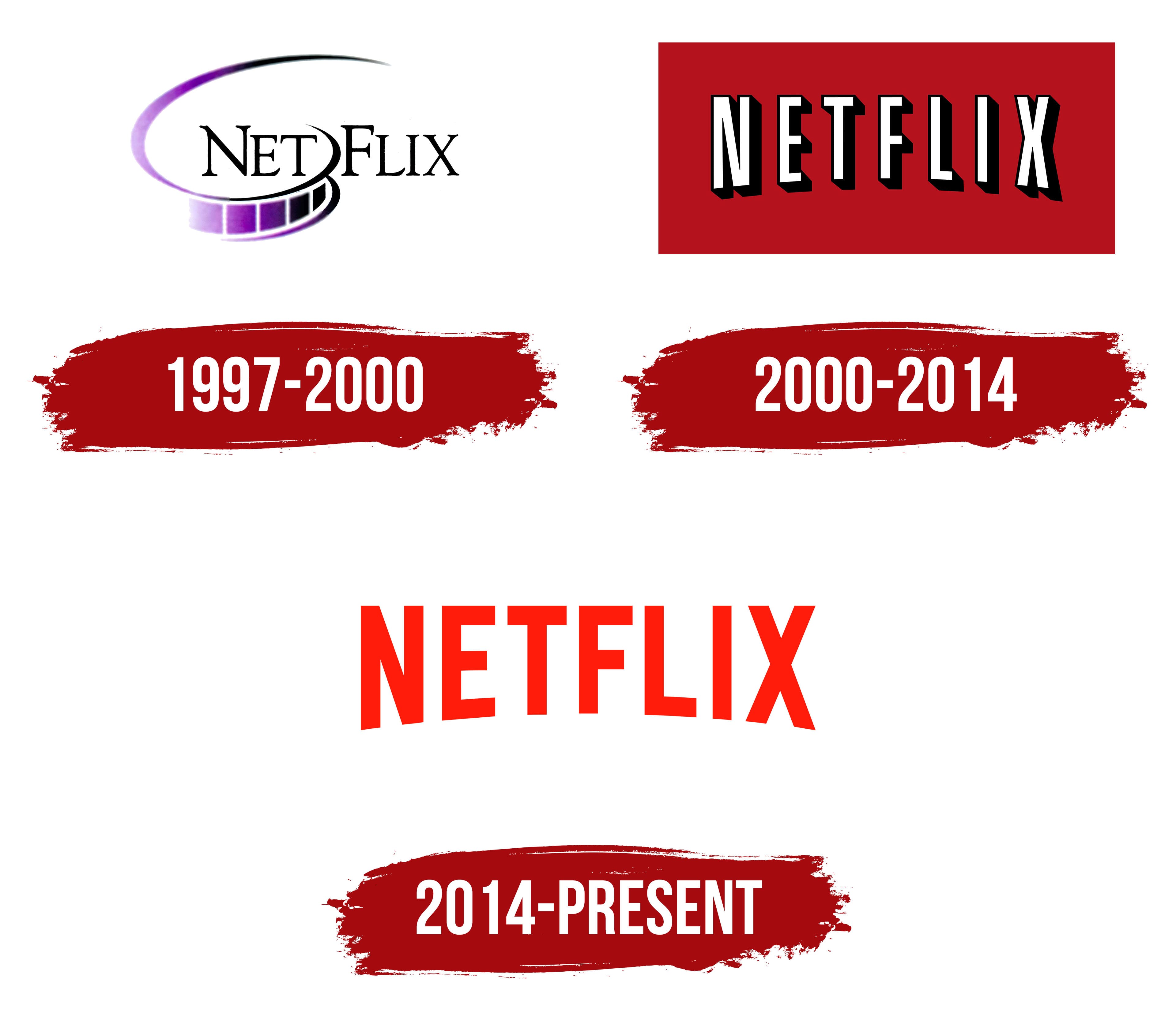
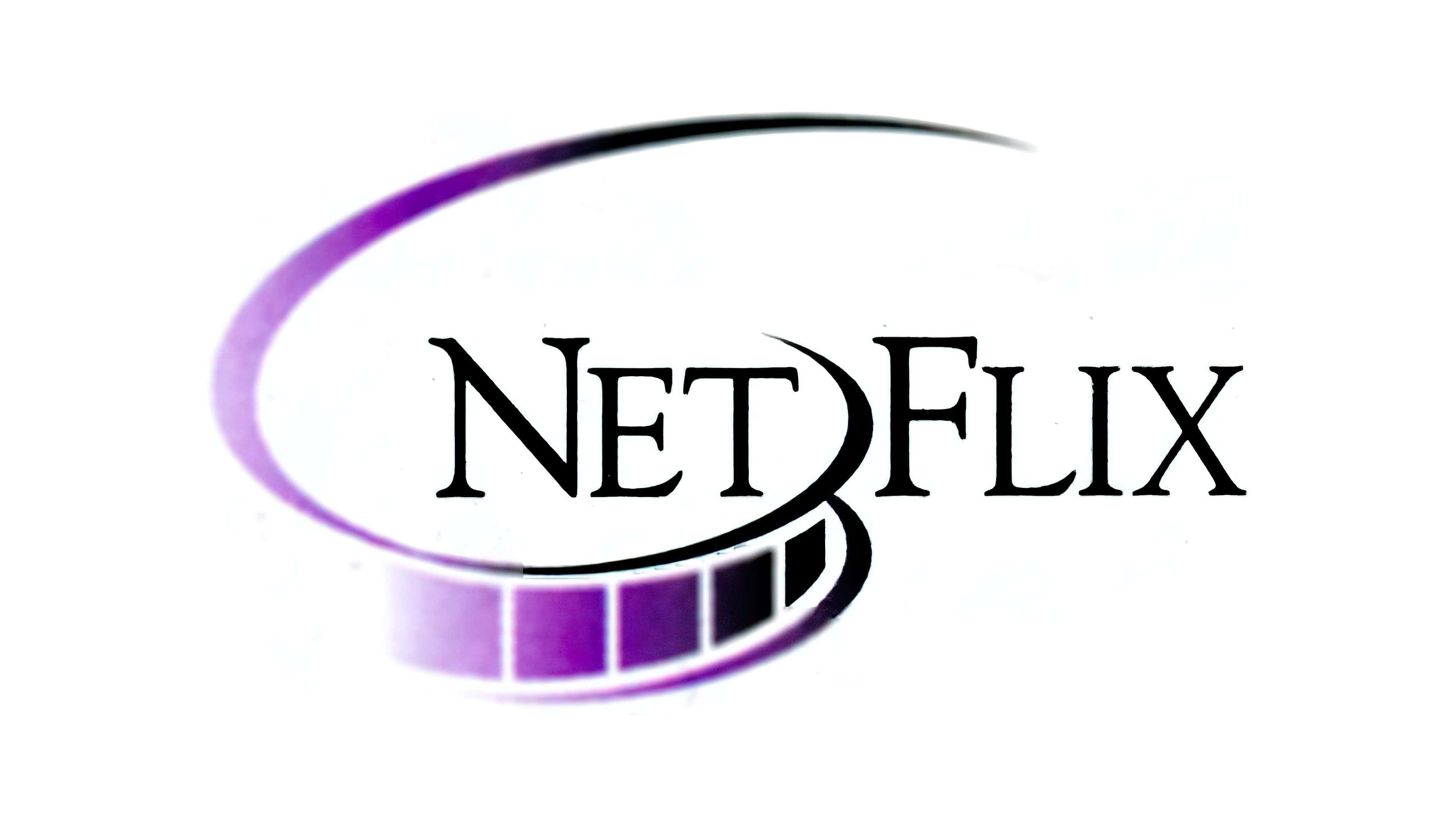
The company acquired a brand name with the inscription “Netflix” back in 1997, but it did not last long. In 2000, designers changed the approach to styling, adding bright colors, and making the inscription symmetrical. This was a transitional step towards a modern logo.
حصلت الشركة على اسم علامة تجارية مع نقش "Netflix" في عام 1997 ، لكنه لم يدم طويلاً. في عام 2000 ، غيّر المصممون أسلوب التصميم وإضافة الألوان الزاهية وجعل النقش متماثلًا. كانت هذه خطوة انتقالية نحو الشعار الحديث.
1997 – 2000
The debut logo is characterized by some “lack of assembly.” It is visually divided into several fragments. Even the letters in “Netflix” decay: capital letters “N” and “F” are larger than “E,” “T,” “L,” “I,” and “X,” which are also written in upper case. This is done specifically to distinguish between the Net and Flix parts.
يتميز الشعار الأول ببعض "النقص في التجميع". وهي مقسمة بصريا إلى عدة شظايا. حتى الأحرف في "Netflix" تتحلل: الأحرف الكبيرة "N" و "F" أكبر من "E" و "T" و "L" و "I" و "X" ، وهي مكتوبة أيضًا بأحرف كبيرة. يتم ذلك على وجه التحديد للتمييز بين أجزاء Net و Flix.
Another symbolic element is film. She goes around the first half of the word and dissolves on a white background. The black and purple gradient gives the pattern a dynamic feel. A personalized font enlivens the logo with thin elongated lines and sharp serifs.
عنصر رمزي آخر هو الفيلم. تدور حول النصف الأول من الكلمة وتذوب على خلفية بيضاء. يمنح التدرج اللوني الأسود والأرجواني النمط إحساسًا ديناميكيًا. يعمل الخط المخصص على تنشيط الشعار بخطوط رفيعة طويلة ورموز حادة.
2000 – 2014
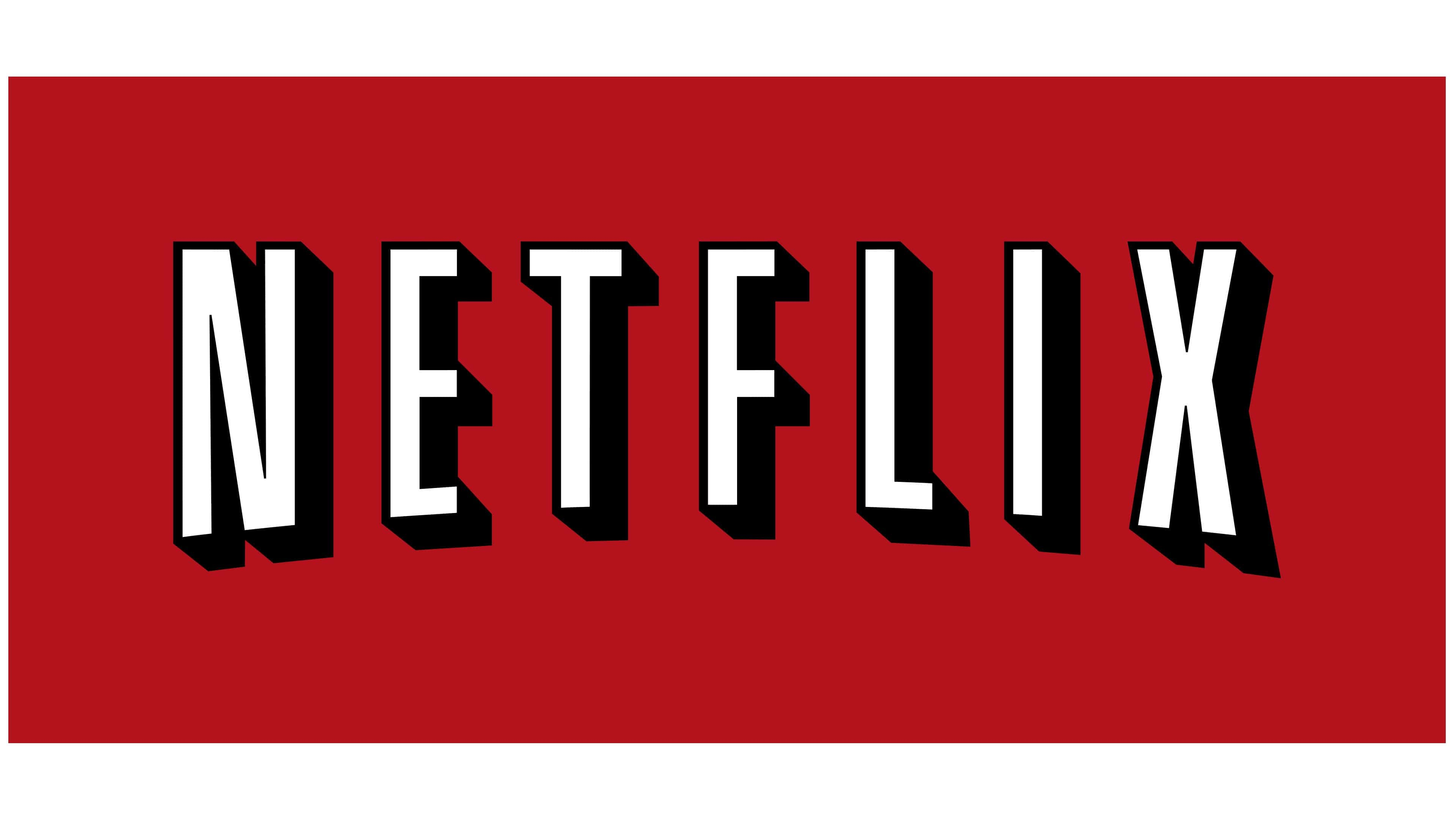
In 2000, the company adopted a new logo, changing the style of the inscription. Now the word “Netflix” arches in the form of a low arch. Designers borrowed this design technique from the vintage CinemaScope. Black contours and shadows surround sans serif white letters. Thanks to such a contrasting combination of colors, they stand out clearly against a red background.
في عام 2000 ، تبنت الشركة شعارًا جديدًا غير نمط النقش. الآن كلمة "Netflix" أقواس على شكل قوس منخفض. استعار المصممون تقنية التصميم هذه من CinemaScope القديمة. تحيط الخطوط والظلال السوداء بأحرف بيضاء بلا رقيق. بفضل هذه التركيبة المتناقضة من الألوان ، تبرز بوضوح على خلفية حمراء.
2014 – today
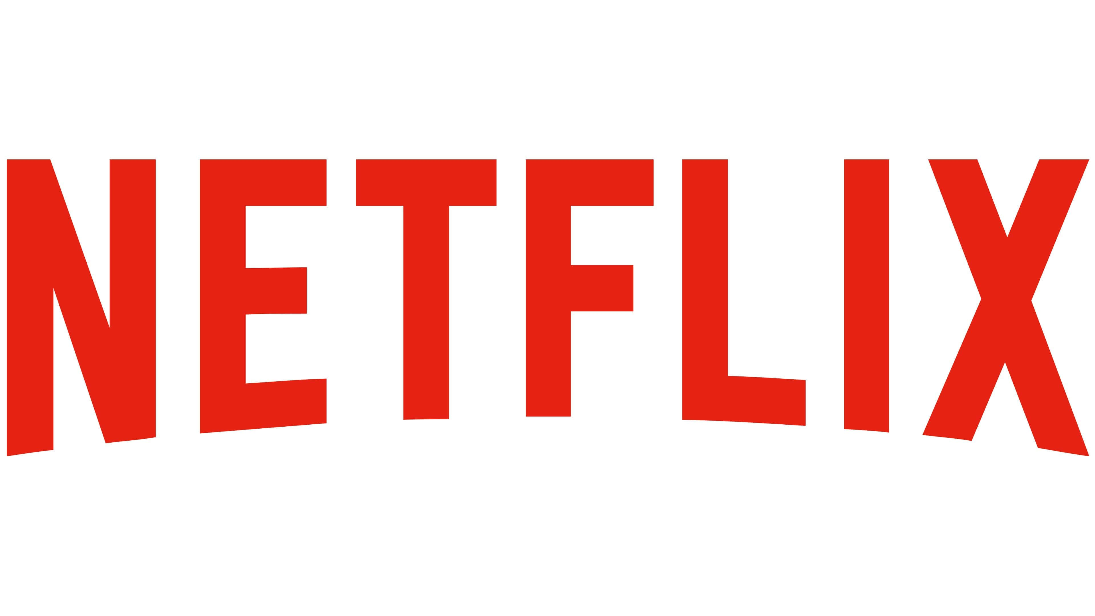
In June 2014, the owners of the streaming service conducted a global rebranding. The process involved the design studio Gretel from New York. Specialists developed another brand name and changed the website interface. In the updated emblem, there are no dark shadows, which previously made the visual perception heavier. There is only a company name painted in Netflix Red. The inscription is made in a custom font. It is based on the Gotham Book and Gotham Bold.
في يونيو 2014 ، أجرى مالكو خدمة البث إعادة تسمية عالمية. تضمنت العملية استوديو التصميم جريتيل من نيويورك. طور المتخصصون اسم علامة تجارية أخرى وغيروا واجهة الموقع. في الشعار المحدث ، لا توجد ظلال داكنة ، مما جعل الإدراك البصري في السابق أثقل. لا يوجد سوى اسم شركة مرسوم باللون الأحمر لـ Netflix. النقش مصنوع بخط مخصص. وهو يستند إلى كتاب جوثام وجوثام بولد.
FONT AND COLOR OF THE EMBLEM

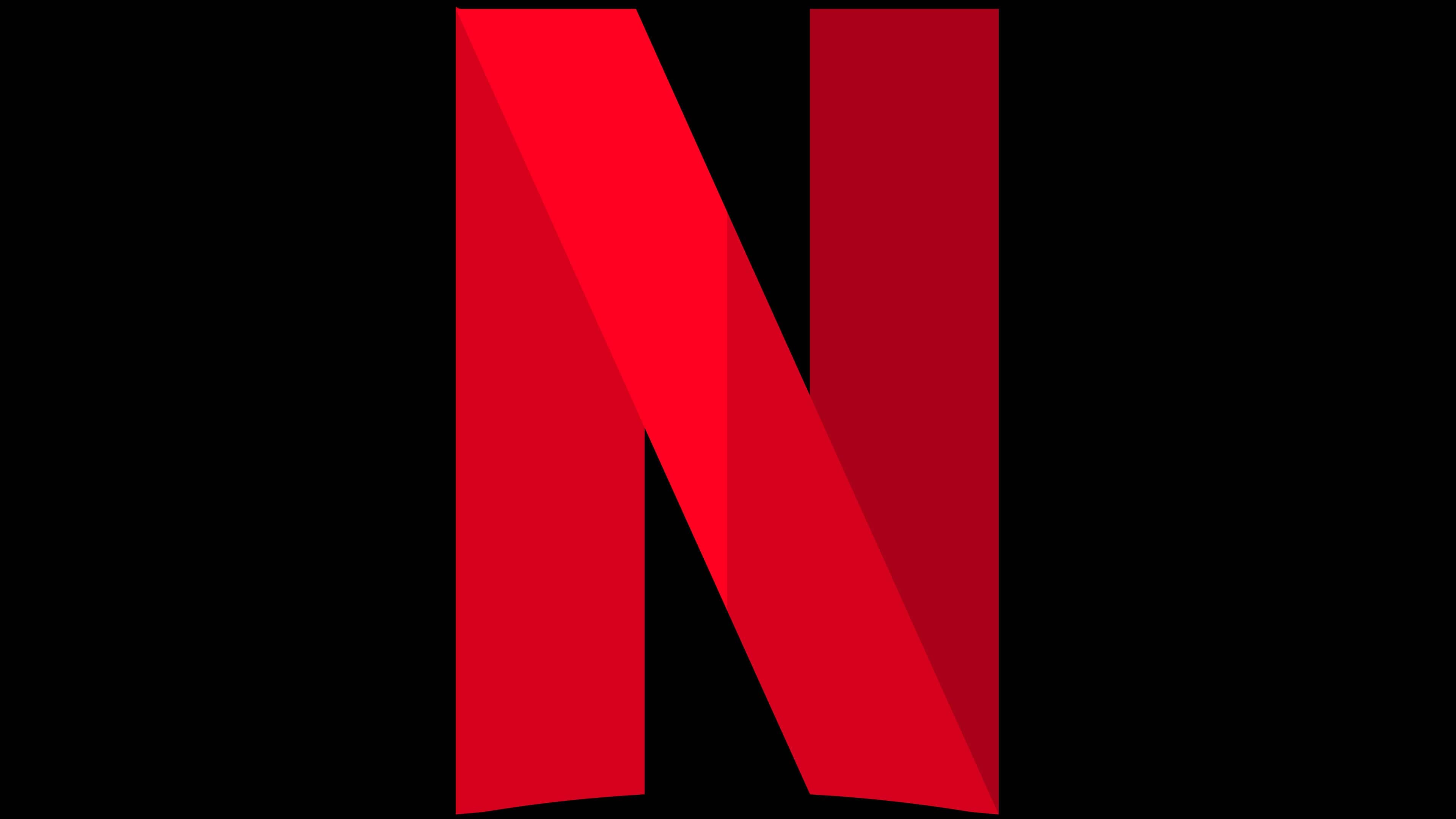
In June 2016, another element of the graphic visualization of the brand appeared – an icon in the form of an “N.” The letter consists of several wide lines formed by different shades of red.
في يونيو 2016 ، ظهر عنصر آخر من التصور الرسومي للعلامة التجارية - رمز على شكل "N." تتكون الرسالة من عدة خطوط عريضة مكونة من درجات مختلفة من اللون الأحمر.
Service representatives clarified that this emblem is used along with the main corporate symbol. It is intended for mobile applications, social networks, a website and rarely appears in teasers and press materials. In the latter, a full-sized version of the logo is more common.
أوضح ممثلو الخدمة أن هذا الشعار مستخدم جنبًا إلى جنب مع رمز الشركة الرئيسي. الغرض منه هو تطبيقات الهاتف المحمول والشبكات الاجتماعية وموقع الويب ونادراً ما يظهر في الإعلانات التشويقية والمواد الصحفية. في الأخير ، تكون النسخة بالحجم الكامل من الشعار أكثر شيوعًا.

Both the letter “N” and the word “Netflix” have the same palette. The vast majority of the inscriptions are made in the shade of Netflix Red. But if they are used as watermarks, then white is acceptable instead of red. The preferred background is black. In rare cases, other options are possible: for example, white and light, non-contrasting shades. According to the brand concept, the main red and black gamut should emphasize the cinematic quality of the premium class.
كل من الحرف "N" وكلمة "Netflix" لهما نفس اللوحة. الغالبية العظمى من النقوش مصنوعة في ظل Netflix Red. أما إذا استخدمت كعلامات مائية ، فالأبيض مقبول بدلاً من الأحمر. الخلفية المفضلة سوداء. في حالات نادرة ، هناك خيارات أخرى ممكنة: على سبيل المثال ، ظلال بيضاء وخفيفة وغير متناقضة. وفقًا لمفهوم العلامة التجارية ، يجب أن يؤكد التدرج الرئيسي باللونين الأحمر والأسود على الجودة السينمائية للفئة المتميزة.
Comments
Post a Comment