Nissan is a Japanese automobile brand owned by Nissan Motor Company. It appeared based on the Datsun brand after the Jidosha Seizo Company acquired Tobata Casting and Kwaishinsha Motor Car Works. In 1934, the name of the main company was changed to Nissan Motor Company. The first word is short for Nippon Sangyo.
نيسان هي علامة تجارية يابانية للسيارات مملوكة لشركة نيسان موتور. ظهرت على أساس العلامة التجارية Datsun بعد أن استحوذت شركة Jidosha Seizo على Tobata Casting و Kwaishinsha Motor Car Works. في عام 1934 ، تم تغيير اسم الشركة الرئيسية إلى شركة نيسان موتور. الكلمة الأولى هي اختصار لـ Nippon Sangyo.
MEANING AND HISTORY
What is Nissan?
The word Nissan is known primarily as the name of the Japanese car manufacturer Nissan Motor Co., Ltd. But this line of business of the Nissan Group was a side business for a long time, and insurance and real estate were considered the main occupation. Everything changed in the 1990s when the concern nearly went bankrupt and was forced to make its automotive division an independent company.
تُعرف كلمة Nissan في المقام الأول باسم الشركة اليابانية لتصنيع السيارات Nissan Motor Co. ، Ltd. ولكن هذا النوع من الأعمال لمجموعة Nissan كان عملاً جانبياً لفترة طويلة ، وكان التأمين والعقارات يعتبران المهنة الرئيسية. تغير كل شيء في التسعينيات عندما كاد القلق يفلس واضطر إلى جعل قسم السيارات التابع لها شركة مستقلة.
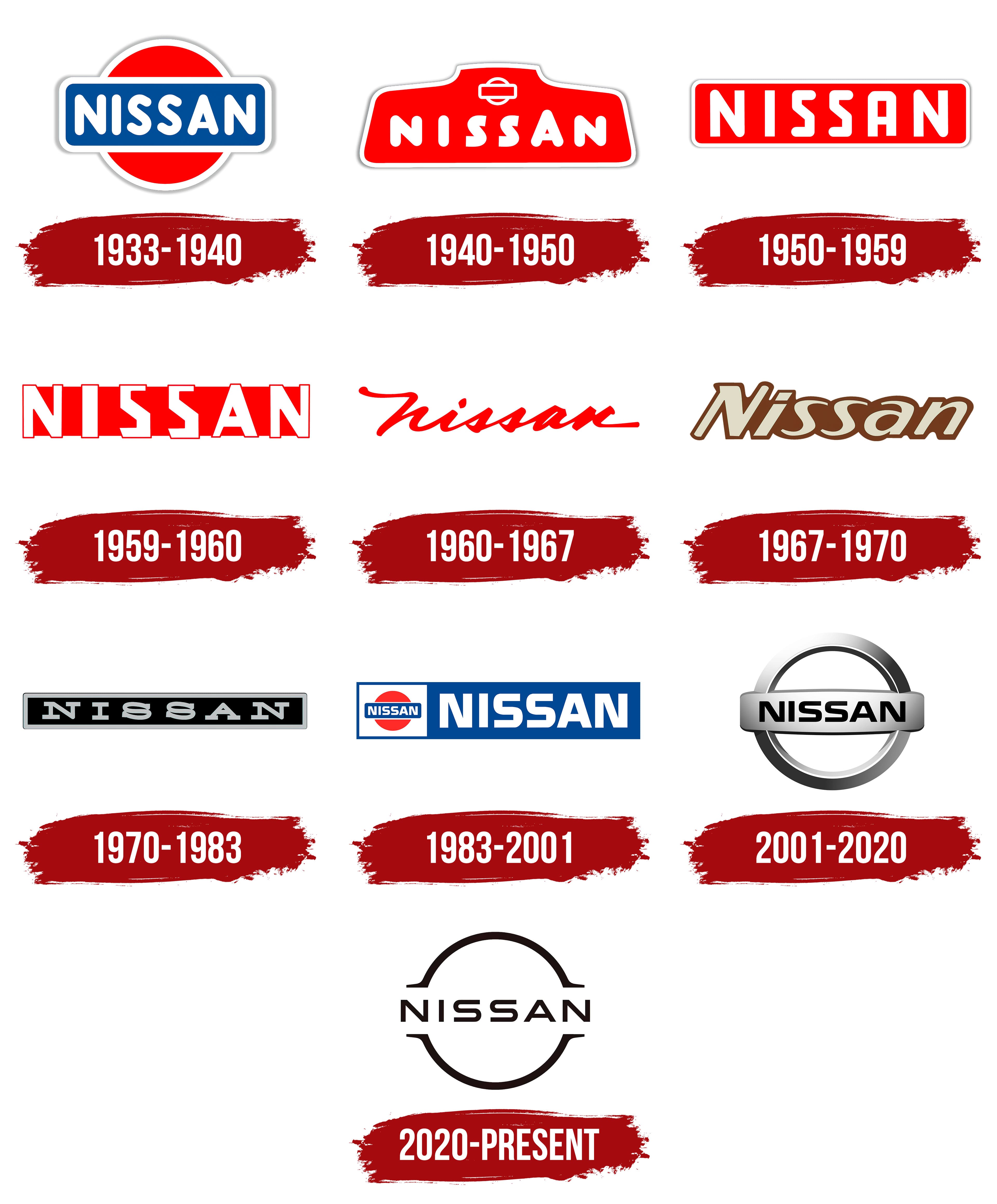
The evolution of the brand from Datsun to Nissan can be traced to the change of logos. There are no less than 29, but most often, we are talking about the main options that left a noticeable mark in history.
يمكن تتبع تطور العلامة التجارية من Datsun إلى Nissan إلى تغيير الشعارات. لا يوجد ما لا يقل عن 29 ، ولكن في أغلب الأحيان ، نتحدث عن الخيارات الرئيسية التي تركت بصمة ملحوظة في التاريخ.
The debut emblem shows a blue rounded rectangle. In the center is the name of the company, executed in white bold sans serif letters. The uppercase font makes the caption more expressive. In the background is a large red circle. It symbolizes the rising sun as a sign of respect for the Japanese nation.
يُظهر الشعار الأول مستطيلاً مستدير الزوايا باللون الأزرق. يوجد في المنتصف اسم الشركة ، مكتوبًا بأحرف بيضاء غامقة بلا سيريف. يجعل الخط الكبير التسمية التوضيحية أكثر تعبيرًا. في الخلفية دائرة حمراء كبيرة. إنه يرمز إلى شروق الشمس كعلامة على احترام الأمة اليابانية.
At first, it was a reference to the word “Datsun,” which consists of two parts: “DAT” (short for investors Den, Aoyama, and Takuchi) and “sun.” Then, in its place, the name “Nissan” harmoniously fell in tune with the hieroglyphs “ni” (“sun”) and “ssan” (“birth”).
في البداية ، كانت عبارة عن إشارة إلى كلمة "Datsun" ، والتي تتكون من جزأين: "DAT" (اختصار للمستثمرين Den و Aoyama و Takuchi) و "الشمس". ثم ، في مكانه ، كان اسم "نيسان" متناغمًا بشكل متناغم مع الهيروغليفية "ني" ("الشمس") و "سان" ("الولادة").
In the 1940s, the brand has a new logo. It has the shape of a trapezoid with rounded corners and a small protrusion in the upper part. The word Nissan is written in the middle of the geometric figure. The letters seem jagged because “A” is higher than “N,” “I” and “S.” All strokes are rounded at the ends; only two “S” top edges are cut at an angle.
في الأربعينيات من القرن الماضي ، أصبحت العلامة التجارية تحمل شعارًا جديدًا. لها شكل شبه منحرف بزوايا مستديرة وبروز صغير في الجزء العلوي. كلمة نيسان مكتوبة في منتصف الشكل الهندسي. تبدو الأحرف خشنة لأن الحرف "A" أعلى من "N" و "I" و "S." يتم تقريب جميع السكتات الدماغية في النهايات ؛ يتم قطع حافتين علويتين فقط "S" بزاوية.
A familiar symbol is depicted above the name of the automobile brand: a circle covered by a horizontal rectangle. This is a reference to the previous logo, which has been used since the early 1930s. Also, designers retained red color and wide white contours with gray shading.
يظهر رمز مألوف فوق اسم ماركة السيارات: دائرة مغطاة بمستطيل أفقي. هذه إشارة إلى الشعار السابق الذي تم استخدامه منذ أوائل الثلاثينيات. أيضًا ، احتفظ المصممون باللون الأحمر وخطوط عريضة بيضاء مع تظليل رمادي.
In the 1950s, a rectangular red emblem with a white Nissan inscription was approved. The usual light frame remained in place. The font has become angular, which is why the letters “S” are similar to the number “5”.
في الخمسينيات من القرن الماضي ، تمت الموافقة على شعار أحمر مستطيل عليه نقش أبيض لنيسان. ظل إطار الضوء المعتاد في مكانه. أصبح الخط زاويًا ، ولهذا السبب تشبه الأحرف "S" الرقم "5".
Over time, the red rectangle decreased. Also, rounding at the corners and light contours disappeared.
بمرور الوقت ، انخفض المستطيل الأحمر. أيضًا ، اختفى التقريب عند الزوايا وخطوط الضوء.
In 1960, designers went on an experiment: removed the background geometric shape and made the word red. To enhance the effect, they chose the original handwritten font.
في عام 1960 ، أجرى المصممون تجربة: أزالوا الشكل الهندسي للخلفية وجعلوا الكلمة حمراء. لتعزيز التأثير ، اختاروا الخط الأصلي المكتوب بخط اليد.
For three years, a logo with the italic inscription was used. Its characteristic differences: brown palette, uneven line thickness, protruding serif at the capital “N.”
لمدة ثلاث سنوات ، تم استخدام شعار بنقش مائل. اختلافاته المميزة: لوح بني ، سمك خط غير مستوٍ ، رقيق بارز في العاصمة "N."
The rectangular frame is back but in a different color. Designers preferred black as the main one and added a silver outline to it. The inscription “Nissan” is light. The font is completely unlike the one that was before: now, the letters are even unified, with large serifs.
عاد الإطار المستطيل ولكن بلون مختلف. فضل المصممون اللون الأسود باعتباره العنصر الرئيسي وأضافوا له مخططًا فضيًا. نقش "نيسان" خفيف. الخط مختلف تمامًا عن الخط الذي كان من قبل: الآن ، الحروف موحدة ، مع رقيق كبير.
In 1983, the brand gave a second life to the 1933 emblem by placing a small copy of it in a small white rectangle. The entire graphic composition is inside a large blue rectangle, on the right side of which is written the name, Nissan. The palette matches the classic.
في عام 1983 ، أعطت العلامة التجارية حياة ثانية لشعار عام 1933 من خلال وضع نسخة صغيرة منه في مستطيل أبيض صغير. التكوين الرسومي بأكمله موجود داخل مستطيل أزرق كبير ، على الجانب الأيمن مكتوب الاسم ، نيسان. تتطابق اللوحة مع الكلاسيكية.
When Renault bought the brand, the logo became three-dimensional. It consists of three elements: a wide ring (in the background), a convex rectangle (in the middle), and the word “Nissan.” The position of the horizontal strip is determined by two golden sections of the diameter of the circle. The geometric elements are gray with a silver gradient. The inscription is completely black.
عندما اشترت رينو العلامة التجارية ، أصبح الشعار ثلاثي الأبعاد. وتتكون من ثلاثة عناصر: حلقة عريضة (في الخلفية) ، ومستطيل محدب (في المنتصف) ، وكلمة "نيسان". يتم تحديد موضع الشريط الأفقي بواسطة قسمين ذهبيين لقطر الدائرة. العناصر الهندسية رمادية اللون مع تدرج فضي. النقش أسود بالكامل.
What does the Nissan logo represent?
The round shape of the Nissan logo is a reference to the flag of Japan, which also has a round element. The abstract ring with notches on the sides represents the sun because this company’s home is called Land of The Rising Sun.
الشكل الدائري لشعار نيسان هو إشارة إلى علم اليابان الذي يحتوي أيضًا على عنصر دائري. تمثل الحلقة المجردة ذات الشقوق على الجانبين الشمس لأن منزل هذه الشركة يسمى أرض الشمس المشرقة.
In March 2020, an automobile brand applied for registration of a new trademark in Argentina, Chile, Uruguay, Peru, and the UK. He decided to replace the chrome symbol with its minimalist version. Following the latest fashion, the manufacturer abandoned the multi-color 3D logo. The round shape has been preserved, but the lines have become much thinner.
في مارس 2020 ، تقدمت علامة تجارية للسيارات بطلب لتسجيل علامة تجارية جديدة في الأرجنتين وتشيلي وأوروغواي وبيرو والمملكة المتحدة. قرر استبدال رمز الكروم بنسخته البسيطة. بعد أحدث صيحات الموضة ، تخلت الشركة المصنعة عن الشعار ثلاثي الأبعاد متعدد الألوان. تم الحفاظ على الشكل الدائري ، لكن الخطوط أصبحت أرق بكثير.
Now the word “Nissan” is on a blank white background. Two thin black arcs adjoin it: one from above, the second from below. Small horizontal stripes stretch outward from their ends – the only thing left of the rectangle.
الآن كلمة "نيسان" على خلفية بيضاء فارغة. ويوجد به قوسان رقيقان أسودان: أحدهما من الأعلى ، والثاني من الأسفل. تمتد الخطوط الأفقية الصغيرة للخارج من نهاياتها - الشيء الوحيد المتبقي من المستطيل.
FONT AND COLOR OF THE EMBLEM

Why did Nissan change their logo?
As the car manufacturer admitted, he wanted his new logo to be “thin, light and flexible.” This shows the desire for fashionable minimalism with two-dimensional forms. Another goal pursued by Nissan was to make the sign as versatile and as simple as possible, as it was supposed to be illuminated by LEDs on future models.
كما اعترفت الشركة المصنعة للسيارة ، أراد أن يكون شعاره الجديد "نحيفًا وخفيفًا ومرنًا". هذا يدل على الرغبة في بساطتها العصرية بأشكال ثنائية الأبعاد. كان الهدف الآخر الذي سعت إليه نيسان هو جعل العلامة متعددة الاستخدامات وبسيطة قدر الإمكان ، حيث كان من المفترض أن تضيء بمصابيح LED في الطرز المستقبلية.
Is Nissan changing their logo?
Yes, Nissan changed its logo for 2020, removing the 3D look, silver lines, and a wide horizontal badge. As a result, the chrome symbol disappeared. The inscription remained hanging in the air, and two holes appeared in the ring frame on the sides.
نعم ، غيرت Nissan شعارها لعام 2020 ، وأزالت المظهر ثلاثي الأبعاد والخطوط الفضية والشارة الأفقية العريضة. نتيجة لذلك ، اختفى رمز الكروم. ظلت الكتابة معلقة في الهواء ، وظهرت فتحتان في الإطار الدائري على الجانبين.
Nissan’s current logo consists of a wide silver crossbar ring that bears the automotive brand’s name. It differs from previous versions in a minimalistic style because earlier, the Japanese automaker tried to attract attention with bright trademarks of unusual shapes. But in 2001, the designers completely changed the logo so that the identity indicated the company’s scope. This happened after Renault took over the company.
يتكون شعار نيسان الحالي من حلقة عريضة فضية عريضة تحمل اسم ماركة السيارات. إنه يختلف عن الإصدارات السابقة بأسلوب بسيط لأنه في وقت سابق ، حاول صانع السيارات الياباني جذب الانتباه بعلامات تجارية مشرقة ذات أشكال غير عادية. ولكن في عام 2001 ، قام المصممون بتغيير الشعار بالكامل بحيث تشير الهوية إلى نطاق الشركة. حدث هذا بعد أن استحوذت رينو على الشركة.

Nissan’s logos have always featured the brand name. For this, the developers used different fonts, including rounded (from 1933 to 1950), angular (from 1959 to 1960), handwritten (from 1960 to 1971), italic (from 1967 to 1970), and antiquity (from 1970 to 1983). In its current version, the inscription “NISSAN” is grotesque and has no serifs.
لطالما تميزت شعارات نيسان باسم العلامة التجارية. لهذا الغرض ، استخدم المطورون خطوطًا مختلفة ، بما في ذلك الخطوط المستديرة (من 1933 إلى 1950) ، والزاوية (من 1959 إلى 1960) ، والمكتوبة بخط اليد (من 1960 إلى 1971) ، والمائلة (من 1967 إلى 1970) ، والعصور القديمة (من 1970 إلى 1983) . نقش "نيسان" في نسخته الحالية بشع وليس له أي رقيق.
Until 2001, the company had colorful logos with a palette dominated by shades of red and blue. The current color scheme is black, white, and silver. There is a gradient that creates a 3D effect.
حتى عام 2001 ، كانت الشركة تمتلك شعارات ملونة مع لوحة تهيمن عليها ظلال من اللون الأحمر والأزرق. نظام الألوان الحالي هو الأسود والأبيض والفضي. يوجد تدرج يقوم بإنشاء تأثير ثلاثي الأبعاد.
Comments
Post a Comment