One day, Shirzad Chamine, now a lecturer and speaker at the TED Stanford Lecturer, wondered what it would be like if children were able to get the right mental development by activating the positive forces of Sage in themselves. He devoted his whole life to this problem, which resulted in the emergence of a program – Positive Intelligence, controlled by the application, to undergo special psychological training. Based on a global study, the program has ensured maximum performance in achieving success and obtaining happiness. More than a million users have already shown interest in the offer, “warmed up” by the correct study of informative visualization, whose update was recently carried out. Today, thousands of trainers have begun to offer their services in the established community. The new visualization from Landscape has helped increase the appeal while organizing a scalable design system that applies across all touchpoints of the updated app.
ذات يوم ، تساءل شيرزاد شامين ، وهو الآن محاضر ومتحدث في محاضر جامعة ستانفورد ، عما سيكون عليه الحال إذا كان الأطفال قادرين على الحصول على النمو العقلي الصحيح من خلال تنشيط القوى الإيجابية للحكيم في أنفسهم. كرس حياته كلها لهذه المشكلة التي نتج عنها ظهور برنامج - الذكاء الإيجابي ، يتحكم فيه التطبيق ، ليخضع لتدريب نفسي خاص. بناء على دراسة عالمية ، فقد ضمن البرنامج أقصى أداء في تحقيق النجاح والحصول على السعادة. أبدى أكثر من مليون مستخدم بالفعل اهتمامًا بالعرض ، "تحسنت" الدراسة الصحيحة للتصور الإعلامي ، الذي تم تحديثه مؤخرًا. اليوم ، بدأ آلاف المدربين في تقديم خدماتهم في المجتمع القائم. ساعد التصور الجديد من على زيادة الجاذبية أثناء تنظيم نظام تصميم قابل للتطوير يتم تطبيقه عبر جميع نقاط الاتصال للتطبيق المحدث.
The main elements of the complex formation of a new brand’s perception were its logo, unique voice, messaging, style, typography, and illustrativeness. At the same time, a whole set of digital tools was developed that can be combined to increase the uniqueness and applied methodology for organizing the program on a redesigned website. The result is an optimistic, intuitive, and illustrative look and feel, using visual markers to represent evidence-based concepts. The minimalist style of the identity provided maximum impact without information overload.
كانت العناصر الرئيسية للتكوين المعقد لتصور العلامة التجارية الجديدة هي شعارها وصوتها الفريد ورسائلها وأسلوبها وطباعتها وإيضاحها. في الوقت نفسه ، تم تطوير مجموعة كاملة من الأدوات الرقمية التي يمكن دمجها لزيادة التفرد والمنهجية المطبقة لتنظيم البرنامج على موقع ويب معاد تصميمه. والنتيجة هي مظهر وشعور متفائلين وبديهي وتوضيحي ، باستخدام العلامات المرئية لتمثيل المفاهيم القائمة على الأدلة. قدم أسلوب الحد الأدنى للهوية أقصى تأثير بدون تحميل معلومات زائدة.

The identity, built on the foundations of the science of positivity, with its graphic construction, font, and bright colors, conveys its spirit and direction through an originally formed visual impact. The bright color scheme of the website and applications, based on the variety of colors that evoke positive emotions, helps to block negative thoughts by activating positive reflexes. In combination with the strict contrasting black color of the logo’s wordmark, the maximum effect of creating attractiveness is achieved.
الهوية المبنية على أسس علم الإيجابية ، ببنيته الرسومية والخط والألوان الزاهية ، تنقل روحها واتجاهها من خلال تأثير بصري تم تكوينه في الأصل. يساعد نظام الألوان الزاهية للموقع والتطبيقات ، بناءً على تنوع الألوان التي تثير المشاعر الإيجابية ، على منع الأفكار السلبية عن طريق تنشيط ردود الفعل الإيجابية. بالاقتران مع اللون الأسود المتباين الصارم للشعار النصي للشعار ، يتم تحقيق أقصى تأثير لخلق الجاذبية.
Reflecting the main idea of positivism is the created round and smooth sans-serif font of medium thickness, easily perceived both in typographic execution and digitally. The clarity of execution and color saturation makes it easy to read at any scale.
تعكس الفكرة الرئيسية للوضعية الخط المستدير والسلس الذي تم إنشاؤه بسمك متوسط ، ويمكن إدراكه بسهولة في كل من التنفيذ المطبعي ورقميًا. يجعل وضوح التنفيذ وتشبع اللون من السهل القراءة بأي مقياس.
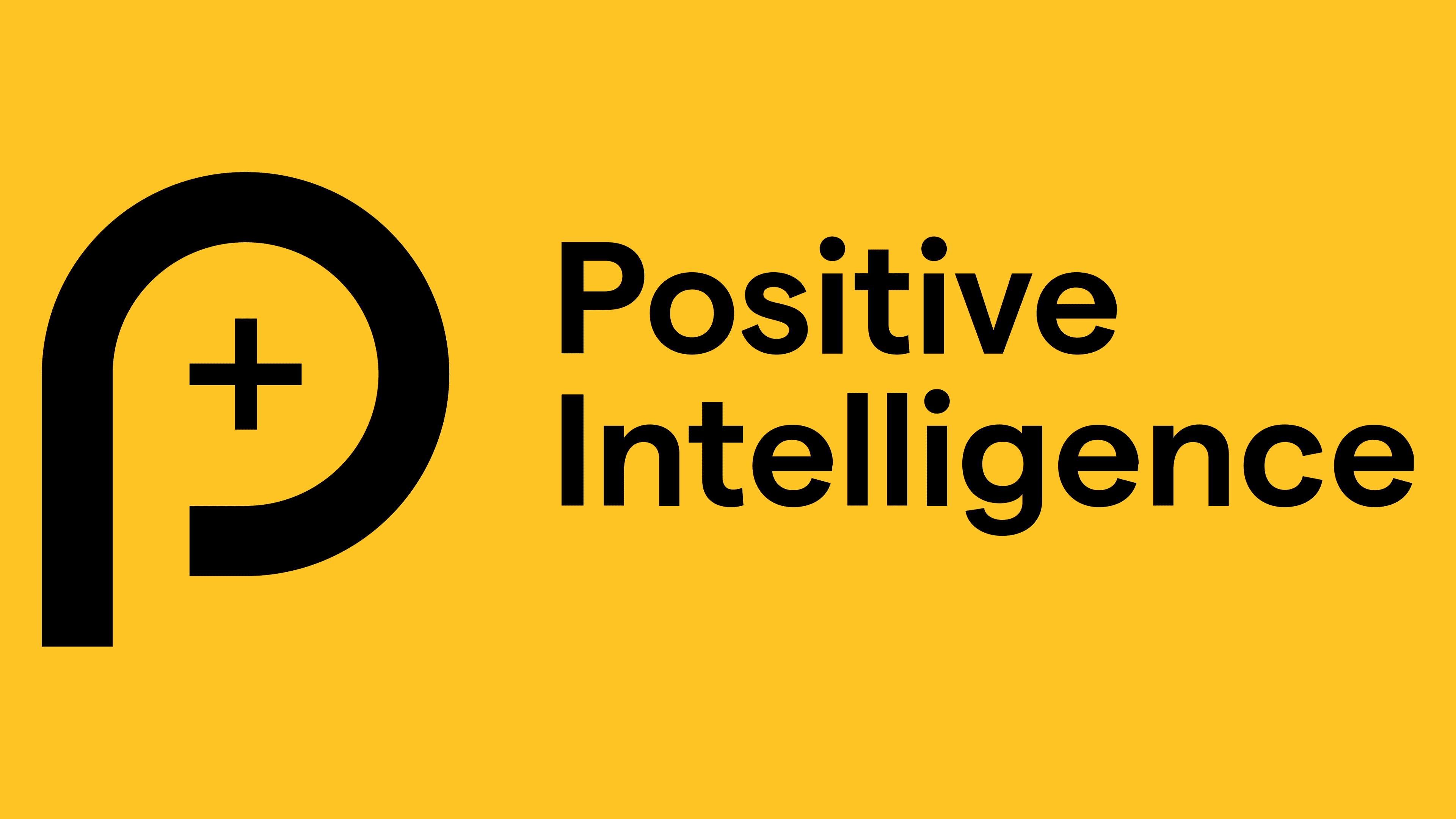
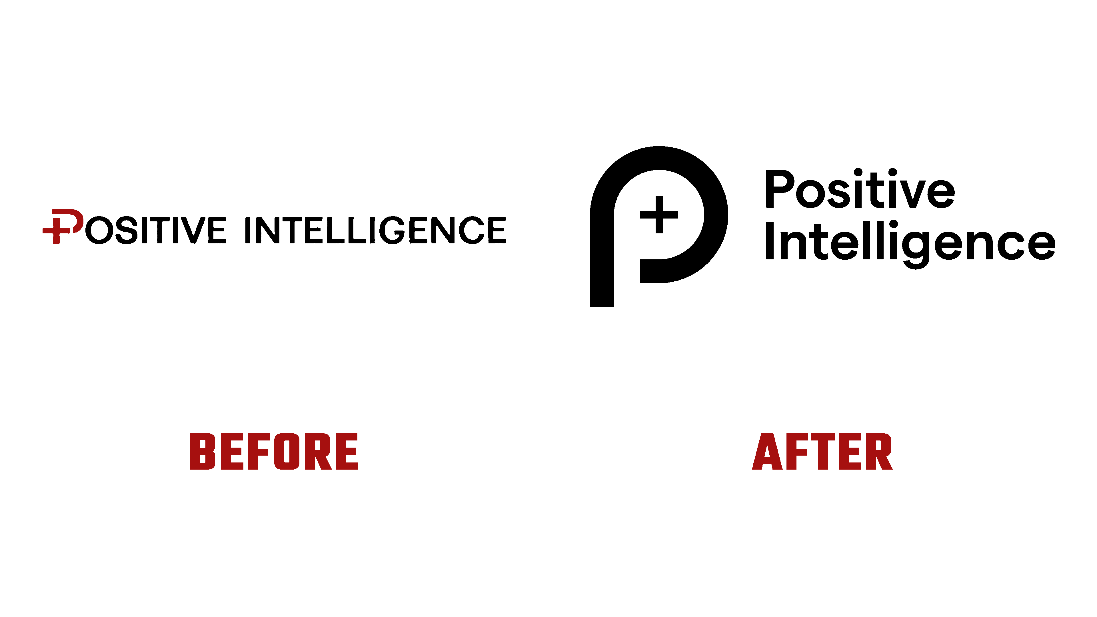
The new symbol in the form of a stylized but open letter P with the previously accepted mathematical sign “+” in the internal negative space of the letter provides a better reflection of the spirit, goals, and objectives of the brand. At the same time, the symbol demonstrates the close connection of the updated platform with its origins.
يوفر الرمز الجديد في شكل حرف منمق ولكن مفتوح مع العلامة الرياضية المقبولة مسبقًا "+" في المساحة السلبية الداخلية للحرف انعكاسًا أفضل لروح وأهداف وأهداف العلامة التجارية. في الوقت نفسه ، يوضح الرمز الارتباط الوثيق للمنصة المحدثة بأصولها.
Comments
Post a Comment