Roblox is an unusual online platform developed and published by Roblox Corporation. It allows users to create their games and play other people’s games, and the list of genres is not limited: it can be various obstacle courses, simulations, races, and much more. The entertainment service owners make a profit because gamers buy virtual items, paying for them with their internal currency – Robux.
Roblox عبارة عن منصة غير عادية عبر الإنترنت تم تطويرها ونشرها بواسطة شركة Roblox Corporation. يسمح للمستخدمين بإنشاء ألعابهم ولعب ألعاب الآخرين ، وقائمة الأنواع ليست محدودة: يمكن أن تكون دورات عقبات متنوعة ، ومحاكاة ، وسباقات ، وغير ذلك الكثير. يحقق مالكو الخدمات الترفيهية ربحًا لأن اللاعبين يشترون عناصر افتراضية ويدفعون مقابلها بعملتهم الداخلية - Robux.
MEANING AND HISTORY
What is Roblox?
Roblox is not just a video game. This is a “building site” for creating games using the Roblox Studios tool. The platform contains hundreds of virtual worlds with races, obstacle courses, arcades, simulators developed by users. Roblox Corporation owns the project.
Roblox ليست مجرد لعبة فيديو. هذا "موقع بناء" لإنشاء ألعاب باستخدام أداة Roblox Studios. تحتوي المنصة على مئات من العوالم الافتراضية مع سباقات ودورات عقبات وأروقة ومحاكيات طورها المستخدمون. تمتلك شركة Roblox المشروع.
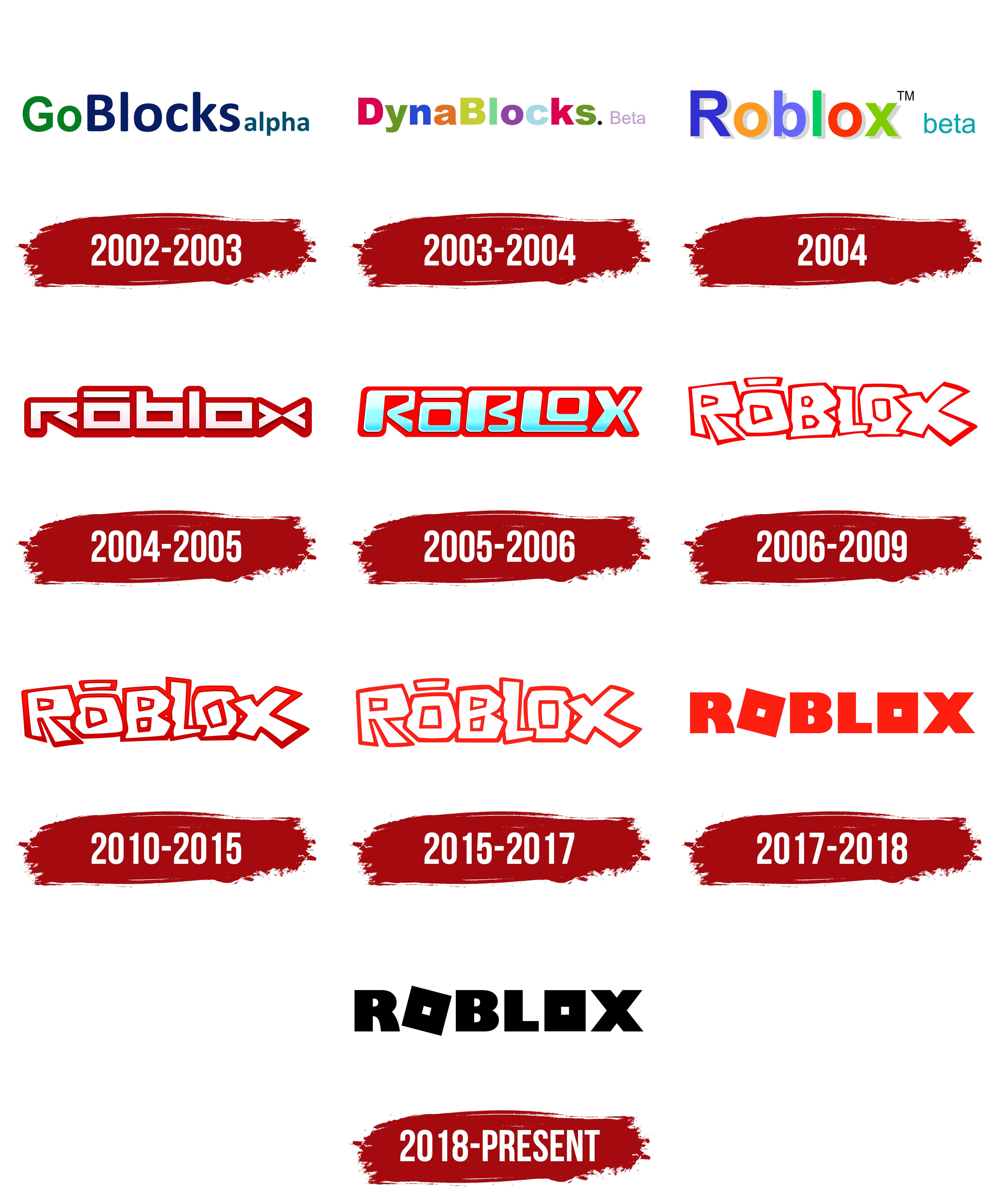
The entrepreneur David Baszucki, who invented Roblox, once created the Interactive Physics tutorial application. The animated laboratory allowed experiments to be carried out directly on the computer. The kids loved this creative activity, so David decided to develop a 3D game design platform. At first, he chose the name GoBlocks, but then changed his mind and gave it a new name – DynaBlocks. After a while, the service was renamed Roblox. This inconsistency was reflected in the logo, which changed almost every year.
قام رجل الأعمال David Baszucki ، الذي اخترع Roblox ، بإنشاء تطبيق تعليمي للفيزياء التفاعلية. سمح المختبر المتحرك بإجراء التجارب مباشرة على الكمبيوتر. أحب الأطفال هذا النشاط الإبداعي ، لذلك قرر ديفيد تطوير منصة تصميم ألعاب ثلاثية الأبعاد. في البداية ، اختار اسم GoBlocks ، لكنه غير رأيه بعد ذلك وأعطاه اسمًا جديدًا - DynaBlocks. بعد فترة ، تم تغيير اسم الخدمة إلى Roblox. انعكس هذا التناقض في الشعار ، والذي يتغير كل عام تقريبًا.
David Baszucki was going to name the gaming platform GoBlocks, so he prepared an emblem with this inscription in advance. On the right was the word “alpha” written in lowercase letters. It pointed to the version of the site. The phrase was divided into parts using different colors: the designers combined green “Go,” dark blue “Blocks,” and light blue “alpha” in one line.
كان David Baszucki سيطلق على منصة الألعاب GoBlocks ، لذلك أعد شعارًا بهذا النقش مسبقًا. على اليمين كانت كلمة "alpha" مكتوبة بأحرف صغيرة. وأشار إلى إصدار الموقع. تم تقسيم العبارة إلى أجزاء باستخدام ألوان مختلفة: جمع المصممون اللون الأخضر "Go" والأزرق الداكن "Blocks" والأزرق الفاتح "alpha" في سطر واحد.
During beta testing, the GoBlocks platform was renamed. Its new name, DynaBlocks, stuck and passed on to the next version of the platform. Also, it was preserved in the logo, in which each letter had a different color. The pink word “Beta” came after the big black dot.
أثناء الاختبار التجريبي ، تمت إعادة تسمية النظام الأساسي GoBlocks. تم تعليق اسمه الجديد ، DynaBlocks ، وانتقل إلى الإصدار التالي من النظام الأساسي. أيضًا ، تم حفظه في الشعار ، حيث كان لكل حرف لون مختلف. جاءت الكلمة الوردية "بيتا" بعد النقطة السوداء الكبيرة.
After the launch of the beta version of the site, the developers concluded that DynaBlocks was difficult to remember, so they replaced it with Roblox. The emblem also began to look different: the designers introduced a new platform name into it, removed the dot, and made the word “beta” blue. The multicolored letters remained because it was the main feature of the entertainment portal. She envisioned Roblox as a haven of fun and entertainment, where imagination must be used to play.
بعد إطلاق النسخة التجريبية من الموقع ، خلص المطورون إلى أنه من الصعب تذكر DynaBlocks ، لذلك قاموا باستبدالها بـ Roblox. بدأ الشعار أيضًا في الظهور بشكل مختلف: أدخل المصممون اسمًا جديدًا للمنصة فيه ، وأزالوا النقطة ، وجعلوا كلمة "beta" زرقاء. ظلت الحروف متعددة الألوان لأنها كانت السمة الرئيسية لبوابة الترفيه. لقد تخيلت لعبة Roblox كملاذ للمتعة والترفيه ، حيث يجب استخدام الخيال للعب.
A few months after creating the first logo, a second one appeared – with the same inscription, but without the word “beta.” It used a completely new font: square white letters outlined in dark red. Above the first “o” was a horizontal line, which suggested how to pronounce the vowel sound.
بعد بضعة أشهر من إنشاء الشعار الأول ، ظهر شعار آخر - بنفس النقش ، ولكن بدون كلمة "بيتا". استخدم خطًا جديدًا تمامًا: أحرف بيضاء مربعة محددة باللون الأحمر الداكن. كان فوق الحرف الأول "o" خط أفقي يقترح كيفية نطق حرف العلة.
In 2005, the platform was officially renamed Roblox. The wordmark changed again, although the general style remained the same. The letters acquired a blue and white scale, and the developers created a gradient transition between the two colors. They also chose a brighter shade of red, capitalized the lettering, and made italic.
في عام 2005 ، تم تغيير اسم النظام الأساسي رسميًا إلى Roblox. تم تغيير العلامة النصية مرة أخرى ، على الرغم من أن النمط العام ظل كما هو. اكتسبت الأحرف مقياسًا باللونين الأزرق والأبيض ، وخلق المطورون انتقالًا متدرجًا بين اللونين. اختاروا أيضًا ظلًا أكثر إشراقًا من اللون الأحمر ، وجعلوا الحروف الكبيرة مائلة.
In 2006, beta testing ended, and the official launch of Roblox took place. The site owners abandoned the idea of using a strict square font, so in the new version of the logo, the letters are jumping and uneven, as if drawn by hand. The interior of the lettering has turned white, and the outline is unevenly thin.
في عام 2006 ، انتهى الاختبار التجريبي ، وتم الإطلاق الرسمي لـ Roblox. تخلى مالكو الموقع عن فكرة استخدام خط مربع صارم ، لذلك في النسخة الجديدة من الشعار ، الحروف تقفز وغير متساوية ، كما لو كانت مرسومة باليد. تحول الجزء الداخلي من الحروف إلى اللون الأبيض ، والخطوط العريضة رقيقة بشكل غير متساو.
After a small redesign, the red has taken on a darker shade. At first, this emblem was used only for merchandising, but then it became the main one.
بعد إعادة تصميم صغيرة ، اتخذ اللون الأحمر ظلًا أغمق. في البداية ، تم استخدام هذا الشعار للتسويق فقط ، ولكن بعد ذلك أصبح الشعار الرئيسي.
In 2010, designers darkened the contours even further and added a subtle gradient. The 3D lettering represented Roblox at various events and featured in games until 2015.
في عام 2010 ، قام المصممون بتغميق الخطوط بشكل أكبر وإضافة تدرج لوني دقيق. مثلت الحروف ثلاثية الأبعاد لعبة Roblox في أحداث مختلفة وظهرت في الألعاب حتى عام 2015.
In 2015, the logo designers abandoned the 3D design and returned a 2D version with dark red lettering.
في عام 2015 ، تخلى مصممو الشعار عن التصميم ثلاثي الأبعاد وأعادوا نسخة ثنائية الأبعاد بحروف حمراء داكنة.
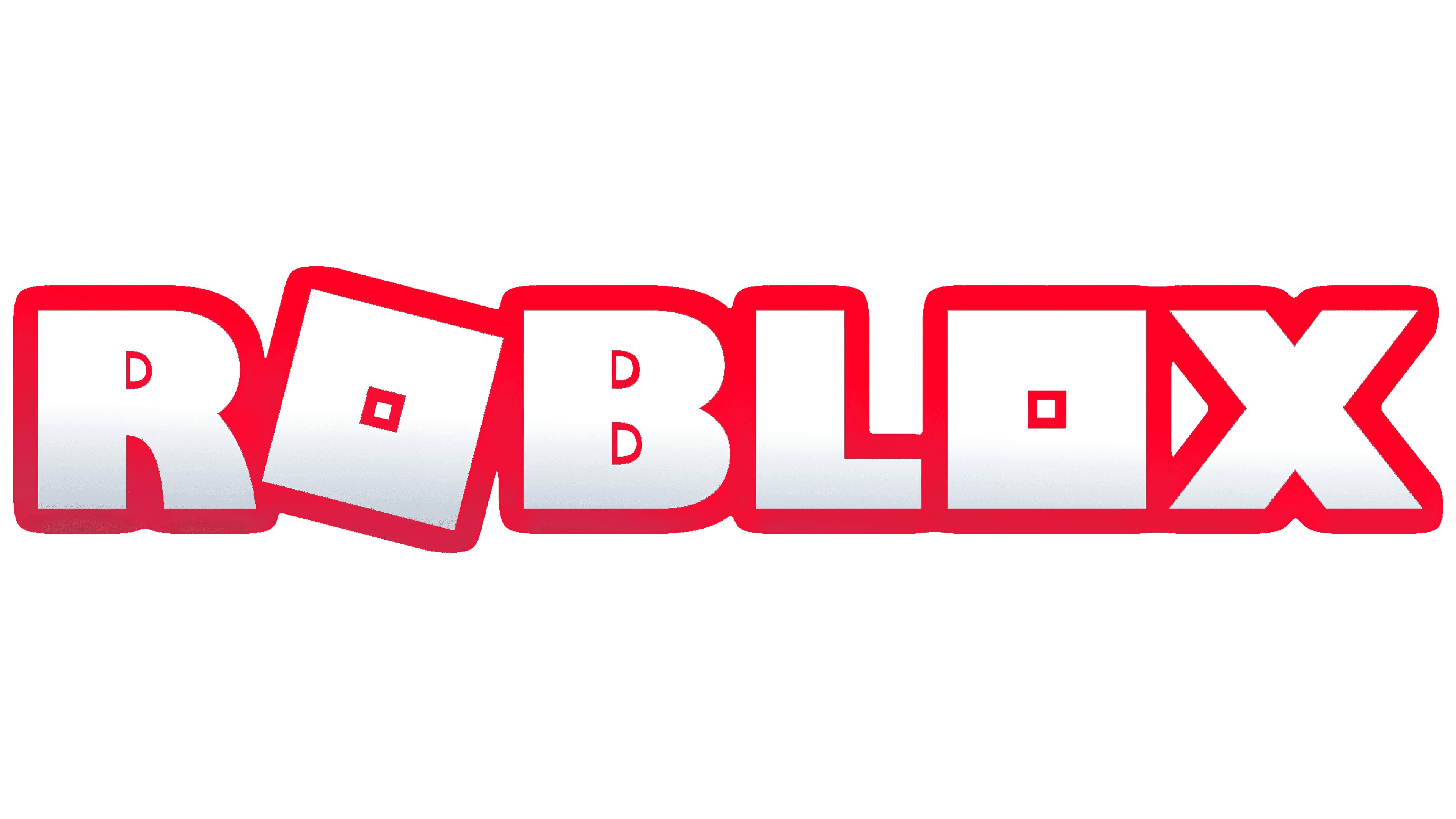
In early 2017, the multiplayer Roblox platform adopted a new logo, in which each letter stood alone. The “O” looked like large red squares with white mini-squares in the middle. The “R,” “B,” “L,” and “X” were also red and matched the chosen style.
في أوائل عام 2017 ، تبنت منصة Roblox متعددة اللاعبين شعارًا جديدًا ، حيث يقف كل حرف بمفرده. بدا الحرف "O" مثل المربعات الحمراء الكبيرة مع وجود مربعات صغيرة بيضاء في المنتصف. كانت الأحرف "R" و "B" و "L" و "X" حمراء أيضًا ومطابقة للنمط المختار.
[sc_fs_faq html=”true” headline=”p” img=”” question=”What was the original Roblox logo?” img_alt=”” css_class=””] The first Roblox logo appeared when the platform was called GoBlocks; therefore, it contained the corresponding inscription, supplemented with the word alpha. The phrase was one line. Each fragment used a different color: green for Go, blue for Blocks, and turquoise for alpha. [/sc_fs_faq]
[sc_fs_faq html = "true" headline = "p" img = "" question = "ما هو شعار Roblox الأصلي؟" img_alt = ”” css_class = ””] ظهر شعار Roblox الأول عندما كانت المنصة تسمى GoBlocks ؛ لذلك ، احتوت على النقش المقابل ، مكملًا بكلمة alpha. كانت العبارة سطر واحد. استخدم كل جزء لونًا مختلفًا: الأخضر لـ Go والأزرق للكتل والفيروز لـ alpha. [/ sc_fs_faq]
In 2018, something happened that had not happened since the days of GoBlocks – the red color disappeared from the logo. The lettering went black for the first time, and that’s the only change the redesign brought.
في عام 2018 ، حدث شيء لم يحدث منذ أيام GoBlocks - اختفى اللون الأحمر من الشعار. تحولت الحروف إلى اللون الأسود لأول مرة ، وهذا هو التغيير الوحيد الذي أحدثته إعادة التصميم.
ROBLOX ICON
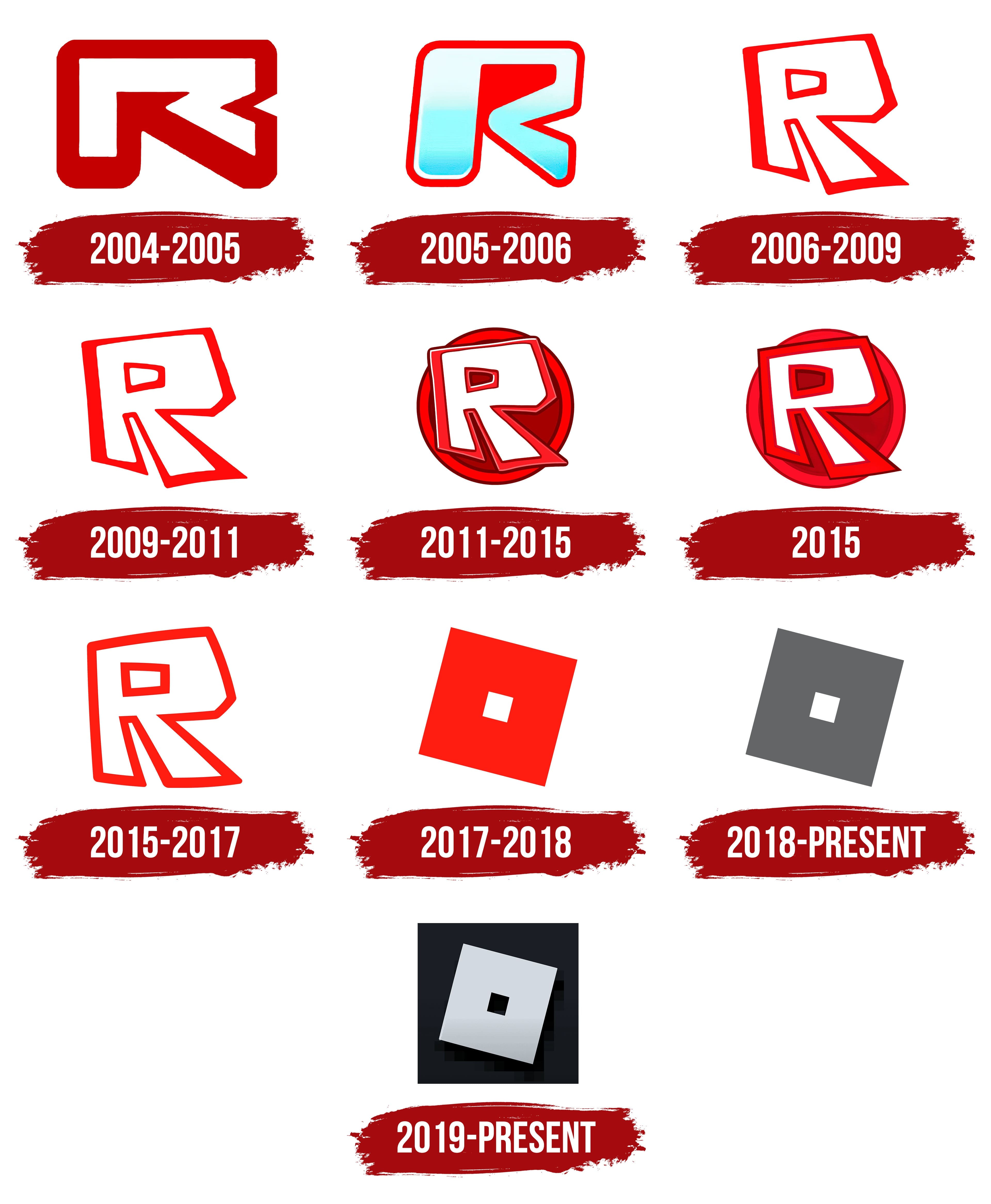
Roblox app icons have always contained one letter from the logo. Until 2017, “R” was used because it was the most recognizable because of its unusual shape. Then it was changed to the first “O,” which looked like a large inverted square with a hole inside. Further evolution was reflected only in color: there was a transition from red to gray, black, and silver.
احتوت أيقونات تطبيق Roblox دائمًا على حرف واحد من الشعار. حتى عام 2017 ، تم استخدام الحرف "R" لأنه كان الأكثر شهرة نظرًا لشكله غير المعتاد. ثم تم تغييره إلى الحرف الأول "O" ، والذي بدا وكأنه مربع كبير مقلوب به فتحة بداخله. انعكس التطور الإضافي في اللون فقط: كان هناك انتقال من الأحمر إلى الرمادي والأسود والفضي.
The first icon consisted of a stylized letter “R” in a curved line with a pink and white gradient. It looked like an unfinished arrow pointing to the upper left corner. A thick dark red stripe surrounded the central element.
تتألف الأيقونة الأولى من حرف منمنم “R” في خط منحني بتدرج لوني وردي وأبيض. بدا الأمر وكأنه سهم غير مكتمل يشير إلى الزاوية اليسرى العليا. شريط أحمر غامق سميك يحيط بالعنصر المركزي.
With the release of the beta version of Roblox, a new icon began to be used. The “R” has changed its shape: the designers stretched it vertically and tilted it slightly to the right. In doing so, they rounded the corners, changed the thickness of the centerline, and used a blue gradient instead of a pink one. The frame is bright red.
مع إصدار الإصدار التجريبي من Roblox ، بدأ استخدام رمز جديد. لقد غيّر حرف "R" شكله: قام المصممون بشده عموديًا وإمالته قليلاً إلى اليمين. وبذلك ، قاموا بتقريب الزوايا وتغيير سمك الخط المركزي واستخدام تدرج أزرق بدلاً من التدرج الوردي. الإطار أحمر فاتح.
In 2006, for the first time, an icon appeared that looked like a child’s drawing. The “R” was completely white except for thin red outlines. Only uneven lines were used in the letter because the asymmetrical shape created the effect of movement. For the same reason, the right leg was wider and longer than the left.
في عام 2006 ، ظهر لأول مرة رمز يشبه رسم طفل. كان الحرف "R" أبيضًا بالكامل باستثناء الخطوط الحمراء الرفيعة. تم استخدام الخطوط غير المستوية فقط في الحرف لأن الشكل غير المتماثل خلق تأثير الحركة. للسبب نفسه ، كانت الساق اليمنى أعرض وأطول من اليسرى.
The new icon is the same as the previous one, but some details are still different. Its creators rounded off some of the corners changed the shape of the letter space and the thickness of the outlines. This version has been used as an app icon and as a graphic symbol for Roblox Studio and Roblox Player.
الرمز الجديد هو نفسه الرمز السابق ، لكن بعض التفاصيل لا تزال مختلفة. قام منشئوه بتقريب بعض الزوايا غيرت شكل مساحة الحروف وسمك الخطوط العريضة. تم استخدام هذا الإصدار كرمز تطبيق ورمز رسومي لـ Roblox Studio و Roblox Player.
In 2011, the “R” was placed inside a burgundy circle with a border scarlet. The letter itself remains white. The main elements had a double-sided stroke, making the icon look even more like a child’s drawing. Uneven stripes and rounded corners reinforced the feeling of “childhood.” Due to the thin light lines drawn along the edges of the “R” (left and top), the image seemed three-dimensional.
في عام 2011 ، تم وضع حرف "R" داخل دائرة بورجوندي ذات حدود قرمزية. الرسالة نفسها تظل بيضاء. كانت العناصر الرئيسية لها حد مزدوج الجوانب ، مما يجعل الرمز يبدو أشبه برسم طفل. عززت الخطوط غير المستوية والزوايا المستديرة الشعور "بالطفولة". نظرًا لخطوط الضوء الرفيعة المرسومة على طول حواف حرف "R" (اليسار والأعلى) ، بدت الصورة ثلاثية الأبعاد.
The designers have redesigned the icon by changing the size and shape of its components. As a result, the letter became visually flat because it had no white reflections. And she returned her angularity, as in 2006-2009. At the same time, the “R” was increased. Shades of red have moved to a darker palette.
أعاد المصممون تصميم الرمز من خلال تغيير حجم وشكل مكوناته. ونتيجة لذلك ، أصبح الحرف مسطحًا بصريًا لأنه لم يكن به أي انعكاسات بيضاء. وعادت لها زاويتها ، كما في 2006-2009. في نفس الوقت ، تمت زيادة "R". انتقلت ظلال اللون الأحمر إلى لوحة أغمق.
In 2015, Roblox returned to the old icon design. The round base with the annular border is gone, so the background and letterspacing are white again. The shape of the letter has changed a bit: the developers have rounded the corners and shortened the right leg so that it is almost equal to the left one.
في عام 2015 ، عاد Roblox إلى تصميم الأيقونات القديم. اختفت القاعدة الدائرية ذات الحد الحلقي ، لذا أصبحت الخلفية والمسافة بين الأحرف بيضاء مرة أخرى. لقد تغير شكل الحرف قليلاً: قام المطورون بتدوير الزوايا وتقصير الساق اليمنى بحيث تكون مساوية تقريبًا للساق اليسرى.
After the rebranding of the multi-user platform, the app icon underwent a revolutionary change. The place of the traditional letter “R” was taken by “O,” and not the usual one, but in the form of a falling rhombus with a hole inside. The main part was red, so the small white diamond in the center looked contrasting. This “O” was borrowed from the Roblox logo, where it was the second in a row.
بعد إعادة تسمية النظام الأساسي متعدد المستخدمين ، خضعت أيقونة التطبيق لتغيير ثوري. تم أخذ مكان الحرف التقليدي "R" بواسطة "O" ، وليس المكان المعتاد ، ولكن في شكل معين ساقط به فتحة بداخله. كان الجزء الرئيسي أحمر اللون ، لذا بدت الماسة البيضاء الصغيرة في المنتصف متناقضة. تم استعارة حرف "O" هذا من شعار Roblox ، حيث كان هو الثاني على التوالي.
In 2018, the icon had new versions: white, black, and gray. Until 2019, there was also a colorful graphic symbol depicting two running men.
في عام 2018 ، كان للأيقونة إصدارات جديدة: أبيض ، أسود ، ورمادي. حتى عام 2019 ، كان هناك أيضًا رمز رسومي ملون يصور رجلين يركضان.
The current version contains the silver letter “O” with a gradient. She, as before, stands on the edge, but now her place is in the black square. This icon can be found on social networks and in the application. And Roblox Player uses a diamond-shaped “O” on a white background. It seems voluminous due to black and gray shadows.
يحتوي الإصدار الحالي على الحرف الفضي "O" مع التدرج اللوني. هي ، كما كانت من قبل ، تقف على الحافة ، لكن مكانها الآن في المربع الأسود. يمكن العثور على هذا الرمز على الشبكات الاجتماعية وفي التطبيق. ويستخدم Roblox Player حرف "O" الماسي على خلفية بيضاء. يبدو كثيفًا بسبب الظلال السوداء والرمادية.
AESTHETIC ROBLOX LOGO
Aesthetic is a separate trend on the Roblox platform, which brings together fans of youth style at the intersection of glamour and Tumblr. We are talking about girls of primary school age. They create identical profiles and like to use the word “aesthetic” when talking about cute things. There are entire guides online (on blogs and on YouTube) on making your account aesthetic.
Aesthetic هو اتجاه منفصل على منصة Roblox ، والذي يجمع بين عشاق أسلوب الشباب عند تقاطع السحر مع Tumblr. نحن نتحدث عن الفتيات في سن المدرسة الابتدائية. إنهم ينشئون ملفات تعريف متطابقة ويحبون استخدام كلمة "جمالية" عند الحديث عن أشياء لطيفة. توجد أدلة كاملة عبر الإنترنت (على المدونات وعلى موقع YouTube) حول جعل حسابك جماليًا.
When and why this trend came about is unknown. But it has become very popular among kids who play and interact with Roblox. It is based on a culture of fashion and mass consumption. For Aesthetic supporters, what matters is the external shine, luxury – that is everything on which the worldview of glamour is based.
متى ولماذا ظهر هذا الاتجاه غير معروف. لكنها أصبحت شائعة جدًا بين الأطفال الذين يلعبون ويتفاعلون مع Roblox. يقوم على ثقافة الموضة والاستهلاك الشامل. بالنسبة لمؤيدي الجماليات ، ما يهم هو اللمعان الخارجي والرفاهية - هذا هو كل شيء تقوم عليه النظرة العالمية للسحر.
Separate groups of aesthetic items and clothing have been created for such users. These can be purchased with Robux’s virtual currency to make an avatar look cute. Appropriate faces, heads, and animation sets are also sold. These outfits and accessories are important because it’s what Aesthetic supporters recognize each other by. You could say they all look the same: their avatars are slender, with beautiful faces, and wearing fashionable styles. Recently, increasing instances of insulting other players have been insulting because their characters don’t conform to trendy styles.
تم إنشاء مجموعات منفصلة من العناصر والملابس الجمالية لهؤلاء المستخدمين. يمكن شراؤها بعملة Robux الافتراضية لجعل الصورة الرمزية تبدو جذابة. تباع أيضًا الوجوه والرؤوس ومجموعات الرسوم المتحركة المناسبة. هذه الملابس والإكسسوارات مهمة لأنها ما يتعرف عليه الداعمون الجماليون بعضهم البعض. يمكنك القول إنهم جميعًا يبدون متشابهين: صورهم الرمزية نحيلة ، ووجوههم جميلة ، ويرتدون أنماطًا عصرية. في الآونة الأخيرة ، كانت حالات الإهانة المتزايدة للاعبين الآخرين مهينة لأن شخصياتهم لا تتوافق مع الأساليب العصرية.
Aesthetic Roblox fans have come up with nicknames that they consider aesthetic. For example, AestheticArii or LuxvelyRoses. There are even user name generators to create combinations of thematic words. The same goes for group names. They often mention angels, gloss, flowers, and other terms related to glamour.
ابتكر عشاق لعبة Roblox الجمالية ألقاب يعتبرونها جمالية. على سبيل المثال ، AestheticArii أو LuxvelyRoses. هناك أيضًا مولدات اسم المستخدم لإنشاء مجموعات من الكلمات الموضوعية. الشيء نفسه ينطبق على أسماء المجموعات. غالبًا ما يذكرون الملائكة واللمعان والزهور وغيرها من المصطلحات المتعلقة بالسحر.
When filling out a profile, players use “aesthetic” quotes with some deep meaning to show their mystique or romance. Most often, it’s something philosophical about feelings and relationships. And users arrange the text with unusual fonts in the style of Barbie and decorate it with cute emoticons.
عند ملء ملف تعريف ، يستخدم اللاعبون الاقتباسات "الجمالية" مع بعض المعنى العميق لإظهار سحرهم أو علاقتهم الرومانسية. غالبًا ما يكون شيئًا فلسفيًا حول المشاعر والعلاقات. ويقوم المستخدمون بترتيب النص بخطوط غير عادية بأسلوب باربي وتزيينه برموز تعبيرية لطيفة.

Another component is the selection of beautiful themes, which also help create an aesthetic profile. We are talking about pictures of beautifully dressed avatars. So Aesthetic Roblox is not just a fashion trend. It’s a brand that represents an entire branch of the gaming industry. Individual users (virtual outfit store owners) and the online platform itself earn good money on it because beauty requires sacrifice, and in this case – money. Kids pay for items deemed “aesthetic,” after which sellers convert Robux coins into real currency.
مكون آخر هو اختيار السمات الجميلة ، والتي تساعد أيضًا في إنشاء ملف تعريف جمالي. نحن نتحدث عن صور أفاتار يرتدون ملابس جميلة. لذا فإن لعبة Aesthetic Roblox ليست مجرد اتجاه للأزياء. إنها علامة تجارية تمثل فرعًا كاملاً لصناعة الألعاب. يكسب المستخدمون الفرديون (أصحاب متاجر الملابس الافتراضية) والمنصة الإلكترونية نفسها أموالًا جيدة من ذلك لأن الجمال يتطلب التضحية ، وفي هذه الحالة - المال. يدفع الأطفال مقابل العناصر التي تعتبر "جمالية" ، وبعد ذلك يقوم البائعون بتحويل عملات Robux إلى عملة حقيقية.
But the brand is not fully designed. It has no visual identity of its own, so players have a lot of room for creativity. They are free to choose any nicknames, avatars, clothes, icons – as long as they are aesthetically pleasing.
لكن العلامة التجارية ليست مصممة بالكامل. ليس له هوية بصرية خاصة به ، لذلك لدى اللاعبين مساحة كبيرة للإبداع. إنهم أحرار في اختيار أي ألقاب أو صور رمزية أو ملابس أو أيقونات - طالما أنها ممتعة من الناحية الجمالية.
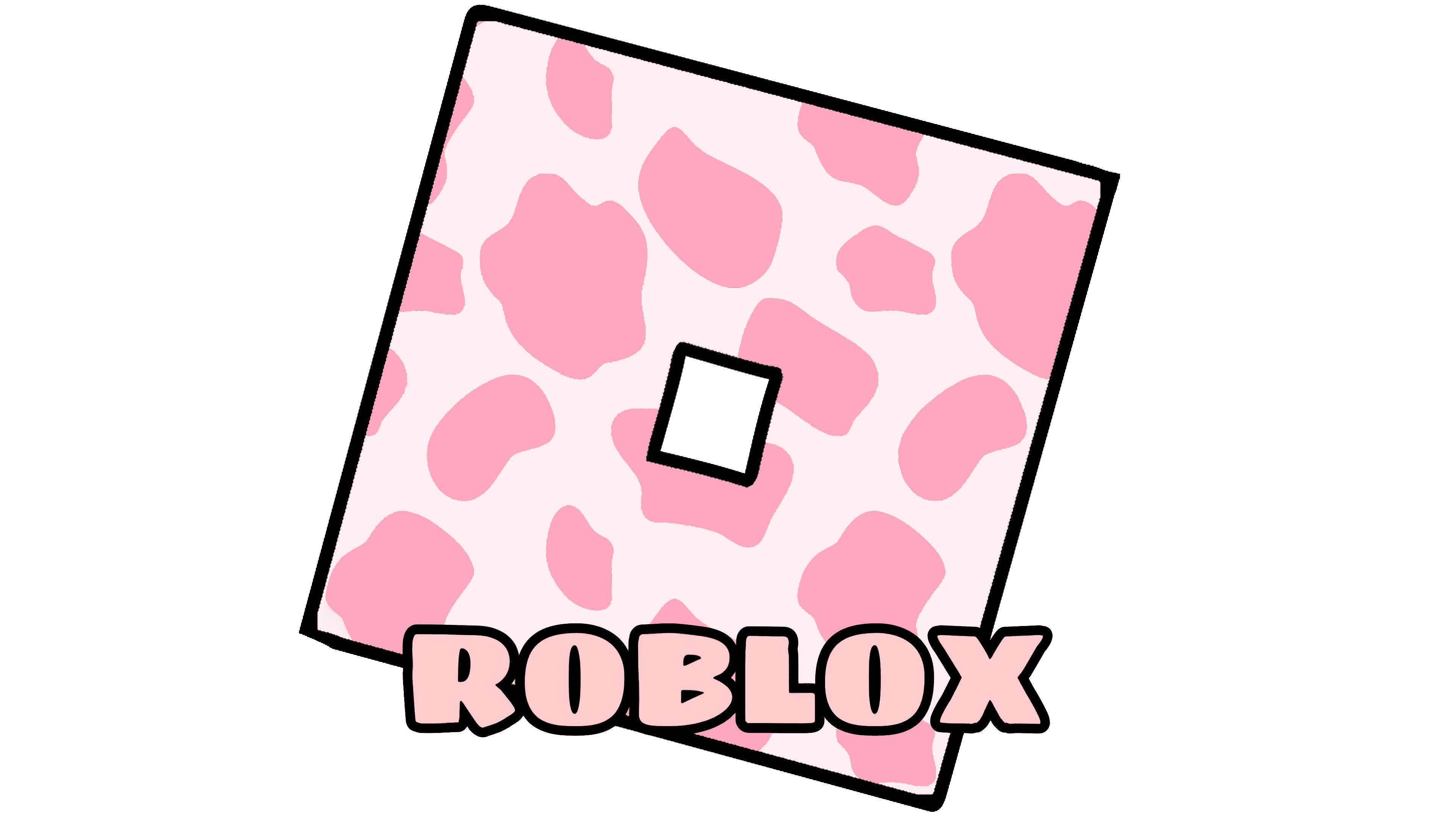
Fashion fans have come up with many unofficial Roblox logos. They mimic the app’s main icon, which looks like a square “O” placed on the bottom right corner. In the original, the symbol is gray, but aesthetics fans are not satisfied with this: they wanted to paint it in different colors and ornaments.
ابتكر عشاق الموضة العديد من شعارات Roblox غير الرسمية. إنها تحاكي الرمز الرئيسي للتطبيق ، والذي يبدو على شكل مربع "O" في الزاوية اليمنى السفلية. في الأصل ، كان الرمز رماديًا ، لكن عشاق الجماليات غير راضين عن هذا: لقد أرادوا رسمه بألوان وزخارف مختلفة.
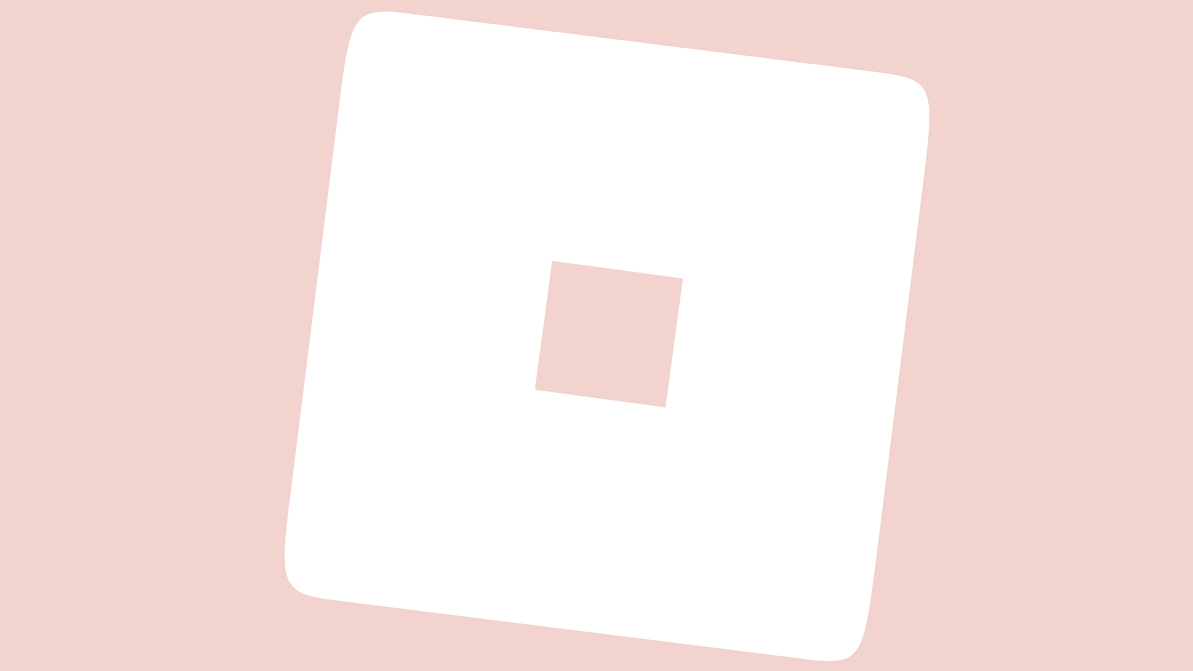
As a result, versions with a pink “O” (or white on a pink background) appeared. And they can be not only monochrome but spotty – with the so-called “strawberry cow” pattern. In addition, purple and blue emblems are popular among beauty lovers. There are versions with shadows, bold black outlines, and gradients.
نتيجة لذلك ، ظهرت إصدارات ذات حرف "O" وردي (أو أبيض على خلفية وردية). ولا يمكن أن تكون أحادية اللون فحسب ، بل متقطعة - بما يسمى بنمط "بقرة الفراولة". بالإضافة إلى ذلك ، تحظى الشعارات الأرجواني والأزرق بشعبية بين عشاق الجمال. هناك إصدارات بظلال ومخططات سوداء جريئة وتدرجات.
Since the Aesthetic Roblox brand exists as a fashion trend without any specific rules, it has no regulated fonts. The color scheme also depends on the preferences of the users themselves. Most often, they choose pink, blue, and nude shades.
نظرًا لأن العلامة التجارية Aesthetic Roblox موجودة كإتجاه للأزياء دون أي قواعد محددة ، فلا يوجد بها خطوط منظمة. يعتمد نظام الألوان أيضًا على تفضيلات المستخدمين أنفسهم. في أغلب الأحيان ، يختارون الظلال الوردية والأزرق والعارية.
FONT AND COLOR OF THE EMBLEM

Why the Roblox logo is GRAY?
The main version of the Roblox logo is not gray but black. The online platform developers ditched the red color to make the brand less visible and take it into the background. In this way, they wanted to demonstrate that the Roblox marketplace is less important than its users.
الإصدار الرئيسي من شعار Roblox ليس رماديًا بل أسود. تخلص مطورو النظام الأساسي عبر الإنترنت من اللون الأحمر لجعل العلامة التجارية أقل وضوحًا وتأخذها في الخلفية. بهذه الطريقة ، أرادوا إثبات أن سوق Roblox أقل أهمية من مستخدميه.
Why did Roblox change their logo?
The designers changed the color of the ROBLOX lettering from red to black to make it easier to perceive the brand. In their opinion, the too bright and aggressive platform’s logo showed that it is dominant, while the real “stars of the show” should be the content creators.
قام المصممون بتغيير لون حروف ROBLOX من الأحمر إلى الأسود لتسهيل فهم العلامة التجارية. في رأيهم ، أظهر شعار النظام الأساسي شديد السطوع والعنف أنه مهيمن ، بينما يجب أن يكون "نجوم العرض" الحقيقيون هم منشئو المحتوى.
The Roblox wordmark only seems simple – in fact, it has hidden connotations. The oblique letter “O” symbolizes fantasy without borders and limitations. This is a game element that hints at the specifics of the website.
يبدو تصميم كلمة Roblox بسيطًا فقط - في الواقع ، له دلالات خفية. الحرف المائل "O" يرمز إلى خيال بلا حدود وحدود. هذا عنصر لعبة يلمح إلى تفاصيل الموقع.
The latest version of the logo features a modified Gill Sans Ultra Bold font. The designers changed the letters a little, making the “O” square. A little later, a free Roblox-2017 typeface was developed based on the inscription.
يتميز أحدث إصدار من الشعار بخط Gill Sans Ultra Bold المعدل. قام المصممون بتغيير الحروف قليلاً ، مما جعل المربع "O". بعد ذلك بقليل ، تم تطوير محرف Roblox-2017 مجانًا بناءً على النقش.
Most of the logo palette contained red, but now all letters are black. White remained only as a background.
احتوت معظم لوحة الشعار على اللون الأحمر ، ولكن الآن أصبحت جميع الأحرف سوداء. بقي الأبيض فقط كخلفية.
Comments
Post a Comment