Skanska – a new look at a healthy and sustainable lifestyle - سكانسكا - نظرة جديدة لنمط حياة صحي ومستدام
In 1887, a concrete factory was founded in Sweden, which, over 135 years, has grown into the world’s largest real estate development and construction company called the Skanska Group. Today, through the productive application of knowledge and effective use of foresight, the brand has expanded its reach into the building markets of Nordics, Europe, and the United States. The company is characterized by creating innovative and sustainable solutions that support a healthy lifestyle throughout the life of the facilities under construction. Pursuing the dual goal of innovating and creating something that will be useful for people and society, the brand develops, designs, and builds everything safe for health and the environment, from office buildings to smart homes and infrastructure. To better reflect its modern essence and the desire to innovate and respect its founding values constantly, the brand has developed its new positioning, making changes to its own visual identity.
في عام 1887 ، تم إنشاء مصنع للخرسانة في السويد ، والذي نما ، على مدار 135 عامًا ، ليصبح أكبر شركة للتطوير العقاري والبناء في العالم تسمى مجموعة سكانسكا. اليوم ، من خلال التطبيق المثمر للمعرفة والاستخدام الفعال للبصيرة ، قامت العلامة التجارية بتوسيع نطاق وصولها إلى أسواق البناء في بلدان الشمال الأوروبي وأوروبا والولايات المتحدة. تتميز الشركة بإيجاد حلول مبتكرة ومستدامة تدعم أسلوب حياة صحي طوال عمر المرافق قيد الإنشاء. سعياً وراء الهدف المزدوج المتمثل في الابتكار وإنشاء شيء سيكون مفيداً للأفراد والمجتمع ، تقوم العلامة التجارية بتطوير وتصميم وبناء كل شيء آمن للصحة والبيئة ، من مباني المكاتب إلى المنازل الذكية والبنية التحتية. لتعكس جوهرها الحديث بشكل أفضل والرغبة في الابتكار واحترام قيمها التأسيسية باستمرار ، طورت العلامة التجارية موقعها الجديد ، وأدخلت تغييرات على هويتها المرئية.
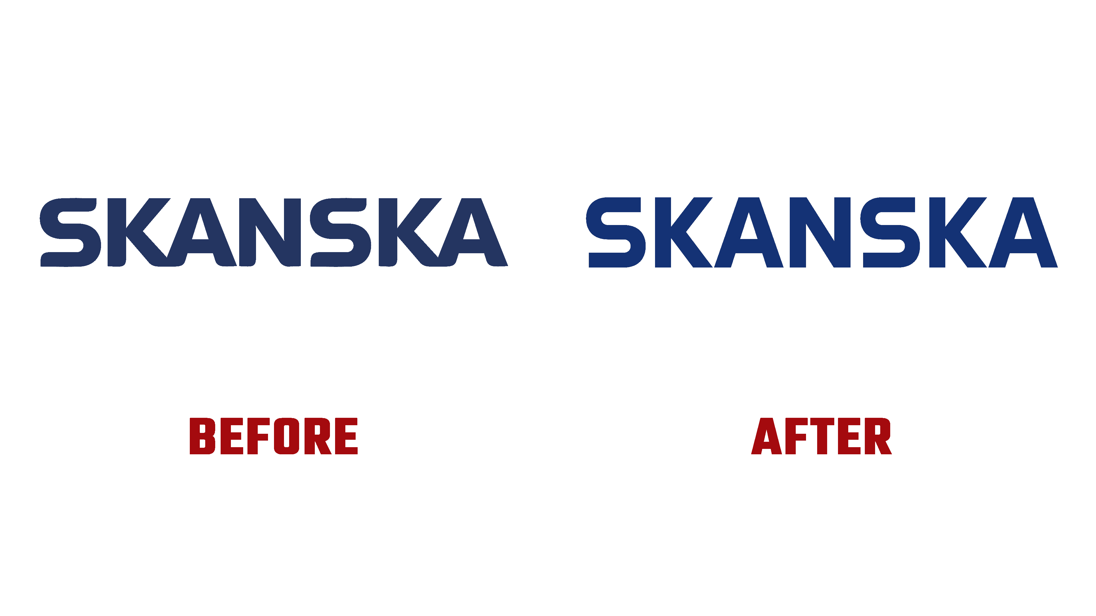
With the help of the new visualization, Skanska’s core values were reflected while demonstrating the understanding that any decision has its permanent impact. The whole design concept was built on constructability, shapes, precision, innovative solutions, and clear architectural markers. The traditional story of the brand was presented in a modern way with enhanced visual appeal and how it contributes to lifestyle.
بمساعدة التصور الجديد ، انعكست القيم الأساسية لشركة Skanska مع إظهار فهم أن أي قرار له تأثيره الدائم. تم بناء مفهوم التصميم بالكامل على قابلية البناء والأشكال والدقة والحلول المبتكرة والعلامات المعمارية الواضحة. تم تقديم القصة التقليدية للعلامة التجارية بطريقة حديثة مع تعزيز الجاذبية البصرية وكيف تساهم في نمط الحياة.

The new logo used an improved mathematical and geometric approach in the formation of graphic images and word form. Although this option was not particularly good for displaying a letter like “S,” the high degree of precision and balance of all other characters ensured the entire text block’s smoothness, cohesion, and strength. The effect of improving the visual perception of the text has been enhanced by the use of complex kerning and indentation, which has done the best job for the sake of comfortable viewing of the image.
استخدم الشعار الجديد نهجًا رياضيًا وهندسيًا محسّنًا في تشكيل الصور الرسومية وشكل الكلمات. على الرغم من أن هذا الخيار لم يكن جيدًا بشكل خاص لعرض حرف مثل "S" ، إلا أن الدرجة العالية من الدقة والتوازن لجميع الأحرف الأخرى ضمنت سلاسة كتلة النص بالكامل وتماسكها وقوتها. تم تعزيز تأثير تحسين الإدراك المرئي للنص من خلال استخدام المسافة البادئة المعقدة لتقنين الأحرف والمسافات البادئة ، والتي أدت إلى أفضل أداء من أجل عرض مريح للصورة.
The purity and clarity of the created logo create the best conditions for its use in large fragments; they become abstract forms in layouts that create a feeling of powerful and solid physical engineering and large-scale built-up environments. With the applied bright illustrations and photographs, simple typography, characterized by a non-standard identity in its simplicity and conciseness, turned out to be effective and encouraging. The brand’s identity has been shaped by a family of custom fonts that symbolize the company’s attitude towards the individuality of each of its projects. All this has become a solid foundation for building a system that creates a sense of trust and reliability.
تخلق نقاء الشعار الذي تم إنشاؤه ووضوحه أفضل الظروف لاستخدامه في الأجزاء الكبيرة ؛ تصبح أشكالًا مجردة في تخطيطات تخلق شعورًا بالهندسة الفيزيائية القوية والصلبة والبيئات المبنية على نطاق واسع. من خلال الرسوم التوضيحية والصور الساطعة المطبقة ، تبين أن الطباعة البسيطة ، التي تتميز بهوية غير قياسية في بساطتها وإيجازها ، كانت فعالة ومشجعة. تم تشكيل هوية العلامة التجارية من خلال مجموعة من الخطوط المخصصة التي ترمز إلى موقف الشركة تجاه خصوصية كل مشروع من مشاريعها. كل هذا أصبح أساسًا متينًا لبناء نظام يخلق إحساسًا بالثقة والموثوقية.
Comments
Post a Comment