The essence of the StartMail platform is that it encrypts emails so that only those users who know the password have access to them. The OpenPGP standard is used, which provides network anonymity and information security. The encrypted version of Pretty Good Privacy was developed by the creator of this software, the American scientist Philip R. Zimmermann.
يكمن جوهر نظام StartMail في أنه يشفر رسائل البريد الإلكتروني بحيث لا يتمكن من الوصول إليها سوى المستخدمين الذين يعرفون كلمة المرور. يتم استخدام معيار OpenPGP ، والذي يوفر إخفاء هوية الشبكة وأمان المعلومات. تم تطوير النسخة المشفرة من Pretty Good Privacy من قبل مبتكر هذا البرنامج ، العالم الأمريكي Philip R. Zimmermann.
MEANING AND HISTORY
What is StartMail?
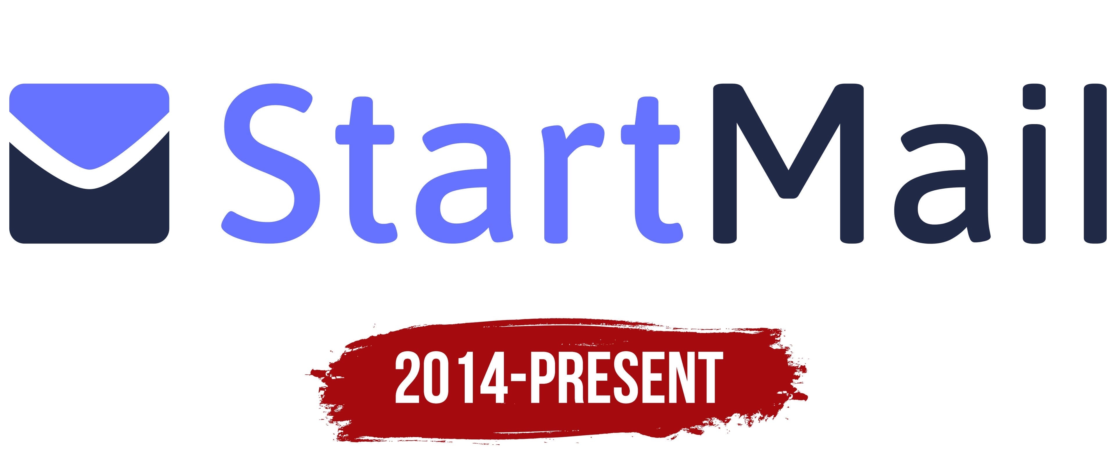
StartMail is an email platform that protects the privacy of its users. It was created in 2013 and, along with Startpage.com, is owned by the Dutch company Surfboard Holding BV. The founder of the web service is software developer David Bodnick.
StartMail عبارة عن منصة بريد إلكتروني تحمي خصوصية مستخدميها. تم إنشاؤه في عام 2013 ، إلى جانب Startpage.com ، مملوك للشركة الهولندية Surfboard Holding BV. مؤسس خدمة الويب هو مطور البرامج ديفيد بودنيك.
StartMail allows you to generate an infinite number of disposable email addresses. Moreover, it is intended not only for everyday communication – it is used by many companies, for which special business accounts are provided on the platform. The email service has a lot in common with Startpage because they were launched by the same person – David Bodnick, co-founder of Surfboard Holding BV. Both services aim to protect the privacy and do not collect user data.
يسمح لك StartMail بإنشاء عدد لا حصر له من عناوين البريد الإلكتروني التي يمكن التخلص منها. علاوة على ذلك ، فهو مخصص ليس فقط للتواصل اليومي - يتم استخدامه من قبل العديد من الشركات ، حيث يتم توفير حسابات أعمال خاصة على النظام الأساسي. تشترك خدمة البريد الإلكتروني في الكثير من القواسم المشتركة مع Startpage لأنها أطلقها نفس الشخص - David Bodnick ، المؤسس المشارك لـ Surfboard Holding BV. تهدف كلتا الخدمتين إلى حماية الخصوصية ولا تجمع بيانات المستخدم.
StartMail appeared in 2013, which is much later than Startpage. But Gravita Creative Ltd worked on their modern visual identification. In this regard, both brands are similar in concept. They even have the same color schemes, which contain a combination of white, light blue, and dark purple.
ظهر StartMail في عام 2013 ، وهو متأخر جدًا عن Startpage. لكن Gravita Creative Ltd عملت على التعرف البصري الحديث. في هذا الصدد ، كلا العلامتين التجاريتين متشابهتان في المفهوم. لديهم حتى أنظمة الألوان نفسها ، والتي تحتوي على مزيج من الأبيض والأزرق الفاتح والأرجواني الداكن.
The current StartMail logo has two parts. On the left is a stylized square letter envelope with rounded corners. It is divided into two halves by a white line that curves downwards in the shape of a boomerang. This strip resembles the middle of the capital “M,” and the imagination completes the side strokes of the letter: they run parallel to the edges of the quadrangle. Here comes the association with the Gmail logo.
يتكون شعار StartMail الحالي من جزأين. يوجد على اليسار مظروف بأحرف مربعة بأسلوب منمق بزوايا دائرية. وهي مقسمة إلى نصفين بواسطة خط أبيض ينحني لأسفل على شكل ذراع الرافعة. يشبه هذا الشريط منتصف الحرف الكبير "M" ، ويكمل الخيال الضربات الجانبية للحرف: فهي تعمل بالتوازي مع حواف رباعي الزوايا. هنا يأتي الارتباط بشعار Gmail.
The bottom of the envelope looks like a dark purple rectangle with a notch in the middle. The top is a light blue triangle pointing at a 90-degree angle into the recess located directly below it. The Gravita designers looked at many StartMail logo concepts with different shapes and combinations before coming up with just this one. Among their designs were paper airplanes, origami, and the blue “M.” But the agency staff abandoned all versions in favor of the current emblem.
يبدو الجزء السفلي من المغلف على شكل مستطيل أرجواني داكن مع شق في المنتصف. الجزء العلوي عبارة عن مثلث أزرق فاتح يشير بزاوية 90 درجة في التجويف الواقع تحته مباشرة. نظر مصممو Gravita في العديد من مفاهيم شعار StartMail بأشكال وتركيبات مختلفة قبل الخروج بهذا الشعار فقط. ومن بين تصميماتهم الطائرات الورقية ، والأوريغامي ، وعلامة "M." الزرقاء. لكن موظفي الوكالة تخلوا عن جميع الإصدارات لصالح الشعار الحالي.
To the right of the graphic sign is the name of the service. It is also two-tone: the first half (“Start”) is light blue, and the second (“Mail”) is dark purple. Each part starts with a capital letter. To design the inscription, the designers chose a sans-serif font. It could be called simple if they did not round all the corners. This decision makes the logo visually soft.
على يمين العلامة الرسومية يوجد اسم الخدمة. وهي أيضًا ذات نغمتين: النصف الأول ("البداية") باللون الأزرق الفاتح ، والثاني ("البريد") باللون الأرجواني الداكن. يبدأ كل جزء بحرف كبير. لتصميم النقش ، اختار المصممون خط sans-serif. يمكن أن يطلق عليه بسيط إذا لم يتم تقريب جميع الزوايا. هذا القرار يجعل الشعار ناعمًا بصريًا.
FONT AND COLORS OF THE EMBLEM

Logically, the email service uses a logo with a picture of a mail envelope. In this case, it symbolizes the protection of information because it is an opaque shell that hides the contents of the letter from the eyes of strangers. Dividing the drawing into two parts made it possible to play on negative space: if you look closely, it becomes noticeable that the capital “M” is hidden in it – the first letter from the word “Mail.”
منطقيًا ، تستخدم خدمة البريد الإلكتروني شعارًا مع صورة لمغلف بريد. في هذه الحالة ، يرمز إلى حماية المعلومات لأنه غلاف معتم يخفي محتويات الرسالة عن أعين الغرباء. أتاح تقسيم الرسم إلى جزأين إمكانية اللعب على مساحة سلبية: إذا نظرت عن كثب ، يصبح ملحوظًا أن الحرف الكبير "M" مخفي فيه - الحرف الأول من كلمة "Mail".
Initially, Gravita designers planned to combine three elements in the lower half of the sign: an envelope, a fortress tower, and a heart. So the protruding edges of the dark purple fragment can be considered stylized teeth of a fortress or halves of a heart. Fortification is associated with reliable protection, and the heart symbolizes love for users.
في البداية ، خطط مصممو Gravita لدمج ثلاثة عناصر في النصف السفلي من اللافتة: مغلف وبرج حصن وقلب. لذلك يمكن اعتبار الحواف البارزة للجزء الأرجواني الداكن أسنانًا منمنمة لقلعة أو نصفي قلب. يرتبط التحصين بحماية موثوقة ، ويرمز القلب إلى حب المستخدمين.
Both parts of the service name are written in the same font – a grotesque with rounded corners. It resembles Adobe’s Myriad Arabic Regular in shape; only the “M” has a slightly lower middle diagonal. Similar typefaces are Webnar Medium by The Northern Block, Drive Regular by Fontyou, and Noto Sans Display Medium by Google. But the designers at Gravita have rounded the letters to make the lettering seem smooth and streamlined.
تمت كتابة كلا الجزأين من اسم الخدمة بنفس الخط - وهو شكل بشع بزوايا مستديرة. يشبه الشكل Myriad Arabic Regular من Adobe ؛ فقط "M" له قطري متوسط منخفض قليلاً. المحارف المماثلة هي Webnar Medium بواسطة The Northern Block ، و Drive Regular بواسطة Fontyou ، و Noto Sans Display Medium بواسطة Google. لكن المصممين في Gravita قاموا بتقريب الأحرف لجعل الحروف تبدو سلسة وانسيابية.

The staff of the British agency paid no less attention to the color scheme. They chose a purple theme for StartMail (and sister service Startpage), complemented by white and light blue.
لم يول موظفو الوكالة البريطانية اهتمامًا أقل لمخطط الألوان. لقد اختاروا سمة أرجوانية لـ StartMail (وصفحة Startpage للخدمة الشقيقة) ، يكملها اللون الأبيض والأزرق الفاتح.
Comments
Post a Comment