MEANING AND HISTORY
What is StumbleUpon?
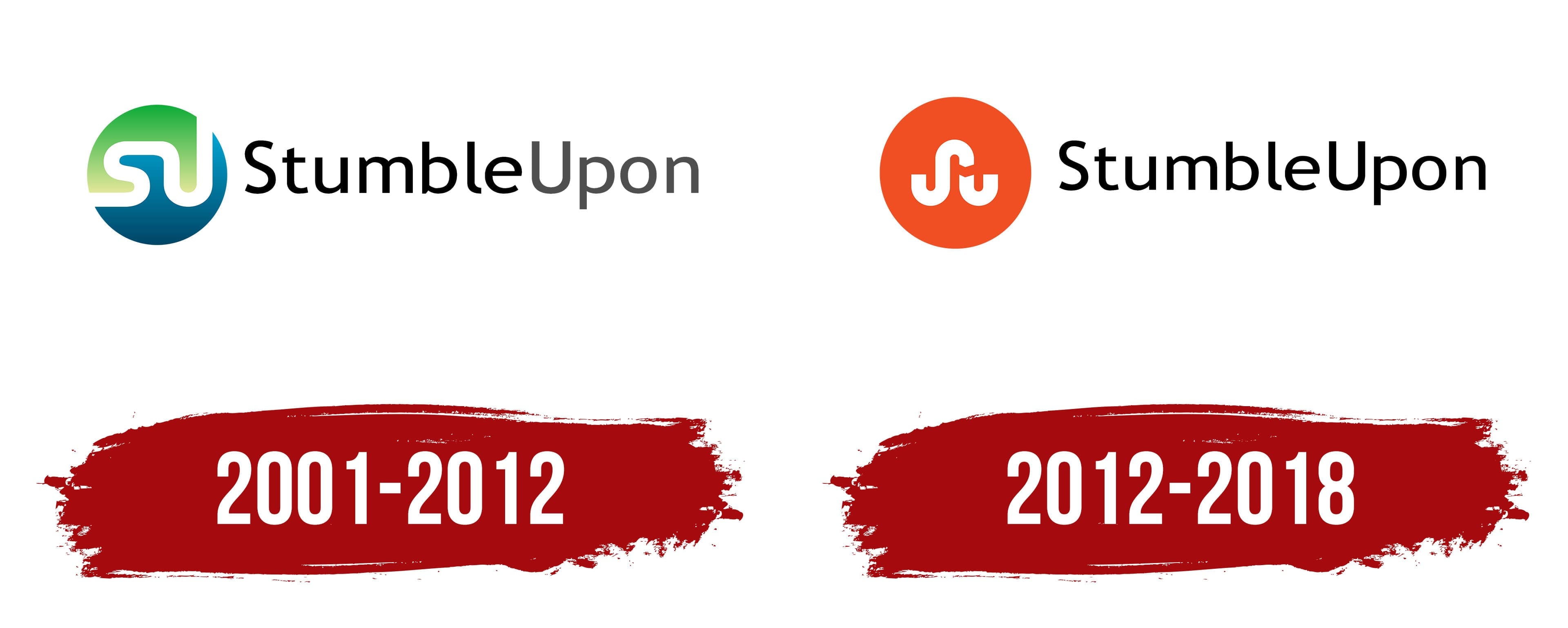
StumbleUpon is an unusual search engine that recommends new online content to users based on their interests. She found a variety of websites, for which it was enough to click on the orange “Stumble” button. Since 2018, the service has not existed: it was closed due to a sharp decline in popularity.
StumbleUpon هو محرك بحث غير عادي يوصي بمحتوى جديد على الإنترنت للمستخدمين بناءً على اهتماماتهم. عثرت على مجموعة متنوعة من المواقع الإلكترونية ، وكان يكفيها النقر فوق الزر البرتقالي "Stumble". منذ عام 2018 ، الخدمة غير موجودة: تم إغلاقها بسبب الانخفاض الحاد في شعبيتها.
StumbleUpon Inc. started as a small startup in 2001 when Geoff Smith, Garrett Camp, and Eric Boyd launched a search engine that recommended personalized content to users. Their business gradually grew and attracted large investments. In 2007 the site was sold to eBay. But the creators of StumbleUpon thought this was a bad decision, so they teamed up with investors and bought out their product just a couple of years after the previous deal.
بدأت StumbleUpon Inc. كشركة صغيرة ناشئة في عام 2001 عندما أطلق جيف سميث وجاريت كامب وإريك بويد محرك بحث أوصى بمحتوى مخصص للمستخدمين. نمت أعمالهم تدريجياً وجذبت استثمارات كبيرة. في عام 2007 تم بيع الموقع إلى eBay. لكن مبتكري StumbleUpon اعتقدوا أن هذا كان قرارًا سيئًا ، لذلك تعاونوا مع مستثمرين واشتروا منتجهم بعد عامين فقط من الصفقة السابقة.
At first, everything was fine: the service’s popularity grew until the number of users exceeded 12 million. In 2011, its owners carried out a major redesign, which was criticized. Then StumbleUpon got a new orange emblem instead of blue-green. Due to the new visual identity, site traffic has plummeted. Meanwhile, the company chased profits and even laid off some employees to save money. Attempts to cut costs and increase traffic were unsuccessful, so in 2018 the search service was closed, unable to withstand the competition with social networks.
في البداية ، كان كل شيء على ما يرام: نمت شعبية الخدمة حتى تجاوز عدد المستخدمين 12 مليونًا. في عام 2011 ، أجرى أصحابها عملية إعادة تصميم كبيرة ، والتي تم انتقادها. ثم حصل StumbleUpon على شعار برتقالي جديد بدلاً من الأزرق والأخضر. بسبب الهوية المرئية الجديدة ، انخفضت حركة المرور على الموقع. في غضون ذلك ، طاردت الشركة الأرباح بل وسرّحت بعض الموظفين لتوفير المال. لم تنجح محاولات خفض التكاليف وزيادة حركة المرور ، لذلك تم إغلاق خدمة البحث في عام 2018 ، غير قادرة على تحمل المنافسة مع الشبكات الاجتماعية.
The first StumbleUpon logo contained a blue-green circle divided in two by a sinuous white stripe. This line symbolized a circular format, similar to how a website redirected users from page to page, helping them navigate the web. Both halves had a gradient: there were light shades closer to the middle and dark ones along the edges. Fun fact: The two-tone badge looked like a mini pack of Cascade Complete dishwashing detergent.
احتوى شعار StumbleUpon الأول على دائرة زرقاء وخضراء مقسمة إلى قسمين بواسطة شريط أبيض متعرج. يرمز هذا الخط إلى تنسيق دائري ، على غرار الطريقة التي أعاد بها موقع الويب توجيه المستخدمين من صفحة إلى أخرى ، مما يساعدهم على التنقل في الويب. كلا النصفين لهما تدرج: كانت هناك ظلال فاتحة أقرب إلى الوسط والظلال الداكنة على الحواف. حقيقة ممتعة: بدت الشارة ذات اللونين وكأنها عبوة صغيرة من منظف الصحون Cascade Complete.
The inscription with the service’s name was to the emblem’s right. The designers chose a sans-serif typeface for it, roughly similar to Asap Bold by Omnibus Type. The first word (“Stumble”) was black, and the second word (“Upon”) was gray.
كان النقش الذي يحمل اسم الخدمة على يمين الشعار. اختار المصممون خط sans-serif لذلك ، مشابهًا تقريبًا لـ Asap Bold بواسطة Omnibus Type. كانت الكلمة الأولى ("Stumble") سوداء ، وكانت الكلمة الثانية ("Upon") باللون الرمادي.
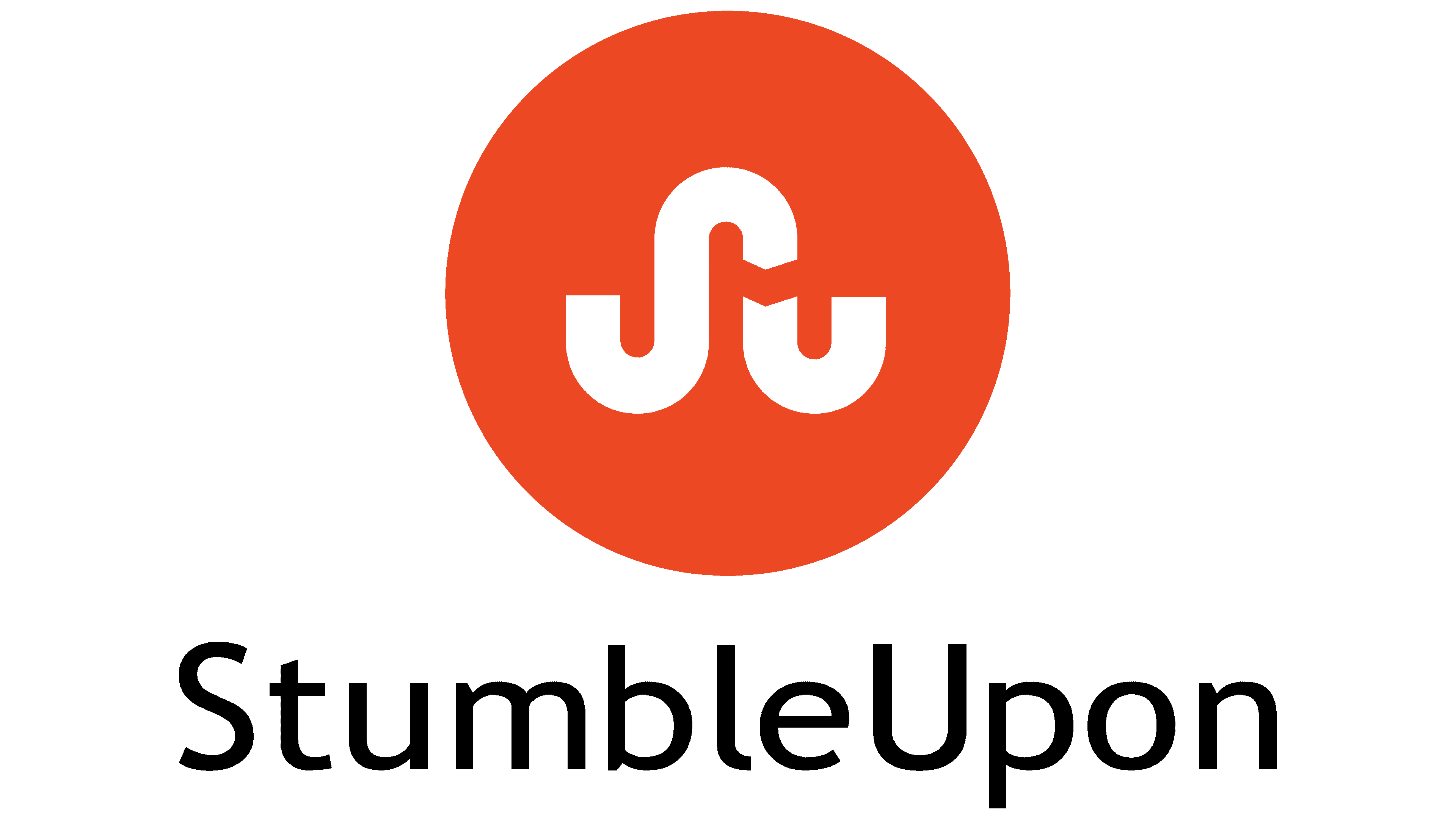
On December 6, 2011, a new design for the StumbleUpon website was unveiled as it was getting ready to go international. At the same time, a minimalistic version of the logo appeared – this time without the famous blue-green circle. An orange circle replaced it with a short curving line in the middle. The white stripe was split into two sections so that the left side looked like a diagonally turned “S” and the right side looked like a “U.” The wordmark became completely black but remained in its place. At the same time, the font was slightly changed: the developers kept the grotesque but made it more round, similar to Roger White’s Yoxall Bold.
في 6 ديسمبر 2011 ، تم الكشف عن تصميم جديد لموقع StumbleUpon حيث كان يستعد للانطلاق عالميًا. في الوقت نفسه ، ظهرت نسخة مبسطة من الشعار - هذه المرة بدون الدائرة الزرقاء والخضراء الشهيرة. استبدلت به دائرة برتقالية بخط منحني قصير في المنتصف. تم تقسيم الشريط الأبيض إلى قسمين بحيث بدا الجانب الأيسر وكأنه تحول قطريًا إلى "S" والجانب الأيمن يشبه "U". أصبحت العلامة النصية سوداء تمامًا ولكنها بقيت في مكانها. في الوقت نفسه ، تم تغيير الخط قليلاً: احتفظ المطورون بالخط الغريب لكنهم جعلوه دائريًا ، على غرار روجر وايت Yoxall Bold.
The company’s designers created the visual identity in collaboration with the Huge agency. Before making the changes, they conducted several surveys and found out that people liked the upcoming changes. But when the rebrand was completed, it caused a flurry of criticism because StumbleUpon began to resemble Pinterest in appearance, and users did not like it. The logo remained relevant until 2018 when the service closed.
ابتكر مصممو الشركة الهوية المرئية بالتعاون مع الوكالة الضخمة. قبل إجراء التغييرات ، أجروا العديد من الاستطلاعات واكتشفوا أن الأشخاص قد أحبوا التغييرات القادمة. ولكن عند اكتمال إعادة العلامة التجارية ، تسببت في موجة من الانتقادات لأن StumbleUpon بدأت تشبه Pinterest في المظهر ، ولم يعجبها المستخدمون. ظل الشعار مناسبًا حتى عام 2018 عندما تم إغلاق الخدمة.
FONT AND COLORS OF THE EMBLEM

The first letters of the company’s brand name are encrypted in a white winding stripe: “S” and “U.” But this is not just a stylized monogram but a symbol with a deep meaning because the white line resembles a winding road that leads into the unknown. This value echoes the main function of StumbleUpon – random content search. The emblem represents progress, forward movement, development, and an exciting journey from one page to another.
يتم تشفير الأحرف الأولى من اسم العلامة التجارية للشركة في شريط أبيض متعرج: "S" و "U." لكن هذا ليس مجرد حرف واحد فقط بل هو رمز ذو معنى عميق لأن الخط الأبيض يشبه طريقًا متعرجًا يؤدي إلى المجهول. هذه القيمة تعكس الوظيفة الرئيسية لـ StumbleUpon - البحث العشوائي عن المحتوى. يمثل الشعار التقدم والحركة إلى الأمام والتنمية ورحلة مثيرة من صفحة إلى أخرى.
The brand name is written in a sans-serif font. Even though “Stumble” and “Upon” are concatenated, both words start with a capital letter. The geometric sans serif chosen by the designers is similar to GNU FreeFont’s FreeSans Bold, but with rounder glyphs, as in Roger White’s Yoxall Bold.
اسم العلامة التجارية مكتوب بخط sans-serif. على الرغم من تسلسل "Stumble" و "Upon" ، تبدأ كلتا الكلمتين بحرف كبير. يشبه التصميم الهندسي sans serif الذي اختاره المصممون FreeSans Bold من GNU FreeFont ، ولكن مع الحروف الرسومية المستديرة ، كما في روجر وايت Yoxall Bold.

After the logo update in 2012, the most criticized was the change in the color scheme. During this period, there was a sharp transition from a combination of blue and green to a dark orange hue (#EB471D). The strip inside the circle remained white, and the inscription became completely black, whereas before, its second half was gray.
بعد تحديث الشعار في عام 2012 ، كان التغيير في نظام الألوان هو الأكثر تعرضًا للانتقاد. خلال هذه الفترة ، كان هناك انتقال حاد من مزيج من اللون الأزرق والأخضر إلى اللون البرتقالي الداكن (# EB471D). وظل الشريط داخل الدائرة أبيض اللون ، وأصبح النقش أسود بالكامل ، بينما كان النصف الثاني من قبل باللون الرمادي.
Comments
Post a Comment