Turo connects car owners and renters who want to book a car. For some, it allows them to rent out vehicles when they’re idling in the garage, and for others, it gives them a choice from a unique list of vehicles available nearby. The carshare organization is headquartered in San Francisco, although it was launched in Boston.
يربط Turo مالكي السيارات والمستأجرين الذين يرغبون في حجز سيارة. بالنسبة للبعض ، يسمح لهم بتأجير المركبات عندما يكونون في وضع الخمول في المرآب ، وبالنسبة للآخرين ، فإنه يمنحهم خيارًا من قائمة فريدة من المركبات المتوفرة في مكان قريب. يقع المقر الرئيسي لمنظمة مشاركة السيارات في سان فرانسيسكو ، على الرغم من إطلاقها في بوسطن.
MEANING AND HISTORY
What is Turo?
The American company Turo allows drivers to rent out their vehicles and travelers to rent cars. It came into being in 2010car-sharingcar-sharing and pioneered the carsharing industry. The service used to be called RelayRides, but it was renamed because of inappropriate associations with ridesharing.
تسمح شركة Turo الأمريكية للسائقين بتأجير سياراتهم والمسافرين لتأجير السيارات. ظهرت إلى حيز الوجود في 2010 تقاسم السيارات تقاسم ورائدة في صناعة مشاركة السيارات. كان يطلق على الخدمة اسم RelayRides ، ولكن تمت إعادة تسميتها بسبب وجود ارتباطات غير مناسبة مع ميزة مشاركة الرحلات.
A pioneer in the sharing industry, Turo entered the market in 2010. Its founder, Shelby Clark, was somehow convinced that people would agree to rent out their cars to strangers. Despite the insanity of such an idea, he was not mistaken: car owners happily jumped at the opportunity to earn extra money. Travelers, in turn, were eager to rent vehicles not from fleets but directly from individuals.
دخلت Turo السوق في عام 2010 كشركة رائدة في صناعة المشاركة. وكان مؤسسها ، شيلبي كلارك ، مقتنعًا بطريقة ما بأن الناس سيوافقون على تأجير سياراتهم للغرباء. على الرغم من جنون هذه الفكرة ، إلا أنه لم يكن مخطئًا: فقد اغتنم مالكو السيارات فرصة لكسب أموال إضافية. كان المسافرون بدورهم حريصين على استئجار مركبات ليس من الأساطيل ولكن مباشرة من الأفراد.
The original company name (RelayRides) and its original logo in the form of a steering wheel placed inside a ring of two arrows, as in the recycling symbol, underlined the unusual concept. At first, rentals were short-term: drivers booked a car for just a few hours, then returned it to the owner or passed it on to the next renter. But after two years, the carsharing service switched to long-term rentals and literally “grew out” of its old name, which was associated with ridesharing, shared rides. It is worth noting that when RelayRides appeared, such a concept as ridesharing did not yet exist – it was introduced later by Lyft and Uber.
أكد اسم الشركة الأصلي (RelayRides) وشعارها الأصلي على شكل عجلة قيادة موضوعة داخل حلقة من سهمين ، كما في رمز إعادة التدوير ، على المفهوم غير العادي. في البداية ، كانت الإيجارات قصيرة الأجل: حجز السائقون سيارة لساعات قليلة فقط ، ثم أعادوها إلى المالك أو نقلها إلى المستأجر التالي. ولكن بعد عامين ، تحولت خدمة مشاركة السيارات إلى الإيجارات طويلة الأجل و "نمت" حرفيًا من اسمها القديم ، الذي ارتبط بركوب السيارات المشتركة ، وركوب الخيل المشتركة. تجدر الإشارة إلى أنه عندما ظهرت RelayRides ، لم يكن مفهوم مثل ridesharing موجودًا بعد - تم تقديمه لاحقًا بواسطة Lyft و Uber.
After a rebranding in 2015, the company became known as Turo. This word is a neologism in the English language. It was invented by the Lexicon naming studio, the same one that gave rise to the Swiffer and Blackberry brands. The new name is associated with exciting adventures and great speed because it is in tune with “Gran Turismo” and “Turbo.” The designers reflected it in the new logo, placing it inside the road sign in the form of an arrow.
بعد تغيير علامتها التجارية في عام 2015 ، أصبحت الشركة تُعرف باسم Turo. هذه الكلمة هي حديث في اللغة الإنجليزية. تم اختراعه بواسطة استوديو التسمية Lexicon ، وهو نفس الاستوديو الذي أدى إلى ظهور علامتي Swiffer و Blackberry. يرتبط الاسم الجديد بمغامرات مثيرة وسرعة كبيرة لأنه يتوافق مع "Gran Turismo" و "Turbo". عكسه المصممون في الشعار الجديد ووضعوه داخل لافتة الطريق على شكل سهم.
In the beginning, RelayRides used a logo in the form of a steering wheel inside a ring of two semicircular arrows, but that option was temporary. A few years later, it had a new graphic, unofficially nicknamed “The Human Centipede. At least, that’s what some employees of the carsharing service called it.
في البداية ، استخدمت RelayRides شعارًا على شكل عجلة قيادة داخل حلقة من سهمين نصف دائريين ، لكن هذا الخيار كان مؤقتًا. بعد بضع سنوات ، ظهر رسم جديد ، أطلق عليه بشكل غير رسمي "حريش الإنسان. على الأقل ، هذا ما أطلق عليه بعض موظفي خدمة مشاركة السيارات.
It consisted of two wavy lines intertwined with each other in the form of a chain. One line was gray, like a road. Inside it was white dotted lines that mimicked the roadway markings. The second wavy element was light blue. On top were three circles: two blue at the edges and one gray in the middle. They looked like human heads, while the intertwined stripes resembled shoulders and arms.
كان يتألف من خطين متموجين متشابكين مع بعضهما البعض في شكل سلسلة. كان أحد الخطوط رماديًا ، مثل الطريق. داخلها كانت هناك خطوط بيضاء منقطة تحاكي علامات الطريق. العنصر الثاني المتموج كان أزرق فاتح. في الأعلى كانت هناك ثلاث دوائر: اثنتان باللون الأزرق عند الحواف وواحدة باللون الرمادي في المنتصف. بدوا وكأنهم رؤوس بشرية ، في حين أن الخطوط المتشابكة تشبه الكتفين والذراعين.
Underneath the emblem, depicting three people embracing was the brand name with two capital letters “R.” The designers made it gray and designed it in a custom sans serif font. The closest counterpart to the chosen headset is the REZ Regular by Fraser Davidson. The rounded glyphs with a minimum of protrusions look like tiny racing tracks.
تحت الشعار ، رسم ثلاثة أشخاص يحتضنون اسم العلامة التجارية بحرفين كبيرين "R." جعله المصممون باللون الرمادي وصمموه بخط sans serif المخصص. أقرب نظير لسماعة الرأس المختارة هو REZ Regular by Fraser Davidson. تبدو الصور الرمزية المستديرة مع الحد الأدنى من النتوءات مثل مسارات سباق صغيرة.
Due to the expansion of RelayRides, the owners decided to rename the service and completely change its concept. It took the company several months to contact investors and clients, hire a naming agency, Lexicon, and negotiate a collaboration with DesignStudio. During the joint work, they defined the vector of brand development, found a new name for it, created a typographic system, and picked up the corporate colors. All this was done on the eve of Turo’s entrance into the international market.
نظرًا لتوسيع RelayRides ، قرر المالكون إعادة تسمية الخدمة وتغيير مفهومها بالكامل. لقد استغرقت الشركة عدة أشهر للاتصال بالمستثمرين والعملاء ، وتوظيف وكالة تسمية ، معجم ، والتفاوض بشأن تعاون مع DesignStudio. أثناء العمل المشترك ، حددوا متجه تطوير العلامة التجارية ، ووجدوا اسمًا جديدًا لها ، وأنشأوا نظامًا مطبعيًا ، والتقطوا ألوان الشركة. تم كل هذا عشية دخول Turo إلى السوق الدولية.
The rebranding project itself lasted for nine months. The designers rented a few dozen cars and even leased their vehicles to immerse themselves in the atmosphere fully. They realized that Turo was an ambitious and adventurous car rental service. Still, it needed a simple logo that could symbolize the trip’s starting point and encourage them to start a new adventure.
استمر مشروع تغيير العلامة التجارية نفسه لمدة تسعة أشهر. استأجر المصممون بضع عشرات من السيارات واستأجروا سياراتهم ليغمروا أنفسهم في الجو بشكل كامل. لقد أدركوا أن Turo كانت خدمة تأجير سيارات طموحة ومغامرة. ومع ذلك ، فقد احتاجت إلى شعار بسيط يمكن أن يرمز إلى نقطة انطلاق الرحلة ويشجعهم على بدء مغامرة جديدة.
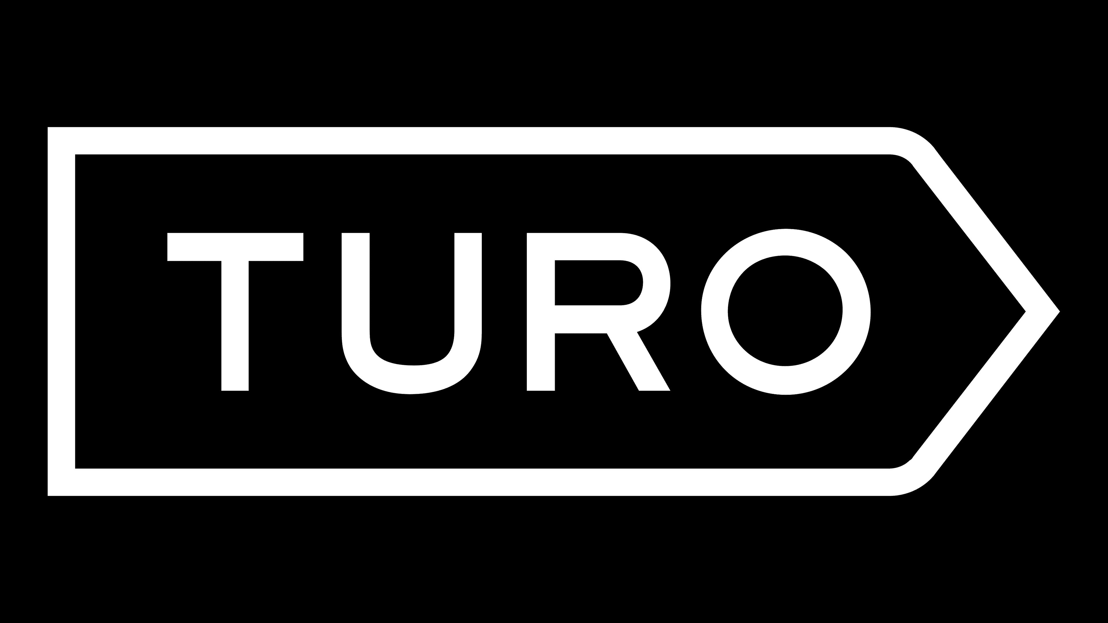
So the car rental service got a modern wordmark – a minimalistic “TURO” inscription placed inside a white road sign with a black outline. The base is rectangular, but the right side is pointed as a triangular arrow. Remarkably, the presentation of the new design took place at the GoKart track in San Francisco.
لذلك حصلت خدمة تأجير السيارات على علامة نصية حديثة - نقش "TURO" المبسط داخل لافتة طريق بيضاء مع مخطط أسود. القاعدة مستطيلة ، لكن الجانب الأيمن مشار إليه كسهم مثلثي. ومن اللافت للنظر أن عرض التصميم الجديد تم في مسار GoKart في سان فرانسيسكو.
FONT AND COLORS OF THE EMBLEM

The company’s graphic sign does not accidentally look like a road sign. It says that all roads are open and sets the direction to the future, towards the adventures. It is a call not to sit still but to move forward, travel and change cars. He also presents Turo as a confident and reliable brand with an innovative approach to car sharing.
لا تبدو اللافتة الرسومية للشركة عن طريق الخطأ كإشارة طريق. تقول أن جميع الطرق مفتوحة وتحدد الاتجاه نحو المستقبل ، نحو المغامرات. إنها دعوة لا للجلوس مكتوفي الأيدي بل للمضي قدمًا والسفر وتغيير السيارات. كما يقدم Turo كعلامة تجارية واثقة وموثوقة مع نهج مبتكر لمشاركة السيارة.
The staff of DesignStudio developed a whole system of fonts for Turo to distinguish the company from its competitors. The wordmark, in particular, is a simple geometric grotesque font that has a lot in common with Graphie SemiBold by Dharma Type, Ridley Grotesk Semi Bold by Radomir Tinkov, Nutmeg Regular by W Foundry, and Stem Medium by ParaType.
طور موظفو DesignStudio نظامًا كاملاً للخطوط لـ Turo لتمييز الشركة عن منافسيها. العلامة النصية ، على وجه الخصوص ، عبارة عن خط هندسي بشع بسيط له الكثير من القواسم المشتركة مع Graphie SemiBold من Dharma Type ، و Ridley Grotesk Semi Bold من Radomir Tinkov ، و Nutmeg Regular by W Foundry ، و Stem Medium by ParaType.

The color scheme is similarly minimalistic, with only black and white. The former is used for the brand name and the outline, while the latter is used for the base. This is in line with the “starting point” concept, where there shouldn’t be anything superfluous and distracting.
نظام الألوان بسيط بالمثل ، مع الأسود والأبيض فقط. يستخدم الأول لاسم العلامة التجارية والمخطط التفصيلي ، بينما يستخدم الأخير للقاعدة. يتماشى هذا مع مفهوم "نقطة البداية" ، حيث لا ينبغي أن يكون هناك أي شيء غير ضروري ومشتت للانتباه.
Comments
Post a Comment