Today, consumers can finally get acquainted with the unique products of the Mexican brand Bawi, the development of which was launched in 2020. After two years, the Agua Frescas-inspired sparkling water brand launched its first offerings in an original and attractive design. The distinctive look and convenient, multi-colored packaging, designed by The Working Assembly, NY, is a welcome addition to the unique taste variety of sparkling water. The recipe for this product was created by two students, Victor Guardiola from Monterrey, Mexico, and Jordan Hicks from Austin, TX, who met at the University of Texas at Austin. The new product results from a practical course at an educational institution, the task of which was to create carbonated water with low sugar content and the taste characteristics of traditional Agua Frescas fruit-based drinks. During the development process, the founders improved their recipe and prepared for the launch this year a line of ready-made drinks from three main flavors – pineapple, lime, and passion fruit.
اليوم ، يمكن للمستهلكين أخيرًا التعرف على المنتجات الفريدة للعلامة التجارية المكسيكية Bawi ، والتي تم إطلاق تطويرها في عام 2020. بعد عامين ، أطلقت العلامة التجارية للمياه الفوارة المستوحاة من Agua Frescas عروضها الأولى بتصميم أصلي وجذاب. الشكل المميز والتعبئة والتغليف المريح متعدد الألوان ، الذي صممه The Working Assembly ، NY ، هو إضافة مرحب بها إلى المذاق الفريد المتنوع للمياه الفوارة. تم إنشاء الوصفة الخاصة بهذا المنتج من قبل طالبين ، فيكتور جوارديولا من مدينة مونتيري بالمكسيك وجوردان هيكس من أوستن ، تكساس ، التقيا في جامعة تكساس في أوستن. نتج المنتج الجديد عن دورة عملية في مؤسسة تعليمية ، كانت مهمتها إنشاء مياه غازية ذات محتوى منخفض من السكر وخصائص طعم مشروبات Agua Frescas التقليدية القائمة على الفاكهة. خلال عملية التطوير ، حسّن المؤسسون وصفتهم وأعدوا لإطلاق مجموعة من المشروبات الجاهزة هذا العام من ثلاث نكهات رئيسية - الأناناس والليمون والباشن فروت.
The identity of the created new brand was built on the reflection of Mexican roots, modern and bold style. The typography was created using hand-drawn technology, including the voluminous vernacular that commonly appears in the names and advertisements of local food and fruit stands. It is also particularly active in Mexican street art. Colorful packaging and non-standard style of illustrations have become a reflection of the traditional Mexican card game -Lotería. It dates back to the twenties of the last century; whose visual design of the cards was done in a vintage watercolor style. An innovative idea was the simultaneous use of several visualization languages to ensure readability not only by consumers in the country of origin. Native Spanish and general English were used here. This duality on the packaging hints at the deep intersection of Mexican-American and Tex-Mex cultures.
تم بناء هوية العلامة التجارية الجديدة التي تم إنشاؤها على انعكاس الجذور المكسيكية والأسلوب الحديث والجريء. تم إنشاء الطباعة باستخدام تقنية مرسومة باليد ، بما في ذلك اللغة العامية الضخمة التي تظهر بشكل شائع في أسماء وإعلانات الأطعمة المحلية وأكشاك الفاكهة. كما أنها نشطة بشكل خاص في فن الشارع المكسيكي. أصبحت العبوات الملونة والأسلوب غير القياسي للرسوم التوضيحية انعكاسًا للعبة الورق المكسيكية التقليدية -Lotería. يعود تاريخه إلى العشرينات من القرن الماضي. تم تصميم البطاقات المرئية بأسلوب ألوان مائية عتيقة. كانت الفكرة المبتكرة هي الاستخدام المتزامن للعديد من لغات التصور لضمان سهولة القراءة ليس فقط من قبل المستهلكين في بلد المنشأ. تم استخدام اللغة الإسبانية الأصلية والإنجليزية العامة هنا. تشير هذه الازدواجية على العبوة إلى التقاطع العميق بين الثقافات المكسيكية الأمريكية والتكس مكس.

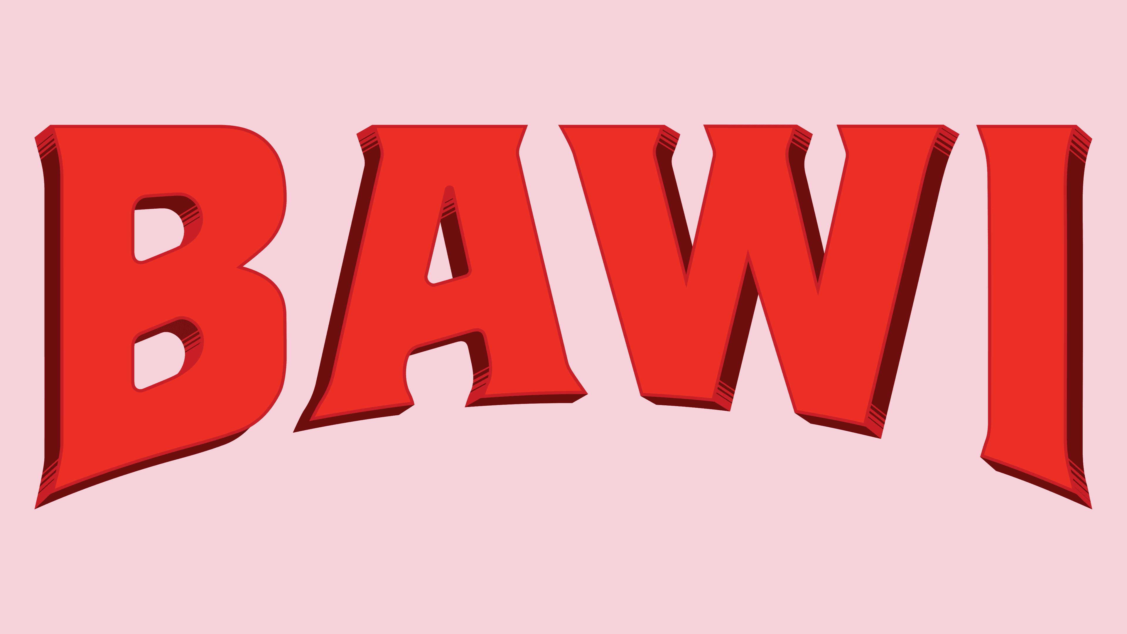
To create a uniquely appealing visual identity, the new logo reflects the fun customization of each letter of the wordmark. They all have a lot of personalities, reminiscent of the vernacular inscriptions used in Mexican “wall advertising.” They are also widely used in signs and names of food stalls and shops, menus, and decorations of small Mexican catering establishments. The letters are distinguished by flared serifs, strong sharpening, and curvature of the lower part. The horizontal strokes of the letters “B” and “A” set stimulating upward movements. The text modules and the wordmark were shaped using a family of original fonts – a sprawling, sans-serif, cheerful Steradian, and Shackleton – especially effective in the logo itself.
لإنشاء هوية بصرية جذابة بشكل فريد ، يعكس الشعار الجديد التخصيص الممتع لكل حرف من أحرف العلامة النصية. لديهم جميعًا الكثير من الشخصيات ، تذكرنا بالنقوش المحلية المستخدمة في "إعلانات الحائط" المكسيكية. كما أنها تستخدم على نطاق واسع في اللافتات وأسماء أكشاك الطعام والمحلات التجارية وقوائم الطعام وزخارف مؤسسات تقديم الطعام المكسيكية الصغيرة. تتميز الحروف برموز متعرجة وشحذ قوي وانحناء للجزء السفلي. الضربات الأفقية للحرفين "B" و "A" تحفز الحركات الصاعدة. تم تشكيل وحدات النص والشعار النصي باستخدام عائلة من الخطوط الأصلية - مترامية الأطراف ، بلا سيريف ، ستيراديان مبهجة ، وشاكلتون - فعالة بشكل خاص في الشعار نفسه.
Comments
Post a Comment