WeChat is software that allows millions of users worldwide to exchange messages with each other. The first release appeared in 2011. The application is available to owners of Android and iPhone-based smartphones and those users who prefer personal computers and laptops. WeChat mainly operates in the market of China, where about 230 million people are active users.
WeChat هو برنامج يسمح لملايين المستخدمين حول العالم بتبادل الرسائل مع بعضهم البعض. ظهر الإصدار الأول في عام 2011. التطبيق متاح لأصحاب الهواتف الذكية التي تعمل بنظام Android و iPhone والمستخدمين الذين يفضلون أجهزة الكمبيوتر الشخصية وأجهزة الكمبيوتر المحمولة. تعمل WeChat بشكل أساسي في سوق الصين ، حيث يوجد حوالي 230 مليون شخص من المستخدمين النشطين.
MEANING AND HISTORY
What is WeChat?
First of all, it is the ability to write a message anywhere and anytime. The user-friendly interface and navigation only add to the appeal of the application in the eyes of the target audience.
بادئ ذي بدء ، إنها القدرة على كتابة رسالة في أي مكان وزمان. تضيف الواجهة سهلة الاستخدام والتنقل فقط إلى جاذبية التطبيق في عيون الجمهور المستهدف.
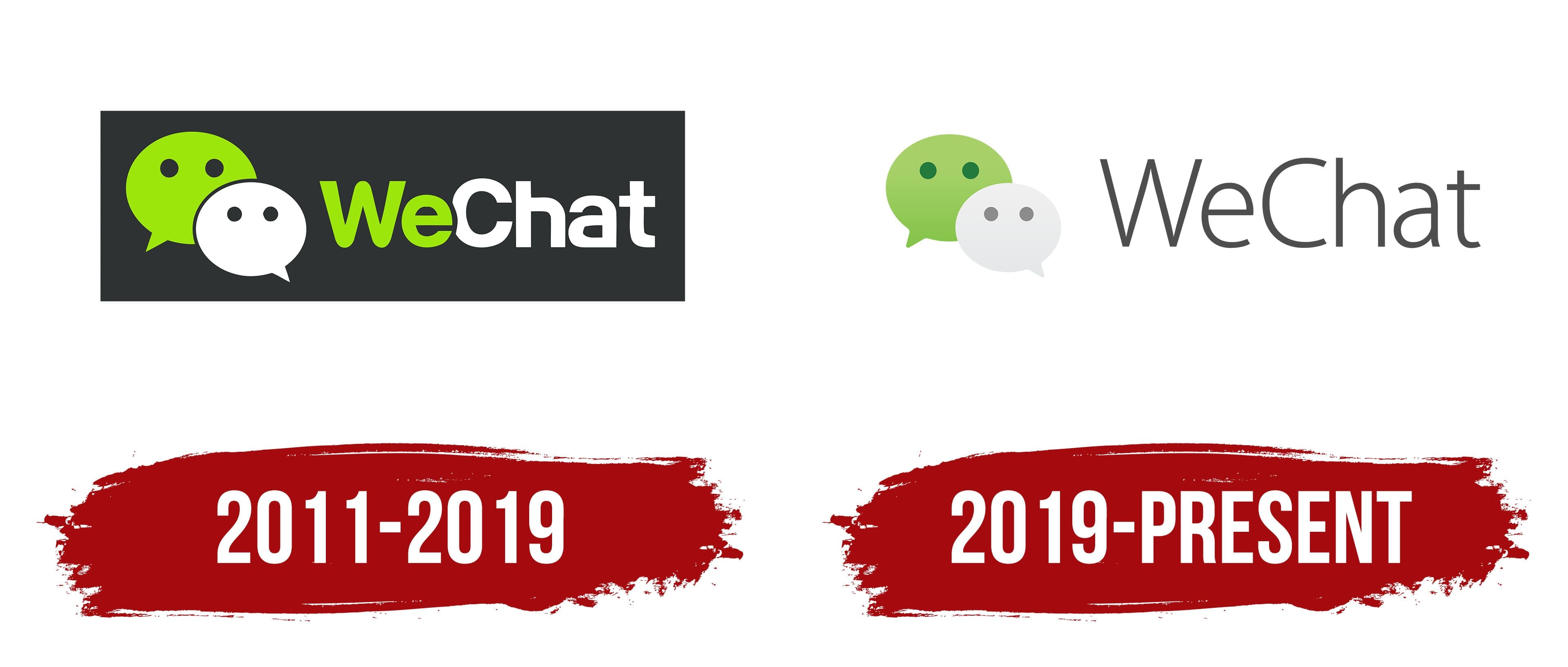
WeChat is the main analog of WhatsApp, designed specifically for the Chinese market. The creation of the messenger was because many international messenger programs are not available to locals. Most users will immediately find similarities between the two applications. And it is not just about functionality but also about the tools of visual recognition. An identical color scheme is used for the logo. For all the time WeChat has been on the market, there have been only two logo variants. Moreover, the only redesign made only minimal changes.
WeChat هو النظير الرئيسي لتطبيق WhatsApp ، وهو مصمم خصيصًا للسوق الصيني. تم إنشاء برنامج المراسلة لأن العديد من برامج المراسلة الدولية غير متاحة للسكان المحليين. سيجد معظم المستخدمين على الفور أوجه تشابه بين التطبيقين. ولا يتعلق الأمر بالوظائف فحسب ، بل يتعلق أيضًا بأدوات التعرف المرئي. تم استخدام مخطط ألوان متطابق للشعار. طوال الوقت الذي كان WeChat في السوق ، لم يكن هناك سوى نوعين مختلفين من الشعارات. علاوة على ذلك ، فإن إعادة التصميم الوحيدة لم تحدث سوى تغييرات طفيفة.
2011 – 2019
Messenger became available to the target audience in 2011. At the same time, the first version of the logo was also presented to customers. It depicts the same elements as in the current version, namely a verbal inscription that repeats the name of the brand and the emblem. For the messenger’s name, a modern sans serif font with rounded corners was chosen. In this case, the letter “e” is superimposed on the “C.” Thus, the logo looks playful and provocative. The first part of the inscription is presented in green and the second in white. The same color palette was chosen for the emblem. It is presented in the form of two dialogue symbols, which are superimposed on top of each other. Each dialogue depicts two dots, which can be associated with both eyes and a typed message. All of the logo elements, in turn, are inside a dark gray rectangle that acts as a background.
أصبح Messenger متاحًا للجمهور المستهدف في عام 2011. وفي الوقت نفسه ، تم أيضًا تقديم الإصدار الأول من الشعار للعملاء. وهي تصور نفس العناصر الموجودة في الإصدار الحالي ، وهي نقش شفهي يكرر اسم العلامة التجارية والشعار. بالنسبة لاسم الرسول ، تم اختيار خط sans serif الحديث بزوايا مستديرة. في هذه الحالة ، يتم تثبيت الحرف "e" على الحرف "C." وبالتالي ، يبدو الشعار مرحًا واستفزازيًا. الجزء الأول من الكتابة مكتوب باللون الأخضر والثاني باللون الأبيض. تم اختيار نفس لوحة الألوان للشعار. يتم تقديمه في شكل رمزي حوار متراكبين فوق بعضهما البعض. يصور كل حوار نقطتين يمكن ربطهما بكلتا العينين والرسالة المكتوبة. جميع عناصر الشعار ، بدورها ، موجودة داخل مستطيل رمادي غامق يعمل كخلفية.
2019 – today
The 2019 redesign led to a simplification of the logo, even though all the main elements have been retained. At the same time, the background was removed, making the image even brighter and friendlier. The dialog symbols became identical in size to the verbal lettering. The green and white gradients were used to make the emblem more vivid. It is what is used as an icon for mobile applications and personal computer versions. A classic sans serif font in dark gray with capital “W” and “C” was used for the lettering.
أدت إعادة التصميم لعام 2019 إلى تبسيط الشعار ، على الرغم من الاحتفاظ بجميع العناصر الرئيسية. في الوقت نفسه ، تمت إزالة الخلفية ، مما يجعل الصورة أكثر إشراقًا وودية. أصبحت رموز الحوار متطابقة في الحجم مع الحروف اللفظية. تم استخدام التدرجات اللونية الخضراء والبيضاء لجعل الشعار أكثر وضوحًا. إنه ما يستخدم كرمز لتطبيقات الهاتف المحمول وإصدارات أجهزة الكمبيوتر الشخصية. تم استخدام خط sans serif الكلاسيكي باللون الرمادي الداكن مع الأحرف الكبيرة "W" و "C" للحروف.
FONT AND COLORS OF THE EMBLEM


Classic for the logo WeChat is a green-white color palette. Many people associate green with life and communication, while white speaks of unity. The simplification of the verbal inscription, which is done in one tone in the current version, further motivates users to pay attention to the emblem, which is the “highlight” of the application and some reference to the more famous WhatsApp.
Classic للشعار WeChat عبارة عن لوحة ألوان خضراء-بيضاء. يربط الكثير من الناس اللون الأخضر بالحياة والتواصل ، بينما يتحدث الأبيض عن الوحدة. إن تبسيط الكتابة اللفظية ، والذي يتم بنبرة واحدة في الإصدار الحالي ، يحفز المستخدمين بشكل أكبر على الانتباه إلى الشعار ، وهو "تمييز" التطبيق وبعض الإشارات إلى WhatsApp الأكثر شهرة.
Comments
Post a Comment