Inspired by the screen version of the novel, the famous company Quaker Oats decided to make the fictional sweetness real. Confectionery products received the appropriate design. It was a bright, colorful design with elements reminiscent of the legendary film. The style changed many times, but each new version did not deviate from the original concept.
مستوحاة من نسخة الشاشة للرواية ، قررت شركة Quaker Oats الشهيرة أن تجعل الحلاوة الخيالية حقيقية. تلقت منتجات الحلويات التصميم المناسب. لقد كان تصميمًا مشرقًا وملونًا مع عناصر تذكرنا بالفيلم الأسطوري. تغير النمط عدة مرات ، لكن كل نسخة جديدة لم تحيد عن المفهوم الأصلي.
MEANING AND HISTORY
Wonka Bar compares favorably with other sweets. The main reason is the special story of the appearance, which is associated with fairy tale characters. The candy bar became the real embodiment of a fictional product that was at the center of the plot of a fascinating children’s novel. Moreover, its production was launched at about the same period when the movie based on the famous creation was released.
يقارن ونكا بار بشكل إيجابي مع الحلويات الأخرى. السبب الرئيسي هو القصة الخاصة للمظهر ، والتي ترتبط بشخصيات الحكايات الخيالية. أصبح قالب الحلوى التجسيد الحقيقي لمنتج خيالي كان في قلب حبكة رواية رائعة للأطفال. علاوة على ذلك ، تم إطلاق إنتاجه في نفس الفترة تقريبًا عندما تم إصدار الفيلم المستند إلى الإبداع الشهير.
A new kind of chocolate quickly became popular, so the company began large-scale production of candy with magical overtones. Throughout its existence, the candy bar was produced in different wrappers. Almost all of them had a bright color scheme, the original font associated with magic, and elements from the movie. Such a product was instantly recognizable in the shop window.
سرعان ما أصبح نوع جديد من الشوكولاتة شائعًا ، لذلك بدأت الشركة في إنتاج الحلوى على نطاق واسع بنبرة سحرية. طوال فترة وجودها ، تم إنتاج قالب الحلوى في أغلفة مختلفة. كان لجميعهم تقريبًا نظام ألوان ساطع والخط الأصلي المرتبط بالسحر وعناصر من الفيلم. يمكن التعرف على مثل هذا المنتج على الفور في نافذة المتجر.
1971 – 1996
The presentation of the new candy brand took place a month before the release of the screen version of the novel. Wonka Bar candy was introduced to the market in the spring of 1971 by Quaker Oats, who worked in tandem with two manufacturers – Chocolate Factory and Willy Wonka. A little later, viewers got a chance to watch an interesting movie in which the tasty bar repeatedly appeared. It was a marketing ploy, providing the brand with good profits.
تم تقديم العلامة التجارية الجديدة للحلوى قبل شهر من إصدار نسخة الشاشة من الرواية. تم تقديم حلوى ونكا إلى السوق في ربيع عام 1971 من قبل شركة كويكر أوتس ، التي عملت جنبًا إلى جنب مع شركتين مصنعة - مصنع الشوكولاتة وويلي ونكا. بعد ذلك بقليل ، حصل المشاهدون على فرصة لمشاهدة فيلم مثير للاهتمام ظهر فيه الشريط اللذيذ مرارًا وتكرارًا. لقد كانت حيلة تسويقية ، وفرت للعلامة التجارية أرباحًا جيدة.
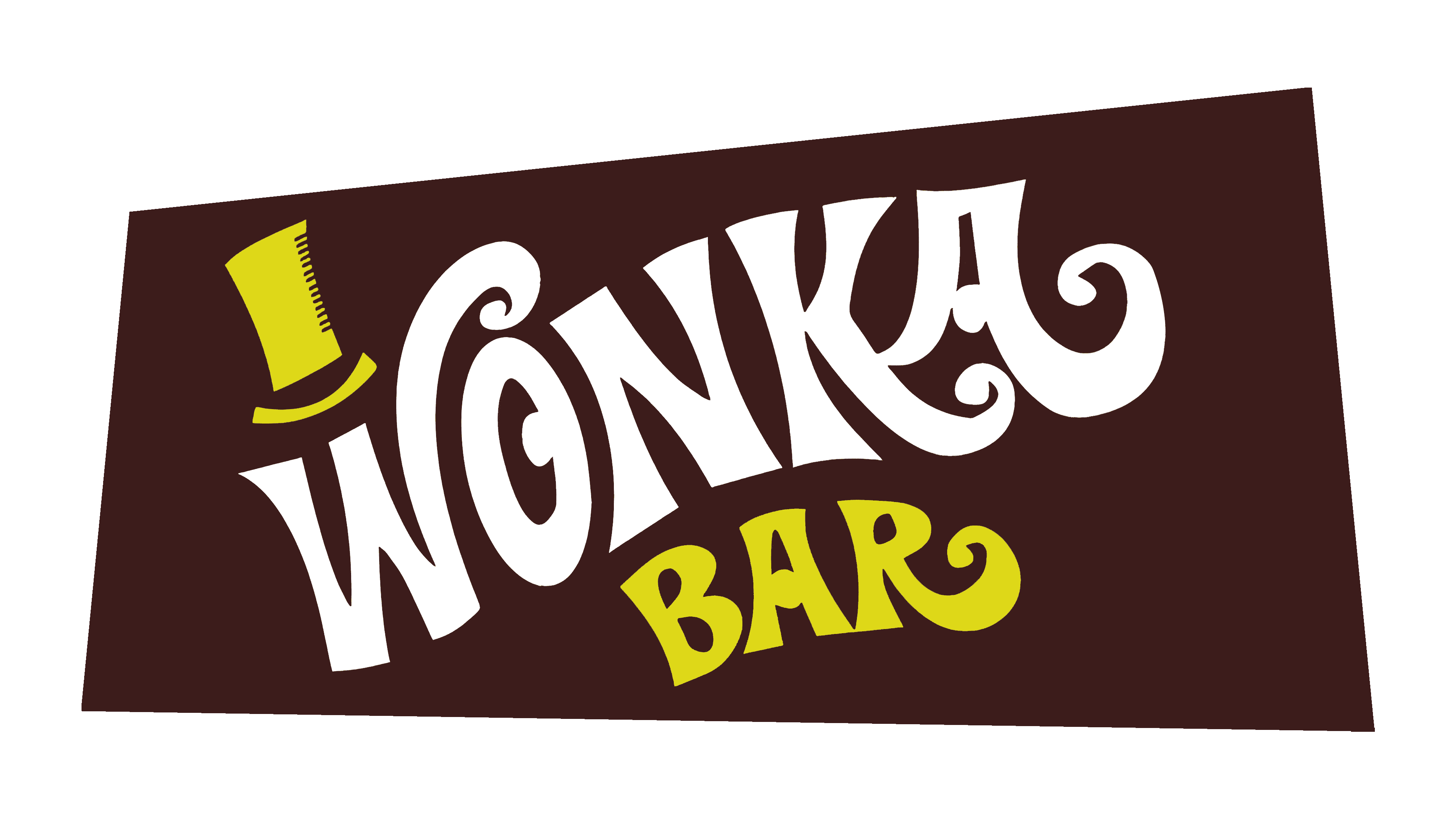
The first candy bars had a stylish thematic design. The following elements could be seen on the wrappers:
- A large Wonka Bar inscription;
- a dark background;
- an impressive hat.
The last part was associated with the movie’s main character, the chocolatier Willy Wonka. A feature of this style was the emphasis on the fairy tale format. This was evidenced by the magician’s hat, the unusual typeface, and the distinctive color scheme. The letters had artistic curves, and each had a unique design.
ارتبط الجزء الأخير بشخصية الفيلم الرئيسية ، صانع الشوكولاتة ويلي ونكا. كانت إحدى سمات هذا الأسلوب هي التركيز على تنسيق الحكاية الخيالية. يتضح هذا من خلال قبعة الساحر ، والخط غير المعتاد ، ونظام الألوان المميز. كان للحروف منحنيات فنية ، ولكل منها تصميم فريد.
As for colors, the designers used shades of gold and red and basic white. The hat and the word Bar had a golden hue, and white was used to decorate the word Wonka. The play of such colors created the effect of contrasts and attracted customers’ attention well.
أما بالنسبة للألوان ، فقد استخدم المصممون ظلال من الذهب والأحمر والأبيض الأساسي. كان للقبعة وكلمة "بار" صبغة ذهبية ، وكان اللون الأبيض يستخدم لتزيين كلمة ونكا. خلقت لعبة هذه الألوان تأثير التناقضات وجذبت انتباه العملاء جيدًا.
1999 – 2008
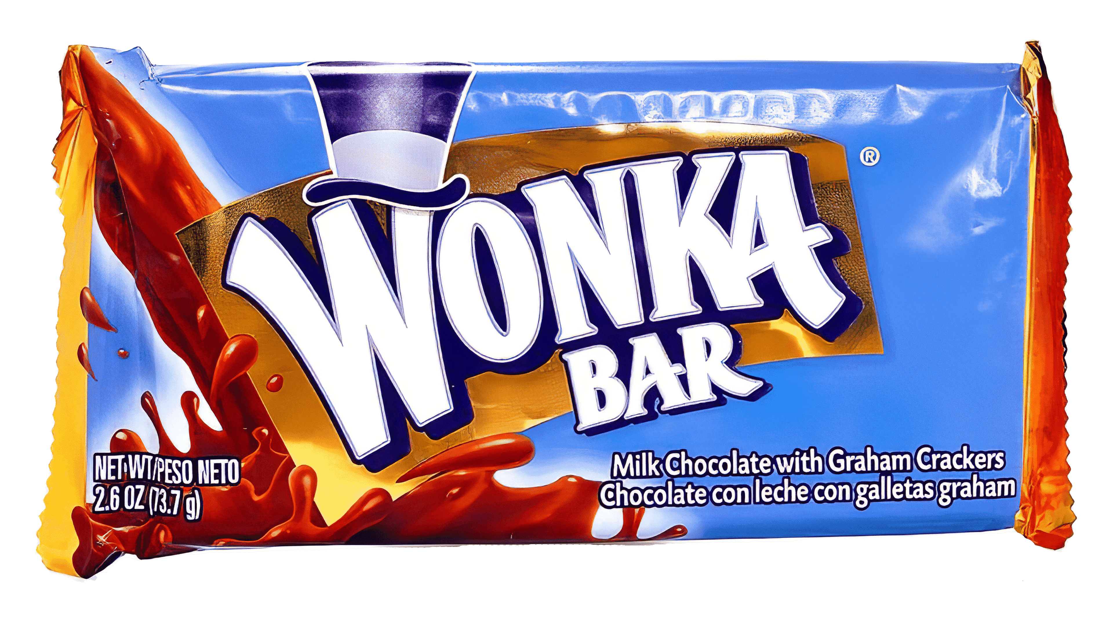
During this period, the brand was owned by one of the world’s biggest corporations, Nestlé. It turned Wonka into an umbrella brand; as a result, other sweets began to be sold under this name. This list included Laffy Taffy, SweeTARTS, etc. In connection with this, a rebranding was carried out. The new visual concept differed significantly from the original version.
The wrapper changed color, the font became more complex, and the overall picture was updated with new elements. But, at the same time, the traditional brand icon of a magician’s hat was preserved in the updated packaging. It was made in blue and moved to the center of the letter W. The twisted ends were removed from the font, while the overall magical style was retained.
تم تغيير لون الغلاف ، وأصبح الخط أكثر تعقيدًا ، وتم تحديث الصورة الإجمالية بعناصر جديدة. ولكن في الوقت نفسه ، تم الحفاظ على رمز العلامة التجارية التقليدية لقبعة الساحر في العبوة المحدثة. تم صنعه باللون الأزرق وتم نقله إلى منتصف الحرف W. تمت إزالة الأطراف الملتوية من الخط ، بينما تم الاحتفاظ بالنمط السحري العام.
The coloring was updated with blue and brown. The first one was used as a background, and the second one was used to design the new element – chocolate drops. The word Bar changed its golden hue to a basic white. The updated design proves that the company strives to develop and constantly improve its product. In addition, the new design became more bright, positive, and understandable to children. And they were the main target audience.
تم تحديث التلوين باللون الأزرق والبني. تم استخدام الأول كخلفية ، والثاني تم استخدامه لتصميم العنصر الجديد - قطرات الشوكولاتة. غيرت كلمة بار لونها الذهبي إلى الأبيض الأساسي. يثبت التصميم المحدث أن الشركة تسعى جاهدة لتطوير منتجاتها وتحسينها باستمرار. بالإضافة إلى ذلك ، أصبح التصميم الجديد أكثر إشراقًا وإيجابية ومفهومًا للأطفال. وكانوا الجمهور المستهدف الرئيسي.
After some time, the Nestlé company decided to release a new line of bars, “Wonka Exceptionals.” But, the company did not stop with this, and several more flavors appeared in the future. The concept of the iconic during this period changed again. Management decided to change the color palette and design in general.
بعد مرور بعض الوقت ، قررت شركة نستله إطلاق مجموعة جديدة من القضبان ، "ونكا إكسبشنالز". لكن الشركة لم تتوقف عند هذا الحد ، وظهرت العديد من النكهات في المستقبل. تغير مفهوم الأيقونة خلال هذه الفترة مرة أخرى. قررت الإدارة تغيير لوحة الألوان والتصميم بشكل عام.
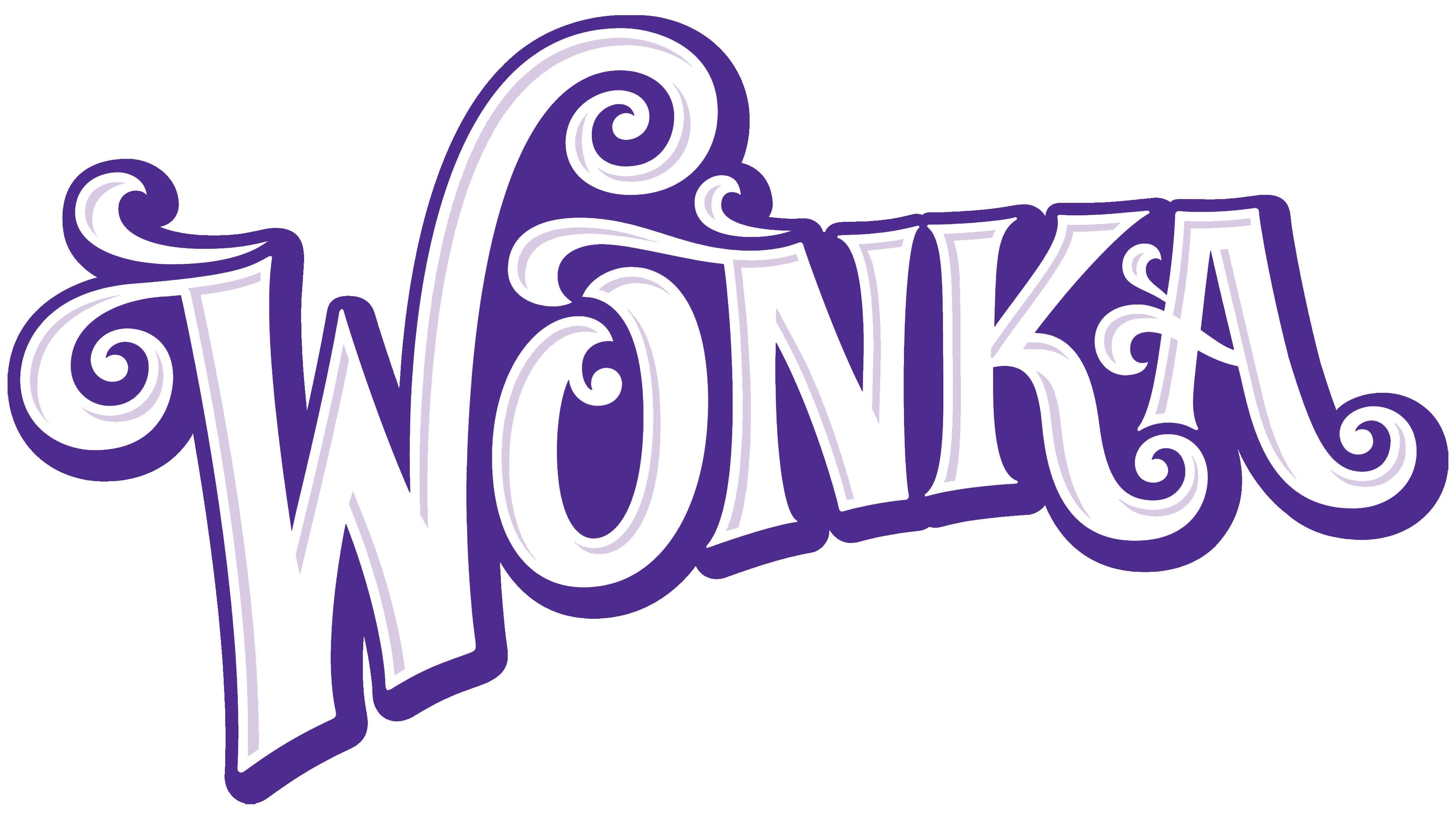
The basis was taken version, which existed from 1996 to 2009. The luxurious purple color appeared on the package, harmoniously combined with gold, white and red shades. The font became simpler again and lost the fancy curls.
تم أخذ نسخة الأساس ، والتي كانت موجودة من عام 1996 إلى عام 2009. ظهر اللون الأرجواني الفاخر على العبوة ، جنبًا إلى جنب بشكل متناغم مع ظلال ذهبية وبيضاء وحمراء. أصبح الخط أكثر بساطة مرة أخرى وفقد تجعيد الشعر الرائع.
2008 – today
FONT AND COLORS OF THE EMBLEM

Wonka’s corporate style was based on a combination of bright colors, which created a single color scheme. It evoked pleasant associations with a warm fairy-tale atmosphere, especially appealing to children. In the center of the emblem, there was a fascinating word mark Wonka Bar. The first part was done in basic white, which symbolizes purity and trustworthiness.
اعتمد أسلوب شركة Wonka على مزيج من الألوان الزاهية ، مما أدى إلى إنشاء نظام ألوان واحد. وقد أثار ارتباطات ممتعة مع جو حكاية خرافية دافئة ، وجذابة بشكل خاص للأطفال. في وسط الشعار ، كان هناك علامة كلمة رائعة ونكا بار. تم عمل الجزء الأول باللون الأبيض الأساسي ، والذي يرمز إلى النقاء والجدارة بالثقة.
Comments
Post a Comment