One of the most convenient tools for performing cryptocurrency transactions is the largest American platform Coinbase. Founded back in 2012, the brand is a leader in terms of the trading volume. Its creation was based on an idea that was understandable to everyone but radical at that time, that everyone should be able to conveniently and safely manage their bitcoins from anywhere. Its founder Brian Armstrong worked as an engineer at Airbnb, where he drew attention to the complexities and problems associated with the use of crypto. Based on these observations, the platform formation structure and all its functionality were built. The rapid growth and development of the company led to the fact that even the governments of many countries of the world paid attention to it. With the help of Coinbase, it became easy to organize a full-fledged transition to the crypto economy, which became a precedent for turning the company into a new type of global bank. This transformation was the main reason for making adjustments to the visual identity of the platform.
تعد أكبر منصة أمريكية Coinbase واحدة من أكثر الأدوات ملاءمة لإجراء معاملات العملات المشفرة. تأسست في عام 2012 ، تعد العلامة التجارية رائدة من حيث حجم التداول. استند إنشائها على فكرة كانت مفهومة للجميع ولكنها جذرية في ذلك الوقت ، وهي أن كل شخص يجب أن يكون قادرًا على إدارة عملات البيتكوين الخاصة به بشكل ملائم وآمن من أي مكان. عمل مؤسسها Brian Armstrong كمهندس في Airbnb ، حيث لفت الانتباه إلى التعقيدات والمشاكل المرتبطة باستخدام التشفير. بناءً على هذه الملاحظات ، تم بناء هيكل تشكيل النظام الأساسي وجميع وظائفه. أدى النمو السريع للشركة وتطورها إلى حقيقة أنه حتى حكومات العديد من دول العالم اهتمت بها. بمساعدة Coinbase ، أصبح من السهل تنظيم انتقال كامل إلى اقتصاد التشفير ، والذي أصبح سابقة لتحويل الشركة إلى نوع جديد من البنوك العالمية. كان هذا التحول هو السبب الرئيسي لإجراء تعديلات على الهوية المرئية للمنصة.
A personality was created whose task was to open the door to a new era of economic freedom. The visualization made it possible to reflect the infinite trust, absolute security, simplicity, and accessibility of the banking world in modern conditions. The changes affected the font, graphics, colors, and layouts. An attractive animation was created with a full set of recommendations for using the brand. The design provided a reflection of the balance between the reliability of the elements of the financial world and the need to demonstrate the humanity and accessibility of such structures.
تم إنشاء شخصية كانت مهمتها فتح الباب لعصر جديد من الحرية الاقتصادية. جعل التصور من الممكن أن يعكس الثقة اللامحدودة ، والأمن المطلق ، والبساطة ، وإمكانية الوصول إلى عالم البنوك في الظروف الحديثة. أثرت التغييرات على الخط والرسومات والألوان والتخطيطات. تم إنشاء الرسوم المتحركة الجذابة مع مجموعة كاملة من التوصيات لاستخدام العلامة التجارية. قدم التصميم انعكاسًا للتوازن بين موثوقية عناصر العالم المالي والحاجة إلى إثبات الإنسانية وإمكانية الوصول إلى مثل هذه الهياكل.

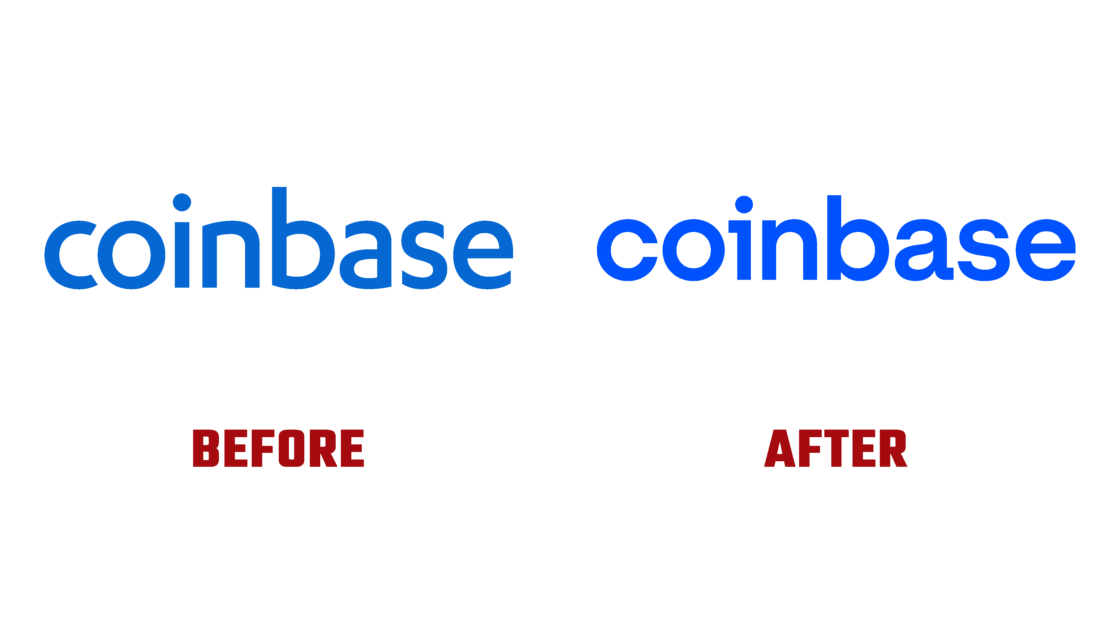
A monospace-type font was used to make the logo more readable and attractive. These were traditionally used in the formation of financial documents and navigational symbols. At the same time, the structure of the entire layout reflects the flexibility and dynamism characteristic of the global financial market operating on a 24/7 system. The icon was redesigned a year ago. The entire visual set was thought out and worked out during this time.
تم استخدام خط أحادي المسافة لجعل الشعار أكثر سهولة في القراءة وجاذبية. كانت تستخدم تقليديا في تشكيل الوثائق المالية والرموز الملاحية. في الوقت نفسه ، يعكس هيكل التصميم بأكمله المرونة والديناميكية التي تتميز بها السوق المالية العالمية التي تعمل على نظام يعمل على مدار الساعة طوال أيام الأسبوع. تم إعادة تصميم الرمز قبل عام. تم التفكير في المجموعة المرئية بالكامل والعمل عليها خلال هذا الوقت.
The new logo has become more attractive and visually interesting; it perfectly reflects the ideas about the world of cryptography, making a solid step in the evolution from the universal corporate image of the nineties to modern fintech. The accent elements of the text module are the letter “a” – thin and whimsical, the icon in the form of a tile above the letter “i” and the letter “c,” striving for the isolation of its internal space.
أصبح الشعار الجديد أكثر جاذبية وإثارة للاهتمام من الناحية المرئية ؛ إنه يعكس تمامًا الأفكار حول عالم التشفير ، مما يجعل خطوة قوية في التطور من صورة الشركة العالمية في التسعينيات إلى التكنولوجيا المالية الحديثة. عناصر التمييز في وحدة النص هي الحرف "a" - رفيع وغريب الأطوار ، والأيقونة على شكل بلاطة فوق الحرف "i" والحرف "c" ، سعياً وراء عزل مساحتها الداخلية.
The visual purpose of the new logo is provided by a strong geometric design, making it more general in a broad sense. Providing relationships for the entire Coinbase Sans family as a whole became possible thanks to the development of a font based on two – Akzidenz Grotesk and IBM Plex. This beautiful font family brings revitalizing dynamics, forming a kind of financial matrix.
يتم توفير الغرض المرئي للشعار الجديد من خلال تصميم هندسي قوي ، مما يجعله أكثر عمومية بمعنى أوسع. أصبح توفير العلاقات لعائلة Coinbase Sans بأكملها ممكنًا بفضل تطوير خط يعتمد على خطين - Akzidenz Grotesk و IBM Plex. تجلب عائلة الخطوط الجميلة هذه ديناميكيات تنشيطية ، وتشكل نوعًا من المصفوفة المالية.
Comments
Post a Comment