Everyone loves the new Woodgreen – especially the animals - الجميع يحب الهوية الجديدة - وخاصة الحيوانات
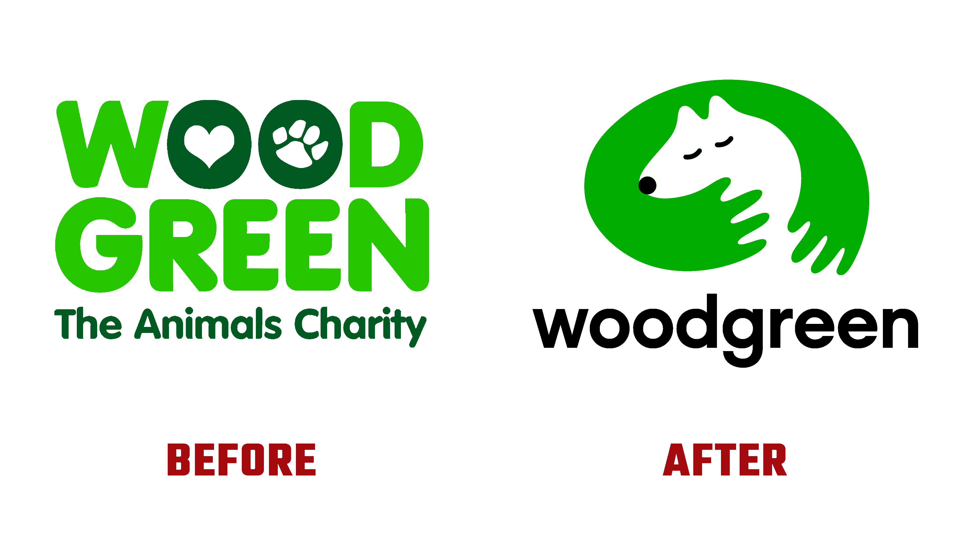
On the eve of its century, the world famous company Woodgreen felt the need for a radical change, starting with forming a new identity. Every day there is an opportunity to receive professional advice and support for pet owners at any stage of raising pets. A general and individual plan is created on an extensive program, including the regimen and methods of nutrition and treatment, behavioral training, and recommendations for owners. After the training and training period, each pet becomes the owner of his loving home and trained owner. The brand not only accepts the homeless but also provides owners with several important services, including free consultations by phone and via the Internet. The company organizes information support, seminars, and classes, which, among other things, inform its current and future customers about its updated visual identity.
عشية هذا القرن ، شعرت شركة Woodgreen المشهورة عالميًا بالحاجة إلى تغيير جذري ، بدءًا من تشكيل هوية جديدة. كل يوم هناك فرصة لتلقي المشورة المهنية والدعم لأصحاب الحيوانات الأليفة في أي مرحلة من مراحل تربية الحيوانات الأليفة. يتم إنشاء خطة عامة وفردية على برنامج واسع النطاق ، بما في ذلك نظام وطرق التغذية والعلاج ، والتدريب السلوكي ، والتوصيات للمالكين. بعد فترة التدريب والتدريب ، يصبح كل حيوان أليف مالكًا لمنزله المحب ومالكًا مدربًا. لا تقبل العلامة التجارية المشردين فحسب ، بل توفر أيضًا للمالكين العديد من الخدمات المهمة ، بما في ذلك الاستشارات المجانية عبر الهاتف وعبر الإنترنت. تنظم الشركة دعمًا للمعلومات ، وندوات ، وفصولًا ، والتي ، من بين أمور أخرى ، تُطلع عملائها الحاليين والمستقبليين على هويتها المرئية المحدثة.
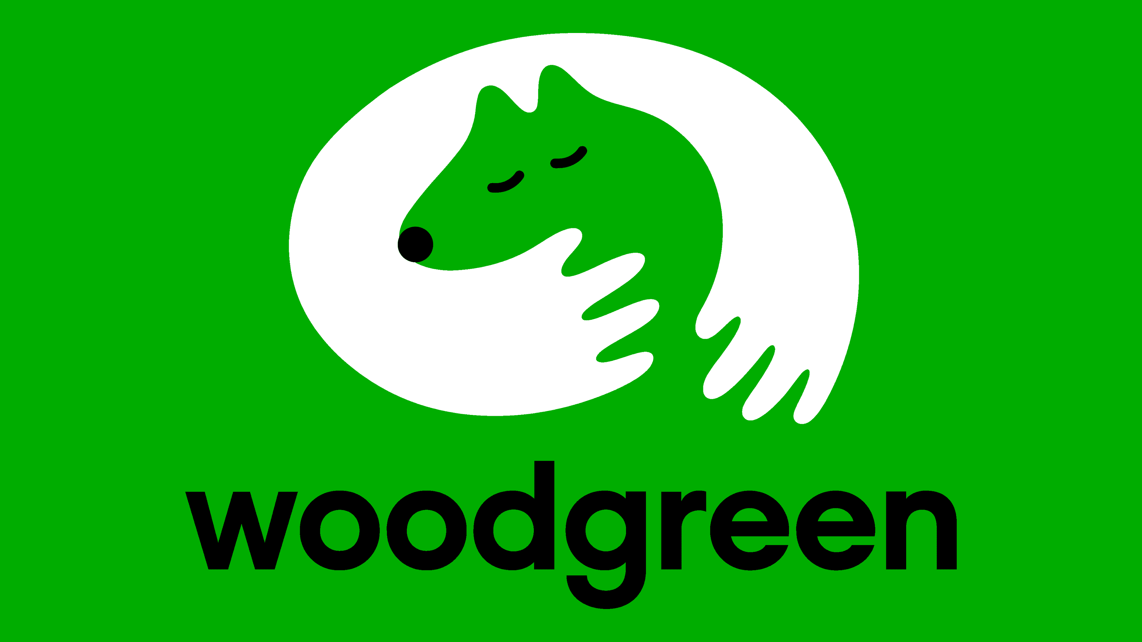
The change began with a completely redesigned company strategy to reflect Woodgreen’s uniqueness by focusing on the close bond between pets and people. At the same time, it was noted that the former is the heart and main focus of the brand. A touching symbol reflecting this inseparable connection, which effectively used both positive and negative space, became the center of the corporate identity. In this way, it was possible to very accurately reflect the direct dependence of these groups on each other. The slogan – Helping pets and their people, placed under the logo, perfectly sums up the idea that the company looks at all problems from the point of view of a pet.
بدأ التغيير باستراتيجية الشركة المعاد تصميمها بالكامل لتعكس تفرد Woodgreen من خلال التركيز على الرابطة الوثيقة بين الحيوانات الأليفة والأشخاص. في الوقت نفسه ، لوحظ أن الأول هو قلب العلامة التجارية وتركيزها الرئيسي. أصبح رمز اللمس الذي يعكس هذا الاتصال غير المنفصل ، والذي يستخدم بشكل فعال كلاً من المساحة الإيجابية والسلبية ، مركزًا لهوية الشركة. بهذه الطريقة ، كان من الممكن أن تعكس بدقة شديدة الاعتماد المباشر لهذه المجموعات على بعضها البعض. الشعار - مساعدة الحيوانات الأليفة وأفرادها ، الموضوع تحت الشعار ، يلخص تمامًا فكرة أن الشركة تنظر في جميع المشكلات من وجهة نظر حيوان أليف.

All images of the identity are very important in expressing the essence and meaning of the brand. Photos of pets are concentrated at eye level of the latter, making them the center of attention. All images are documentaries made by professionals, staff, and volunteers. They are an integral part of the story, demonstrating all the nuances of the ongoing charity. Additional works highlight an important connection and core mission.
جميع صور الهوية مهمة جدًا في التعبير عن جوهر ومعنى العلامة التجارية. تتركز صور الحيوانات الأليفة على مستوى عين الأخيرة ، مما يجعلها مركز الاهتمام. جميع الصور هي أفلام وثائقية صنعها محترفون وموظفون ومتطوعون. إنها جزء لا يتجزأ من القصة ، مما يدل على جميع الفروق الدقيقة للأعمال الخيرية المستمرة. تسلط أعمال إضافية الضوء على اتصال مهم ومهمة أساسية.
The font selection was due to the need to reflect the tone and personality of the company. The applied type Raisonne Pro from Colophon Foundry is the main type used in all elements of identification, demonstrating the kindness, high qualification, and professionalism of the company’s employees. Modern and simple, it forms a distinctive voice that reflects all of Woodgreen’s communication styles.
تم اختيار الخط بسبب الحاجة إلى عكس طابع الشركة وشخصيتها. النوع المطبق Raisonne Pro من Colophon Foundry هو النوع الرئيسي المستخدم في جميع عناصر التعريف ، مما يدل على اللطف والمؤهلات العالية والاحترافية لموظفي الشركة. حديث وبسيط ، فهو يشكل صوتًا مميزًا يعكس جميع أساليب الاتصال في Woodgreen.
In this way, a visualization is formed that allows you to convey all the values, compassion, and social benefits that create a special relationship between the company and its customers.
بهذه الطريقة ، يتم تكوين تصور يسمح لك بنقل جميع القيم والرحمة والمزايا الاجتماعية التي تخلق علاقة خاصة بين الشركة وعملائها.
Comments
Post a Comment