1948 was the year of creating a brand called LEKI, which later became a manufacturer of unique sports equipment – innovative trekking poles. From that moment on, the brand began its ascent to the pinnacle of success, the conquest of which is closely connected with the history of the Lenhart family – the founders of the company. The history of this success is full of enthusiasm and dedication to the sport, a constant search for improvement, and aspirations for a better future. The company was started by the turning workshop of the Lenhart family – Karl and Gertrude, also called Karl Lenhart, Plastik + Metall, which was founded in Dettingen/Teck. Initially, the brand produced letters for signs, thus laying the foundation for LEKI Lenhart GmbH. The switch to sports equipment was driven by the personal dissatisfaction of Karl, who was an avid skier, with the poor quality of ski poles. In 1960 we started our production of handles and tool baskets. The name LEKI 1970 first appeared on the company’s products. It became a reflection of the owner’s name and the location of the headquarters – “Lenhart” and “kirchheim.” Production expanded, products improved, and in 1974 the Makalu era began – the world’s first adjustable trekking pole, which brought the brand worldwide fame. Today the company is a world leader in glove systems, folding poles, and trail running technology. Innovation, high quality, passion, and maximum performance are the foundations of a recent rebrand that ushered in a new era for the company and a new generation of users.
كان عام 1948 عام إنشاء علامة تجارية تسمى LEKI ، والتي أصبحت فيما بعد شركة مصنعة للمعدات الرياضية الفريدة - أعمدة الرحلات المبتكرة. منذ تلك اللحظة فصاعدًا ، بدأت العلامة التجارية في صعودها إلى قمة النجاح ، حيث يرتبط غزوها ارتباطًا وثيقًا بتاريخ عائلة Lenhart - مؤسسو الشركة. إن تاريخ هذا النجاح مليء بالحماس والتفاني في الرياضة ، والبحث المستمر عن التحسين ، والتطلعات إلى مستقبل أفضل. بدأت الشركة من خلال ورشة الخراطة لعائلة Lenhart - Karl and Gertrude ، والتي تسمى أيضًا Karl Lenhart و Plastik + Metall ، والتي تأسست في Dettingen / Teck. في البداية ، أنتجت العلامة التجارية حروفًا للإشارات ، وبالتالي أرست الأساس لشركة LEKI Lenhart GmbH. كان التحول إلى المعدات الرياضية مدفوعًا بعدم الرضا الشخصي لكارل ، الذي كان متزلجًا متعطشًا ، بسبب الجودة الرديئة لأعمدة التزلج. في عام 1960 بدأنا إنتاج المقابض وسلال الأدوات. ظهر اسم LEKI 1970 لأول مرة على منتجات الشركة. أصبح انعكاسًا لاسم المالك وموقع المقر - "Lenhart" و "kirchheim". توسع الإنتاج ، وتحسنت المنتجات ، وفي عام 1974 بدأ عصر Makalu - أول قطب رحلات قابل للتعديل في العالم ، والذي جلب شهرة العلامة التجارية في جميع أنحاء العالم. اليوم الشركة هي شركة رائدة عالميًا في أنظمة القفازات والأعمدة القابلة للطي وتكنولوجيا الجري. الابتكار والجودة العالية والشغف والأداء الأقصى هي أسس إعادة العلامة التجارية الحديثة التي بشرت بعصر جديد للشركة وجيل جديد من المستخدمين.
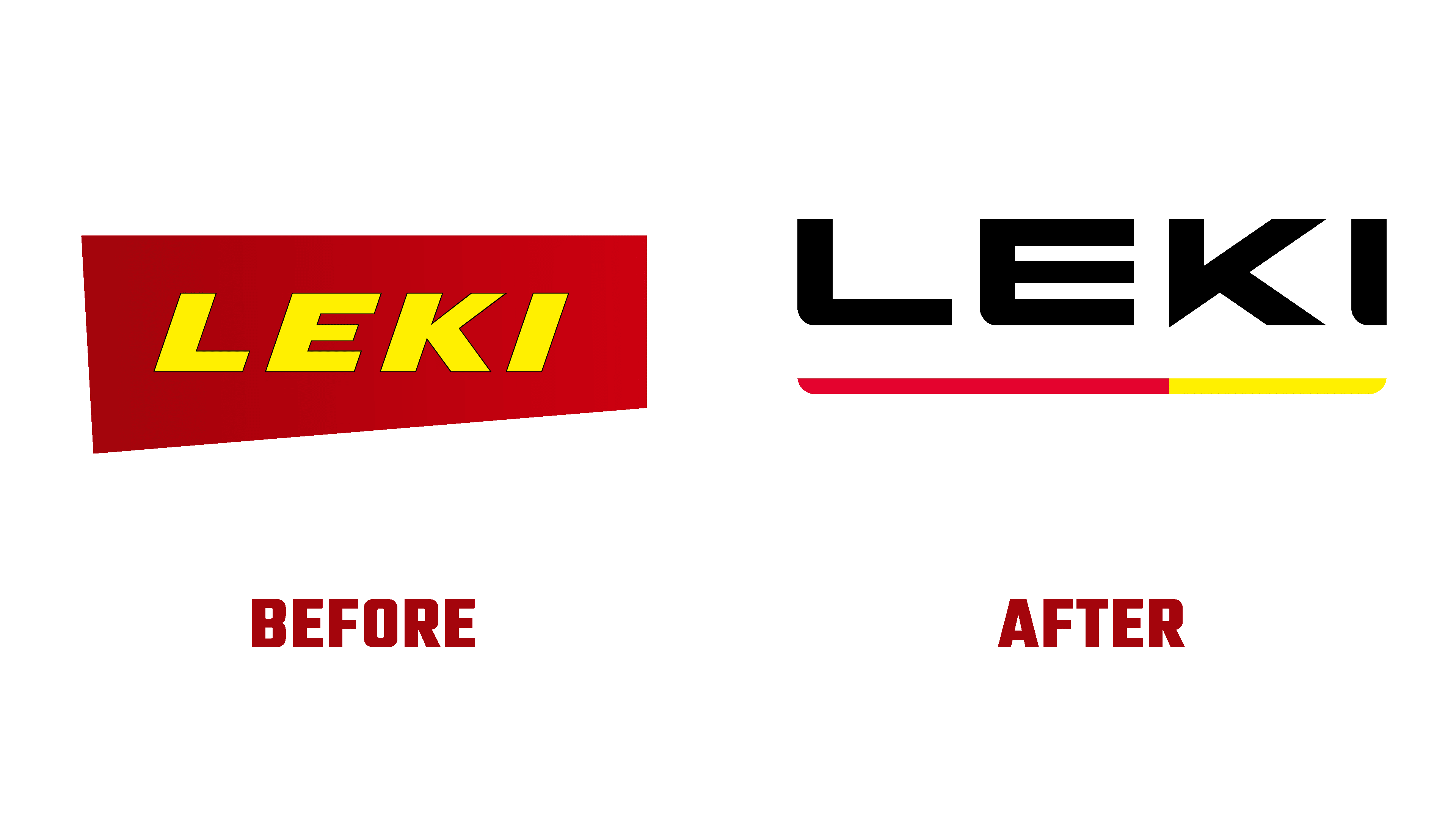
The creation of a new brand started three years ago. During this time, a unique strategic framework has been developed to achieve an important goal – strengthening and increasing the company’s influence around the world. The development of the logo and corporate design was formed based on the early elements that ensured the company’s success. Fine-tuning visual elements carried out their evolution according to the requirements of modern minimalist design. The logo in the form of a verbal module – the name of the brand, ensured the simplicity of its perception and ease of remembering. It is represented by a wordmark in a clear and large sans-serif font in contrasting black. Its execution made it easy and simple to distinguish the brand from many others, ensuring recognition and long-term use of it.
بدأ إنشاء علامة تجارية جديدة منذ ثلاث سنوات. خلال هذا الوقت ، تم تطوير إطار عمل استراتيجي فريد لتحقيق هدف مهم - تعزيز وزيادة تأثير الشركة في جميع أنحاء العالم. تم تطوير الشعار وتصميم الشركة بناءً على العناصر المبكرة التي ضمنت نجاح الشركة. نفذت الضبط الدقيق للعناصر المرئية تطورها وفقًا لمتطلبات التصميم الحديث البسيط. يضمن الشعار على شكل وحدة لفظية - اسم العلامة التجارية ، بساطة تصورها وسهولة تذكرها. يتم تمثيله بشعار نصي بخط sans-serif واضح وكبير باللون الأسود المتباين. جعل تنفيذه من السهل والبسيط تمييز العلامة التجارية عن العديد من العلامات التجارية الأخرى ، مما يضمن التعرف عليها واستخدامها على المدى الطويل.

The official color scheme has been retained as a tribute to the brand’s rich and successful history. A strip of these two colors, bright red and yellow, was made under the name itself to ensure minimalization and better visual perception. Her performance refers the viewer to the stylized form produced by the product brand, providing a subtle link between aesthetics, design originality, and brand awareness.
تم الاحتفاظ بنظام الألوان الرسمي كإشادة بالتاريخ الثري والناجح للعلامة التجارية. تم صنع شريط من هذين اللونين ، الأحمر الفاتح والأصفر ، تحت الاسم نفسه لضمان الحد الأدنى والإدراك البصري الأفضل. يحيل أدائها المشاهد إلى الشكل المنمق الذي تنتجه العلامة التجارية للمنتج ، مما يوفر رابطًا دقيقًا بين الجماليات وأصالة التصميم والوعي بالعلامة التجارية.
Comments
Post a Comment