Monetization of art from Goodtype becomes even more useful and clearer - يصبح تسييل الفن أكثر فائدة ووضوحًا
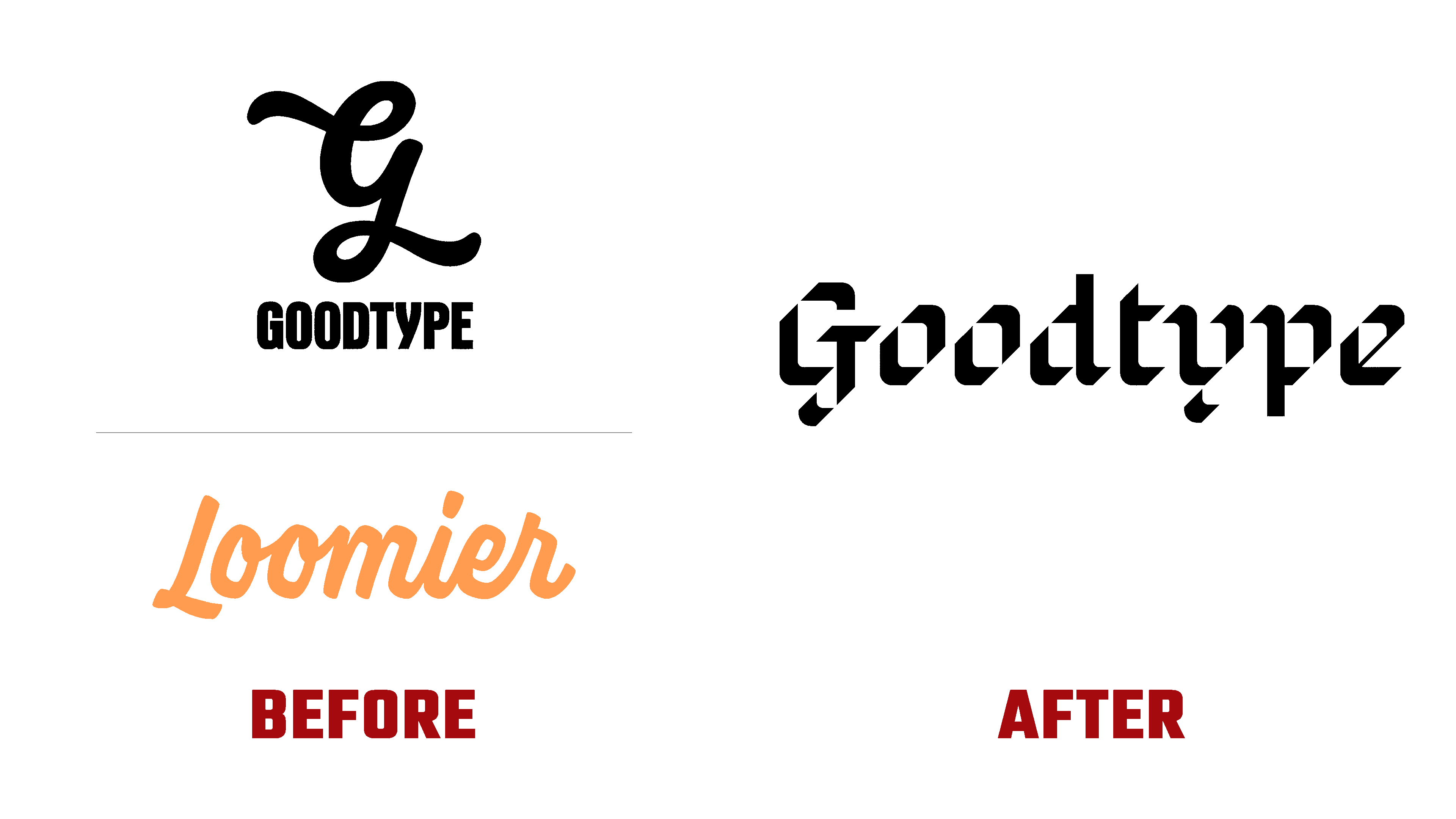
Created in 2014, the Loomier application, having gone through several stages of improvement and development, carried out a radical rebranding, changing its name and identity. Designed to make it easier for artists to earn money with their favorite business, the service offered many useful business resources, courses, and ways to support the entire community. Using the platform, artists can easily create their own successful and sustainable businesses based on what each of them can do best. Here you can find a lot of useful tools, selected articles by subject, and a huge free library. Everything is geared towards helping you get started quickly. The application provided the formation of a community, allowing you to connect with like-minded people who understand all the problems and peculiarities of what each artist goes through in the process of their creativity and the formation of their own business. The new identity informs everyone that the brand is always there, cheers for everyone, and believes in the capabilities of its users, supporting them at all stages of the journey.
تم إنشاء تطبيق Loomier في عام 2014 ، بعد أن مر بمراحل عديدة من التحسين والتطوير ، وأجرى تغييرًا جذريًا للعلامة التجارية ، وتغيير اسمه وهويته. صُممت الخدمة لتسهيل كسب الفنانين للمال من أعمالهم المفضلة ، وقدمت العديد من موارد الأعمال المفيدة والدورات التدريبية وطرق دعم المجتمع بأكمله. باستخدام المنصة ، يمكن للفنانين بسهولة إنشاء أعمالهم الناجحة والمستدامة بناءً على ما يمكن لكل منهم القيام به بشكل أفضل. هنا يمكنك العثور على الكثير من الأدوات المفيدة ، والمقالات المختارة حسب الموضوع ، ومكتبة مجانية ضخمة. كل شيء موجه نحو مساعدتك على البدء بسرعة. قدم التطبيق تشكيل مجتمع ، مما يسمح لك بالتواصل مع الأشخاص ذوي التفكير المماثل الذين يفهمون جميع المشاكل والخصائص التي يمر بها كل فنان في عملية إبداعهم وتشكيل أعمالهم الخاصة. تخبر الهوية الجديدة الجميع أن العلامة التجارية موجودة دائمًا ، وتهتف للجميع ، وتؤمن بقدرات مستخدميها ، وتدعمهم في جميع مراحل الرحلة.
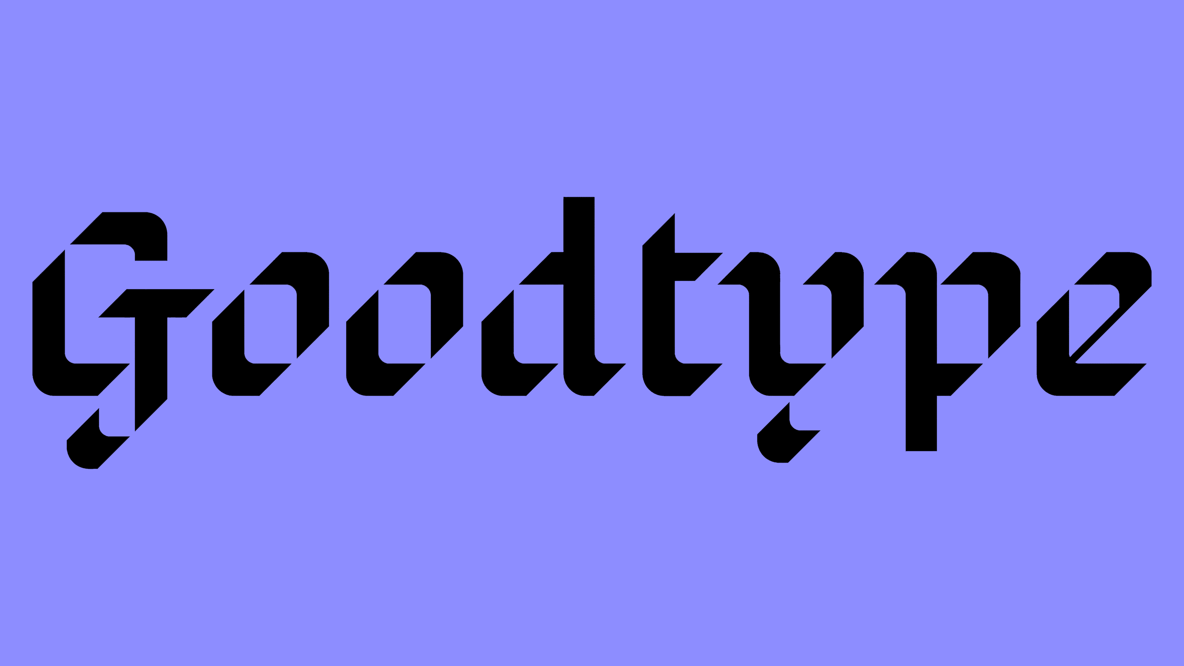
When forming the company’s logo, the goal was to create a decorative verbal brand that does not need signs not an icon. The text itself became iconic. Its creation reflected a modern take on the classic black letter. It gives the logo a sense of confidence and creativity without using any overt trends. For such a demonstration, the Goodtype font was used, with which it became easy to create graphic compositions that reflect events and create a presence on social networks. The typography looks unusually solid and confident. The auxiliary font Griffith Gothic by Tobias Frere-Jones was also used, which belongs to a family of fonts with a large range of reflection, used for both body text and subheadings. The text was a separate element, executed in a beautiful calligraphic font by Margo from HEX.
عند تشكيل شعار الشركة ، كان الهدف هو إنشاء علامة تجارية لفظية زخرفية لا تحتاج إلى إشارات ولا إلى رمز. أصبح النص نفسه مبدعًا. يعكس إنشائها نظرة حديثة للحرف الأسود الكلاسيكي. يمنح الشعار إحساسًا بالثقة والإبداع دون استخدام أي اتجاهات علنية. لمثل هذا العرض التوضيحي ، تم استخدام خط Goodtype ، والذي أصبح من السهل إنشاء تراكيب رسومية تعكس الأحداث وتخلق تواجدًا على الشبكات الاجتماعية. تبدو الطباعة صلبة وواثقة بشكل غير عادي. تم أيضًا استخدام الخط الإضافي Griffith Gothic بواسطة Tobias Frere-Jones ، والذي ينتمي إلى عائلة من الخطوط ذات نطاق كبير من الانعكاس ، ويستخدم لكل من النص الأساسي والعناوين الفرعية. كان النص عنصرًا منفصلاً ، تم تنفيذه بخط خطي جميل بواسطة Margo من HEX.

All layouts are built using bright and clear photographs covering the widest information area. A vibrant color palette effectively supports a playful yet bold typography system characterized by crispness and geometric sans serifs that give it a distinct personality. The attractiveness and memorability of the logo are ensured by the use of original design solutions and animations. Its entire design is thought out so that it looks great both horizontally and vertically.
تم تصميم جميع المخططات باستخدام صور فوتوغرافية مشرقة وواضحة تغطي أوسع منطقة معلومات. تدعم لوحة الألوان النابضة بالحياة بشكل فعال نظام طباعة مرح وجريء يتميز بالوضوح وشكل هندسي بلا رقيق يمنحه شخصية مميزة. يتم ضمان جاذبية الشعار وتذكره من خلال استخدام حلول التصميم والرسوم المتحركة الأصلية. تم التفكير في تصميمه بالكامل بحيث يبدو رائعًا أفقيًا وعموديًا.
Comments
Post a Comment