The first version of MSN appeared simultaneously as Windows 95 on August 24, 1995. Initially, it was a portal with a limited list of Internet services, but the MSN brand was used for a wide range of Microsoft products as it expanded. The website has been translated into many languages and is available worldwide, although it is still based in the US and registered in the .com domain zone (since 1998).
ظهر الإصدار الأول من MSN في وقت واحد على أنه Windows 95 في 24 أغسطس 1995. في البداية ، كان عبارة عن بوابة تحتوي على قائمة محدودة من خدمات الإنترنت ، ولكن تم استخدام علامة MSN التجارية لمجموعة واسعة من منتجات Microsoft أثناء توسعها. تمت ترجمة موقع الويب إلى العديد من اللغات وهو متاح في جميع أنحاء العالم ، على الرغم من أنه لا يزال موجودًا في الولايات المتحدة ومسجلًا في نطاق نطاق .com (منذ 1998).
MEANING AND HISTORY
What is MSN?
MSN is a shorthand for “Microsoft Network.” This is the name of a website that hosts a collection of Windows software. There is also online content in the categories “News,” “Sports,” “Health,” “Entertainment,” “Cars,” “Travel,” “Weather,” and so on.
MSN هو اختصار لـ "Microsoft Network". هذا هو اسم موقع الويب الذي يستضيف مجموعة من برامج Windows. هناك أيضًا محتوى عبر الإنترنت في الفئات "الأخبار" و "الرياضة" و "الصحة" و "الترفيه" و "السيارات" و "السفر" و "الطقس" وما إلى ذلك.
First, there was the online service Microsoft Network, which provided access to the Internet. It had its own Microsoft Internet Start portal. It acted as the start page in the Internet Explorer browser and contained useful content. In 1998, it was moved to a new domain and at the same time renamed, reducing the long two-word name to the short abbreviation MSN. The range of services united under this brand has been actively expanding. This is where the Bing search engine, the Bing Maps mapping service, and many Windows applications come from.
أولاً ، كانت هناك خدمة Microsoft Network عبر الإنترنت ، والتي وفرت الوصول إلى الإنترنت. كان لديه بوابة Microsoft Internet Start الخاصة به. كانت بمثابة صفحة البداية في متصفح Internet Explorer وتحتوي على محتوى مفيد. في عام 1998 ، تم نقله إلى مجال جديد وأعيد تسميته في نفس الوقت ، مما أدى إلى اختزال الاسم الطويل المكون من كلمتين إلى الاختصار القصير MSN. تم توسيع نطاق الخدمات الموحدة تحت هذه العلامة التجارية بنشاط. هذا هو المكان الذي يأتي منه محرك بحث Bing وخدمة تعيين خرائط Bing والعديد من تطبيقات Windows.
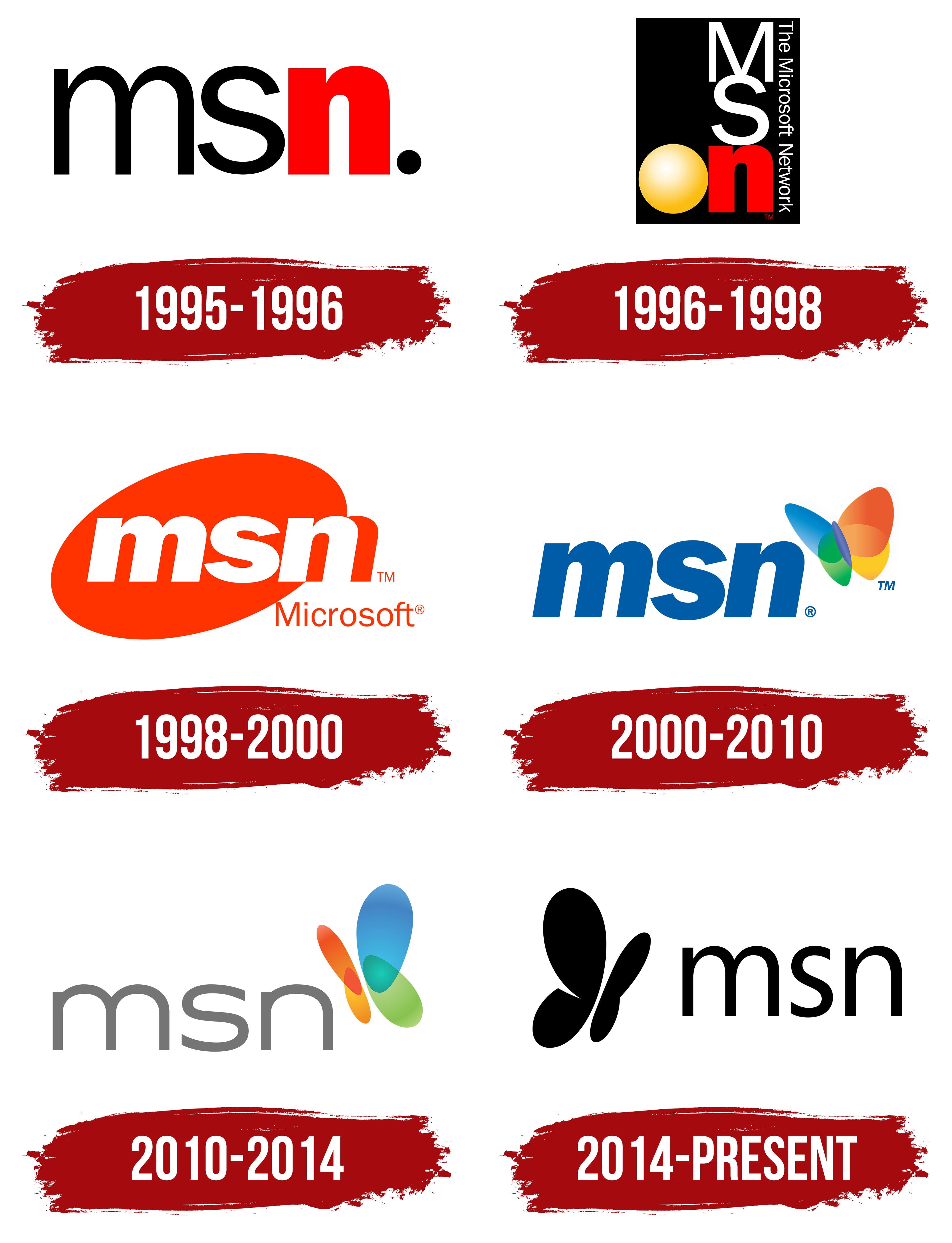
As stated in the branding guide, the current MSN logo contains a wordmark and a graphic image (butterfly) that cannot be separated from each other. Moreover, this is the only place where the portal’s name is written in lowercase – in all other situations, the letters must be capitalized. The copyright holder also notes that he does not oblige the use of a registered trademark mark, except in certain cases. This is not the first MSN logo: the web service has had many other identifying symbols in various configurations.
كما هو مذكور في دليل العلامة التجارية ، يحتوي شعار MSN الحالي على علامة نصية وصورة رسومية (فراشة) لا يمكن فصلها عن بعضها البعض. علاوة على ذلك ، هذا هو المكان الوحيد الذي يُكتب فيه اسم البوابة بأحرف صغيرة - في جميع المواقف الأخرى ، يجب أن تكون الأحرف كبيرة. يلاحظ صاحب حقوق النشر أيضًا أنه لا يلزم استخدام علامة تجارية مسجلة ، إلا في حالات معينة. ليس هذا هو شعار MSN الأول: فقد احتوت خدمة الويب على العديد من رموز التعريف الأخرى في تكوينات مختلفة.
The debut wordmark consisted of the letters “m,” “s,” and “n” in lower case. There was a big round dot at the end of the abbreviation as if it were part of the domain name. The “n” in front of her stood out noticeably in shape and color. First, it was red, while the rest of the elements were black. Secondly, the designers made it bolder than the “m” and “s,” so the logo used two different fonts. The “m” and “s” typeface is similar to Wiescher-Design’s Franklin Gothic Raw Book, Manfred Klein’s Nonserif Regular, or Suomi Type Foundry’s TeeFranklin Medium. The lowercase “n” style is reminiscent of Sky Sans Bold by Aviation Partners, Acumin Pro Semi Condensed Black by Adobe, or Mr. Eaves XL Modern Narrow Ultra by Émigré.
تتكون العلامة النصية لأول مرة من الأحرف "m" و "s" و "n" في الأحرف الصغيرة. كانت هناك نقطة مستديرة كبيرة في نهاية الاختصار كما لو كانت جزءًا من اسم المجال. برز حرف "n" أمامها بشكل ملحوظ في الشكل واللون. أولاً ، كانت حمراء ، بينما كانت بقية العناصر سوداء. ثانيًا ، جعله المصممون أكثر جرأة من حرف "m" و "s" ، لذلك استخدم الشعار خطين مختلفين. يشبه محرف "m" و "s" كتاب Wiescher-Design's Franklin Gothic Raw Book ، أو Nonserif Regular من Manfred Klein ، أو TeeFranklin Medium من Suomi Type Foundry. يذكرنا نمط الأحرف الصغيرة "n" بأسلوب Sky Sans Bold من Aviation Partners أو Acumin Pro Semi Condensed Black من Adobe أو Mr. Eaves XL Modern Narrow Ultra من Émigré.
After the redesign, the logo acquired a complex configuration. The base was a black vertical rectangle. Most of the space was occupied by the letters “M,” “s,” and “n,” lined up in columns one below the other, with the “M” being capitalized. In the lower left corner was a yellow ball with a gradient, which probably symbolized the global nature of the service. On the right (on the very edge) was the phrase “The Microsoft Network,” inverted so that the beginning was at the top and the end was at the bottom.
بعد إعادة التصميم ، اكتسب الشعار تكوينًا معقدًا. كانت القاعدة عبارة عن مستطيل أسود عمودي. معظم المساحة كانت مشغولة بالأحرف "M" و "s" و "n" ، مصطفة في أعمدة واحدة أسفل الأخرى ، مع كتابة الحرف "M" بحروف كبيرة. في الزاوية اليسرى السفلية كانت هناك كرة صفراء ذات تدرج ، والذي ربما يرمز إلى الطبيعة العالمية للخدمة. على اليمين (على الحافة ذاتها) كانت عبارة "شبكة Microsoft" مقلوبة بحيث تكون البداية في الأعلى والنهاية في الأسفل.
In 1998, the portal was moved to the .com domain and officially became known as MSN. Naturally, this was reflected in his logo. The designers converted the acronym to lowercase and used bold italics, roughly similar to CheapProFonts’ Familiar Pro Black Oblique. The white letters were set against an orange ellipse at about 45 degrees. Because the “n” didn’t fit entirely inside the shape, it had its orange base. The word “Microsoft” was written in a sans-serif typeface from the Segoe UI subfamily in the lower right corner.
في عام 1998 ، تم نقل البوابة الإلكترونية إلى مجال .com وأصبحت تُعرف رسميًا باسم MSN. وبطبيعة الحال ، انعكس هذا في شعاره. قام المصممون بتحويل الاختصار إلى أحرف صغيرة واستخدموا خط مائل غامق ، مشابه تقريبًا لـ CheapProFonts 'Familiar Pro Black Oblique. تم وضع الأحرف البيضاء على شكل بيضاوي برتقالي عند 45 درجة تقريبًا. نظرًا لأن "n" لا يتناسب تمامًا مع الشكل ، فقد كان له قاعدته البرتقالية. تمت كتابة كلمة "Microsoft" بخط sans-serif من عائلة Segoe UI في الركن الأيمن السفلي.
In 2000, MSN launched a logo created by the joint efforts of McCann Erickson, FutureBrand, and Everbrand. It was launched at the beginning of the year (in February), that is, the main developments were carried out back in 1999. The designers removed the orange background and made the abbreviation dark blue. They used the grotesque Franklin Gothic Bold Italic to decorate the letters. The word “Microsoft” was removed because it interfered with the new element – a flying butterfly with multi-colored wings of green, blue, red, and yellow. The insect was in the upper right corner. Its wings were translucent so that at the points of their connection, mixed shades were obtained: green plus blue and red plus yellow. The butterfly seemed voluminous due to the gradient and light highlights, and it also cast a light gray shadow.
في عام 2000 ، أطلقت MSN شعارًا تم إنشاؤه من خلال الجهود المشتركة لماكان إريكسون و FutureBrand و Everbrand. تم إطلاقه في بداية العام (في فبراير) ، أي ، تم تنفيذ التطورات الرئيسية في عام 1999. أزال المصممون الخلفية البرتقالية وجعلوا الاختصار باللون الأزرق الداكن. استخدموا أسلوب فرانكلين القوطي الغامق المائل الغريب لتزيين الحروف. تمت إزالة كلمة "Microsoft" لأنها تداخلت مع العنصر الجديد - فراشة طائرة بأجنحة متعددة الألوان باللون الأخضر والأزرق والأحمر والأصفر. كانت الحشرة في الزاوية اليمنى العليا. كانت أجنحتها شفافة بحيث تم الحصول على ظلال مختلطة عند نقاط الاتصال: أخضر زائد أزرق وأحمر بالإضافة إلى أصفر. بدت الفراشة ضخمة بسبب التدرج اللوني والإبرازات الخفيفة ، كما أنها تلقي بظلالها الرمادي الفاتح.
A decade later, MSN decided on another redesign, which was recognized as one of the worst (according to Brand New). The portal started implementing the new logo on December 29, 2009, and completed the process in March 2010, although the website was originally scheduled to be redesigned in autumn 2009. As a result of the changes, the butterfly has become much simpler. Both wings on the left side were scaled down and repainted orange with a gradient, while blue and green were used for the right side. The difference in size was supposed to reflect the tilted flight of the butterfly.
بعد عقد من الزمان ، قررت MSN إعادة تصميم أخرى ، والتي تم الاعتراف بها على أنها واحدة من الأسوأ (وفقًا لـ Brand New). بدأت البوابة في تنفيذ الشعار الجديد في 29 ديسمبر 2009 ، وأكملت العملية في مارس 2010 ، على الرغم من أنه كان من المقرر في الأصل إعادة تصميم الموقع في خريف 2009. ونتيجة للتغييرات ، أصبحت الفراشة أكثر بساطة. تم تصغير كلا الجناحين على الجانب الأيسر وإعادة طلاءهما باللون البرتقالي بتدرج ، بينما تم استخدام اللونين الأزرق والأخضر للجانب الأيمن. كان من المفترض أن يعكس الاختلاف في الحجم الرحلة المائلة للفراشة.
The designers changed the font, making the letters straight, thin, and light gray. It was similar to Artegra Sans Extended Regular by Artegra or Chinger Regular by Bud White, with the tops of the vertical strokes at “m” and “n” cut off.
قام المصممون بتغيير الخط ، مما جعل الحروف مستقيمة ورقيقة ورمادية فاتحة. كان مشابهًا لـ Artegra Sans Extended Regular بواسطة Artegra أو Chinger Regular بواسطة Bud White ، مع قطع قمم الضربات الرأسية عند "m" و "n".
In October 2014, a redesigned version of the MSN badge was introduced, with the butterfly turned black and moved to the top left corner. At the same time, the shape of her wings slightly changed: one of them had a sharp corner. The inscription, like the butterfly, is now also black, so there is a complete harmony of colors in the composition. For letters, a font from the Segoe UI subfamily is used. The word “Microsoft” was written in almost the same humanistic grotesque as part of the 1998-2000 logo.
في أكتوبر 2014 ، تم تقديم نسخة معاد تصميمها من شارة MSN ، حيث تحولت الفراشة إلى اللون الأسود وانتقلت إلى الزاوية اليسرى العليا. في الوقت نفسه ، تغير شكل أجنحتها قليلاً: كان لأحدهما زاوية حادة. أصبح النقش الآن ، مثل الفراشة ، أسود أيضًا ، لذلك هناك تناغم كامل للألوان في التكوين. بالنسبة للأحرف ، يتم استخدام خط من عائلة Segoe UI الفرعية. تمت كتابة كلمة "Microsoft" بنفس الأسلوب الإنساني الغريب تقريبًا كجزء من شعار 1998-2000.
FONT AND COLORS OF THE EMBLEM

The butterfly is MSN’s signature symbol, but how does it relate to the website’s history? This is likely just a beautiful element that symbolizes beauty, rebirth, and immortality. In Native American culture, she represents positive change, joy, beauty, and transformation. There is no hidden connection with the functions or heritage of the web portal here. The butterfly was originally a joint fantasy between McCann Erickson, FutureBrand, and Everbrand. This image was so memorable and represented MSN so vividly that it was decided to keep it in all subsequent versions of the emblem. By the way, the Illuminati has one little-known symbol – the monarch butterfly. It represents mind control.
الفراشة هي رمز توقيع MSN ، ولكن ما علاقتها بتاريخ الموقع؟ من المحتمل أن يكون هذا مجرد عنصر جميل يرمز إلى الجمال والبعث والخلود. في الثقافة الأمريكية الأصلية ، تمثل التغيير الإيجابي والفرح والجمال والتحول. لا يوجد اتصال خفي بوظائف أو تراث بوابة الويب هنا. كانت الفراشة في الأصل خيالًا مشتركًا بين ماكان إريكسون و FutureBrand و Everbrand. كانت هذه الصورة لا تنسى وتمثل MSN بوضوح شديد لدرجة أنه تقرر الاحتفاظ بها في جميع الإصدارات اللاحقة من الشعار. بالمناسبة ، لدى المتنورين رمز واحد غير معروف - فراشة الملك. إنه يمثل السيطرة على العقل.

The current MSN logo is set in the humanistic grotesque Segoe UI. It belongs to a family of fonts created by typographer Steve Mattson in 1994, specifically for Microsoft. This typeface is used in all products of the American company for a uniform display of text. Remarkably, in the MSN wordmark, all letters are lowercase, while in other cases, they must be uppercase. Previously, the abbreviation was painted in the corporate color of the portal – blue Pantone 3005. After the redesign, both the butterfly and the brand name became black.
تم تعيين شعار MSN الحالي في واجهة Segoe UI الإنسانية. إنه ينتمي إلى عائلة الخطوط التي أنشأها الخطاط ستيف ماتسون في عام 1994 ، خصيصًا لمايكروسوفت. يستخدم هذا الخط في جميع منتجات الشركة الأمريكية لعرض موحد للنص. بشكل ملحوظ ، في علامة MSN النصية ، تكون جميع الأحرف صغيرة ، بينما في حالات أخرى ، يجب أن تكون كبيرة. في السابق ، تم رسم الاختصار بلون الشركة للبوابة - الأزرق Pantone 3005. بعد إعادة التصميم ، أصبح اسم الفراشة والعلامة التجارية باللون الأسود.
Comments
Post a Comment