According to the data for 2020, the attendance of the Internet resource was about 45 million users per month. The rapid increase in the audience and the constant development of the site have made it one of the most popular. In the popular ranking, she takes 30th place. The modern service logo is simple and expressive. A bright upside-down OK icon is complemented by an inscription in a base shade.
وفقًا لبيانات عام 2020 ، بلغ حضور مورد الإنترنت حوالي 45 مليون مستخدم شهريًا. جعلت الزيادة السريعة في الجمهور والتطور المستمر للموقع من أكثر المواقع شعبية. في الترتيب الشعبي ، احتلت المركز 30. شعار الخدمة الحديث بسيط ومعبر. يكتمل رمز OK المقلوب المقلوب بنقش في الظل الأساسي.
MEANING AND HISTORY
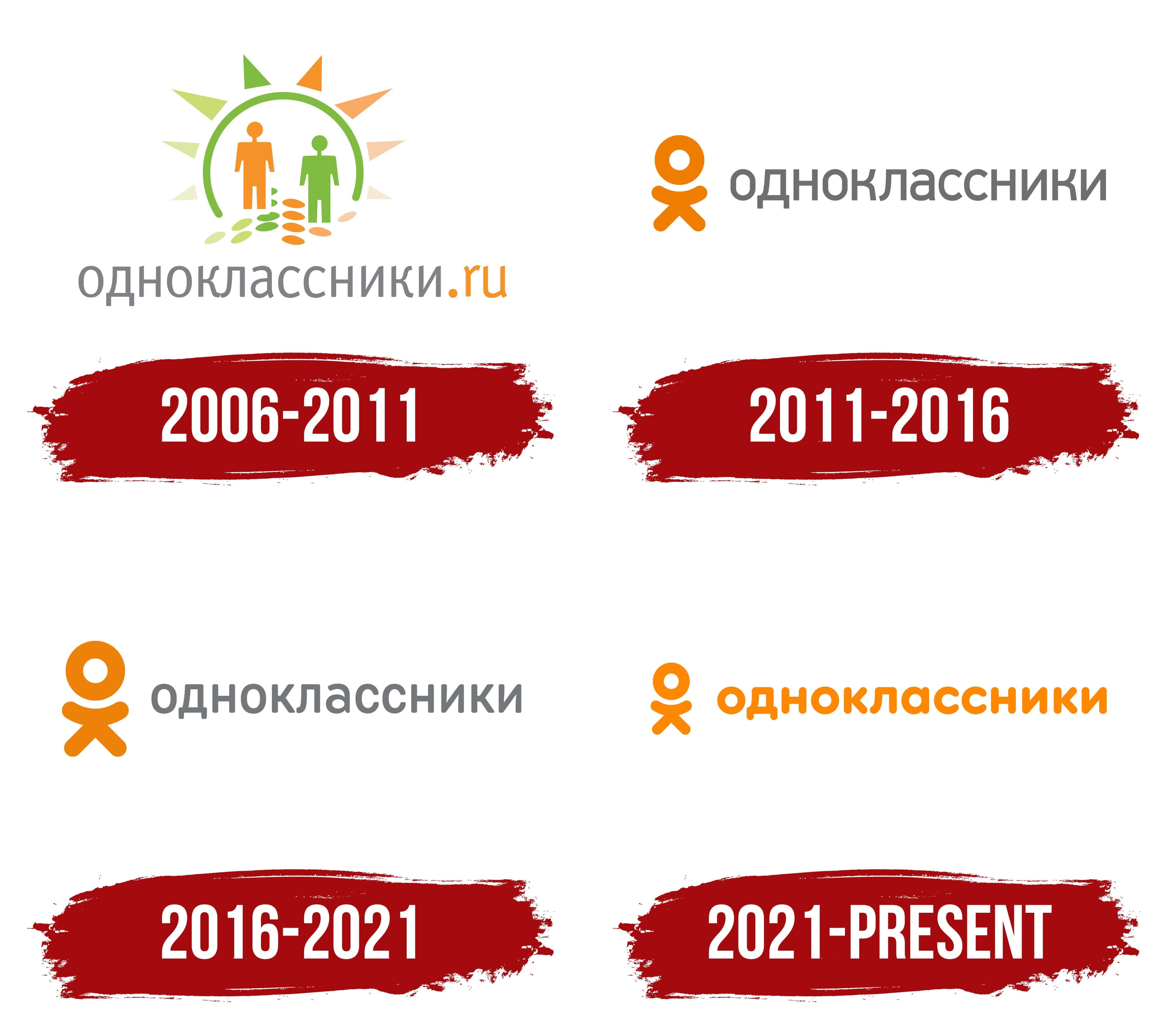
In the history of the Odnoklassniki service, many significant events influenced the functionality of the site and the concept of identity. The project was started back in 2006. But, for the first few months, A. Popkov considered it exclusively a hobby and invested in development himself.
في تاريخ خدمة Odnoklassniki ، أثرت العديد من الأحداث المهمة على وظائف الموقع ومفهوم الهوية. بدأ المشروع في عام 2006. ولكن ، في الأشهر القليلة الأولى ، اعتبر أ. بوبكوف أنه مجرد هواية واستثمر في التطوير بنفسه.
The number of users grew rapidly, so he created a legal entity. At the initial stage, the design was handled by Dmitry Utkin. The logo was brightly colored and consisted of different shapes. It was later replaced with a more modern and stylish version.
نما عدد المستخدمين بسرعة ، لذلك أنشأ كيانًا قانونيًا. في المرحلة الأولية ، تم التعامل مع التصميم من قبل ديمتري أوتكين. كان الشعار بألوان زاهية ويتكون من أشكال مختلفة. تم استبداله لاحقًا بنسخة أكثر حداثة وأنيقة.
At first, the Odnoklassniki logo was multi-colored: orange, gray, and green prevailed. These were the calm colors of the pastel spectrum. The basis of the composition was the sun, depicted in the form of an arch, through which two figures passed. The little men were geometric and looked more like puppets than real people. Under their feet were ovals of several colors.
في البداية ، كان شعار Odnoklassniki متعدد الألوان: البرتقالي والرمادي والأخضر. كانت هذه الألوان الهادئة لطيف الباستيل. كان أساس التكوين هو الشمس ، التي صورت على شكل قوس ، مر من خلالها شخصان. كان الرجال الصغار هندسيين وكانوا يشبهون الدمى أكثر من كونهم أشخاصًا حقيقيين. تحت أقدامهم كانت أشكال بيضاوية من عدة ألوان.
Triangles with sharp ends were located on the outer side of the arc. They symbolized the sun’s rays: the central ones were elongated and large, and the side ones were short and small. At the bottom, the designers placed the social network’s name with a domain name. The silver word “odnoklassniki” was typed in Cyrillic. It was intricate and grotesque. At the same time, the orange “.ru” domain had English spelling.
The social network Odnoklassniki expanded rapidly. In 2011, the number of registered users reached 70 million and then grew exponentially. The growth in popularity prompted the management to think about changing the corporate identity. The logo needed a major update to keep up with the trends of the time.
توسعت الشبكة الاجتماعية Odnoklassniki بسرعة. في عام 2011 ، وصل عدد المستخدمين المسجلين إلى 70 مليونًا ثم نما بشكل كبير. دفع النمو في الشعبية الإدارة إلى التفكير في تغيير هوية الشركة. احتاج الشعار إلى تحديث كبير لمواكبة اتجاهات العصر.
After some discussion, it was decided to update the logo design. The new badge was a new version that compares favorably with its predecessor. It was much simpler, clearer, and more meaningful. In addition, the bright icon has become more recognizable. The very quality of the performance was much better than in the previous version.
This approach emphasized the values of the company and its direction of activity. In addition, changes in design testified to the desire of the social network to remain on the same wavelength with its users. The stylized word OK became the visual basis. The letters were made so that they resembled a small man with a large head; after them was the network’s name, made in a simple font.
أكد هذا النهج على قيم الشركة واتجاه نشاطها. بالإضافة إلى ذلك ، تشهد التغييرات في التصميم على رغبة الشبكة الاجتماعية في البقاء على نفس الطول الموجي مع مستخدميها. أصبحت الكلمة المنمقة OK هي الأساس البصري. صنعت الحروف بحيث تشبه رجلاً صغيراً برأس كبير ؛ بعدهم كان اسم الشبكة ، تم إنشاؤه بخط بسيط.
A feature of the logo was that the letters OK had a special meaning. If you turn them at a right angle, they mean the generally accepted abbreviation of the network. In the standard form, the letters symbolized a little man – a user of Odnoklassniki.
كانت إحدى سمات الشعار أن الحروف "موافق" لها معنى خاص. إذا قمت بتدويرها بزاوية قائمة ، فهذا يعني الاختصار المقبول عمومًا للشبكة. في الشكل القياسي ، ترمز الحروف إلى رجل صغير - مستخدم Odnoklassniki.
In 2016, the popularity of the service continued to grow. Odnoklassniki was in second place in terms of video views, according to Runet. During this period, there were small changes in the design of the logo:
- updated color palette;
- the font has changed.
The colors became lighter, which added lightness and freshness to the logo. In the context of identity, such changes personified the desire for something new, the opening of wide opportunities for users, and the development of the service. The font has changed within the same group. In addition, according to the rules of 2016, it was forbidden to rotate the image at a right angle.
أصبحت الألوان أفتح مما أضاف خفة ونضارة للشعار. في سياق الهوية ، جسدت هذه التغييرات الرغبة في شيء جديد ، وفتح فرص واسعة للمستخدمين ، وتطوير الخدمة. تم تغيير الخط داخل نفس المجموعة. بالإضافة إلى ذلك ، وفقًا لقواعد عام 2016 ، تم منع تدوير الصورة بزاوية قائمة.
The modern logo is simple. The designers changed the typeface to use low-rise, bold glyphs with rounded ends for the title. The inverted “OK” brand icon has been retained and proportionally reduced about the text. Both parts are now colored orange.
الشعار الحديث بسيط. قام المصممون بتغيير الخط لاستخدام الحروف الرسومية المنخفضة الارتفاع والجريئة مع نهايات مستديرة للعنوان. تم الاحتفاظ بأيقونة العلامة التجارية "OK" المعكوسة وتقليلها بشكل متناسب حول النص. كلا الجزأين الآن باللون البرتقالي.
FONT AND COLORS OF THE EMBLEM

The current logo of the Odnoklassniki brand is made in a special style – Din Round Pro, which became the official font of the social network. It replaced Din Text Pro, which was used to design the previous version. The company also allows the use of other fonts, but only in certain situations. Helvetica and Arial fonts are acceptable if the required type is missing.
تم تصميم الشعار الحالي للعلامة التجارية Odnoklassniki بأسلوب خاص - Din Round Pro ، والذي أصبح الخط الرسمي للشبكة الاجتماعية. حل محل Din Text Pro ، والذي تم استخدامه لتصميم الإصدار السابق. تسمح الشركة أيضًا باستخدام خطوط أخرى ، ولكن في مواقف معينة فقط. خطوط Helvetica و Arial مقبولة إذا كان النوع المطلوب مفقودًا.

The logo’s color scheme consists of gray, presented in 3 shades (Cool Gray 3, Cool Gray 9, and 432 C) and orange (in the matching system, it is represented by the number 144 C). This palette demonstrates balance and harmony. Bright orange looks great with basic gray. This favorably emphasizes the stability of the social network base and the constant updating of its functionality.
يتكون مخطط ألوان الشعار من الرمادي ، مقدمًا في 3 ظلال (Cool Gray 3 و Cool Gray 9 و 432 C) والبرتقالي (في نظام المطابقة ، يتم تمثيله بالرقم 144 C). توضح هذه اللوحة التوازن والتناغم. اللون البرتقالي اللامع يبدو رائعًا مع اللون الرمادي الأساسي. هذا يؤكد بشكل إيجابي على استقرار قاعدة الشبكة الاجتماعية والتحديث المستمر لوظائفها.
Comments
Post a Comment