A distinctive feature of the team is the name itself. Royal Challengers Bangalore consists of 2 names: the city and the brand of alcoholic beverages. The identity is also evident in a stylish modern logo that shows energy, purpose, and development.
السمة المميزة للفريق هو الاسم نفسه. يتكون Royal Challengers Bangalore من اسمين: المدينة والعلامة التجارية للمشروبات الكحولية. تتجلى الهوية أيضًا في شعار عصري أنيق يُظهر الطاقة والهدف والتنمية.
MEANING AND HISTORY
RCB is quite an unusual team. In the entire history of its existence, it has never won the IPL (Indian Premier League). But, at the same time, the club is not an outsider. Royal Challengers Bangalore consistently performs well and often finds itself in the top five teams. At such moments, a stylish logo with the image of a lion with a crown on its head appears in the ratings.
RCB فريق غير عادي. طوال تاريخ وجودها ، لم تفز قط بـ IPL (الدوري الهندي الممتاز). لكن في نفس الوقت ، النادي ليس دخيلاً. تقدم Royal Challengers Bangalore أداءً جيدًا باستمرار وغالبًا ما تجد نفسها في أفضل خمسة فرق. في مثل هذه اللحظات ، يظهر في التصنيفات شعار أنيق عليه صورة أسد مع تاج على رأسه.
This strong visual concept depicts the players’ drive and their drive to win championships. The “royal” style is complemented by an elegant color scheme that combines elitism and energy.
يصور هذا المفهوم المرئي القوي دافع اللاعبين واندفاعهم للفوز بالبطولات. يكتمل الأسلوب "الملكي" بمخطط ألوان أنيق يجمع بين النخبوية والطاقة.
The prerequisite for creating the popular Indian cricket club was an announcement by the Cricket Control Board in 2007. It was about creating the Indian Premier League and planning the next year’s competition. As early as February 2008, the teams for the game, including Bangalore, were put up for auction. Her franchise was bought by a well-known businessman who owns United Spirits. From that moment began the history of Royal Challengers Bangalore.
كان الشرط الأساسي لإنشاء نادي الكريكيت الهندي الشهير هو إعلان مجلس التحكم في لعبة الكريكيت في عام 2007. وكان الأمر يتعلق بإنشاء الدوري الهندي الممتاز والتخطيط لمنافسة العام المقبل. في وقت مبكر من فبراير 2008 ، تم طرح فرق اللعبة ، بما في ذلك بنغالور ، للبيع بالمزاد. تم شراء امتيازها من قبل رجل أعمال معروف يمتلك United Spirits. منذ تلك اللحظة بدأ تاريخ Royal Challengers Bangalore.
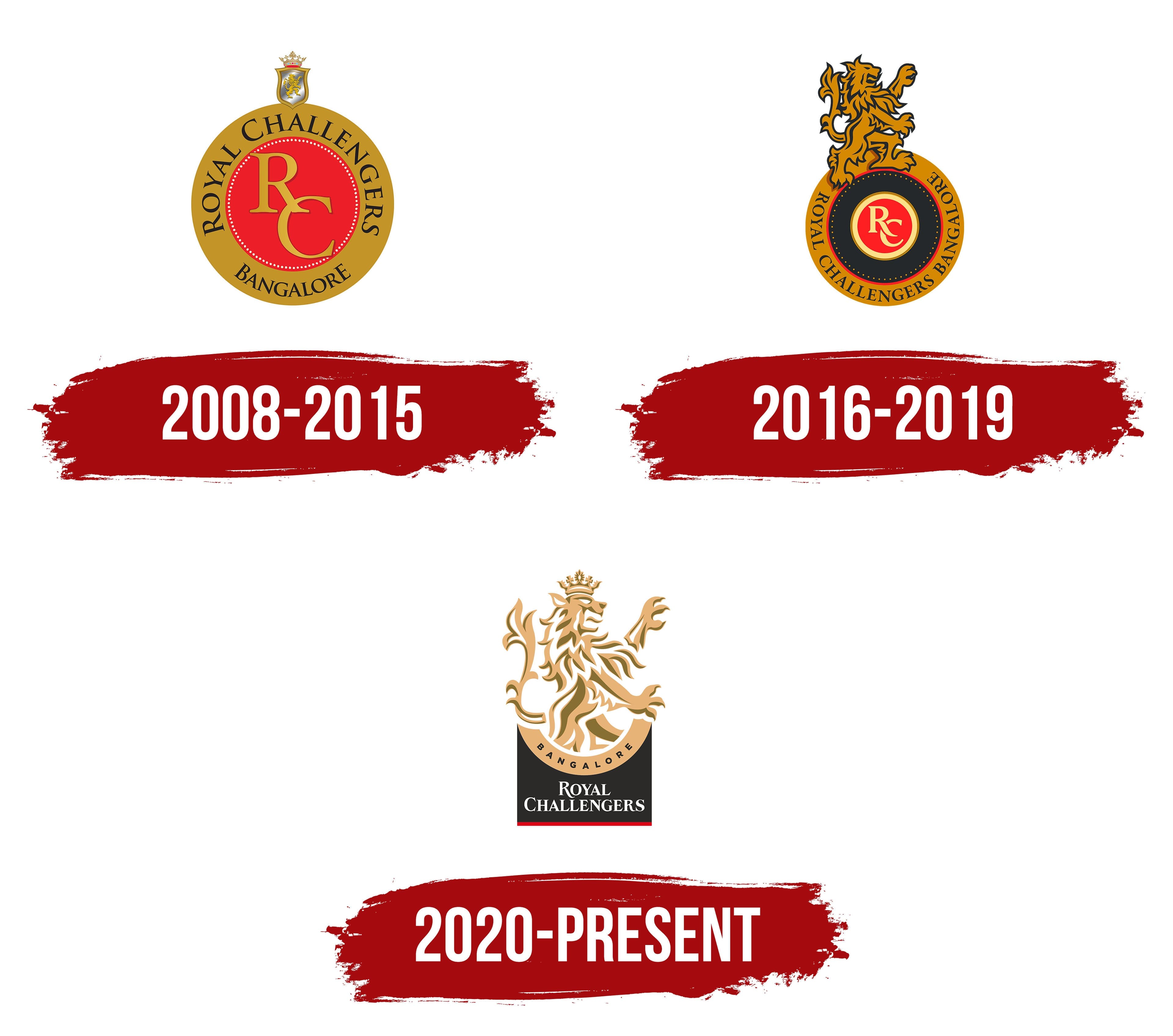
The team received a visual identity and a stylish uniform. In the same year, the first logo was created. It was based on an elegant round medallion complemented by stylish inscriptions. In the center of the badge was an exquisite and, at the same time, laconic monogram. She was surrounded by a thin frame in the form of a small dotted line. Outside the frame was a wordmark in the form of the club’s name.
حصل الفريق على هوية بصرية وزي رسمي أنيق. في نفس العام ، تم إنشاء الشعار الأول. كانت ترتكز على ميدالية مستديرة أنيقة تكملها نقوش أنيقة. في وسط الشارة كان هناك حرف واحد فقط رائع ومقتضب في نفس الوقت. كانت محاطة بإطار رفيع على شكل خط صغير منقط. خارج الإطار كان هناك علامة نصية على شكل اسم النادي.
All letters were made in capital style. Above the medallion was a miniature team coat of arms, decorated with a chic crown. Compared to the logos of other teams, the badge presented was quite complex. But, this reflected the essence of Royal Challengers Bangalore. It was a strong team, which consisted of players with different temperaments and playing styles. Together they complimented each other and adhered to a single strategy.
كل الحروف مصنوعة بأسلوب كبير. وفوق الرصيعة كان هناك شعار فريق مصغر من النبالة ، مزين بتاج أنيق. مقارنة بشعارات الفرق الأخرى ، كانت الشارة المقدمة معقدة للغاية. لكن هذا يعكس جوهر Royal Challengers Bangalore. لقد كان فريقًا قويًا يتكون من لاعبين من مختلف الطباع وأنماط اللعب. لقد أثنوا معًا على بعضهم البعض والتزموا باستراتيجية واحدة.
In addition, cohesion and the desire for success were manifested in perfectly matched colors. Shades of gold, bright red, expressive white, strict black, and tints of silver were chosen for decoration. The central part was made in gold and red, the combination of which evoked associations with the elite, energy, and vitality. The black letters made a successful accent on the name, the white dotted line refreshed the logo a little, and the silver tints adorned the miniature crown.
بالإضافة إلى ذلك ، تجلى التماسك والرغبة في النجاح بألوان متطابقة تمامًا. تم اختيار ظلال من الذهب والأحمر الفاتح والأبيض التعبيري والأسود الصارم وصبغات من الفضة للزينة. تم صنع الجزء المركزي باللونين الذهبي والأحمر ، وقد أثار الجمع بينهما ارتباطات بالنخبة والطاقة والحيوية. جعلت الأحرف السوداء لهجة ناجحة على الاسم ، والخط الأبيض المنقط أعاد تحديث الشعار قليلاً ، وزينت الصبغات الفضية التاج المصغر.
In 2016, the RCB team continued its journey in cricket and pleased the fan with excellent results. The internal structure changed several times throughout the period as new players joined the Royal Challengers Bangalore. In addition, the changes affected the corporate emblem. In 2016, management decided to update the logo design. The new version consisted of the same base in a medallion but with some modifications.
في عام 2016 ، واصل فريق RCB رحلته في لعبة الكريكيت وأسعد الجماهير بنتائج ممتازة. تغير الهيكل الداخلي عدة مرات طوال الفترة حيث انضم لاعبون جدد إلى Royal Challengers Bangalore. بالإضافة إلى ذلك ، أثرت التغييرات على شعار الشركة. في عام 2016 ، قررت الإدارة تحديث تصميم الشعار. يتكون الإصدار الجديد من نفس القاعدة في ميدالية ولكن مع بعض التعديلات.
Dark shades appeared in the inner filling. They favorably distinguished the inner monogram from the word mark in the form of an inscription. The clearer demarcation made the logo more modern and extravagant. The monogram itself has become lighter. Light beige colors replaced the golden hues. The red did not disappear anywhere but remained only along the edges and inside the central circle.
ظهرت ظلال داكنة في الحشوة الداخلية. لقد ميزوا بشكل إيجابي حرف واحد فقط داخلي من علامة الكلمة في شكل نقش. جعل التحديد الأكثر وضوحًا الشعار أكثر حداثة وإسرافًا. أصبح حرف واحد فقط أخف وزنا. حلت ألوان البيج الفاتحة محل الأشكال الذهبية. لم يختف اللون الأحمر في أي مكان ولكنه ظل فقط على طول الحواف وداخل الدائرة المركزية.
The coat of arms with a crown at the top of the logo has changed to a powerful lion standing on two legs. Such a pose of the animal meant an attack, which conveyed the team’s mood. The players were determined and determined to defeat their opponent. A new font also supplemented the picture. The lines became bolder, and the name was made in a more strict and direct serif font.
تم تغيير شعار النبالة الذي يوجد تاج في أعلى الشعار إلى أسد قوي يقف على قدمين. مثل هذه الوضعية للحيوان تعني هجومًا ، مما نقل مزاج الفريق. كان اللاعبون مصممين ومصممين على هزيمة خصمهم. خط جديد يكمل الصورة أيضا. أصبحت الخطوط أكثر جرأة ، وتم صنع الاسم بخط سيريف أكثر صرامة ومباشرة.
In 2020, there was another renewal of the composition. The team includes promising players who are determined to succeed (Chris Morris, Aaron Finch, Isuru Udana, and many others). Changes in the team and style of play contributed to the change in visual concept. The round medallion that the predecessors had was removed from the logo, and the figure of a lion was also increased.
في عام 2020 ، كان هناك تجديد آخر للتكوين. يضم الفريق لاعبين واعدين مصممون على النجاح (كريس موريس ، وآرون فينش ، وإيسورو أودانا ، وغيرهم الكثير). ساهمت التغييرات في الفريق وأسلوب اللعب في تغيير المفهوم المرئي. تمت إزالة الميدالية المستديرة التي كان أسلافها من الشعار ، كما تمت زيادة صورة الأسد.
The changes confirmed the fighting spirit of the team and the mood to improve the strategies of the game. The emblem emphasized that the Royal Challengers Bangalore is a team of real “predators” who are confidently moving towards the goal. The colors of the logo have also changed. It retained black, red, light gold, and basic white shades.
وأكدت التغييرات الروح القتالية للفريق والمزاج لتحسين استراتيجيات اللعبة. أكد الشعار أن Royal Challengers Bangalore هو فريق من "المفترسين" الحقيقيين الذين يتحركون بثقة نحو الهدف. تغيرت ألوان الشعار أيضًا. احتفظت بظلال الأسود والأحمر والذهبي الفاتح والأبيض الأساسي.
FONT AND COLORS OF THE EMBLEM

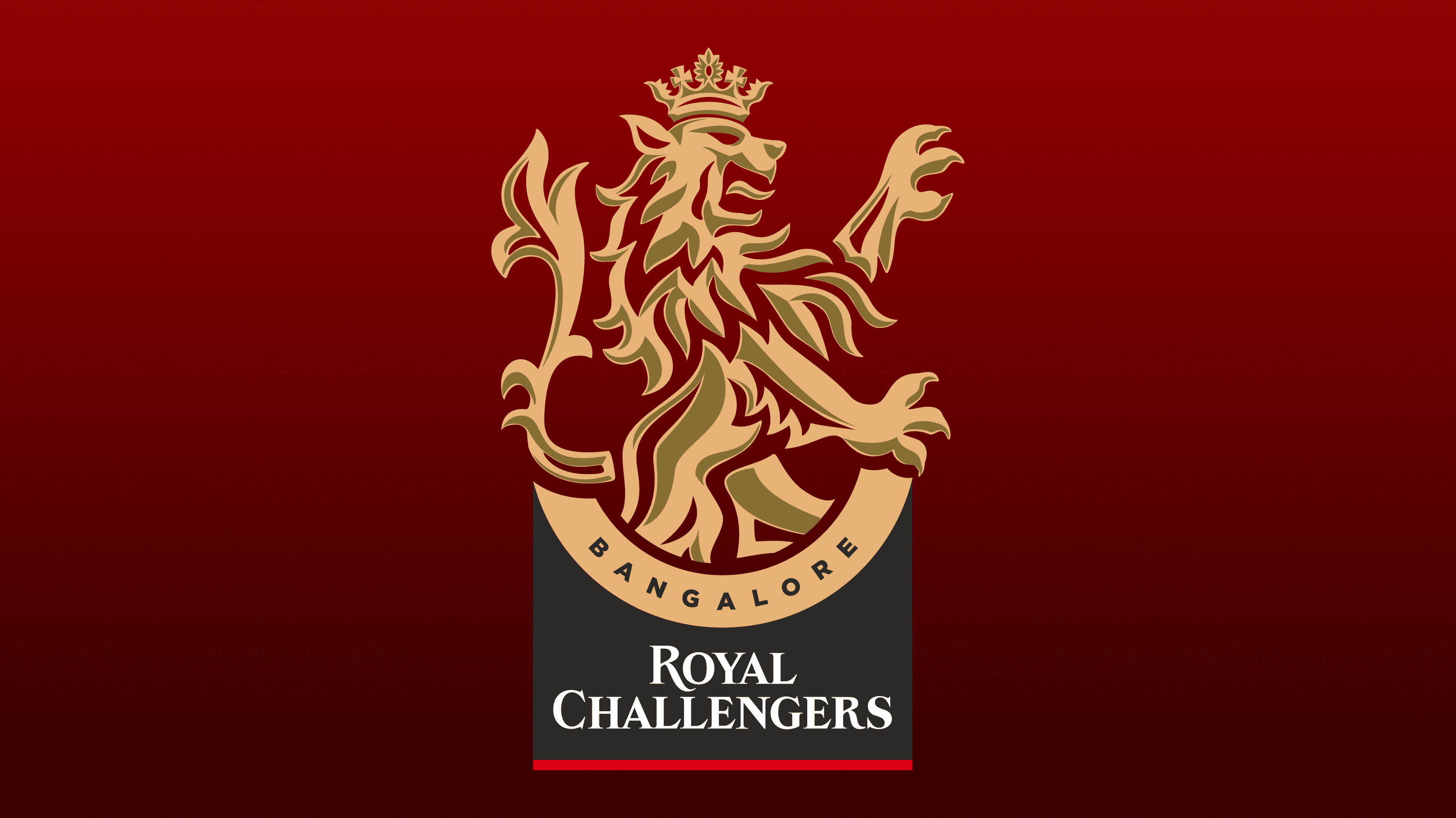
The modern Indian RCB team uses the 2020 version of the logo. This is a vertically oriented icon based on the figure of a lion. The animal stands on two hind legs, and the two front ones are in the air. Below it is a semicircle with a black inscription of the city where the gaming club is based, and even lower is the inscription Royal Challengers, made in white.
يستخدم فريق RCB الهندي الحديث إصدار 2020 من الشعار. هذا رمز موجه عموديًا يعتمد على شكل أسد. يقف الحيوان على رجليه الخلفيتين ، والقدمان الأماميتان في الهواء. يوجد أسفله نصف دائرة به نقش أسود للمدينة التي يوجد بها نادي الألعاب ، وحتى أقل من ذلك يوجد نقش Royal Challengers ، مصنوع باللون الأبيض.
The title is underlined with a thin red line at the bottom. For the design of the lion, a light gold color was chosen, which symbolizes flourishing and luxury. The two-level inscription is made in different fonts. The city’s name is written in capital letters, and the lower part is made in the same style but with serifs. A chic combination of color palette and stylish font demonstrates a new level of development of the team and the desire to meet the modern level of sports.
العنوان مسطر بخط أحمر رفيع في الأسفل. أما بالنسبة لتصميم الأسد ، فقد تم اختيار لون ذهبي فاتح يرمز إلى الازدهار والرفاهية. يتكون النقش من مستويين بخطوط مختلفة. اسم المدينة مكتوب بأحرف كبيرة ، والجزء السفلي مصنوع بنفس الأسلوب ولكن بالحروف الرقيقة. يُظهر المزيج الأنيق من لوحة الألوان والخط الأنيق مستوى جديدًا من تطور الفريق والرغبة في تلبية المستوى الحديث للرياضة.
Comments
Post a Comment